More Layouts Snippets
Front-End Coding Playgrounds
Learn to code with interactive, live-preview playgrounds — HTML, CSS, JavaScript, React & more.
 HTML Playground42 lessons · Click-based · Live preview
 CSS PlaygroundLearn CSS with a live editor
 JavaScript Playground60 lessons · DOM · Async · Canvas
 React PlaygroundLearn React with a live code editor
 GSAP PlaygroundLearn GSAP animation interactively
 SVG Playground44 lessons · shapes · paths · animation
 SCSS Playground45 lessons · Sass modules · tokens
 Tailwind PlaygroundLearn Tailwind CSS with a live editor
 Bootstrap 5 Playground50 lessons · live preview
Vertical Timeline — Free HTML CSS Snippet
Vertical Timeline · Layouts · Plain HTML & CSS · Live preview
What's included
Features
About this UI Snippet
Vertical Timeline — ::before Gradient Line, Node States & CSS Pulse
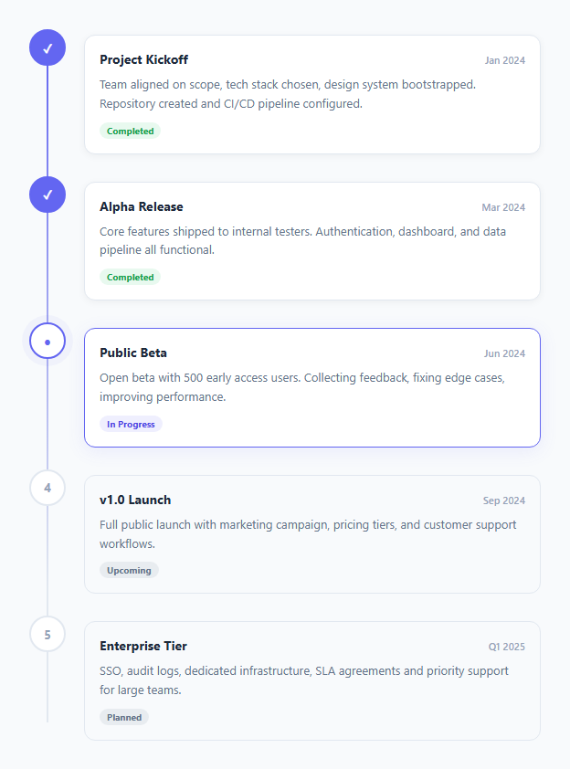
A vertical timeline displays events, steps, or milestones in chronological order along a vertical axis (for a horizontal layout, see the horizontal timeline). Used on product roadmaps, company history pages, onboarding steps, changelog entries, and project status pages. This snippet implements the full layout with a connecting gradient line, three node states, and a pulse animation on the active step — pure HTML and CSS.
The connecting gradient line
.timeline::before is an absolutely positioned pseudo-element: left: 19px; top: 20px; bottom: 20px; width: 2px — a 2px vertical bar centred on the 40px node circles. background: linear-gradient(to bottom, #6366f1, #e2e8f0 80%) fades the line from accent colour at the top to grey at 80%, suggesting that past events are defined and future events are pending.
Three node states
Each .node is a 40px circle. .done shows a filled background with a checkmark or number. .active shows a bordered circle with the accent colour. .pending shows a grey border with dimmed text. These three states communicate progress through the timeline.
The pulse animation on active
.node.active::after { animation: pulse 2s infinite } adds a growing ring behind the active node. The keyframe expands from scale(1) to scale(1.6) while fading to transparent — a soft radar-sweep that draws the eye to the current position.
Flex layout
Each .item uses display: flex; gap: 20px with the node on the left and content on the right. padding-bottom: 24px spaces items vertically. The node has position: relative; z-index: 1 to sit above the connecting line pseudo-element.
The ::before gradient line
The timeline container has ::before { content: ''; position: absolute; left: 20px; top: 0; bottom: 0; width: 2px; background: linear-gradient(to bottom, var(--accent), transparent); }. The gradient line fades from the accent colour at the top to transparent at the bottom, creating a natural end without a hard cut. Each timeline item is position: relative with left padding that offsets content from the line.
Node states
Each timeline node has one of three states: done (filled circle with checkmark — uses SVG or a Unicode ✓), active (accent ring with a CSS pulse animation), or pending (grey empty circle). The active node uses @keyframes pulse with box-shadow: 0 0 0 6px rgba(accent, 0.2) that scales in and out, creating a live "current position" indicator.
Connecting line fill animation
The fill line behind the main gradient line uses a height that increases as more steps complete. height: (completedSteps / totalSteps) * 100 + '%'. Animating this height via CSS transition: height 0.6s ease makes the line visually fill as the user progresses through the timeline.
Build with AI
Build, Understand, Optimize, and Extend It With AI
Instead of tracing the pixel math by hand, paste this snippet's HTML, CSS, and JS into an AI coding assistant like Claude and ask it to explain exactly why the timeline::before pseudo-element is positioned at left: 19px, and how that number relates to the 40px node circle's diameter, so the line lands precisely through the center of every node regardless of how many items exist. It's also worth asking about the gradient itself — have it explain why fading the line to a lighter color at 80% down rather than a hard color stop communicates "future events are undefined" more effectively than a solid line would. For extending it, have it add a way to compute the fill percentage of an inner progress overlay from a completedSteps/totalSteps ratio, connect real icons or images to each node instead of numbers, or make the whole timeline collapse into a compact summary on narrow screens. Treat the code less like a finished artifact and more like a starting point for a conversation.
Prompt to recreate it
Copy this into your AI assistant of choice to build the effect from scratch, or as a jumping-off point for your own variant:
Build a vertical activity/milestone timeline in plain HTML and CSS only, with no JavaScript required for the core visual, using a single pseudo-element for the connecting line rather than extra markup.

Requirements:
- A vertical list of timeline items, each consisting of a circular node on the left and a content card on the right, laid out with flexbox so the node and its card sit side by side.
- The connecting vertical line between nodes must be created by a single ::before pseudo-element on the timeline container: absolutely positioned, sized to a couple of pixels wide, positioned horizontally so it passes exactly through the center of the node circles (calculate the left offset from the node's diameter), and spanning from just below the first node to just above the last.
- The connecting line must use a linear-gradient background that starts at an accent color at the top and fades to a neutral gray by roughly 80% of the way down, so the line visually communicates that later items are less defined/upcoming than earlier ones.
- Each node must support exactly three visual states via CSS classes: a completed state with a filled background and a checkmark or number, a current/active state with a bordered circle in the accent color plus a continuously pulsing outer ring built from a box-shadow keyframe animation, and an upcoming state with a plain gray-bordered circle.
- Nodes must have a higher z-index than the connecting line so they visually sit on top of it.
- Each content card must show a title, a date, a short description, and a small status tag/badge (e.g. "Completed", "In Progress", "Upcoming") styled with a distinct background color per status.
- The currently active item's card should be visually distinguished from other cards (for example, a colored border or stronger shadow) so the current position in the timeline is unambiguous even without reading every node.
Step by step
How to Use
- 1Load the snippetClick "Vertical Timeline" in the sidebar. The preview shows 4 steps with done, active, and pending states plus the gradient connecting line.
- 2Update step contentIn the HTML panel, change the date, title, and description text in each .item.
- 3Change node statesAdd or remove .done, .active, .pending classes on .node divs to reflect your current progress state.
- 4Add more stepsCopy an .item div and paste it inside .timeline. The connecting line auto-extends to the last item.
- 5Change the gradient line colourUpdate the linear-gradient on .timeline::before in the CSS panel to match your brand.
- 6Export in your formatClick "HTML" for a standalone file, "JSX" for a React component, or "Tailwind" for a React + Tailwind version.
Real-world uses
Common Use Cases
Got questions?
Frequently Asked Questions
.timeline::before is an absolutely positioned pseudo-element with position: absolute; left: 19px; top: 20px; bottom: 20px; width: 2px. The 19px left aligns it with the centre of the 40px node circles (40/2 - 1 = 19). The gradient fades from accent at top to grey at 80%.
.node.active::after is an absolutely positioned circle behind the active node. @keyframes pulse scales it from scale(1) to scale(1.6) while fading opacity from 0.4 to 0 over 2 seconds, repeating infinitely. This creates a radar-sweep ring effect.
Copy any .item div inside .timeline and paste it in position. Update the .node state class (done/active/pending) and the date, title, and description content. The ::before connecting line automatically extends.
Remove .active from the current node div and add it to the target node div. Remove .pending from that node. The CSS handles all visual changes — pulse animation, border colour, and text colour — automatically.
Replace the number text inside .node with an SVG element. Set width: 16px; height: 16px on the SVG and use stroke="currentColor" to inherit the node text colour.
Yes. Click "JSX" for a React component. Map over a steps array to render .item divs. Derive the node class from the step status: status === "done" ? "node done" : status === "active" ? "node active" : "node pending".