Learn Coding Visually
Learn to code with interactive, live-preview playgrounds — HTML, CSS, JavaScript, React & more.
 HTML Playground42 lessons · Click-based · Live preview
 CSS PlaygroundLearn CSS with a live editor
 JavaScript Playground60 lessons · DOM · Async · Canvas
 React PlaygroundLearn React with a live code editor
 GSAP PlaygroundLearn GSAP animation interactively
 SVG Playground44 lessons · shapes · paths · animation
 SCSS Playground45 lessons · Sass modules · tokens
 Tailwind PlaygroundLearn Tailwind CSS with a live editor
 Bootstrap 5 Playground50 lessons · live preview
Horizontal Timeline — Free HTML CSS JS Snippet
Horizontal Timeline · Navigation · Plain HTML, CSS & JS · Live preview
What's included
Features
About this UI Snippet
Horizontal Timeline — Done/Active/Upcoming States, Pulse Ring, Scroll Progress & Auto-Scroll
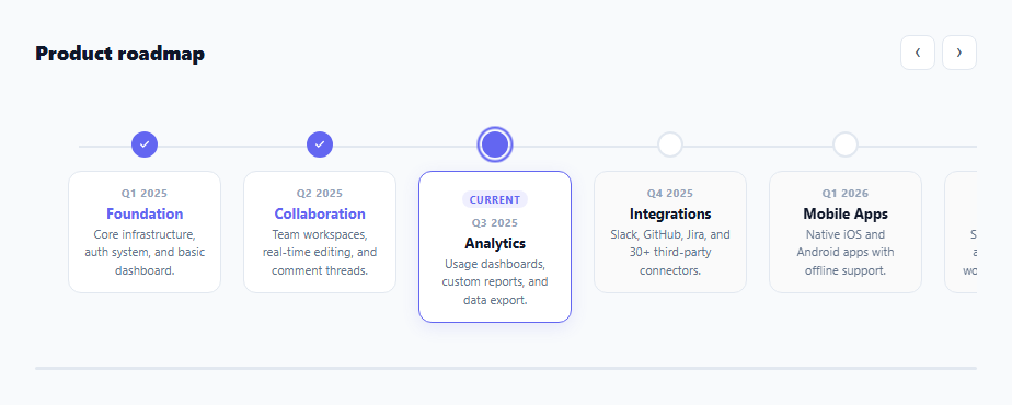
A horizontal timeline visualises a sequence of events, milestones, or phases laid out left-to-right — ideal for product roadmaps, company histories, project phases, and onboarding step indicators. Unlike vertical timelines (which work with unlimited height), horizontal timelines must handle overflow — this snippet uses horizontal scroll with hidden scrollbars, a scroll progress indicator, and arrow navigation buttons.
Three item states
Each .tl-item has one of three classes: .done (past milestones — filled indigo dot with checkmark), .active (current milestone — pulsing ring animation), or .upcoming (future milestones — empty grey dot, muted card background). The CSS responds to these classes automatically — no JavaScript state management needed for the visual differentiation.
The pulsing ring animation
The active dot has a .pulse class. Its ::after pseudo-element uses a @keyframes that oscillates scale (0.9 to 1.1) and opacity (0.4 to 1) — creating a breathing glow ring effect. This immediately draws the eye to the current timeline position.
The connecting line
A single .tl-line div is absolutely positioned at top: 53px (the dot centre) with left: 40px and right: 40px. It spans the full track width behind all dots. No JavaScript sizing needed — the absolute positioning with right: 40px automatically extends as the track grows with more items.
Overflow scroll without scrollbar
The .tl-scroll container has overflow-x: auto with scrollbar-width: none (Firefox) and ::-webkit-scrollbar { display: none } (Chrome/Safari). This allows natural scroll gestures on touch devices while hiding the scrollbar for a cleaner desktop appearance. The arrow buttons provide explicit navigation.
Auto-scroll to active item
On page load, scrollTo() centres the active item in the viewport. The timeout ensures the DOM is rendered before measuring offsetLeft. The calculation: item.offsetLeft - containerWidth/2 + itemWidth/2 centres the item precisely.
Connecting to real roadmap data
Replace the static HTML with dynamically generated items: fetch("/api/roadmap").then(r=>r.json()).then(data => { data.milestones.forEach(m => { const item = document.createElement("div"); item.className = "tl-item " + m.state; item.innerHTML = buildItemHTML(m); track.appendChild(item); }); autoScrollToActive(); }). Define buildItemHTML(m) to return the dot and card HTML from the milestone object. The auto-scroll and progress bar work identically with dynamic content.
Accessibility considerations
The horizontal timeline uses a scrollable region. Add role="region" and aria-label="Product roadmap timeline" to .tl-scroll for screen readers. Each .tl-item can include an aria-label with the date and event name. The prev/next buttons already have aria-label attributes. For keyboard users, the scroll container is focusable by default and arrow keys scroll horizontally when focused.
Build with AI
Build, Understand, Optimize, and Extend It With AI
You don't have to work out the centering math by hand. Paste this snippet's HTML, CSS, and JS into an AI coding assistant like Claude and ask it to explain exactly how the auto-scroll offset calculation (offsetLeft minus half the container width plus half the item width) centers the active milestone, or why the connecting line is positioned with a fixed top value tied to the dot's vertical center rather than computed dynamically. The same assistant is useful for optimizing it — ask whether the scroll event listener's progress-bar calculation needs throttling on a timeline with many more items, and whether the 300ms setTimeout before auto-scrolling is a fragile way to wait for layout compared to using a resize observer or double requestAnimationFrame. It's just as handy for extending the timeline: ask it to add keyboard arrow-key navigation between items, support vertical stacking on narrow screens instead of horizontal scroll, or fetch milestones from an API and rebuild the connecting line and progress bar dynamically. Treat the code less like a finished artifact and more like a starting point for a conversation.
Prompt to recreate it
Copy this into your AI assistant of choice to build the effect from scratch, or as a jumping-off point for your own variant:
Build a horizontally-scrolling roadmap timeline in plain HTML, CSS, and JavaScript — no library, no scroll-jacking.

Requirements:
- A horizontally scrollable container holding a row of timeline items, each with a small circular dot and a card below it showing a date, an event title, and a description.
- Each item must carry one of three states — done, active, or upcoming — expressed purely as a CSS class, with done items showing a filled dot with a checkmark icon, active showing a pulsing ring animation around its dot (via a keyframe animating scale and opacity on a pseudo-element), and upcoming showing an empty outlined dot and a muted card background.
- A single absolutely-positioned line spanning behind all the dots at their vertical center, extending automatically as more items are added without needing to recalculate its width in JavaScript.
- Hide the horizontal scrollbar visually in both Firefox and WebKit browsers while keeping the container fully scrollable by touch, mouse wheel, and drag.
- Add previous/next arrow buttons that scroll the container by a fixed pixel amount using smooth scrolling behavior.
- Add a thin progress bar beneath the timeline whose fill width is recalculated on every scroll event as the ratio of current scroll position to the maximum possible scroll distance.
- On page load, after allowing time for layout to settle, automatically smooth-scroll the container so the currently active item is centered in the visible viewport, calculating the target scroll offset from the active item's offsetLeft and width relative to the container's clientWidth.
Want to tighten it up first? Run this prompt through the AI Prompt Studio to score it across 8 quality dimensions, catch anti-patterns, and tune the wording for Claude, ChatGPT, or Gemini before you paste it in.
Source Code
<div class="wrap">
  <div class="timeline-head">
    <h2 class="tl-title">Product roadmap</h2>
    <div class="tl-controls">
      <button class="tl-nav" onclick="scrollTl(-1)" aria-label="Previous">‹</button>
      <button class="tl-nav" onclick="scrollTl(1)"  aria-label="Next">›</button>
    </div>
  </div>

  <div class="tl-scroll" id="tl-scroll">
    <div class="tl-track" id="tl-track">
      <!-- Connecting line -->
      <div class="tl-line"></div>

      <div class="tl-item done" data-date="Q1 2025">
        <div class="tl-dot"><svg width="10" height="10" viewBox="0 0 24 24" fill="none" stroke="currentColor" stroke-width="3" stroke-linecap="round"><polyline points="20 6 9 17 4 12"/></svg></div>
        <div class="tl-card">
          <div class="tl-date">Q1 2025</div>
          <div class="tl-event">Foundation</div>
          <div class="tl-desc">Core infrastructure, auth system, and basic dashboard.</div>
        </div>
      </div>

      <div class="tl-item done" data-date="Q2 2025">
        <div class="tl-dot"><svg width="10" height="10" viewBox="0 0 24 24" fill="none" stroke="currentColor" stroke-width="3" stroke-linecap="round"><polyline points="20 6 9 17 4 12"/></svg></div>
        <div class="tl-card">
          <div class="tl-date">Q2 2025</div>
          <div class="tl-event">Collaboration</div>
          <div class="tl-desc">Team workspaces, real-time editing, and comment threads.</div>
        </div>
      </div>

      <div class="tl-item active" data-date="Q3 2025">
        <div class="tl-dot pulse"></div>
        <div class="tl-card current">
          <div class="tl-badge">Current</div>
          <div class="tl-date">Q3 2025</div>
          <div class="tl-event">Analytics</div>
          <div class="tl-desc">Usage dashboards, custom reports, and data export.</div>
        </div>
      </div>

      <div class="tl-item upcoming" data-date="Q4 2025">
        <div class="tl-dot"></div>
        <div class="tl-card">
          <div class="tl-date">Q4 2025</div>
          <div class="tl-event">Integrations</div>
          <div class="tl-desc">Slack, GitHub, Jira, and 30+ third-party connectors.</div>
        </div>
      </div>

      <div class="tl-item upcoming" data-date="Q1 2026">
        <div class="tl-dot"></div>
        <div class="tl-card">
          <div class="tl-date">Q1 2026</div>
          <div class="tl-event">Mobile Apps</div>
          <div class="tl-desc">Native iOS and Android apps with offline support.</div>
        </div>
      </div>

      <div class="tl-item upcoming" data-date="Q2 2026">
        <div class="tl-dot"></div>
        <div class="tl-card">
          <div class="tl-date">Q2 2026</div>
          <div class="tl-event">AI Features</div>
          <div class="tl-desc">Smart suggestions, auto-tagging, and workflow automation.</div>
        </div>
      </div>

    </div>
  </div>

  <div class="tl-progress">
    <div class="tl-prog-fill" id="tl-prog-fill"></div>
  </div>
</div>
* { box-sizing: border-box; margin: 0; padding: 0; }
body { font-family: system-ui, sans-serif; background: #f8fafc; min-height: 100vh; display: flex; align-items: center; justify-content: center; padding: 32px 24px; }
.wrap { width: 100%; max-width: 860px; display: flex; flex-direction: column; gap: 16px; }
.timeline-head { display: flex; justify-content: space-between; align-items: center; }
.tl-title { font-size: 18px; font-weight: 800; color: #0f172a; }
.tl-controls { display: flex; gap: 6px; }
.tl-nav { width: 32px; height: 32px; border-radius: 8px; border: 1.5px solid #e2e8f0; background: #fff; color: #475569; font-size: 18px; cursor: pointer; display: flex; align-items: center; justify-content: center; transition: all 0.12s; }
.tl-nav:hover { border-color: #6366f1; color: #6366f1; }
/* Scrollable track */
.tl-scroll { overflow-x: auto; scrollbar-width: none; -ms-overflow-style: none; padding-bottom: 8px; }
.tl-scroll::-webkit-scrollbar { display: none; }
.tl-track { display: flex; gap: 0; position: relative; min-width: max-content; padding: 40px 20px 16px; }
/* Connecting line */
.tl-line { position: absolute; top: 53px; left: 40px; right: 40px; height: 2px; background: #e2e8f0; z-index: 0; }
/* Items */
.tl-item { display: flex; flex-direction: column; align-items: center; gap: 0; min-width: 160px; flex: 1; position: relative; z-index: 1; }
.tl-dot { width: 24px; height: 24px; border-radius: 50%; background: #fff; border: 2px solid #e2e8f0; display: flex; align-items: center; justify-content: center; margin-bottom: 12px; flex-shrink: 0; position: relative; z-index: 2; }
.tl-item.done .tl-dot { background: #6366f1; border-color: #6366f1; color: #fff; }
.tl-item.active .tl-dot { border-color: #6366f1; }
.tl-dot.pulse { width: 24px; height: 24px; background: #6366f1; }
.tl-dot.pulse::after { content:''; position:absolute; inset:-5px; border-radius:50%; border:2px solid #6366f1; animation:pulsering 2s ease-in-out infinite; }
@keyframes pulsering { 0%,100%{opacity:0.4;transform:scale(0.9)} 50%{opacity:1;transform:scale(1.1)} }
.tl-card { background: #fff; border: 1.5px solid #e2e8f0; border-radius: 12px; padding: 12px 14px; text-align: center; width: 140px; transition: box-shadow 0.15s, border-color 0.15s; }
.tl-card:hover { border-color: #6366f1; box-shadow: 0 4px 16px rgba(99,102,241,0.1); }
.tl-card.current { border-color: #6366f1; box-shadow: 0 4px 16px rgba(99,102,241,0.12); }
.tl-badge { font-size: 9px; font-weight: 700; letter-spacing: 0.8px; text-transform: uppercase; color: #6366f1; background: rgba(99,102,241,0.1); padding: 2px 7px; border-radius: 10px; display: inline-block; margin-bottom: 6px; }
.tl-date { font-size: 10px; font-weight: 700; color: #94a3b8; text-transform: uppercase; letter-spacing: 0.5px; }
.tl-event { font-size: 13px; font-weight: 700; color: #0f172a; margin: 3px 0; }
.tl-desc { font-size: 11px; color: #64748b; line-height: 1.5; }
.tl-item.done .tl-card .tl-event { color: #6366f1; }
.tl-item.upcoming .tl-card { background: #fafafa; }
/* Scroll progress indicator */
.tl-progress { height: 3px; background: #e2e8f0; border-radius: 2px; overflow: hidden; }
.tl-prog-fill { height: 100%; background: #6366f1; border-radius: 2px; width: 0%; transition: width 0.1s; }const scroll = document.getElementById('tl-scroll');
const progFill = document.getElementById('tl-prog-fill');
scroll.addEventListener('scroll', () => {
const pct = scroll.scrollLeft / (scroll.scrollWidth - scroll.clientWidth) * 100;
progFill.style.width = pct.toFixed(1) + '%';
}, { passive: true });
function scrollTl(dir) {
scroll.scrollBy({ left: dir * 200, behavior: 'smooth' });
}
// Auto-scroll to active item on load
const active = document.querySelector('.tl-item.active');
if (active) {
setTimeout(() => {
const offset = active.offsetLeft - scroll.clientWidth / 2 + active.offsetWidth / 2;
scroll.scrollTo({ left: Math.max(0, offset), behavior: 'smooth' });
}, 300);
}Step by step
How to Use
- 1Scroll horizontally or use the ‹ › arrowsThe timeline scrolls horizontally. Use arrow buttons or swipe on mobile. The thin progress bar below shows scroll position within the timeline.
- 2Update the timeline items and datesEdit each .tl-item div: change .tl-date, .tl-event, and .tl-desc text. The state classes (done/active/upcoming) control the visual appearance automatically.
- 3Change the current active itemMove class="tl-item active" to the item you want highlighted as current. Remove the .pulse class from the old dot div and add it to the new one. Move the .tl-badge "Current" label similarly.
- 4Add more timeline itemsDuplicate any .tl-item div and place it at the correct position. The connecting line automatically extends. Each item has min-width: 160px so they space consistently.
- 5Change the connecting line positionUpdate top: 53px on .tl-line to match the vertical centre of your dots. If you change the dot size or top padding, adjust this value to keep the line at dot height.
- 6Export in your formatClick "HTML" for a standalone file, "JSX" for a React component mapping a milestones array to timeline items, or "Tailwind" for a React + Tailwind CSS version.
Real-world uses
Common Use Cases
Got questions?
Frequently Asked Questions
Three CSS declarations together hide the scrollbar in all browsers while keeping scrolling functional. For Firefox: scrollbar-width: none on the container. For Chrome, Safari, Edge: .container::-webkit-scrollbar { display: none }. For Internet Explorer: -ms-overflow-style: none. The container still scrolls on touch swipe and mouse wheel horizontally — only the visual scrollbar track is hidden. This is the standard approach for all carousels and custom horizontal scroll areas.
The auto-scroll calculation: const offset = active.offsetLeft - scroll.clientWidth / 2 + active.offsetWidth / 2. This centres the active item in the visible scroll viewport. scroll.scrollTo({ left: offset, behavior: "smooth" }) animates to that position. The setTimeout(fn, 300) delay ensures the layout has rendered and offsetLeft has been computed before the scroll fires. Without the timeout, offsetLeft may be 0 during the synchronous render phase.
Define a milestones array: const milestones = [{ date: "Q1 2025", event: "Foundation", desc: "...", state: "done" }, ...]. Map to HTML: milestones.forEach(m => { const item = document.createElement("div"); item.className = "tl-item " + m.state; item.innerHTML = getItemHTML(m); track.appendChild(item); }). Where getItemHTML(m) returns the inner HTML with dot and card. Run this before the auto-scroll initialisation.
Click "JSX" to download. Define a milestones prop array with date, event, desc, and state fields. Map to timeline item divs with className derived from state. Use useRef for the scroll container. The auto-scroll useEffect depends on the milestones array. The progress bar state uses useState(0) updated by a scroll event listener attached in useEffect with cleanup.