Source Code
<div class="demo-bg">
<div class="progress-card">
<h2 class="card-title">Account Setup</h2>
<div class="stepper" id="stepper">
<div class="step completed" data-step="0">
<div class="step-circle">
<svg class="check-icon" width="14" height="14" viewBox="0 0 24 24" fill="none" stroke="currentColor" stroke-width="3" stroke-linecap="round"><polyline points="20 6 9 17 4 12"/></svg>
<span class="step-num">1</span>
</div>
<div class="step-label">
<span class="step-title">Create account</span>
<span class="step-sub">Email & password</span>
</div>
<div class="connector"><div class="connector-fill"></div></div>
</div>
<div class="step active" data-step="1">
<div class="step-circle">
<svg class="check-icon" width="14" height="14" viewBox="0 0 24 24" fill="none" stroke="currentColor" stroke-width="3" stroke-linecap="round"><polyline points="20 6 9 17 4 12"/></svg>
<span class="step-num">2</span>
</div>
<div class="step-label">
<span class="step-title">Verify email</span>
<span class="step-sub">Check your inbox</span>
</div>
<div class="connector"><div class="connector-fill"></div></div>
</div>
<div class="step pending" data-step="2">
<div class="step-circle">
<svg class="check-icon" width="14" height="14" viewBox="0 0 24 24" fill="none" stroke="currentColor" stroke-width="3" stroke-linecap="round"><polyline points="20 6 9 17 4 12"/></svg>
<span class="step-num">3</span>
</div>
<div class="step-label">
<span class="step-title">Profile details</span>
<span class="step-sub">Name & avatar</span>
</div>
<div class="connector"><div class="connector-fill"></div></div>
</div>
<div class="step pending last" data-step="3">
<div class="step-circle">
<svg class="check-icon" width="14" height="14" viewBox="0 0 24 24" fill="none" stroke="currentColor" stroke-width="3" stroke-linecap="round"><polyline points="20 6 9 17 4 12"/></svg>
<span class="step-num">4</span>
</div>
<div class="step-label">
<span class="step-title">Choose plan</span>
<span class="step-sub">Free or Pro</span>
</div>
</div>
</div>
<div class="step-content" id="stepContent">
<p class="content-text">Step 2 of 4 — Check your inbox for a verification email and click the link to continue.</p>
</div>
<div class="btn-row">
<button class="btn btn-back" id="btnBack" onclick="prevStep()">← Back</button>
<button class="btn btn-next" id="btnNext" onclick="nextStep()">Continue →</button>
</div>
</div>
</div>*{box-sizing:border-box;margin:0;padding:0}
body{font-family:system-ui,sans-serif;background:#f1f5f9;min-height:100vh;display:flex;align-items:center;justify-content:center;padding:24px}
.demo-bg{display:flex;align-items:center;justify-content:center;width:100%}
.progress-card{background:#fff;border-radius:20px;box-shadow:0 4px 24px rgba(0,0,0,.08);padding:32px;width:400px}
.card-title{font-size:18px;font-weight:700;color:#1e293b;margin-bottom:28px}
/* Stepper layout */
.stepper{display:flex;flex-direction:column;gap:0}
.step{display:flex;align-items:flex-start;gap:14px;position:relative;cursor:pointer}
.step.last .connector{display:none}
/* Circle */
.step-circle{
width:36px;height:36px;border-radius:50%;
display:flex;align-items:center;justify-content:center;
flex-shrink:0;position:relative;z-index:1;
border:2px solid #e2e8f0;background:#fff;
transition:background .25s,border-color .25s,transform .2s
}
.check-icon{display:none;color:#fff}
.step-num{font-size:13px;font-weight:700;color:#94a3b8;transition:color .2s}
.step.completed .step-circle{background:#6366f1;border-color:#6366f1;transform:none}
.step.completed .check-icon{display:block}
.step.completed .step-num{display:none}
.step.active .step-circle{background:#6366f1;border-color:#6366f1;box-shadow:0 0 0 4px rgba(99,102,241,.18)}
.step.active .step-num{color:#fff;display:block}
.step.pending .step-circle:hover{border-color:#a5b4fc}
/* Labels */
.step-label{padding-bottom:28px;flex:1}
.step.last .step-label{padding-bottom:0}
.step-title{display:block;font-size:14px;font-weight:600;color:#1e293b;transition:color .2s}
.step-sub{display:block;font-size:12px;color:#94a3b8;margin-top:2px}
.step.active .step-title{color:#6366f1}
.step.pending .step-title{color:#94a3b8}
/* Connector line */
.connector{
position:absolute;left:17px;top:36px;
width:2px;height:calc(100% - 36px);
background:#e2e8f0;overflow:hidden
}
.connector-fill{
width:100%;height:0%;background:#6366f1;
transition:height .4s ease
}
.step.completed .connector-fill{height:100%}
/* Content area */
.step-content{
margin:24px 0;padding:16px;
background:#f8fafc;border-radius:12px;
border-left:3px solid #6366f1;min-height:60px
}
.content-text{font-size:14px;color:#475569;line-height:1.6}
/* Buttons */
.btn-row{display:flex;gap:10px;justify-content:flex-end;margin-top:8px}
.btn{padding:9px 20px;font-size:14px;font-weight:600;border-radius:10px;border:none;cursor:pointer;font-family:inherit;transition:all .15s}
.btn-back{background:#f1f5f9;color:#64748b}
.btn-back:hover{background:#e2e8f0}
.btn-next{background:linear-gradient(135deg,#6366f1,#4f46e5);color:#fff;box-shadow:0 4px 12px rgba(99,102,241,.3)}
.btn-next:hover{filter:brightness(1.08)}
.btn:disabled{opacity:.4;cursor:not-allowed}const steps = document.querySelectorAll('.step');
const content = document.getElementById('stepContent');
const btnBack = document.getElementById('btnBack');
const btnNext = document.getElementById('btnNext');
let current = 1; // active step index (0-based)
const CONTENT = [
'Step 1 of 4 — Enter your email address and choose a secure password to create your account.',
'Step 2 of 4 — Check your inbox for a verification email and click the link to continue.',
'Step 3 of 4 — Add your name, profile photo, and a short bio so teammates can recognise you.',
'Step 4 of 4 — Choose your plan. Start free and upgrade anytime as your team grows.',
];
function updateStepper() {
steps.forEach((step, i) => {
step.classList.remove('completed', 'active', 'pending');
if (i < current) step.classList.add('completed');
else if (i === current) step.classList.add('active');
else step.classList.add('pending');
});
content.querySelector('.content-text').textContent = CONTENT[current];
btnBack.disabled = current === 0;
btnNext.textContent = current === steps.length - 1 ? '✓ Finish' : 'Continue →';
if (current === steps.length - 1 && btnNext.textContent === '✓ Finish') {
btnNext.disabled = false;
}
}
function nextStep() {
if (current < steps.length - 1) {
current++;
updateStepper();
} else {
// Finish action
content.querySelector('.content-text').textContent = '🎉 All done! Your account is set up and ready.';
btnNext.disabled = true;
}
}
function prevStep() {
if (current > 0) { current--; updateStepper(); }
}
// Click to navigate any completed step
steps.forEach((step, i) => {
step.addEventListener('click', () => {
if (i <= current) { current = i; updateStepper(); }
});
});
updateStepper();Learn Coding Visually
Learn to code with interactive, live-preview playgrounds — HTML, CSS, JavaScript, React & more.
 HTML Playground42 lessons · Click-based · Live preview
 CSS PlaygroundLearn CSS with a live editor
 JavaScript Playground60 lessons · DOM · Async · Canvas
 React PlaygroundLearn React with a live code editor
 GSAP PlaygroundLearn GSAP animation interactively
 SVG Playground44 lessons · shapes · paths · animation
 SCSS Playground45 lessons · Sass modules · tokens
 Tailwind PlaygroundLearn Tailwind CSS with a live editor
 Bootstrap 5 Playground50 lessons · live preview
Multi-Step Progress Indicator — HTML CSS JS
Multi-Step Progress Indicator · Navigation · Plain HTML, CSS & JS · Live preview
What's included
Features
About this UI Snippet
Multi-Step Progress Indicator — Completed/Active/Pending States & Animated Connector Fill
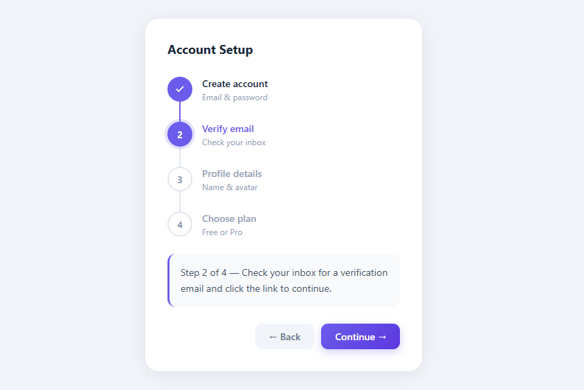
Multi-step progress indicators, also called steppers or breadcrumb flows, are navigation components that show a user's position within a multi-page process — checkout flows, onboarding wizards, form sequences, and setup flows. Clear visual progress reduces abandonment by giving users a sense of completion and a clear endpoint. This snippet builds a vertical stepper with animated connector fills, three distinct visual states, click-to-navigate completed steps, and a content panel that updates per step.
Three-state visual system
The stepper uses three CSS classes to represent progression: .completed (steps already done), .active (the current step), and .pending (future steps not yet reached). These map to distinct visual treatments:
- Completed: filled indigo circle with a white checkmark SVG icon, full connector fill
- Active: filled indigo circle with white step number, a glowing ring shadow (box-shadow: 0 0 0 4px rgba(99,102,241,.18))
- Pending: empty white circle with gray border, dimmed label text
The JS updates these classes on every state change using classList.remove('completed','active','pending') followed by the appropriate classList.add() — a clean state reset pattern.
Animated connector fill
The connecting line between steps is built with two nested elements: .connector (the gray track) and .connector-fill (the indigo progress). The connector is position:absolute; left:17px; top:36px; width:2px; height:calc(100% - 36px) — positioned to run from the bottom of the circle (36px from the step top) to the bottom of the label area. The fill starts at height:0% and transitions to height:100% when the step's .completed class is applied. The transition:height .4s ease creates a smooth vertical fill animation as steps are completed.
The left:17px positions the line at the horizontal center of the 36px-wide circle (36/2 - 1 = 17, accounting for the 2px line width). This mathematical alignment ensures the line appears to grow from the bottom of the circle, not offset to one side.
Click-to-navigate completed steps
Each step element has a click event listener. The handler only navigates if i <= current — users can click backward to any completed step but cannot skip ahead to pending steps. This matches the UX convention for steppers: you can always go back to review/edit, but you cannot jump ahead. The click handler sets current = i and calls updateStepper(), making completed steps act like navigation links.
Content panel per step
Below the stepper, a content panel displays contextual instructions for the current step. The CONTENT array maps step index to description text. On every state change, content.querySelector('.content-text').textContent = CONTENT[current] updates the panel instantly. A real implementation would animate this update with a fade or slide transition to signal that the content changed.
Finish state handling
When the last step is active and the user clicks "✓ Finish", the button text changes and a completion message replaces the content panel. In a real application, the finish action would submit the form, call an API, or navigate to a success page. The button is then disabled to prevent double submission.
React pattern
In React: const [step, setStep] = useState(0); const steps = [{ title, sub, content }, ...]. The stepper renders a steps.map((s, i) => <Step state={i < step ? 'completed' : i === step ? 'active' : 'pending'} onClick={() => i <= step && setStep(i)} />). The connector fill uses style={{ height: i < step ? '100%' : '0%' }} with a CSS transition. Navigation buttons update the step state.
Build with AI
Build, Understand, Optimize, and Extend It With AI
Have an AI coding assistant like Claude explain the exact math behind the connector's left:17px positioning and why it has to change if you resize the 36px step circles, or why updateStepper() removes all three state classes before adding one back rather than toggling each individually. It is also useful for spotting rough edges — ask whether the content panel swap should animate instead of snapping, or whether the click handler's "i <= current" guard has any edge cases when a user double-clicks fast. For extending the component, ask for per-step validation that blocks Continue until a condition is met, a horizontal layout variant, or a loading spinner state inside the active circle while an async save runs. Treat the code less like a finished artifact and more like a starting point for a conversation.
Prompt to recreate it
Copy this into your AI assistant of choice to build the effect from scratch, or as a jumping-off point for your own variant:
Build a vertical multi-step progress stepper in plain HTML, CSS, and JavaScript with no framework or library.

Requirements:
- Render a fixed sequence of steps, each with a circle, a title, a subtitle, and a connecting line to the next step, and track the current step index in a single JS variable.
- Every step must resolve to exactly one of three states — completed, active, or pending — computed purely from comparing its index to the current index, and each state must apply a distinct class via classList.remove of all three state classes followed by classList.add of the correct one.
- Completed steps show a checkmark icon and hide the step number; active and pending steps show the step number, with the active circle getting an outer glow via box-shadow.
- The vertical connector between two steps must be built from two stacked elements — a static gray track and a colored fill — where the fill's height animates from 0% to 100% via a CSS transition when the earlier step becomes completed.
- Clicking a step must only navigate backward or to itself (index less than or equal to the current step) — clicking a future pending step must do nothing.
- A content panel below the stepper must show step-specific instructional text pulled from an array indexed by the current step, updating whenever the step changes.
- Provide Back and Continue/Finish buttons where Back is disabled on the first step and Continue relabels to a finish state and disables itself after being clicked on the last step.
Want to tighten it up first? Run this prompt through the AI Prompt Studio to score it across 8 quality dimensions, catch anti-patterns, and tune the wording for Claude, ChatGPT, or Gemini before you paste it in.
Step by step
How to Use
- 1Paste HTML, CSS, and JSA vertical 4-step stepper appears. Step 1 is completed (checkmark), Step 2 is active (glowing circle), Steps 3–4 are pending (gray).
- 2Click "Continue"Step 2 becomes completed, its connector line fills with indigo, Step 3 becomes active. The content panel updates with Step 3 instructions.
- 3Click a completed stepClicking Step 1's circle navigates back to it. Steps 2+ revert to pending. The content panel shows Step 1's instructions.
- 4Reach the last stepThe "Continue" button changes to "✓ Finish". Clicking it shows a completion message and disables the button.
- 5Customize step labelsUpdate the
step-titleandstep-subspans in HTML. Update theCONTENTarray in JS with matching instructions for each step.
Real-world uses
Common Use Cases
Got questions?
Frequently Asked Questions
Change .stepper to display:flex; flex-direction:row; align-items:flex-start. Change .connector to position:absolute; top:17px; left:36px; height:2px; width:calc(100% - 36px). Change .connector-fill to height:100%; width:0% and transition width instead of height. The step labels go below the circles.
In nextStep(), run your validation logic before incrementing current. If invalid, show an error message in the content panel and return early. You can highlight the invalid step with an error class: step.classList.add('error') with a red circle style.
Create <Stepper steps={steps} currentStep={step} onStepChange={setStep} />. Each step object has { title, subtitle, content }. The component renders the connector fill with style={{ height: i < currentStep ? '100%' : '0%' }}. Navigation is handled by parent state, making the stepper a controlled component.
Add an isLoading state. In nextStep(), set loading to true, make your async call (API validation, save to server), then set current++ and isLoading = false. While loading, show a spinner in the active step circle and disable both navigation buttons.
Open the Export menu (or the Test Exports preview) in the snippet toolbar. It generates a plain React component, a React + Tailwind version where the step-circle and connector styles become utility classes, a Vue 3 single-file component, and an Angular standalone component. Each converter preserves the markup, the connector-fill animation, and the click-to-navigate behaviour, so the stepper works identically across React, Vue, and Angular. Keep the current step in component state and pass the steps array in as a prop or input rather than hardcoding the panels in the markup.