


Learn Coding Visually
Learn to code with interactive, live-preview playgrounds — HTML, CSS, JavaScript, React & more.
 HTML Playground42 lessons · Click-based · Live preview
 CSS PlaygroundLearn CSS with a live editor
 JavaScript Playground60 lessons · DOM · Async · Canvas
 React PlaygroundLearn React with a live code editor
 GSAP PlaygroundLearn GSAP animation interactively
 SVG Playground44 lessons · shapes · paths · animation
 SCSS Playground45 lessons · Sass modules · tokens
 Tailwind PlaygroundLearn Tailwind CSS with a live editor
 Bootstrap 5 Playground50 lessons · live preview
Progress Stepper — Free HTML CSS JS Wizard Snippet
Progress Stepper · Navigation · Plain HTML, CSS & JS · Live preview
What's included
Features
About this UI Snippet
Progress Stepper — Step States, Connecting Lines & Forward/Back Navigation
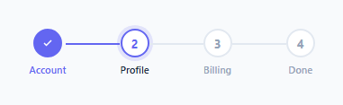
A progress stepper shows users where they are in a multi-step process — a checkout flow, an onboarding wizard, a form with multiple sections, or a setup guide. It communicates position ("you are on step 2 of 4"), history ("steps 1 is complete"), and future ("steps 3 and 4 remain"). This snippet implements a full stepper with three visual states, connecting line fill animation, and forward/back navigation.
The three step states
Each .step element carries one of three state classes at any time:
.done — completed step: the dot shows a checkmark SVG icon, the background fills with accent colour, and the connecting line after it fills. Steps can be navigated back to from done state.
.active — current step: the dot shows the step number, the border and text use the accent colour, and it has a glow ring via box-shadow.
Pending (no class) — future step: grey border, grey number, dimmed label.
The connecting lines
A .line div sits between each pair of steps. In the default state it is grey. When a step moves from .active to .done, the line after it gains the .done class: background: #6366f1. This fills the connector, visually showing that the path between steps has been traversed.
The JavaScript navigation
nextStep() finds the current active index, removes .active from it and adds .done, adds .done to the line between the current and next step, then adds .active to the next step. prevStep() reverses this: removes .active from current, removes .done from the preceding line, removes .done from the preceding step and adds .active back to it. Back and forward buttons are disabled at the ends via if (i >= steps.length - 1) return and if (i <= 0) return.
Adding more steps
To add a fourth step, add a new .step div and a new .line div before it in the HTML. The JavaScript uses querySelectorAll so it picks up any number of steps and lines automatically.
Connecting to form panels
In a real multi-step form, call nextStep() when the user clicks a Next button on each form panel. Before calling it, validate the current panel's fields. If validation fails, do not advance — show the errors instead.
Build with AI
Build, Understand, Optimize, and Extend It With AI
You don't have to trace the class-toggling logic by hand. Paste this snippet's HTML, CSS, and JS into an AI coding assistant like Claude and ask it to explain exactly how activeIndex uses findIndex against the done/active classes to locate the current step, and why nextStep and prevStep have to touch three elements (the outgoing step, the line, and the incoming step) in a specific order to stay consistent. The same assistant can help optimize it — for instance whether re-querying getSteps and getLines with querySelectorAll on every call is wasteful for a stepper with many steps, or whether the state should be tracked as a single index instead of derived from DOM classes each time. It's also useful for extending the effect: ask it to add per-step validation before advancing, a clickable step to jump directly to a completed step, or a vertical layout variant. Treat the code less like a finished artifact and more like a starting point for a conversation.
Prompt to recreate it
Copy this into your AI assistant of choice to build the effect from scratch, or as a jumping-off point for your own variant:
Build a multi-step "progress stepper" in plain HTML, CSS, and JavaScript using only classList toggling — no framework, no state library.

Requirements:
- A horizontal row of step elements, each containing a numbered dot and a label, separated by connector line elements between each pair of steps.
- Each step must support exactly three mutually exclusive visual states driven by CSS classes only: a done state (filled accent background, checkmark icon instead of the number, accent-colored label), an active state (accent-colored border with a soft box-shadow glow ring around the dot, dark label), and a default pending state (grey border, grey number, dimmed label).
- Connector lines must independently track a done state that fills them with the accent color once the step before them is completed.
- Write a nextStep function that locates the currently active step via findIndex against the active class, removes active and adds done to it, adds done to the connecting line immediately after it, then adds active to the following step. Write a prevStep function that reverses all three of those changes in the correct order.
- Both functions must guard against moving past the first or last step (do nothing if already at an end) rather than throwing or wrapping around.
- Use querySelectorAll so the logic works for any number of steps and lines without hardcoding indices or a fixed step count.
- Wire a Back and a Continue button to prevStep and nextStep respectively.
Want to tighten it up first? Run this prompt through the AI Prompt Studio to score it across 8 quality dimensions, catch anti-patterns, and tune the wording for Claude, ChatGPT, or Gemini before you paste it in.
Source Code
<div class="stepper">
  <div class="step done">
    <div class="dot"><svg width="12" height="12" viewBox="0 0 24 24" fill="none" stroke="currentColor" stroke-width="3"><polyline points="20 6 9 17 4 12"/></svg></div>
    <div class="label">Account</div>
  </div>
  <div class="line done"></div>
  <div class="step active">
    <div class="dot">2</div>
    <div class="label">Profile</div>
  </div>
  <div class="line"></div>
  <div class="step">
    <div class="dot">3</div>
    <div class="label">Billing</div>
  </div>
  <div class="line"></div>
  <div class="step">
    <div class="dot">4</div>
    <div class="label">Done</div>
  </div>
</div>
<div class="actions">
  <button class="btn ghost" onclick="prevStep()">Back</button>
  <button class="btn solid" onclick="nextStep()">Continue</button>
</div>
* { box-sizing: border-box; margin: 0; padding: 0; }
body { font-family: system-ui, sans-serif; background: #f8fafc; display: flex; flex-direction: column; align-items: center; justify-content: center; min-height: 100vh; gap: 32px; padding: 20px; }
.stepper { display: flex; align-items: center; }
.step { display: flex; flex-direction: column; align-items: center; gap: 6px; }
.dot {
width: 32px; height: 32px; border-radius: 50%;
border: 2px solid #e2e8f0; background: #fff;
display: flex; align-items: center; justify-content: center;
font-size: 13px; font-weight: 700; color: #94a3b8;
transition: all 0.2s;
}
.step.done .dot { background: #6366f1; border-color: #6366f1; color: #fff; }
.step.active .dot { border-color: #6366f1; color: #6366f1; box-shadow: 0 0 0 4px rgba(99,102,241,0.15); }
.label { font-size: 11px; font-weight: 600; color: #94a3b8; white-space: nowrap; }
.step.done .label { color: #6366f1; }
.step.active .label { color: #1e293b; }
.line { width: 60px; height: 2px; background: #e2e8f0; margin-bottom: 20px; transition: background 0.2s; }
.line.done { background: #6366f1; }
.actions { display: flex; gap: 10px; }
.btn { padding: 9px 22px; font-size: 13px; font-weight: 600; border-radius: 8px; cursor: pointer; font-family: inherit; transition: all 0.15s; }
.btn.solid { background: #6366f1; color: #fff; border: none; }
.btn.solid:hover { background: #4f46e5; }
.btn.ghost { background: none; color: #475569; border: 1.5px solid #e2e8f0; }
.btn.ghost:hover { border-color: #94a3b8; color: #1e293b; }function getSteps() { return [...document.querySelectorAll('.step')]; }
function getLines() { return [...document.querySelectorAll('.line')]; }
function activeIndex() { return getSteps().findIndex(s => s.classList.contains('active')); }
function nextStep() {
const steps = getSteps(), lines = getLines(), i = activeIndex();
if (i >= steps.length - 1) return;
steps[i].classList.remove('active'); steps[i].classList.add('done');
lines[i].classList.add('done');
steps[i+1].classList.add('active');
}
function prevStep() {
const steps = getSteps(), lines = getLines(), i = activeIndex();
if (i <= 0) return;
steps[i].classList.remove('active');
lines[i-1].classList.remove('done');
steps[i-1].classList.remove('done'); steps[i-1].classList.add('active');
}Step by step
How to Use
- 1Click Next and Back in the previewClick Next to advance through the steps. The dot fills, the line fills, and the next step activates. Click Back to reverse.
- 2Update the step labelsIn the HTML panel, change each .label span text to your actual step names — "Account", "Payment", "Confirm", etc.
- 3Set the initial active stepBy default step 1 starts as .active. Add the .done class to any preceding steps to start mid-flow.
- 4Add more stepsAdd a .line div and a .step div for each additional step. The JS uses querySelectorAll so it picks them up automatically.
- 5Change the accent colourFind #6366f1 in the CSS and replace with your brand colour. Updates the done/active dot fill, line fill, and glow ring.
- 6Export in your formatClick "HTML" for a standalone file, "JSX" for a React component, or "Tailwind" for a React + Tailwind version.
Real-world uses
Common Use Cases
Got questions?
Frequently Asked Questions
nextStep() finds the active step index with findIndex, removes .active from it and adds .done, adds .done to the connecting line at that index, then adds .active to the next step. prevStep() reverses this: removes .active from current, removes .done from the preceding line, removes .done from the preceding step and restores .active to it.
In the HTML panel, add a <div class="line"></div> after the last step, then add a new <div class="step"><div class="dot">4</div><span class="label">Your Step</span></div>. The querySelectorAll selectors pick up any number of .step and .line elements automatically.
Add multiple form panel divs (one per step). Show only the active panel. In nextStep(), validate the current panel before advancing. If validation fails, call e.preventDefault() and show error messages instead of calling nextStep().
In the HTML, add class="done" to step 1 and class="done" to the line after it. Add class="active" to step 2 (instead of step 1). Remove .active from step 1.
Change .stepper to display: flex; flex-direction: column; align-items: flex-start. Change .line to width: 2px; height: 32px and remove its flex-shrink. Change .step to flex-direction: row so the dot and label sit side by side.
Yes. Click "JSX" to download a React component. In React, manage a currentStep number with useState. Derive the state of each step from the index relative to currentStep: index < currentStep is done, index === currentStep is active, index > currentStep is pending.