

Learn Coding Visually
Learn to code with interactive, live-preview playgrounds — HTML, CSS, JavaScript, React & more.
 HTML Playground42 lessons · Click-based · Live preview
 CSS PlaygroundLearn CSS with a live editor
 JavaScript Playground60 lessons · DOM · Async · Canvas
 React PlaygroundLearn React with a live code editor
 GSAP PlaygroundLearn GSAP animation interactively
 SVG Playground44 lessons · shapes · paths · animation
 SCSS Playground45 lessons · Sass modules · tokens
 Tailwind PlaygroundLearn Tailwind CSS with a live editor
 Bootstrap 5 Playground50 lessons · live preview
Profile Completeness Card — Weighted Progress with a Genuine Next-Best-Action Suggestion
Profile Completeness Card — Weighted Progress with Next-Best-Action · Cards · Plain HTML, CSS & JS · Live preview
What's included
Features
About this UI Snippet
Weighted Profile Completeness — Why "6 of 8 Done" Is the Wrong Percentage
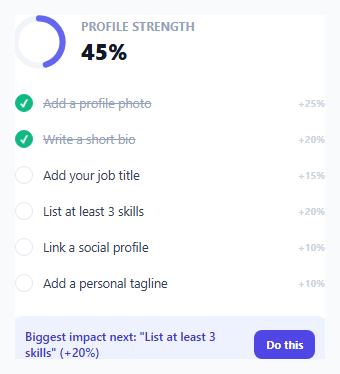
A profile completeness indicator built as a flat fraction — "6 of 8 fields filled in, so 75%" — treats every field as equally valuable, which is rarely true. A profile photo genuinely matters more to how complete and trustworthy a profile *feels* than an optional personal tagline does. This snippet weights each field by its actual importance, so the displayed percentage reflects genuine usefulness rather than a naive item count.
Weighted completion, not a flat fraction
Each item in ITEMS carries its own weight (photo: 25, bio: 20, skills: 20, role: 15, social: 10, tagline: 10 — summing to 100). computeWeightedPercent() sums the weights of only the *completed* items and divides by the total possible weight, rather than counting "how many of the 6 items are done" and dividing by 6. The practical difference: completing the photo and bio (45 combined weight) genuinely represents more real progress than completing the social link and tagline (20 combined weight), even though both pairs are "2 out of 6 items" in a naive flat count — the weighted percentage correctly reflects that difference, a flat fraction would not.
The "next best action" is the highest-impact incomplete item, not the first one
findNextBestAction() filters down to incomplete items and then finds the one with the *highest weight* among them — not simply incomplete[0], the first incomplete item in list order. This is the detail that makes the suggestion genuinely useful rather than arbitrary: recommending "add a personal tagline" (worth only 10%) when "add a profile photo" (worth 25%) is also still incomplete would be actively bad advice, pointing the user toward the *least* impactful thing they could do next rather than the most.
The progress ring's `stroke-dashoffset` math
The SVG ring uses the classic stroke-dasharray/stroke-dashoffset technique for a circular progress indicator: stroke-dasharray is set once to the circle's full circumference, and stroke-dashoffset is set to circumference * (1 - percent/100) — at 0%, the offset equals the full circumference (nothing visible); at 100%, the offset is 0 (the full circle drawn). The circle is also rotated -90 degrees so progress visually starts from the top (12 o'clock) rather than the default 3 o'clock starting point SVG circles use, matching the conventional orientation for this kind of progress ring.
Marking an item done recalculates everything from scratch
The single click handler, whether triggered from the checklist itself or the "Do this" button, does nothing more than flip one item's done flag to true and call render() again — the weighted percentage, the ring fill, the checklist display, and the next-best-action suggestion are all *recomputed fresh* from the current ITEMS array on every render, rather than being incrementally patched. This keeps the whole card's state trivially consistent: there's no way for the ring's percentage to disagree with the checklist's checked items, because both are derived from the same array on every single render call.
Build with AI
Build, Understand, Optimize, and Extend It With AI
Ask an AI assistant to explain why weighting profile fields by importance produces a more meaningful completeness percentage than a flat item-count fraction, and to walk through a concrete example where the "first incomplete item" and "highest-weight incomplete item" next-action suggestions would actually differ. It's also worth asking for a version that persists completion state to localStorage or a real backend, or one that groups fields into categories (e.g. "Basics" and "Professional") each with their own sub-progress alongside the overall weighted total.
Prompt to recreate it
Copy this into your AI assistant of choice to build the effect from scratch, or as a jumping-off point for your own variant:
Build a weighted profile completeness card in HTML, CSS, and vanilla JavaScript with an SVG progress ring — no external library.

Requirements:
- A checklist of at least six profile fields, each with a distinct numeric weight (summing to 100 across all items) reflecting how important that field actually is to profile completeness — not all fields should have equal weight.
- Compute the overall completeness percentage as the sum of completed items' weights divided by the total possible weight — NOT as a flat fraction of "number of completed items divided by total item count."
- Render an SVG circular progress ring using the stroke-dasharray/stroke-dashoffset technique, correctly rotated so progress visually starts from the top of the circle, animating smoothly as the percentage changes.
- Implement a "next best action" suggestion that identifies the SINGLE highest-weight item among the currently incomplete ones — explicitly not just the first incomplete item in the checklist's display order — and prominently suggests completing it, showing exactly how many percentage points completing it would add.
- Clicking either a checklist item directly or a dedicated action button should mark that item as done, and trigger a full re-render where the ring, percentage, checklist display, and next-best-action suggestion are all recomputed fresh from the same underlying data — ensuring they can never show inconsistent state relative to each other.
- Show a distinct, clearly different "complete" state for the next-action area once every item has been checked off, rather than leaving it blank or showing a broken suggestion.
Want to tighten it up first? Run this prompt through the AI Prompt Studio to score it across 8 quality dimensions, catch anti-patterns, and tune the wording for Claude, ChatGPT, or Gemini before you paste it in.
Source Code
<div class="demo">
  <div class="pc-card">
    <div class="pc-header">
      <svg class="pc-ring" viewBox="0 0 64 64" width="56" height="56">
        <circle cx="32" cy="32" r="27" fill="none" stroke="#f1f5f9" stroke-width="7" />
        <circle id="pcRingFill" cx="32" cy="32" r="27" fill="none" stroke="#6366f1" stroke-width="7" stroke-linecap="round" transform="rotate(-90 32 32)" />
      </svg>
      <div>
        <p class="pc-title">Profile strength</p>
        <p class="pc-percent" id="pcPercent">0%</p>
      </div>
    </div>

    <ul class="pc-list" id="pcList"></ul>

    <div class="pc-next" id="pcNext"></div>
  </div>
</div>
* { box-sizing: border-box; margin: 0; padding: 0; }
body { font-family: system-ui, sans-serif; background: #f8fafc; display: flex; align-items: center; justify-content: center; min-height: 100vh; padding: 24px; }
.demo { width: 360px; max-width: 100%; }
.pc-card { background: #fff; border: 1px solid #e2e8f0; border-radius: 18px; padding: 20px; display: flex; flex-direction: column; gap: 16px; }
.pc-header { display: flex; align-items: center; gap: 14px; }
.pc-ring circle#pcRingFill { transition: stroke-dashoffset 0.5s ease; }
.pc-title { font-size: 11.5px; font-weight: 700; color: #94a3b8; text-transform: uppercase; letter-spacing: 0.4px; }
.pc-percent { font-size: 22px; font-weight: 800; color: #111827; margin-top: 2px; }
.pc-list { display: flex; flex-direction: column; gap: 2px; list-style: none; }
.pc-item { display: flex; align-items: center; gap: 10px; padding: 8px 4px; }
.pc-check { width: 18px; height: 18px; border-radius: 50%; flex-shrink: 0; display: flex; align-items: center; justify-content: center; font-size: 10px; font-weight: 800; border: 1.5px solid #e2e8f0; color: transparent; }
.pc-item.done .pc-check { background: #10b981; border-color: #10b981; color: #fff; }
.pc-item-label { font-size: 12.5px; color: #334155; flex: 1; }
.pc-item.done .pc-item-label { color: #94a3b8; text-decoration: line-through; }
.pc-weight { font-size: 10px; color: #cbd5e1; font-weight: 700; }
.pc-next { padding: 12px 14px; border-radius: 12px; background: #eef2ff; display: flex; align-items: center; justify-content: space-between; gap: 10px; }
.pc-next-text { font-size: 12px; color: #4338ca; font-weight: 600; }
.pc-next-btn { flex-shrink: 0; border: none; background: #4f46e5; color: #fff; font-size: 11px; font-weight: 700; padding: 7px 12px; border-radius: 8px; cursor: pointer; font-family: inherit; }
.pc-next-btn:hover { background: #4338ca; }
.pc-next.complete { background: #ecfdf5; }
.pc-next.complete .pc-next-text { color: #047857; }const ringFill = document.getElementById('pcRingFill');
const percentEl = document.getElementById('pcPercent');
const listEl = document.getElementById('pcList');
const nextEl = document.getElementById('pcNext');
const RADIUS = 27;
const CIRCUMFERENCE = 2 * Math.PI * RADIUS;
ringFill.style.strokeDasharray = String(CIRCUMFERENCE);
// Not every profile field is equally valuable — a profile photo matters
// more to completeness than a personal tagline does. Weighting each item
// (rather than treating "6 of 8 fields done" as a flat 75%) means the
// percentage genuinely reflects how USEFUL the profile is, not just how
// many boxes happen to be checked.
const ITEMS = [
{ id: 'photo', label: 'Add a profile photo', weight: 25, done: true },
{ id: 'bio', label: 'Write a short bio', weight: 20, done: true },
{ id: 'role', label: 'Add your job title', weight: 15, done: false },
{ id: 'skills', label: 'List at least 3 skills', weight: 20, done: false },
{ id: 'social', label: 'Link a social profile', weight: 10, done: false },
{ id: 'tagline', label: 'Add a personal tagline', weight: 10, done: false },
];
function computeWeightedPercent() {
const totalWeight = ITEMS.reduce((sum, item) => sum + item.weight, 0);
const doneWeight = ITEMS.filter((item) => item.done).reduce((sum, item) => sum + item.weight, 0);
return Math.round((doneWeight / totalWeight) * 100);
}
function renderRing(percent) {
const offset = CIRCUMFERENCE * (1 - percent / 100);
ringFill.style.strokeDashoffset = String(offset);
percentEl.textContent = percent + '%';
}
function renderList() {
listEl.innerHTML = ITEMS.map((item) => `
<li class="pc-item ${item.done ? 'done' : ''}" data-id="${item.id}">
<span class="pc-check">✓</span>
<span class="pc-item-label">${item.label}</span>
<span class="pc-weight">+${item.weight}%</span>
</li>
`).join('');
}
// The "next best action" is not simply the first incomplete item in list
// order — it's the incomplete item with the HIGHEST weight, since that's
// the single action that moves the completeness percentage the most. This
// is what makes the suggestion genuinely useful rather than an arbitrary
// pick from whichever field happens to be listed first.
function findNextBestAction() {
const incomplete = ITEMS.filter((item) => !item.done);
if (incomplete.length === 0) return null;
return incomplete.reduce((best, item) => (item.weight > best.weight ? item : best));
}
function renderNext() {
const next = findNextBestAction();
if (!next) {
nextEl.className = 'pc-next complete';
nextEl.innerHTML = `<span class="pc-next-text">Your profile is complete — nice work!</span>`;
return;
}
nextEl.className = 'pc-next';
nextEl.innerHTML = `
<span class="pc-next-text">Biggest impact next: "${next.label}" (+${next.weight}%)</span>
<button class="pc-next-btn" data-id="${next.id}">Do this</button>
`;
}
function render() {
const percent = computeWeightedPercent();
renderRing(percent);
renderList();
renderNext();
}
document.addEventListener('click', (e) => {
const item = e.target.closest('.pc-item');
const nextBtn = e.target.closest('.pc-next-btn');
const id = item?.dataset.id || nextBtn?.dataset.id;
if (!id) return;
const target = ITEMS.find((i) => i.id === id);
if (target) {
target.done = true;
render();
}
});
render();Step by step
How to Use
- 1Observe the initial weighted percentageWith photo and bio complete (45 combined weight out of 100), the ring shows 45% — not 33%, which a flat "2 of 6 items" count would incorrectly show.
- 2Check the "Biggest impact next" suggestionIt recommends the highest-weight remaining item (skills, worth 20%) — not simply the next item in the checklist's visual order.
- 3Click "Do this" or click a checklist item directlyMarks that item complete, and the ring, percentage, checklist, and next-best-action suggestion all update together from a single recalculation.
- 4Complete every itemThe next-action panel switches to a "profile complete" celebratory state once no incomplete items remain.
- 5Adjust ITEMS' weights for your own use caseChange which fields matter most by adjusting their weight values — the percentage, ring, and next-best-action logic all adapt automatically with no other code changes.
Real-world uses
Common Use Cases
Got questions?
Frequently Asked Questions
A flat item count treats every field as equally valuable, which rarely reflects reality — a profile photo matters more to a profile's actual usefulness than an optional tagline. Weighting each field by importance means the displayed percentage genuinely represents how complete and useful the profile is, not just how many boxes happen to be checked.
findNextBestAction() filters to only the currently incomplete items and picks whichever one has the highest weight among them — not simply the first incomplete item in the checklist's visual order. This ensures the suggestion always points toward the single action that would improve the completeness percentage the most.
findNextBestAction() returns null when no incomplete items remain, and the next-action panel switches to a distinct celebratory "profile complete" state instead of showing an empty or broken suggestion.
It uses the standard stroke-dasharray/stroke-dashoffset technique: stroke-dasharray is set once to the circle's full circumference, and stroke-dashoffset is calculated as circumference times (1 minus the percent complete), so a higher percentage results in a smaller offset and more of the circle's stroke visibly drawn.
SVG circles start drawing their stroke from the 3 o'clock position by default. Rotating -90 degrees shifts the starting point to 12 o'clock, matching the conventional orientation most circular progress indicators use.
No — render() recomputes the weighted percentage, the ring's fill, the checklist display, and the next-best-action suggestion all fresh from the same ITEMS array every single time it runs, so there is no possible state where any of these pieces could disagree with the underlying data.