Learn Coding Visually
Learn to code with interactive, live-preview playgrounds — HTML, CSS, JavaScript, React & more.
 HTML Playground42 lessons · Click-based · Live preview
 CSS PlaygroundLearn CSS with a live editor
 JavaScript Playground60 lessons · DOM · Async · Canvas
 React PlaygroundLearn React with a live code editor
 GSAP PlaygroundLearn GSAP animation interactively
 SVG Playground44 lessons · shapes · paths · animation
 SCSS Playground45 lessons · Sass modules · tokens
 Tailwind PlaygroundLearn Tailwind CSS with a live editor
 Bootstrap 5 Playground50 lessons · live preview
Scroll-Linked SVG Path Draw — Native CSS view-timeline, No GSAP
SVG Path Draw (view-timeline, No GSAP) · Scroll · Plain HTML, CSS & JS · Live preview
What's included
Features
About this UI Snippet
Scroll-Linked SVG Path Draw — animation-timeline: view() Instead of GSAP ScrollTrigger
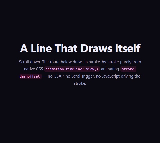
The scroll-linked "line draws itself in" effect — an SVG stroke that appears to trace its own path as the reader scrolls past it — is one of the most recognizable scroll animations on the web, almost always built with GSAP's DrawSVGPlugin and ScrollTrigger (see Scroll SVG Path Draw for that approach). This snippet reproduces the identical stroke-drawing mechanic using nothing but native CSS: a view-timeline binding stroke-dashoffset directly to the SVG's own scroll position, with no animation library and no JavaScript computing scroll progress.
The classic stroke-dasharray trick, now scroll-timed by CSS
stroke-dasharray is set to a value at least as long as the path itself (1400, comfortably longer than this particular route), and stroke-dashoffset starts at that same value, which hides the entire stroke behind an equally long gap. Animating stroke-dashoffset down to 0 reveals the stroke progressively from start to end — this half of the trick is identical to the GSAP version. What's different is what drives the animation's progress: instead of ScrollTrigger's scrub option computing a 0–1 value from scroll position on every frame, animation-timeline: --route-in — a named view timeline declared on the <svg> element itself — supplies that progress value natively.
A second element riding the exact same timeline
A small dot uses CSS offset-path (set to the identical path data) combined with offset-distance animated from 0% to 100%, bound to the same --route-in timeline via animation-range: contain 0% contain 100%. Because both the stroke draw and the dot's movement reference the same named timeline and the same range, they stay perfectly in sync with no manual coordination — both are simply reading the same scroll-derived progress value.
contain instead of cover, and why it matters for a tall SVG
animation-range: contain 0% contain 100% uses the contain keyword so the draw only progresses while the entire SVG is contained within the viewport — for an SVG taller than the viewport, this differs meaningfully from cover, which would start progress the instant the top edge appears even while most of the graphic is still off-screen below. contain here effectively requires the SVG to fit inside the viewport at all, which works well for a graphic sized to roughly viewport height, as this one is; a route taller than the viewport would need a cover-based range or a different sizing approach instead.
Comparing to the GSAP version
The GSAP Scroll SVG Path Draw snippet gives finer control — precise scrub smoothing, pinning, easing curves, and cross-browser consistency today, at the cost of a ~40KB dependency and a JS runtime cost per scroll frame. This CSS-only version has zero dependency weight and runs entirely on the compositor, at the cost of narrower browser support today and less granular control over easing along the path.
Browser support
Chromium-based browsers (Chrome, Edge, Opera, Brave) support animation-timeline: view() today. Firefox and Safari support is still landing, so an @supports not (animation-timeline: view()) block resets the stroke and dot to their fully-drawn end states rather than leaving the line invisible.
Customizing it
Swap the path's d attribute for your own route or logo outline (recompute stroke-dasharray to comfortably exceed the new path's length), adjust the gradient stops in <linearGradient id="spd-grad">, or change view-timeline-axis to inline for a horizontally-scrolling version of the same draw. Pair it with a Scroll Company Timeline or Vertical Timeline for a journey-style narrative.
Build with AI
Build, Understand, Optimize, and Extend It With AI
You don't have to work out the stroke-dasharray or offset-path math by hand. Paste this snippet's HTML, CSS, and JS into an AI coding assistant like Claude and ask it to explain exactly why stroke-dasharray must be set to a value at least as long as the path's total length, how animation-timeline: --route-in ties the stroke-dashoffset progress to the SVG's own scroll position, and why the dot's offset-path animation stays in sync with the stroke draw purely by referencing the same named timeline and range. The same assistant is useful for extending the effect: ask it to add a pulsing glow to the dot as it travels, make the gradient's colors shift along the path length rather than staying fixed, or convert the effect to view-timeline-axis: inline for a horizontally scrolling route. Treat the code less like a finished artifact and more like a starting point for a conversation.
Prompt to recreate it
Copy this into your AI assistant of choice to build the effect from scratch, or as a jumping-off point for your own variant:
Build an SVG line-drawing effect where a stroked path draws itself in as the reader scrolls past it, using only native CSS scroll-driven animations with a view timeline bound to the SVG element — no GSAP, no ScrollTrigger, no JavaScript scroll math.

Requirements:
- An SVG containing a path drawn with a visible stroke and a gradient defined via a native <linearGradient>, plus a small circular dot element that will travel along the same path.
- The <svg> element itself must declare view-timeline-name and view-timeline-axis: block, creating a named view timeline representing the SVG's own transit through the viewport.
- The path must use the classic stroke-dasharray / stroke-dashoffset technique: stroke-dasharray set to a value at least as long as the path's total length, stroke-dashoffset starting at that same value, and a @keyframes animation driving stroke-dashoffset to 0, bound via animation-timeline to the SVG's named view timeline.
- The dot must use offset-path (set to the identical path data as the stroked path) combined with a @keyframes animation driving offset-distance from 0% to 100%, bound to the exact same named view timeline and the same animation-range as the stroke-draw animation, so the dot's position and the stroke's progress stay in sync automatically with no manual coordination logic.
- Use the contain keyword in animation-range (for example contain 0% contain 100%) so progress is tied to the whole SVG genuinely being within the viewport, appropriate for a graphic sized to roughly fit the viewport height.
- Add an @supports not (animation-timeline: view()) fallback that sets stroke-dashoffset to 0 and offset-distance to 100%, so unsupported browsers show the fully drawn line and the dot at the path's end rather than an invisible stroke or a dot stuck at the origin.
- Keep any JavaScript limited to a CSS.supports('animation-timeline: view()') feature check logged to the console — it must never drive the draw or the dot's movement itself.
Want to tighten it up first? Run this prompt through the AI Prompt Studio to score it across 8 quality dimensions, catch anti-patterns, and tune the wording for Claude, ChatGPT, or Gemini before you paste it in.
Step by step
How to Use
- 1Paste the HTML, CSS, and JSAn intro, the route SVG, and an outro render — no CDN or library needed.
- 2Scroll down slowlyWatch the gradient stroke draw itself in and the dot travel along the same path.
- 3Scroll back upThe stroke and dot retract in reverse, since both are bound to a live view timeline.
- 4Swap in your own routeReplace the path d attribute on .spd-track, .spd-line, and offset-path with your own SVG path data.
- 5Recompute stroke-dasharraySet stroke-dasharray to a value at least as long as your new path's total length so it fully hides at the start.
- 6Export in your formatClick "HTML" for a standalone file, "JSX" for a React component, or "Tailwind" for a React + Tailwind version.
Real-world uses
Common Use Cases
Got questions?
Frequently Asked Questions
stroke-dasharray is set to a value at least as long as the path, and stroke-dashoffset starts at that same value, hiding the stroke entirely. A @keyframes animation drives stroke-dashoffset down to 0, and binding that animation to animation-timeline: --route-in (a named view timeline declared on the SVG element) ties its progress directly to the SVG's own scroll-driven visibility instead of to a duration in seconds.
The dot uses offset-path set to the identical path data as the line, with offset-distance animated from 0% to 100%. Because that animation references the exact same --route-in named timeline and the same animation-range as the stroke-draw animation, both progress together automatically — there is no manual synchronization logic.
contain restricts progress to the window during which the entire SVG element is contained within the viewport at once, rather than starting as soon as any part becomes visible (which is what cover does). For an SVG sized to fit within the viewport, this keeps the draw progress tied to the graphic genuinely being on screen rather than starting prematurely while most of it is still off-screen.
The GSAP version (Scroll SVG Path Draw) offers finer scrub smoothing, pinning options, custom easing curves, and works consistently across all current browsers today, at the cost of a JavaScript dependency and per-frame script execution. This CSS-only version has zero dependency weight and runs on the compositor, at the cost of currently narrower browser support and less granular control over the draw's easing.
The @supports not (animation-timeline: view()) block sets stroke-dashoffset to 0 and offset-distance to 100%, so Firefox and Safari users see the fully drawn line and the dot already at the end of the path — a stable, complete state rather than an invisible stroke or a dot stuck at the origin.
Yes. Replace the d attribute on .spd-track, .spd-line, and the offset-path value on .spd-dot with your own path data (all three should describe the same path), and update stroke-dasharray to a number comfortably larger than your new path's total length so it fully hides the stroke at the start.