You Might Also Like
Learn Coding Visually
Learn to code with interactive, live-preview playgrounds — HTML, CSS, JavaScript, React & more.
 HTML Playground42 lessons · Click-based · Live preview
 CSS PlaygroundLearn CSS with a live editor
 JavaScript Playground60 lessons · DOM · Async · Canvas
 React PlaygroundLearn React with a live code editor
 GSAP PlaygroundLearn GSAP animation interactively
 SVG Playground44 lessons · shapes · paths · animation
 SCSS Playground45 lessons · Sass modules · tokens
 Tailwind PlaygroundLearn Tailwind CSS with a live editor
 Bootstrap 5 Playground50 lessons · live preview
Live Ops Alert Feed Panel — Free HTML CSS JS Snippet
Live Ops Alert Feed Panel · Dashboards · Plain HTML, CSS & JS · Live preview
What's included
Features
About this UI Snippet
Live Ops Alert Feed Panel — Severity-Coded Alerts, Unread Badges & Calm-UI Urgency Signaling
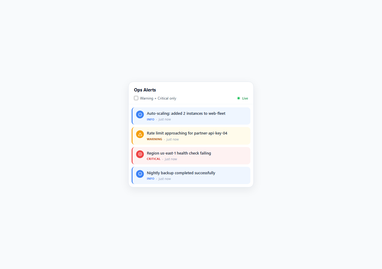
Operations dashboards, incident-response tools, and monitoring consoles all share a common interface problem: how do you surface a steady stream of system events — deploys, latency spikes, disk warnings, outright failures — without either drowning the user in noise or, worse, failing to draw their eye to something that actually needs attention right now? This snippet implements a live alert feed panel that answers that question using a calm UI approach: severity is communicated through color, iconography, and layout weight rather than motion, sound, or flashing. That distinction matters. Strobing or pulsing critical alerts might grab attention in a demo, but in a real operations environment running 12+ hours a day, flashing red elements are a documented accessibility problem (they can trigger photosensitive reactions and contribute to alert fatigue) and a documented UX problem (they train operators to tune out or physically cover the area, defeating the alert's purpose entirely).
How severity is encoded without motion
Each alert item carries one of three severity levels — info, warning, critical — expressed through a combination of a 3px border-left accent color, a tinted background (#eff6ff for info, #fffbeb for warning, #fef2f2 for critical), a solid-colored circular icon badge, and an uppercase severity tag in the metadata row. Critical alerts use red (#ef4444) applied consistently across the border, icon, and tag, so the eye can scan the list and immediately locate the highest-priority item by color alone — a technique called pre-attentive processing. The only animation in the entire panel is a one-time 0.35s slideIn (opacity + translateY) applied when an alert is first inserted at the top of the list; once settled, nothing moves, blinks, or pulses. The small .live-dot next to the "Live" label uses a static green dot with a soft box-shadow ring rather than a pulsing animation, communicating "this feed is active" without any moving parts.
Unread count and focus-based clearing
New alerts arrive via a mock setInterval pulling randomly from a nine-item ALERT_POOL covering realistic ops scenarios: deploy confirmations, auto-scaling events, latency spikes, disk usage warnings, and payment webhook failures. Each new alert increments an unread counter rendered in .unread-badge, which is hidden by default via an .hidden class that combines opacity: 0 and transform: scale(0.6) for a soft pop-in/out rather than an abrupt display toggle. The badge clears — resetting unread to zero and re-hiding — whenever the panel receives keyboard focus, is hovered, or its internal list is scrolled, mirroring how notification centers in modern OSes and chat apps (Slack, macOS Notification Center) clear unread counts on genuine user attention rather than requiring an explicit "mark all read" click.
Severity filtering
A single checkbox labeled "Warning + Critical only" lets operators suppress the (usually higher-volume, lower-urgency) info-level noise during an active incident, without losing those events from the underlying data — the filter only toggles display: none on matching DOM nodes via applyFilter(), so unfiltering instantly restores the full history. This models a real triage workflow: during normal operations, the full feed (including successful deploys and scaling events) is useful context; during an incident, operators want only what demands action.
Why this belongs in a 2026 design system
As more product teams build in-house observability and admin surfaces, the alert feed is one of the most frequently rebuilt dashboard primitives — and one of the most frequently over-designed. The restraint shown here (color and icon over motion, focus-based state clearing over manual dismissal, a genuine filter over a delete button) reflects where alerting UI patterns have converged: legible severity, minimal friction to acknowledge, and zero reliance on flashing or sound, which cannot be relied upon in shared-monitor or accessibility-constrained environments anyway.
Build with AI
Build, Understand, Optimize, and Extend It With AI
Paste this snippet's HTML, CSS, and JS into an AI coding assistant like Claude and ask it to trace exactly how pushAlert(), the unread badge, and applyFilter() interact — in particular, how the alerts array stays in sync with the DOM as items are added past the 30-item cap. It's a good snippet to extend with AI help: ask it to add a fourth "success" severity tier with its own color scheme, to replace the setInterval mock with a real WebSocket or Server-Sent Events connection while preserving the existing render logic, or to add per-item dismiss/acknowledge buttons that track acknowledged state separately from the read/unread badge. You can also ask it to review the calm-UI reasoning — why no flashing or sound is used for critical alerts — and to suggest an accessible alternative (like an aria-live region) for surfacing new critical alerts to screen reader users without a visual flash.
Prompt to recreate it
Copy this into your AI assistant of choice to build the effect from scratch, or as a jumping-off point for your own variant:
Build a live-updating alert feed panel in plain HTML, CSS, and JavaScript for an operations dashboard.

Requirements:
- Three severity levels (info, warning, critical), each visually distinct via a left border accent color, a tinted background, and a colored icon badge — no flashing, pulsing, or sound for any severity, including critical.
- A mock live feed using setInterval that periodically prepends a new alert (drawn from a small pool of realistic ops messages) to the top of the list with a one-time slide-and-fade entrance animation; cap the list at a reasonable max length and drop the oldest items past that cap.
- An unread count badge that increments for every alert added while the user is not actively attending to the panel, and clears automatically when the panel receives keyboard focus, mouse hover, or the internal list is scrolled — not via a manual "mark all read" button.
- A filter control (checkbox or toggle) that hides info-level alerts and shows only warning and critical, without deleting or losing the hidden items from the underlying data — unfiltering must restore the full list instantly.
- The panel container must be keyboard-focusable (tabindex) with a visible focus outline, and use appropriate ARIA labeling so it reads sensibly to assistive technology.
- Keep all severity styling driven by a small number of reusable CSS classes so a new severity tier can be added without restructuring the markup.
Want to tighten it up first? Run this prompt through the AI Prompt Studio to score it across 8 quality dimensions, catch anti-patterns, and tune the wording for Claude, ChatGPT, or Gemini before you paste it in.
Step by step
How to Use
- 1Watch new alerts arriveThe panel seeds four alerts on load, then a setInterval calls pushAlert() every 4 seconds, picking a random entry from ALERT_POOL and prepending it to #feed-list with the slideIn animation.
- 2Check the unread badgeMove your mouse away from the panel and wait — the .unread-badge counter increments for every new alert that arrives while the panel is unfocused. Hover, focus, or scroll the panel to clear it via clearUnread().
- 3Filter to warning and criticalCheck the "Warning + Critical only" checkbox to hide info-level entries via applyFilter(), which sets display: none on non-matching .alert-item elements without removing them from the alerts array.
- 4Customize the alert poolEdit the ALERT_POOL array in the JS panel to match your own system: replace the msg strings and sev values with real event types from your monitoring stack (Datadog, Grafana, PagerDuty).
- 5Wire to a real event sourceReplace the setInterval + Math.random() mock with a WebSocket or Server-Sent Events listener that calls pushAlert({ sev, msg }) whenever your backend emits a new event, keeping the render and unread logic unchanged.
- 6Export and drop into your dashboardClick JSX to get a React component version, or HTML for a standalone file. In a Next.js admin panel, mount AlertFeedPanel in a persistent sidebar or drawer so it stays live across route changes.
Real-world uses
Common Use Cases
Got questions?
Frequently Asked Questions
Flashing UI elements are a known accessibility risk (photosensitive triggers) and tend to cause alert fatigue in always-on monitoring contexts, where operators learn to ignore or cover flashing regions. This snippet instead uses a static but high-contrast combination of red border, red icon, red tag, and tinted background so critical alerts are immediately distinguishable by color and position (top of the list) without relying on motion, which is the calm-UI approach recommended for long-running dashboards.
Remove the setInterval(pushAlert, 4000) call and replace it with a WebSocket onmessage handler or an EventSource (SSE) listener. Parse the incoming payload into { sev, msg } shape and call pushAlert()-equivalent logic (unshift into the alerts array, prepend the rendered DOM node) for each real event. The rendering, unread-badge, and filter logic all work unchanged since they operate on the alerts array and DOM regardless of where the data originated.
clearUnread() is wired to three events on the panel: focus (keyboard tab-in), mouseenter (mouse hover), and scroll on the inner .feed-list. Any of these signals genuine user attention on the panel, at which point unread resets to 0 and the badge hides via the .hidden class. This mirrors how Slack and native OS notification centers clear counts on attention rather than requiring an explicit dismiss action for every item.
Yes — add a new CSS block following the .alert-item.warning pattern (border-left-color, background tint, and .alert-icon background), then reference the new severity string in your ALERT_POOL entries and any incoming event payloads. The existing info/warning/critical convention maps to a fairly universal three-tier severity model, but a fourth tier like "success" (green) is a common addition for deploy-confirmation-heavy feeds.
No — applyFilter() only toggles the CSS display property on non-matching .alert-item DOM nodes; the underlying alerts array is untouched. Unchecking the filter immediately re-reveals every previously received alert in its original order, so no data is lost by filtering.