You Might Also Like
Learn Coding Visually
Learn to code with interactive, live-preview playgrounds — HTML, CSS, JavaScript, React & more.
 HTML Playground42 lessons · Click-based · Live preview
 CSS PlaygroundLearn CSS with a live editor
 JavaScript Playground60 lessons · DOM · Async · Canvas
 React PlaygroundLearn React with a live code editor
 GSAP PlaygroundLearn GSAP animation interactively
 SVG Playground44 lessons · shapes · paths · animation
 SCSS Playground45 lessons · Sass modules · tokens
 Tailwind PlaygroundLearn Tailwind CSS with a live editor
 Bootstrap 5 Playground50 lessons · live preview
Empty State with AI Suggestions — Free HTML CSS JS Snippet
Empty State with AI Suggestions · Dashboards · Plain HTML, CSS & JS · Live preview
What's included
Features
About this UI Snippet
Empty State with AI Suggestions — Turning a Dead End into an On-Ramp for New Users
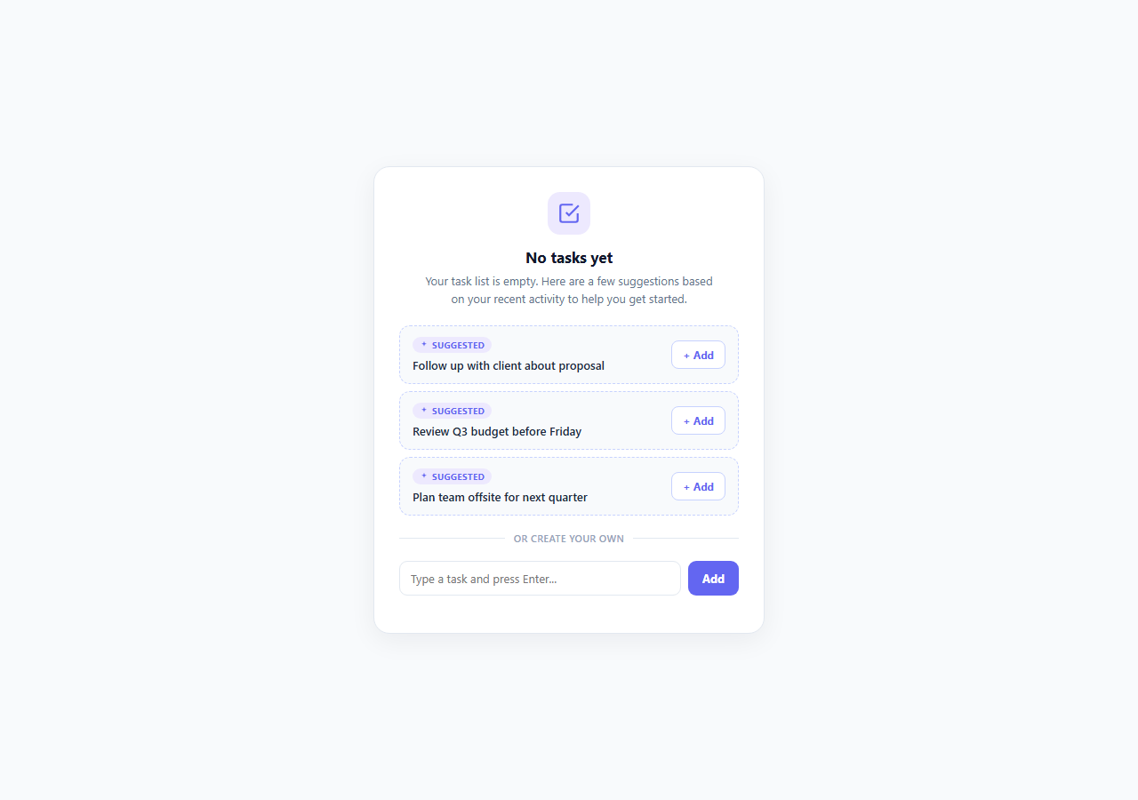
The default empty state — a faint illustration, a line of grey text like "No items yet," and a single "Add your first item" button — has been the industry standard for over a decade, and it has a real cost: it hands the user a blank page and asks them to invent their own first move. For a brand-new user who doesn't yet know what belongs in your task list, project board, or inbox, that blank page is often where onboarding quietly fails. This snippet replaces the generic empty state with an AI-native empty state: instead of one vague call to action, it shows three concrete, contextually relevant starter items the user can add with a single click, alongside — not instead of — the standard manual input.
Why generic empty states underperform
A blank empty state assumes the user already knows what they want to create, which is precisely the assumption that's false for anyone encountering the feature for the first time. Product analytics teams have repeatedly found that empty states with zero suggested content have measurably lower "time to first action" completion than states offering pre-filled or one-click options — the cognitive cost of generating an example from nothing is higher than most designers assume, especially for less experienced or less confident users. The fix isn't a better illustration; it's giving the user something concrete to react to, even if they end up editing or ignoring it entirely.
Suggestions as a genuine on-ramp, not a gimmick
Each suggestion in this panel — "Follow up with client about proposal," "Review Q3 budget before Friday," "Plan team offsite for next quarter" — is written as a plausible, specific example of the kind of item that belongs in a task list, not a placeholder like "Example Task 1." This specificity matters: vague suggestions read as filler and get ignored, while concrete, contextual suggestions do double duty as both a fast one-click action *and* an implicit tutorial on what the feature is for. A production version of this pattern would source suggestions from a real signal — recently mentioned action items in connected email or chat threads, patterns from similar users' first sessions, or an LLM prompt fed the user's recent activity — which is why each item carries a small .ai-tag badge reading "Suggested" with a sparkle icon, honestly signaling that this content was generated or inferred, not manually curated by the product team. That transparency is itself a 2026 UX expectation: as more interface content is AI-assisted, labeling it clearly (rather than presenting it as if a human wrote it) is what keeps AI-native UI trustworthy rather than deceptive.
Interaction: one-click add with a soft dismissal
Clicking "+ Add" on a suggestion calls addTask(), which prepends a new item to #task-list with a short taskIn slide-fade entrance, then the source suggestion card animates out via a .added class that combines opacity: 0 and a subtle translateX before the node is removed on transitionend — never an abrupt disappearance. This gives the user clear before/after feedback: the suggestion visibly becomes a real task rather than silently vanishing.
The manual path is never removed
Critically, the suggestions sit *above* a labeled divider ("or create your own") and a fully functional text input — the AI suggestions augment the empty state, they don't replace user agency. A user who already knows exactly what they want to add can ignore the suggestions entirely and type their own item via the standard #create-form, which calls the identical addTask() function. This is the core design principle behind good AI-assisted UI: AI suggestions should lower the floor for uncertain users without raising the ceiling or removing control for confident ones. An empty state that *only* offered AI suggestions, with no manual escape hatch, would be a regression, not an improvement — this pattern keeps both paths first-class.
Applicability beyond task lists
The same shape — a short, honestly-labeled AI-suggested list plus a manual fallback — generalizes cleanly to search-with-no-results ("Did you mean...", trending queries), empty inbox/CRM states (suggested contacts to add), or empty dashboard widgets (suggested metrics to track), making this one of the more broadly reusable empty-state patterns for any AI-assisted 2026 product surface.
Build with AI
Build, Understand, Optimize, and Extend It With AI
Paste this snippet's HTML, CSS, and JS into an AI coding assistant like Claude and ask it to explain how addTask() is shared between the suggestion "+ Add" buttons and the manual create form, and why that shared function matters for keeping both paths consistent. It's a good snippet to extend with AI help: ask it to wire the suggestion source to a real API call that returns contextual suggestions (and to design a sensible loading/skeleton state while that call is in flight), to add an "undo" toast after a suggestion is accepted in case the user changes their mind, or to generalize the component so the same suggestion-plus-manual-input shape can be reused for an empty search-results state with different copy and suggestion content. You can also ask it to review whether the "Suggested" labeling is clear enough for accessibility (e.g. whether it needs an aria-label beyond the visual tag) for screen reader users.
Prompt to recreate it
Copy this into your AI assistant of choice to build the effect from scratch, or as a jumping-off point for your own variant:
Build an empty-state panel in plain HTML, CSS, and JavaScript for a task list that offers AI-suggested starter items instead of a generic "add your first item" dead end.

Requirements:
- An empty-state header with a short heading (e.g. "No tasks yet") and one sentence of supporting copy explaining that suggestions below are personalized starting points.
- Three suggested starter items, each clearly and honestly labeled as AI-suggested (e.g. a small "Suggested" badge), with realistic, specific example text (not generic placeholders like "Task 1") and a one-click "+ Add" action per item.
- Clicking "+ Add" on a suggestion must add a new confirmed item to a visible list with an entrance animation, and the source suggestion card must animate out (fade/slide) rather than disappearing abruptly, only being removed from the DOM after its exit transition completes.
- Below the suggestions, include a clearly separated "or create your own" section with a real text input and submit action that adds items through the exact same underlying add-item function as the suggestions use — the manual path must remain fully functional and equally prominent, never hidden or de-emphasized.
- Use event delegation for the suggestion "+ Add" buttons rather than attaching a separate listener per button.
- Keep the component's data structure generic enough that the same pattern (suggestions + manual fallback) could be reused for a different empty-state context (e.g. empty search results) with only copy and suggestion-content changes.
Want to tighten it up first? Run this prompt through the AI Prompt Studio to score it across 8 quality dimensions, catch anti-patterns, and tune the wording for Claude, ChatGPT, or Gemini before you paste it in.
Step by step
How to Use
- 1Review the suggested itemsThe panel renders three .suggestion-item rows, each with an "AI Suggested" tag and a concrete example task relevant to a task-list context — click "+ Add" on any of them to accept it.
- 2Watch the add-and-dismiss animationClicking + Add calls addTask() to prepend a new .task-item with a taskIn slide-fade animation, then adds the .added class to the source suggestion, which fades and slides out before being removed on transitionend.
- 3Create your own item manuallyType in the #create-input field below the "or create your own" divider and press Enter (or click Add) — this submits #create-form, which calls the same addTask() function as the suggestions.
- 4Replace the mock suggestions with real onesChange the data-text attributes and visible suggestion-text in the HTML to pull from an actual signal source — recent emails, calendar events, or an LLM call summarizing the user's connected accounts — while keeping the same markup structure.
- 5Adjust the empty-state copy for your contextUpdate the h3 ("No tasks yet") and intro paragraph in .empty-header to match your feature — the same suggestion-plus-manual-input structure works for empty inboxes, contact lists, or dashboard widgets with different suggestion content.
- 6Export and wire to your real data layerClick JSX for a React component, then replace addTask()'s DOM manipulation with a call to your state management or API layer (e.g. a mutation to create a real task record) while keeping the suggestion-dismiss animation logic.
Real-world uses
Common Use Cases
Got questions?
Frequently Asked Questions
Transparency about AI-generated or AI-inferred content is a core 2026 UX expectation — users should be able to tell at a glance what content a human explicitly created versus what a system suggested on their behalf. The small "Suggested" tag with a sparkle icon keeps this honest without being intrusive, and it also sets the right expectation that these are starting points the user may want to edit rather than finished, deliberate entries.
In this demo, accepting a suggestion removes its card from the suggestion list (after the fade-out animation) and adds a corresponding real task. In a production implementation, you would typically also remove that suggestion from the source recommendation set so it isn't offered again, but you could add an "undo" toast if a user accepts a suggestion by mistake — the addTask() and row-removal logic are separate enough to support that extension.
Replace the three static .suggestion-item entries with server-rendered or client-fetched data from an LLM call or heuristic — for example, summarizing recent emails or calendar events into candidate task titles. Keep the same markup shape (data-text attribute, .suggestion-text content, .ai-tag badge) so the existing click-to-add and dismiss-animation JavaScript works unchanged against the new data.
Removing manual creation would take away user agency and would fail any user whose actual need doesn't match the suggestions — which, especially early on, is common. Good AI-assisted UI always keeps a first-class manual path; the suggestions should lower effort for uncertain users, not become the only option. This is why both paths call the same underlying addTask() function and produce identical resulting task items.
Yes — the suggestion-plus-manual-input shape generalizes to any empty or zero-result state: empty inboxes (suggested contacts), zero-result search (suggested alternate queries), empty dashboards (suggested metrics/widgets), or empty CRM pipelines (suggested deals to log). Change the header copy, icon, and suggestion content to match the context while keeping the same interaction structure.