Learn Coding Visually
Learn to code with interactive, live-preview playgrounds — HTML, CSS, JavaScript, React & more.
 HTML Playground42 lessons · Click-based · Live preview
 CSS PlaygroundLearn CSS with a live editor
 JavaScript Playground60 lessons · DOM · Async · Canvas
 React PlaygroundLearn React with a live code editor
 GSAP PlaygroundLearn GSAP animation interactively
 SVG Playground44 lessons · shapes · paths · animation
 SCSS Playground45 lessons · Sass modules · tokens
 Tailwind PlaygroundLearn Tailwind CSS with a live editor
 Bootstrap 5 Playground50 lessons · live preview
Product Roadmap Board — HTML CSS JS Snippet
Product Roadmap Board · Dashboards · Plain HTML, CSS & JS · Live preview
What's included
Features
About this UI Snippet
Product Roadmap Board — Planned, In Progress & Shipped with Upvotes
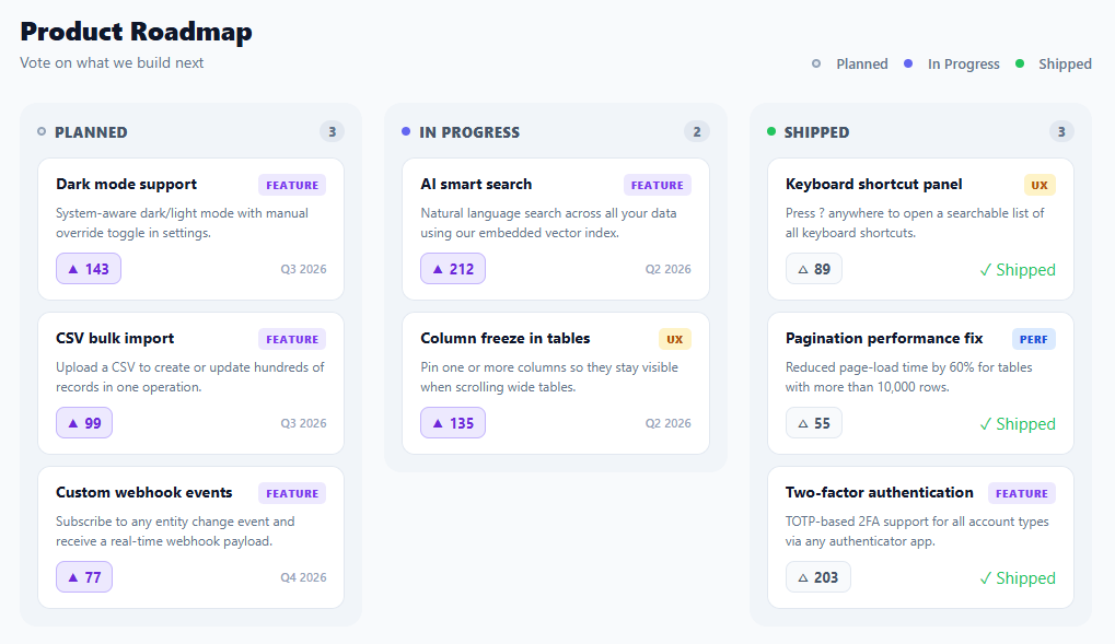
A public product roadmap board is a standard transparency feature for SaaS products and developer tools, and a frequently-searched UI component. Showing users what is coming, what is being built now, and what has shipped builds trust and reduces "when is X coming?" support requests. This snippet provides a complete three-column Kanban-style roadmap with category tags, target quarters, upvote buttons with live vote counts, and a shipped confirmation badge — the released items typically also appear in a changelog feed.
The three-column model
Planned / In Progress / Shipped is the canonical roadmap structure: planned items are committed but not yet started, in-progress items are actively being built, and shipped items are done and deployed. The columns use a CSS grid with three equal columns. Each column is a card with a coloured status dot in the header, an item count badge, and a scrollable list of feature cards.
Feature cards
Each item card shows a title, a category tag (feature, bug, perf, ux), a short description, an upvote button, and a quarter or shipped badge. The tag uses a colour-coded design: purple for features, red for bugs, blue for performance, and amber for UX — making it easy to scan by type across all three columns.
Upvote system
Each item has a vote button (△ hollow, ▲ filled when voted). Clicking toggles the voted state in a local votes map and re-renders. The displayed count is base votes + (voted ? 1 : 0), derived from the votes map rather than mutating the source array — a clean approach that makes the votes undoable. In production, votes would be persisted to a backend with user authentication to prevent duplicate voting.
Data-driven rendering
The entire board renders from a columns array of plain JavaScript objects. Adding a new feature card is adding an object to the correct column's items array; moving a card between columns is moving the object. In a real product this data would come from a backend, a headless CMS, or a product management tool like Linear, Productboard, or Canny via their public API.
Quarter and shipped labels
Planned and in-progress items show their target quarter (Q3 2026, Q4 2026). Shipped items show a green ✓ Shipped badge instead of a quarter, since the timeline is no longer relevant. This distinction is a small detail that makes the board feel genuinely useful rather than a cosmetic exercise.
Build with AI
Build, Understand, Optimize, and Extend It With AI
You don't have to work out the derived-vote-count pattern by hand. Paste this snippet's HTML, CSS, and JS into an AI coding assistant like Claude and ask it to explain exactly why the displayed vote count is computed as item.votes plus a lookup in a separate votes toggle map rather than incrementing item.votes directly, and how that separation makes an "undo vote" trivially correct. The same assistant can help optimize it, for example checking whether rebuilding the entire board's innerHTML on every single vote toggle is wasteful once the item count grows, or whether the same column-rendering logic could be extracted into one reusable function instead of being inlined in the map callback. It's also useful for extending the effect: ask it to add drag-and-drop so items can move between columns, persist votes to localStorage keyed by item id so a refresh doesn't reset them, or add a search/filter input that narrows the visible items across all three columns by keyword or tag. Treat the code less like a finished artifact and more like a starting point for a conversation.
Prompt to recreate it
Copy this into your AI assistant of choice to build the effect from scratch, or as a jumping-off point for your own variant:
Build a three-column product roadmap board (Planned, In Progress, Shipped) with upvoting in plain HTML, CSS, and vanilla JavaScript, rendered entirely from a data structure — no Kanban library.

Requirements:
- A nested data structure: an array of column objects (each with an id, a label, and a color), where each column object contains its own array of item objects (each with an id, a title, a category tag like feature/bug/perf/ux, a description, a base vote count, and a target quarter string).
- Render the entire board by mapping over the columns array to produce one card-styled column per entry, and within each column mapping over that column's items to produce one card per item, with a colored status dot and item count badge in each column's header.
- Each item card must show its title, a color-coded category tag (a distinct background/text color per tag type), its description, an upvote button, and either a target-quarter label or, if the item is in the Shipped column specifically, a green "Shipped" checkmark badge instead of the quarter.
- Implement voting so that a separate object or Set tracks which item ids the current user has voted for (the toggle map), and the displayed vote count for every item is computed at render time as that item's base vote count plus one if its id is present in the toggle map — never mutate the base vote count in the source data directly.
- Clicking an item's vote button must toggle that item's id in the toggle map (add it if absent, remove it if present) and re-render the whole board so the count and the button's filled/outlined arrow icon update immediately.
- Make sure adding a new item is as simple as pushing one more object into the correct column's items array with no other code changes required, since the whole board renders generically from the data.
Want to tighten it up first? Run this prompt through the AI Prompt Studio to score it across 8 quality dimensions, catch anti-patterns, and tune the wording for Claude, ChatGPT, or Gemini before you paste it in.
Step by step
How to Use
- 1Browse the roadmapScan the three columns for planned, in-progress, and shipped items. Category tags and quarter labels give context for each item.
- 2Upvote featuresClick △ on any item to cast your vote. The count increases and the button fills. Click again to remove your vote.
- 3Add your own itemsAdd an object to any column's items array: { id, title, tag, desc, votes, quarter }. Shipped column items show a "✓ Shipped" badge.
- 4Move items between columnsCut and paste an item object from one column's items array to another — the column it is in determines its status dot and badge.
- 5Load from an APIReplace the columns array with a fetch() to your roadmap endpoint (Canny, Productboard, Linear, or your own API) and call render() in the then callback.
- 6Export for your frameworkClick "React" for a component with votes in useState and columns as props. Click "Vue" for a Vue 3 SFC with a reactive votes map.
Real-world uses
Common Use Cases
Got questions?
Frequently Asked Questions
The items array stores a base vote count that never changes. A separate votes plain object acts as a toggle map: votes[id] = true when voted. In the renderer, count = item.votes + (votes[id] ? 1 : 0) derives the displayed value from both sources. This means undoing a vote (deleting votes[id]) automatically returns the displayed count to the original, and the source data stays clean — a pattern that makes syncing to a backend much simpler because you only send the toggle event, not a raw count.
On the client side, store voted item ids in localStorage so votes persist across page reloads. On the backend, record a vote as a row in a votes table with (userId, itemId, createdAt) and a unique constraint on (userId, itemId) to enforce one vote per user per item. The vote endpoint increments a denormalized vote_count on the item row on insert and decrements on delete, returning the new total to the client.
For Linear: query the GraphQL API for issues in a specific project, filtering by state. Map "Backlog" to planned, "In Progress" to progress, and "Done" to shipped. Include the title, description, priority/votes, and target date. For Canny: GET /v1/posts with board_id and category filters. Both APIs return JSON that maps cleanly to the columns[].items shape. Refresh on a server-side schedule and cache so the public page does not hammer the external API.
Accept columns as a prop (or fetch in useEffect). Keep a votes Set in useState for voted item ids. Toggle votes: setVotes(prev => { const next = new Set(prev); next.has(id) ? next.delete(id) : next.add(id); return next; }). Render each column and item from the data, deriving the vote count as item.votes + (votes.has(item.id) ? 1 : 0). The shipped check and quarter label render conditionally based on the column id. For the Tailwind version, click "Tailwind" to get the same markup with utility classes instead of a scoped stylesheet.