You Might Also Like
Learn Coding Visually
Learn to code with interactive, live-preview playgrounds — HTML, CSS, JavaScript, React & more.
 HTML Playground42 lessons · Click-based · Live preview
 CSS PlaygroundLearn CSS with a live editor
 JavaScript Playground60 lessons · DOM · Async · Canvas
 React PlaygroundLearn React with a live code editor
 GSAP PlaygroundLearn GSAP animation interactively
 SVG Playground44 lessons · shapes · paths · animation
 SCSS Playground45 lessons · Sass modules · tokens
 Tailwind PlaygroundLearn Tailwind CSS with a live editor
 Bootstrap 5 Playground50 lessons · live preview
Multi-Line Chart — HTML CSS JS Multi-Series Lines
Multi-Line Chart · Charts · Plain HTML, CSS & JS · Live preview
What's included
Features
About this UI Snippet
Multi-Line Chart — Several Series on a Shared Scale with a Toggleable Legend
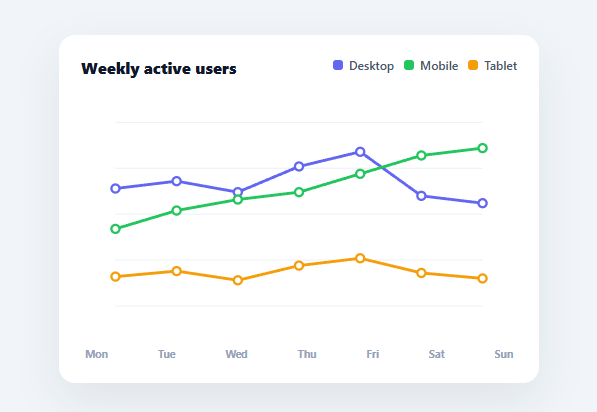
When you need to compare how several things trend over the same period — desktop vs. mobile vs. tablet traffic, revenue across regions, temperatures across cities — you want them on one chart, sharing one scale, so the comparison is direct. This snippet builds a multi-series line chart in plain HTML, CSS, SVG, and vanilla JavaScript: multiple lines drawn as SVG polylines, a legend that toggles each series, point tooltips, and a y-scale that adapts to whichever series are visible — no charting library.
Polylines on a shared, adaptive scale
Each series is drawn as an SVG polyline whose points come from mapping the data through px(i) (evenly spacing points across the width by index) and py(v, max) (scaling values up the height, inverted for SVG's downward y). All visible series share one max, computed from the highest value across only the visible series and rounded up to a clean hundred — so the lines are directly comparable, and the scale tightens automatically when you hide a tall series, giving the remaining lines more vertical room.
A legend that toggles series
The legend lists every series with its colour. Clicking one hides or shows that line and re-renders, which recomputes the shared max and redraws the remaining lines on the new scale — exactly how Chart.js and dashboard charts behave. A guard prevents hiding the last visible series, and hidden entries stay in the legend, dimmed, so they're easy to bring back. This toggling is what makes a busy multi-line chart usable: readers can isolate the series they care about.
Points for precise reading
On top of each line sit small circles at every data point — white-filled with a coloured stroke so they read as markers against any line colour. Each carries its series name, label, and value as data attributes, so hovering shows a tooltip with the exact figure at that point. A single delegated mousemove listener handles every point across every series via closest('.mlc-pt'), and the tooltip follows the cursor using getBoundingClientRect.
Gridlines and aligned x-labels
Horizontal gridlines give the eye reference levels, and the x-axis labels render as a flex row beneath the SVG, justified to match the evenly-spaced points. Keeping the labels in HTML rather than SVG text means they inherit normal font rendering and wrap or truncate with CSS if needed.
Data-driven and drop-in
The chart renders from a LABELS array and a SERIES array of { name, color, data }. Add a series, change the labels, or swap the numbers and everything — lines, legend, scale, tooltips, x-labels — follows. Because it's dependency-free SVG, it's crisp at any size and a clear reference for multi-series scaling and the polyline-from-data pattern that underpins every line chart.
Build with AI
Build, Understand, Optimize, and Extend It With AI
Rather than working through the scaling math by hand, paste this snippet's HTML, CSS, and JS into an AI coding assistant like Claude and ask it to explain exactly why maxVal() recomputes from only the visible series rather than all of them, and how that recomputation is what makes hiding a tall series make the remaining lines taller on redraw. The same assistant can help you optimize it, for instance asking whether wiping and rebuilding the entire svg.innerHTML on every legend click is wasteful compared to updating just the changed polyline and circle elements, or how the chart would need to change to handle a series with missing data points (gaps) rather than a dense array. It's also useful for extending the chart: ask it to add a synchronized vertical hover guideline across all series at once instead of per-point tooltips, animate the polylines drawing in on load, or support a secondary y-axis for a series on a very different scale. Treat the code less like a finished artifact and more like a starting point for a conversation.
Prompt to recreate it
Copy this into your AI assistant of choice to build the effect from scratch, or as a jumping-off point for your own variant:
Build a "multi-series line chart" in plain HTML, CSS, and SVG built with vanilla JavaScript — no charting library, no canvas.

Requirements:
- Accept a labels array (x-axis categories) and a series array of objects, each with a name, a color, and a data array of numbers aligned to the labels.
- Draw each visible series as one SVG polyline whose points are computed by spacing x positions evenly across the chart width by index and scaling y positions by the value against a shared maximum, inverted so higher values sit higher on screen.
- The shared maximum used for the y-scale must be computed dynamically from only the currently visible series (not a fixed constant), rounded up to a clean round number, so hiding a series changes the scale and the remaining lines redraw taller to use the freed vertical space.
- Render a small circular marker at every data point on every visible line, each carrying the series name, the x-axis label, and the raw value as data attributes.
- Build a clickable legend listing every series by name and color swatch; clicking a legend entry must toggle that series' visibility and trigger a full rescale/redraw, but must be prevented from hiding the very last remaining visible series.
- Implement hover behavior with a single delegated mousemove listener on the chart (not one listener per point) that detects the nearest point marker under the cursor and shows a tooltip with the series name, label, and exact value, positioned near the cursor.
- Add faint horizontal gridlines behind the data and x-axis labels below the chart, aligned to the same even spacing used for the point positions.
Want to tighten it up first? Run this prompt through the AI Prompt Studio to score it across 8 quality dimensions, catch anti-patterns, and tune the wording for Claude, ChatGPT, or Gemini before you paste it in.
Step by step
How to Use
- 1Paste HTML, CSS, and JSA multi-line chart renders with three series (Desktop, Mobile, Tablet) over a week.
- 2Toggle a seriesClick a legend item to hide or show that line; the shared scale recomputes and the lines redraw.
- 3Hover a pointMove over any marker to see that series, day, and exact value in a tooltip.
- 4Swap in your dataReplace LABELS and the SERIES array ({ name, color, data }) with your own values.
- 5Add more seriesPush another { name, color, data } object — the legend, scale, and lines adapt automatically.
- 6Wire to an APIFetch your series, map them into the SERIES shape, and call render() to draw the live chart.
Real-world uses
Common Use Cases
Got questions?
Frequently Asked Questions
maxVal() scans every visible series for the highest value and rounds it up to a clean hundred; py(v, max) then scales all series against that single max. Because every line uses the same scale, vertical positions are directly comparable. When you hide a tall series, the max drops and the remaining lines are redrawn taller, using the freed vertical space.
Each series becomes an SVG <polyline> whose points attribute is a list of "x,y" pairs. The x of each point is its index spaced evenly across the width by px(i); the y is the value scaled up the height by py(v, max), inverted because SVG's y-axis grows downward. The polyline connects them with rounded joins, and circles are drawn on top as point markers.
Clicking a legend item flips a flag in the hidden map and calls render(), which recomputes the shared max from only the visible series and redraws every visible line on that new scale. A guard prevents hiding the last visible series. Hidden entries remain in the legend, dimmed, so they can be toggled back on.
Push another object to SERIES with { name, color, data } where data has one value per label, and edit LABELS for the x-axis categories. The legend, shared scale, lines, and tooltips all derive from those two arrays on the next render(). For real data, fetch it, map it into that shape, and call render().
In React, hold the series and hidden state in useState and render polylines/markers from .map() with legend onClick toggles; in Vue, use v-for with ref state; in Angular, use *ngFor with component properties. The px()/py()/maxVal() scaling math is framework-agnostic and ports unchanged — only state and event wiring move into the framework.