Learn Coding Visually
Learn to code with interactive, live-preview playgrounds — HTML, CSS, JavaScript, React & more.
 HTML Playground42 lessons · Click-based · Live preview
 CSS PlaygroundLearn CSS with a live editor
 JavaScript Playground60 lessons · DOM · Async · Canvas
 React PlaygroundLearn React with a live code editor
 GSAP PlaygroundLearn GSAP animation interactively
 SVG Playground44 lessons · shapes · paths · animation
 SCSS Playground45 lessons · Sass modules · tokens
 Tailwind PlaygroundLearn Tailwind CSS with a live editor
 Bootstrap 5 Playground50 lessons · live preview
Candlestick Chart — Stock OHLC HTML CSS JS Snippet
Candlestick Chart · Charts · Plain HTML, CSS & JS · Live preview
What's included
Features
<line> (high→low) plus a body <rect> (open→close), coloured green/red by direction — the standard candlestick anatomy.build maps prices to the data's min/max within padding, so any instrument or price range renders correctly with no config.<rect> per candle makes hovering forgiving — you needn't land on the thin body.show fills a tooltip with formatted O/H/L/C and updates the header price and coloured percent change.preserveAspectRatio — no canvas hit-testing.About this UI Snippet
Candlestick Chart — OHLC Bodies & Wicks, Hover Crosshair & Live Price Readout
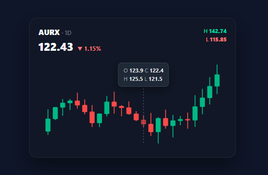
The candlestick chart is the language of financial markets — every trading app, crypto dashboard, and stock tracker uses it because a single candle encodes four values (open, high, low, close) and its colour shows direction at a glance. This snippet draws a real OHLC candlestick chart with an SVG in plain HTML, CSS, and vanilla JavaScript: green/red bodies, high-low wicks, a hover crosshair, and a tooltip with the candle's OHLC plus a live price and percent-change readout.
Anatomy of a candle
Each candle is an SVG <g> containing a thin <line> wick from the high to the low and a <rect> body spanning the open-to-close range. The body is green (.ck-up) when close ≥ open and red (.ck-down) otherwise — the universal convention. build computes the data's overall high and low, derives a y mapping that flips the axis (higher price = higher on screen) and fits everything within padding, then positions each candle at an evenly spaced cx. A minimum body height (Math.max(1.5, …)) keeps doji candles (open ≈ close) visible as a thin line rather than vanishing.
Hover crosshair and OHLC tooltip
Each candle's <g> includes a full-height transparent <rect> as a generous hit area, so you do not have to land precisely on the thin body. On mouseenter, show moves a dashed vertical crosshair to that candle, updates the header price and percent change (coloured green/red), and fills a tooltip with the formatted O, H, L, C values positioned over the candle. Leaving the plot snaps the readout back to the latest candle and hides the crosshair — exactly how trading terminals behave.
Auto-scaling and data generation
The chart auto-scales to the min/max of the dataset, so it works for any price range without configuration. A genData function produces a realistic random walk (each candle opens at the previous close, with randomised high/low spreads) so the demo looks like a real instrument; replace it with your OHLC array from a market API and call build.
Why SVG over Canvas
SVG candles are individually hoverable DOM elements — no hit-testing math, no manual redraws on hover — which makes the crosshair and tooltip trivial, and it stays crisp at any size via preserveAspectRatio. For thousands of candles you would switch to Canvas, but for the typical 20–60 visible candles a dashboard shows, SVG is simpler and exports cleanly to every framework.
Pair this with a realtime line chart for live ticks, a sparkline chart for compact trends, or a metric card grid for portfolio stats.
Build with AI
Build, Understand, Optimize, and Extend It With AI
You don't have to re-derive the y-scale or the hit-area trick by hand to trust this chart. Paste this snippet's HTML, CSS, and JS into an AI coding assistant like Claude and ask it to explain exactly how the y function inverts the price-to-pixel mapping so higher prices land higher on screen, and why each candle's group includes a full-height transparent rect in addition to the visible wick and body. The same assistant can help optimize it — asking whether rebuilding the entire SVG innerHTML string on every build call is necessary versus updating only the changed candle when live data ticks in, or whether the minimum body height guard for doji candles could be made proportional to the chart's overall price range instead of a fixed pixel value. It's also useful for extending the chart: ask it to add volume bars beneath the candles, overlay a moving-average line, or support pinch-zooming into a specific date range. Treat the code less like a finished artifact and more like a starting point for a conversation.
Prompt to recreate it
Copy this into your AI assistant of choice to build the effect from scratch, or as a jumping-off point for your own variant:
Build a "candlestick (OHLC) chart" in plain HTML, CSS, and SVG built with vanilla JavaScript, with a hover crosshair and tooltip — no charting library, no canvas.

Requirements:
- Accept data as an array of objects each with an open, high, low, and close price, and compute the y-axis scale dynamically from the overall minimum low and maximum high across the entire dataset, inverting the mapping so higher prices render at smaller pixel-y coordinates (higher on screen) since SVG's native coordinate system grows downward.
- For every data point, draw a thin vertical line spanning from the high price to the low price (the wick), and a rectangle spanning from the open price to the close price (the body), coloring the wick and body green when the close is greater than or equal to the open and red otherwise — with the body's height enforced to a small non-zero minimum so a candle where open and close are nearly identical still renders as a visible thin line rather than disappearing.
- Wrap each candle's wick and body in a group that also includes an invisible, full chart-height rectangle spanning that candle's full horizontal slot, used purely as a generous mouse hit area so hovering doesn't require precisely targeting the thin visual elements.
- On hovering any candle's group, move a dashed vertical crosshair line to that candle's x position, update a header display showing that candle's closing price and a color-coded (green for up, red for down) percentage change from its own open to close, and show a tooltip positioned above the candle listing its open, high, low, and close values.
- When the mouse leaves the whole chart area, reset the header readout back to the most recent candle in the dataset and hide both the crosshair and the tooltip.
- Make sure the entire scale recomputes correctly for any price range or number of candles passed in, with no hardcoded axis bounds.
Want to tighten it up first? Run this prompt through the AI Prompt Studio to score it across 8 quality dimensions, catch anti-patterns, and tune the wording for Claude, ChatGPT, or Gemini before you paste it in.
Step by step
How to Use
- 1Paste HTML, CSS, and JSA dark "AURX · 1D" card appears with 24 green/red candlesticks and the latest candle's price and % change in the header.
- 2Hover a candleA dashed crosshair snaps to it, the header price and percent change update, and a tooltip shows that candle's O/H/L/C.
- 3Read direction at a glanceGreen candles closed up, red closed down; the wick shows the full high-to-low range, the body the open-to-close range.
- 4Move along the seriesSweep across the candles — the crosshair, price, and tooltip follow each one in turn.
- 5Leave the chartThe readout returns to the most recent candle and the crosshair hides.
- 6Plug in real OHLC dataReplace
genDatawith your market data array of{ o, h, l, c }and callbuild; the chart auto-scales.
Real-world uses
Common Use Cases
Got questions?
Frequently Asked Questions
Replace genData with your data: fetch an array of { o, h, l, c } (open/high/low/close) from a market API and pass it to build (assign it to DATA and skip the generator). The chart auto-scales to the data's min/max, so no axis configuration is needed. For live updates, append the newest candle and re-run build, or update only the last candle's rect/line for efficiency.
For volume, reserve the bottom ~20% of the viewBox and draw a thin <rect> per candle scaled to its volume. For a moving average, compute the rolling mean and draw a smooth <path> (a polyline or Bézier) over the candles. Both overlay cleanly because everything shares the same x step and y scale used by the candles.
SVG is ideal up to a few hundred candles: each is a real DOM element, so hover, crosshair, and tooltips need no hit-testing and it stays crisp at any size. For thousands of candles or high-frequency live updates, Canvas (or WebGL) is faster because it avoids per-element DOM overhead. This snippet uses SVG for the typical 20–60 visible candles a dashboard shows.
An SVG price chart is hard for screen readers, so expose the data textually: the header already shows the current price and change as real text, and you can add an aria-label to the SVG summarising the trend plus an off-screen data table of OHLC values. Ensure up/down is conveyed by more than colour — the percent arrow (▲/▼) and the tooltip labels do this.
In React, compute the candle geometry with useMemo from your OHLC array and render <g>/<line>/<rect> elements in JSX, tracking the hovered index in useState for the crosshair and tooltip. In Vue, use a computed for the candles and v-for. In Angular, compute in the component and *ngFor. The y-scale math and colour logic port unchanged.