You Might Also Like
Learn Coding Visually
Learn to code with interactive, live-preview playgrounds — HTML, CSS, JavaScript, React & more.
 HTML Playground42 lessons · Click-based · Live preview
 CSS PlaygroundLearn CSS with a live editor
 JavaScript Playground60 lessons · DOM · Async · Canvas
 React PlaygroundLearn React with a live code editor
 GSAP PlaygroundLearn GSAP animation interactively
 SVG Playground44 lessons · shapes · paths · animation
 SCSS Playground45 lessons · Sass modules · tokens
 Tailwind PlaygroundLearn Tailwind CSS with a live editor
 Bootstrap 5 Playground50 lessons · live preview
Bubble Chart — HTML CSS JS SVG Bubble Chart
Bubble Chart · Charts · Plain HTML, CSS & JS · Live preview
What's included
Features
About this UI Snippet
Bubble Chart — Three-Variable SVG Scatter with Area-Proportional Bubbles
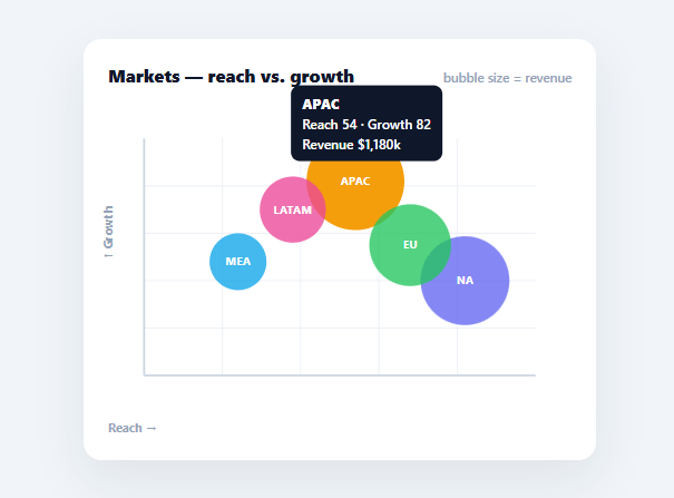
A bubble chart packs three dimensions of data into one view: two via the x and y position of each point, and a third via the size of the bubble. It's the right chart when you want to compare items across two metrics while also weighting them by a third — markets by reach and growth, sized by revenue; products by price and rating, sized by sales. This snippet builds a complete bubble chart in plain HTML, CSS, SVG, and vanilla JavaScript, with gridlines, axes, labelled bubbles, and hover tooltips — no charting library.
Mapping data space to pixel space
The core of any plotted chart is the scaling functions. sx(x) maps a data value on the x-axis (0–100 here) into a pixel x-coordinate inside the padded plot area, and sy(y) does the same for y — but inverted, because SVG's y-axis grows downward while a chart's grows upward. Getting that inversion right is what makes "up" mean "more." The padding keeps bubbles and axes off the very edge so labels and large bubbles aren't clipped.
Area-proportional sizing, not radius-proportional
The third dimension — bubble size — uses sqrt scaling: the radius is proportional to the square root of the value, not the value itself. This is the single most important detail in a bubble chart, because a circle's visual weight is its area, and area grows with the square of the radius. If you scaled the radius linearly, a value twice as large would look four times as big and badly mislead the reader. Square-root scaling makes the perceived area proportional to the value, which is the honest way to size bubbles.
Gridlines, axes, and draw order
The chart draws faint gridlines and solid x/y axes first, then the bubbles on top. Bubbles are sorted largest-first before drawing so smaller bubbles paint over big ones and stay hoverable — otherwise a large bubble would sit on top and swallow the clicks meant for a small one behind it. Each bubble carries a short label centred inside it (text-anchor: middle), and the label is pointer-events: none so it never blocks the bubble's own hover.
Tooltips with all three values
Hovering a bubble shows a tooltip with the name and all three data values — the x metric, the y metric, and the size metric — so the reader can read the exact numbers behind the position and size. The tooltip follows the cursor using getBoundingClientRect to translate page coordinates into card offsets, and a single delegated mousemove listener on the SVG handles every bubble via closest('.bbc-bubble').
Data-driven and drop-in
Everything renders from a DATA array of { name, x, y, r, color }. Swap in your own three-variable data and the positions, sizes, gridlines, and tooltips all follow. Because it's dependency-free SVG, it scales crisply, themes with CSS, and is a clear reference for the data-to-pixel scaling and area-proportional sizing that underpin every scatter and bubble visualisation.
Build with AI
Build, Understand, Optimize, and Extend It With AI
You don't have to re-derive the scaling math by hand to trust this chart's proportions. Paste this snippet's HTML, CSS, and JS into an AI coding assistant like Claude and ask it to explain exactly why radius() takes a square root of the ratio between a value and the dataset's max instead of scaling linearly, and why sy() subtracts the scaled value from the chart height rather than using it directly. The same assistant can help optimize it — asking whether recomputing Math.max across the whole dataset inside radius() on every single bubble is wasteful compared to computing it once per render, or whether the largest-first sort before drawing could be replaced with a z-index-free layering approach. It's also useful for extending the chart: ask it to add a legend mapping colors to categories, support a fourth dimension via bubble opacity or border, or animate bubbles growing in from radius zero on load. Treat the code less like a finished artifact and more like a starting point for a conversation.
Prompt to recreate it
Copy this into your AI assistant of choice to build the effect from scratch, or as a jumping-off point for your own variant:
Build a "bubble chart" in plain HTML, CSS, and SVG built with vanilla JavaScript that encodes three data dimensions per point (an x metric, a y metric, and a size metric) — no charting library, no canvas.

Requirements:
- Accept data as an array of objects, each with a name, an x value, a y value, a size-driving value, and a color, all on a shared numeric domain (e.g. 0-100 for x and y).
- Write separate x and y scaling functions that map a data value into pixel coordinates inside a padded plot area, and make sure the y-scaling function inverts the axis (larger data values must map to smaller pixel-y coordinates, i.e. higher on screen), since SVG's native coordinate system grows downward.
- Compute each bubble's radius using square-root scaling relative to the maximum size-value in the dataset (not a direct linear mapping), so that a data point twice as large in the size metric appears roughly 1.4 times the radius rather than twice the radius — preserving the reader's ability to correctly judge relative area at a glance.
- Draw faint gridlines and solid x and y axis lines before drawing any bubbles, and sort the bubbles from largest to smallest before appending them to the SVG, so smaller bubbles are painted on top of larger ones and remain independently hoverable.
- Give each bubble a centered text label whose pointer-events are disabled so the label itself never intercepts a hover meant for the bubble underneath it.
- Attach a single delegated mousemove listener on the SVG element (not one per bubble) that detects which bubble is under the cursor and shows a tooltip listing that bubble's name and all three of its underlying data values, positioned relative to the chart container using getBoundingClientRect.
Want to tighten it up first? Run this prompt through the AI Prompt Studio to score it across 8 quality dimensions, catch anti-patterns, and tune the wording for Claude, ChatGPT, or Gemini before you paste it in.
Step by step
How to Use
- 1Paste HTML, CSS, and JSA bubble chart renders with five market bubbles positioned by reach and growth, sized by revenue.
- 2Hover a bubbleMove over any bubble to see a tooltip with its name and all three values (x, y, and size).
- 3Swap in your dataReplace the DATA array with { name, x, y, r, color } items on your own 0–100 scales.
- 4Adjust the scalesIf your data isn't 0–100, change the divisor in sx()/sy() or normalise your values first.
- 5Tune bubble sizesEdit the base size and multiplier in radius() to make bubbles larger or smaller overall.
- 6Wire to an APIFetch your records, map them into the DATA shape, and call render() to draw the live chart.
Real-world uses
Common Use Cases
Got questions?
Frequently Asked Questions
A circle's visual weight is its area, and area grows with the square of the radius. If you set radius directly proportional to the value, a value twice as large would render with four times the area and mislead the reader. Scaling the radius by the square root of the value makes the perceived area proportional to the value — the honest, standard way to size bubbles.
SVG coordinates grow downward (y=0 is the top), but a chart's y-axis should grow upward (more = higher). sy() subtracts the scaled value from the bottom of the plot area so larger data values map to smaller pixel-y values, placing them higher on screen. Getting this inversion right is what makes "up" mean "more" on the chart.
If a big bubble is drawn last, it sits on top and intercepts hover/click events meant for smaller bubbles behind it. Sorting the data largest-first before drawing puts small bubbles on top in the paint order, so every bubble stays individually hoverable. The labels are pointer-events:none for the same reason — so they never block their own bubble.
The scaling functions sx()/sy() assume a 0–100 domain. Either change the divisor (100) to your data's maximum, or normalise your values to 0–100 before plotting. For axes with a non-zero minimum, subtract the min and divide by the range (max − min). The radius() function already normalises against the dataset's max, so bubble sizes adapt automatically.
In React, hold the data in useState and render circles/labels from .map(), or run the imperative render() in a useEffect with a ref to the SVG; in Vue, use v-for or a template ref with onMounted; in Angular, use *ngFor or ViewChild with ngAfterViewInit. The sx()/sy()/radius() scaling math is framework-agnostic and ports unchanged.