More Cards Snippets
Star Rating Breakdown Card — HTML CSS JS Snippet
Star Rating Breakdown Card · Cards · Plain HTML, CSS & JS · Live preview
What's included
Features
About this UI Snippet
Star Rating Breakdown Card — Animated Bar Chart, Sentiment Badges & IntersectionObserver Reveal
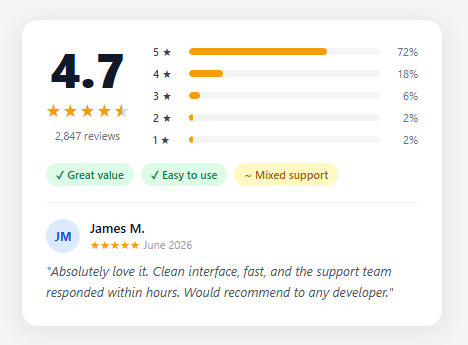
A rating breakdown card communicates product or service quality at a glance by displaying a numeric aggregate score alongside a distribution histogram of individual star ratings. Amazon pioneered this pattern and it has become standard across e-commerce, SaaS review pages, and app stores. The key insight is that the distribution often tells a more nuanced story than the average — a product with a 4.2 average but a large spike of 1-star reviews signals a quality consistency problem that the average hides.
HTML structure
The card uses a two-column flex layout inside .card-header: the left .score-block holds the large numeric score, star icons, and review count; the right .bars-block holds the five distribution rows. Each .bar-row is a flex container with a label, a track div containing the fill div, and a percentage label. The fill div's actual width starts at zero and animates to its target value on page entry.
Half-star CSS technique
The half-star is implemented with a pure CSS trick: the star character (★) is displayed in gray as its base color, then a ::before pseudo-element is positioned absolutely over it with the same character in yellow (#f59e0b). The pseudo-element has width: 55%; overflow: hidden, which clips it to just over half width, creating a convincing half-fill. No JavaScript or SVG required — just two layered characters.
Bar animation via IntersectionObserver
Rather than animating on page load (which wastes CPU if the card is below the fold), the bars animate when the card enters the viewport. An IntersectionObserver with threshold: 0.3 fires when 30% of the card is visible. The callback iterates over all .bar-fill elements, reads their data-pct attribute, and sets element.style.width = pct + '%'. Because the CSS already defines transition: width 0.8s cubic-bezier(0.16, 1, 0.3, 1), setting the inline style triggers the smooth easing animation. After triggering, observer.unobserve() prevents re-animation on scroll.
Color coding the bars
All five bars share the same amber fill (#f59e0b) in this implementation. An alternative approach colors them by star level: 5★ green, 4★ lime, 3★ yellow, 2★ orange, 1★ red. This can be done with :nth-child(n) selectors on .bar-row or with individual data-color attributes read in JavaScript.
Sentiment badges
The badge row uses flex-wrap so badges reflow on narrow viewports. Green badges (background: #dcfce7; color: #15803d) indicate positive sentiment patterns derived from review text analysis. Yellow-tinted badges signal mixed signals. This badge system is common in Google Play Store and Trustpilot product summaries.
The reviewer snippet section
A featured review below the histogram adds social proof specificity. The avatar uses initials (generated from the reviewer name) with a blue background — this is the standard fallback when profile photos are unavailable. The star row uses plain HTML star characters sized to 12px rather than SVG icons, keeping the markup simple.
Accessibility considerations
The numeric score and review count are visible text so no aria labels are needed there. The star elements should have aria-hidden="true" since the score is already conveyed by the adjacent "4.7" text. The bar chart is decorative — the percentage labels next to each bar already convey the data to screen readers, so no additional ARIA roles are required.
React integration
Accept a rating prop (number), a reviews prop (total count), a distribution prop (object mapping star count to percentage), and a sentiments array. Render bars with inline style={{ width: '0%' }} initially and use useEffect with an IntersectionObserver ref to trigger animation on mount. The featured review can be passed as a featuredReview prop object.
Use cases beyond products
This component adapts well to service ratings (restaurants, hotels), employee survey results (Net Promoter Score distribution), course ratings on learning platforms, and app store quality breakdowns. The bar chart pattern is universally understood and builds immediate credibility compared to a simple star average. See also the star rating snippet for the interactive input version, the review card snippet for individual testimonials, and the testimonial masonry snippet for grid layouts of multiple reviews.
Step by step
How to Use
- 1Copy the HTML card structureInclude the .card-header with both .score-block and .bars-block. Each .bar-row needs a .bar-fill with a data-pct attribute set to the percentage (0–100).
- 2Add your rating dataChange the score-big text, adjust data-pct values on each .bar-fill, and update the .bar-pct text labels to match your real distribution data.
- 3Paste the CSSThe CSS is self-contained. Adjust #f59e0b for your brand color. The .bar-fill transition handles the animation — no changes needed.
- 4Add the IntersectionObserver JSThe script fires when the card scrolls 30% into view and sets each bar width from data-pct. It unobserves after the first trigger to prevent re-animation.
- 5Customise sentiment badgesEdit the .badge elements inside .sentiments. Use badge-green for positive and badge-yellow for mixed. Add badge-red for common negative feedback themes.
Real-world uses
Common Use Cases
Got questions?
Frequently Asked Questions
Accept a distribution prop (object mapping 1–5 to percentages) and use useEffect with an IntersectionObserver ref to trigger bar width animation after mount.
Yes — use :nth-child CSS selectors on .bar-row .bar-fill or set data-color attributes and read them in the JS to apply different background colors per row.
See the interactive star rating snippet at /ui-snippets/star-rating/ for a click-and-hover input version.
Yes — replace the hardcoded data-pct values by reading your API response and setting element.style.width directly in JS, then trigger the transition with a requestAnimationFrame.
Open the Export menu (or the Test Exports preview) in the snippet toolbar. It generates a plain React component, a React + Tailwind version where the bar and badge styles become utility classes, a Vue 3 single-file component with the IntersectionObserver logic in script setup, and an Angular standalone component. Each converter preserves the markup, CSS bar animation, and behaviour — the observer that triggers the bar fill is deferred to the framework mount lifecycle (useEffect, onMounted, or ngAfterViewInit), so the card animates the same way in React, Vue, and Angular. For production, pass the distribution in as a component prop or input instead of reading data-pct attributes.
Star Rating Breakdown Card — Export as HTML, React, Vue, Angular & Tailwind
<!DOCTYPE html>
<html lang="en">
<head>
<meta charset="UTF-8" />
<meta name="viewport" content="width=device-width, initial-scale=1.0" />
<title>Star Rating Breakdown Card</title>
<style>
* { box-sizing: border-box; margin: 0; padding: 0; }
body { font-family: system-ui, sans-serif; background: #f3f4f6; display: flex; align-items: center; justify-content: center; min-height: 100vh; padding: 20px; }
.card { background: #fff; border-radius: 16px; box-shadow: 0 4px 24px rgba(0,0,0,0.08); padding: 24px; width: 100%; max-width: 420px; }
.card-header { display: flex; gap: 24px; align-items: flex-start; }
.score-block { display: flex; flex-direction: column; align-items: center; gap: 6px; flex-shrink: 0; min-width: 80px; }
.score-big { font-size: 48px; font-weight: 800; color: #111827; line-height: 1; }
.stars-row { display: flex; gap: 2px; }
.star { font-size: 18px; color: #f59e0b; }
.star.half { position: relative; color: #d1d5db; }
.star.half::before { content: "★"; position: absolute; left: 0; width: 55%; overflow: hidden; color: #f59e0b; }
.review-count { font-size: 11px; color: #6b7280; }
.bars-block { flex: 1; display: flex; flex-direction: column; gap: 7px; }
.bar-row { display: flex; align-items: center; gap: 8px; }
.bar-label { font-size: 11px; color: #374151; font-weight: 500; width: 28px; flex-shrink: 0; }
.bar-track { flex: 1; height: 7px; background: #f3f4f6; border-radius: 4px; overflow: hidden; }
.bar-fill { height: 100%; background: #f59e0b; border-radius: 4px; width: 0; transition: width 0.8s cubic-bezier(0.16, 1, 0.3, 1); }
.bar-pct { font-size: 11px; color: #6b7280; width: 30px; text-align: right; flex-shrink: 0; }
.sentiments { display: flex; flex-wrap: wrap; gap: 7px; margin-top: 16px; }
.badge { font-size: 11px; font-weight: 600; padding: 4px 10px; border-radius: 20px; }
.badge-green { background: #dcfce7; color: #15803d; }
.badge-yellow { background: #fef9c3; color: #a16207; }
.divider { height: 1px; background: #f3f4f6; margin: 16px 0; }
.reviewer-row { display: flex; align-items: center; gap: 10px; margin-bottom: 8px; }
.avatar { width: 34px; height: 34px; border-radius: 50%; background: #dbeafe; color: #1d4ed8; font-size: 12px; font-weight: 700; display: flex; align-items: center; justify-content: center; flex-shrink: 0; }
.reviewer-name { font-size: 13px; font-weight: 600; color: #111827; }
.reviewer-stars { font-size: 12px; color: #f59e0b; }
.rev-date { color: #9ca3af; font-size: 11px; }
.review-text { font-size: 13px; color: #4b5563; line-height: 1.6; font-style: italic; }
</style>
</head>
<body>
<div class="card">
<div class="card-header">
<div class="score-block">
<div class="score-big">4.7</div>
<div class="stars-row">
<span class="star full">★</span><span class="star full">★</span><span class="star full">★</span><span class="star full">★</span><span class="star half">★</span>
</div>
<div class="review-count">2,847 reviews</div>
</div>
<div class="bars-block">
<div class="bar-row"><span class="bar-label">5 ★</span><div class="bar-track"><div class="bar-fill" data-pct="72"></div></div><span class="bar-pct">72%</span></div>
<div class="bar-row"><span class="bar-label">4 ★</span><div class="bar-track"><div class="bar-fill" data-pct="18"></div></div><span class="bar-pct">18%</span></div>
<div class="bar-row"><span class="bar-label">3 ★</span><div class="bar-track"><div class="bar-fill" data-pct="6"></div></div><span class="bar-pct">6%</span></div>
<div class="bar-row"><span class="bar-label">2 ★</span><div class="bar-track"><div class="bar-fill" data-pct="2"></div></div><span class="bar-pct">2%</span></div>
<div class="bar-row"><span class="bar-label">1 ★</span><div class="bar-track"><div class="bar-fill" data-pct="2"></div></div><span class="bar-pct">2%</span></div>
</div>
</div>
<div class="sentiments">
<span class="badge badge-green">✓ Great value</span>
<span class="badge badge-green">✓ Easy to use</span>
<span class="badge badge-yellow">~ Mixed support</span>
</div>
<div class="divider"></div>
<div class="review-snippet">
<div class="reviewer-row">
<div class="avatar">JM</div>
<div>
<div class="reviewer-name">James M.</div>
<div class="reviewer-stars">★★★★★ <span class="rev-date">June 2026</span></div>
</div>
</div>
<p class="review-text">"Absolutely love it. Clean interface, fast, and the support team responded within hours. Would recommend to any developer."</p>
</div>
</div>
<script>
document.addEventListener('DOMContentLoaded', function() {
const observer = new IntersectionObserver(entries => {
entries.forEach(entry => {
if (entry.isIntersecting) {
entry.target.querySelectorAll('.bar-fill').forEach(bar => {
const pct = bar.getAttribute('data-pct');
bar.style.width = pct + '%';
});
observer.unobserve(entry.target);
}
});
}, { threshold: 0.3 });
const card = document.querySelector('.card');
if (card) observer.observe(card);
});
</script>
</body>
</html><!DOCTYPE html>
<html lang="en">
<head>
<meta charset="UTF-8" />
<meta name="viewport" content="width=device-width, initial-scale=1.0" />
<title>Star Rating Breakdown Card</title>
<!-- Tailwind CSS v3+ — arbitrary value classes (e.g. bg-[#0f172a]) are valid -->
<script src="https://cdn.tailwindcss.com"></script>
<style>
* {
box-sizing: border-box; margin: 0; padding: 0;
}
body {
font-family: system-ui, sans-serif; background: #f3f4f6; display: flex; align-items: center; justify-content: center; min-height: 100vh; padding: 20px;
}
.star.half {
position: relative; color: #d1d5db;
}
.star.half::before {
content: "★"; position: absolute; left: 0; width: 55%; overflow: hidden; color: #f59e0b;
}
</style>
</head>
<body>
<div class="card bg-[#fff] rounded-2xl shadow-[0_4px_24px_rgba(0,0,0,0.08)] p-6 w-full max-w-[420px]">
<div class="flex gap-6 items-start">
<div class="flex flex-col items-center gap-1.5 shrink-0 min-w-[80px]">
<div class="text-5xl font-extrabold text-[#111827] leading-none">4.7</div>
<div class="flex gap-0.5">
<span class="star text-lg text-[#f59e0b] full">★</span><span class="star text-lg text-[#f59e0b] full">★</span><span class="star text-lg text-[#f59e0b] full">★</span><span class="star text-lg text-[#f59e0b] full">★</span><span class="star text-lg text-[#f59e0b] half">★</span>
</div>
<div class="text-[11px] text-[#6b7280]">2,847 reviews</div>
</div>
<div class="flex-1 flex flex-col gap-[7px]">
<div class="flex items-center gap-2"><span class="text-[11px] text-[#374151] font-medium w-7 shrink-0">5 ★</span><div class="flex-1 h-[7px] bg-[#f3f4f6] rounded overflow-hidden"><div class="bar-fill h-full bg-[#f59e0b] rounded w-0 [transition:width_0.8s_cubic-bezier(0.16,_1,_0.3,_1)]" data-pct="72"></div></div><span class="text-[11px] text-[#6b7280] w-[30px] text-right shrink-0">72%</span></div>
<div class="flex items-center gap-2"><span class="text-[11px] text-[#374151] font-medium w-7 shrink-0">4 ★</span><div class="flex-1 h-[7px] bg-[#f3f4f6] rounded overflow-hidden"><div class="bar-fill h-full bg-[#f59e0b] rounded w-0 [transition:width_0.8s_cubic-bezier(0.16,_1,_0.3,_1)]" data-pct="18"></div></div><span class="text-[11px] text-[#6b7280] w-[30px] text-right shrink-0">18%</span></div>
<div class="flex items-center gap-2"><span class="text-[11px] text-[#374151] font-medium w-7 shrink-0">3 ★</span><div class="flex-1 h-[7px] bg-[#f3f4f6] rounded overflow-hidden"><div class="bar-fill h-full bg-[#f59e0b] rounded w-0 [transition:width_0.8s_cubic-bezier(0.16,_1,_0.3,_1)]" data-pct="6"></div></div><span class="text-[11px] text-[#6b7280] w-[30px] text-right shrink-0">6%</span></div>
<div class="flex items-center gap-2"><span class="text-[11px] text-[#374151] font-medium w-7 shrink-0">2 ★</span><div class="flex-1 h-[7px] bg-[#f3f4f6] rounded overflow-hidden"><div class="bar-fill h-full bg-[#f59e0b] rounded w-0 [transition:width_0.8s_cubic-bezier(0.16,_1,_0.3,_1)]" data-pct="2"></div></div><span class="text-[11px] text-[#6b7280] w-[30px] text-right shrink-0">2%</span></div>
<div class="flex items-center gap-2"><span class="text-[11px] text-[#374151] font-medium w-7 shrink-0">1 ★</span><div class="flex-1 h-[7px] bg-[#f3f4f6] rounded overflow-hidden"><div class="bar-fill h-full bg-[#f59e0b] rounded w-0 [transition:width_0.8s_cubic-bezier(0.16,_1,_0.3,_1)]" data-pct="2"></div></div><span class="text-[11px] text-[#6b7280] w-[30px] text-right shrink-0">2%</span></div>
</div>
</div>
<div class="flex flex-wrap gap-[7px] mt-4">
<span class="text-[11px] font-semibold py-1 px-2.5 rounded-[20px] bg-[#dcfce7] text-[#15803d]">✓ Great value</span>
<span class="text-[11px] font-semibold py-1 px-2.5 rounded-[20px] bg-[#dcfce7] text-[#15803d]">✓ Easy to use</span>
<span class="text-[11px] font-semibold py-1 px-2.5 rounded-[20px] bg-[#fef9c3] text-[#a16207]">~ Mixed support</span>
</div>
<div class="h-px bg-[#f3f4f6] my-4 mx-0"></div>
<div class="review-snippet">
<div class="flex items-center gap-2.5 mb-2">
<div class="w-[34px] h-[34px] rounded-full bg-[#dbeafe] text-[#1d4ed8] text-xs font-bold flex items-center justify-center shrink-0">JM</div>
<div>
<div class="text-[13px] font-semibold text-[#111827]">James M.</div>
<div class="text-xs text-[#f59e0b]">★★★★★ <span class="text-[#9ca3af] text-[11px]">June 2026</span></div>
</div>
</div>
<p class="text-[13px] text-[#4b5563] leading-[1.6] italic">"Absolutely love it. Clean interface, fast, and the support team responded within hours. Would recommend to any developer."</p>
</div>
</div>
<script>
document.addEventListener('DOMContentLoaded', function() {
const observer = new IntersectionObserver(entries => {
entries.forEach(entry => {
if (entry.isIntersecting) {
entry.target.querySelectorAll('.bar-fill').forEach(bar => {
const pct = bar.getAttribute('data-pct');
bar.style.width = pct + '%';
});
observer.unobserve(entry.target);
}
});
}, { threshold: 0.3 });
const card = document.querySelector('.card');
if (card) observer.observe(card);
});
</script>
</body>
</html>import React, { useEffect } from 'react';
// CSS — optionally move to StarRatingBreakdownCard.module.css
const css = `
* { box-sizing: border-box; margin: 0; padding: 0; }
body { font-family: system-ui, sans-serif; background: #f3f4f6; display: flex; align-items: center; justify-content: center; min-height: 100vh; padding: 20px; }
.card { background: #fff; border-radius: 16px; box-shadow: 0 4px 24px rgba(0,0,0,0.08); padding: 24px; width: 100%; max-width: 420px; }
.card-header { display: flex; gap: 24px; align-items: flex-start; }
.score-block { display: flex; flex-direction: column; align-items: center; gap: 6px; flex-shrink: 0; min-width: 80px; }
.score-big { font-size: 48px; font-weight: 800; color: #111827; line-height: 1; }
.stars-row { display: flex; gap: 2px; }
.star { font-size: 18px; color: #f59e0b; }
.star.half { position: relative; color: #d1d5db; }
.star.half::before { content: "★"; position: absolute; left: 0; width: 55%; overflow: hidden; color: #f59e0b; }
.review-count { font-size: 11px; color: #6b7280; }
.bars-block { flex: 1; display: flex; flex-direction: column; gap: 7px; }
.bar-row { display: flex; align-items: center; gap: 8px; }
.bar-label { font-size: 11px; color: #374151; font-weight: 500; width: 28px; flex-shrink: 0; }
.bar-track { flex: 1; height: 7px; background: #f3f4f6; border-radius: 4px; overflow: hidden; }
.bar-fill { height: 100%; background: #f59e0b; border-radius: 4px; width: 0; transition: width 0.8s cubic-bezier(0.16, 1, 0.3, 1); }
.bar-pct { font-size: 11px; color: #6b7280; width: 30px; text-align: right; flex-shrink: 0; }
.sentiments { display: flex; flex-wrap: wrap; gap: 7px; margin-top: 16px; }
.badge { font-size: 11px; font-weight: 600; padding: 4px 10px; border-radius: 20px; }
.badge-green { background: #dcfce7; color: #15803d; }
.badge-yellow { background: #fef9c3; color: #a16207; }
.divider { height: 1px; background: #f3f4f6; margin: 16px 0; }
.reviewer-row { display: flex; align-items: center; gap: 10px; margin-bottom: 8px; }
.avatar { width: 34px; height: 34px; border-radius: 50%; background: #dbeafe; color: #1d4ed8; font-size: 12px; font-weight: 700; display: flex; align-items: center; justify-content: center; flex-shrink: 0; }
.reviewer-name { font-size: 13px; font-weight: 600; color: #111827; }
.reviewer-stars { font-size: 12px; color: #f59e0b; }
.rev-date { color: #9ca3af; font-size: 11px; }
.review-text { font-size: 13px; color: #4b5563; line-height: 1.6; font-style: italic; }
`;
export default function StarRatingBreakdownCard() {
// Auto-generated escape hatch: the original snippet's vanilla JS runs once
// after mount and queries the rendered DOM. For idiomatic React, lift this
// into state + handlers.
useEffect(() => {
const _listeners = [];
const _originalAddEventListener = EventTarget.prototype.addEventListener;
EventTarget.prototype.addEventListener = function(type, listener, options) {
_listeners.push({ target: this, type, listener, options });
return _originalAddEventListener.call(this, type, listener, options);
};
document.addEventListener('DOMContentLoaded', function() {
const observer = new IntersectionObserver(entries => {
entries.forEach(entry => {
if (entry.isIntersecting) {
entry.target.querySelectorAll('.bar-fill').forEach(bar => {
const pct = bar.getAttribute('data-pct');
bar.style.width = pct + '%';
});
observer.unobserve(entry.target);
}
});
}, { threshold: 0.3 });
const card = document.querySelector('.card');
if (card) observer.observe(card);
});
// Cleanup: restore addEventListener and remove all listeners
return () => {
EventTarget.prototype.addEventListener = _originalAddEventListener;
for (const { target, type, listener, options } of _listeners) {
target.removeEventListener(type, listener, options);
}
};
}, []);
return (
<>
<style>{css}</style>
<div className="card">
<div className="card-header">
<div className="score-block">
<div className="score-big">4.7</div>
<div className="stars-row">
<span className="star full">★</span><span className="star full">★</span><span className="star full">★</span><span className="star full">★</span><span className="star half">★</span>
</div>
<div className="review-count">2,847 reviews</div>
</div>
<div className="bars-block">
<div className="bar-row"><span className="bar-label">5 ★</span><div className="bar-track"><div className="bar-fill" data-pct="72"></div></div><span className="bar-pct">72%</span></div>
<div className="bar-row"><span className="bar-label">4 ★</span><div className="bar-track"><div className="bar-fill" data-pct="18"></div></div><span className="bar-pct">18%</span></div>
<div className="bar-row"><span className="bar-label">3 ★</span><div className="bar-track"><div className="bar-fill" data-pct="6"></div></div><span className="bar-pct">6%</span></div>
<div className="bar-row"><span className="bar-label">2 ★</span><div className="bar-track"><div className="bar-fill" data-pct="2"></div></div><span className="bar-pct">2%</span></div>
<div className="bar-row"><span className="bar-label">1 ★</span><div className="bar-track"><div className="bar-fill" data-pct="2"></div></div><span className="bar-pct">2%</span></div>
</div>
</div>
<div className="sentiments">
<span className="badge badge-green">✓ Great value</span>
<span className="badge badge-green">✓ Easy to use</span>
<span className="badge badge-yellow">~ Mixed support</span>
</div>
<div className="divider"></div>
<div className="review-snippet">
<div className="reviewer-row">
<div className="avatar">JM</div>
<div>
<div className="reviewer-name">James M.</div>
<div className="reviewer-stars">★★★★★ <span className="rev-date">June 2026</span></div>
</div>
</div>
<p className="review-text">"Absolutely love it. Clean interface, fast, and the support team responded within hours. Would recommend to any developer."</p>
</div>
</div>
</>
);
}import React, { useEffect } from 'react';
// Requires Tailwind CSS v3+ — https://tailwindcss.com/docs/installation
// Arbitrary value classes (e.g. bg-[#0f172a]) are valid Tailwind v3+
export default function StarRatingBreakdownCard() {
// Auto-generated escape hatch: the original snippet's vanilla JS runs once
// after mount and queries the rendered DOM. For idiomatic React, lift this
// into state + handlers.
useEffect(() => {
const _listeners = [];
const _originalAddEventListener = EventTarget.prototype.addEventListener;
EventTarget.prototype.addEventListener = function(type, listener, options) {
_listeners.push({ target: this, type, listener, options });
return _originalAddEventListener.call(this, type, listener, options);
};
document.addEventListener('DOMContentLoaded', function() {
const observer = new IntersectionObserver(entries => {
entries.forEach(entry => {
if (entry.isIntersecting) {
entry.target.querySelectorAll('.bar-fill').forEach(bar => {
const pct = bar.getAttribute('data-pct');
bar.style.width = pct + '%';
});
observer.unobserve(entry.target);
}
});
}, { threshold: 0.3 });
const card = document.querySelector('.card');
if (card) observer.observe(card);
});
// Cleanup: restore addEventListener and remove all listeners
return () => {
EventTarget.prototype.addEventListener = _originalAddEventListener;
for (const { target, type, listener, options } of _listeners) {
target.removeEventListener(type, listener, options);
}
};
}, []);
return (
<>
<style>{`
* {
box-sizing: border-box; margin: 0; padding: 0;
}
body {
font-family: system-ui, sans-serif; background: #f3f4f6; display: flex; align-items: center; justify-content: center; min-height: 100vh; padding: 20px;
}
.star.half {
position: relative; color: #d1d5db;
}
.star.half::before {
content: "★"; position: absolute; left: 0; width: 55%; overflow: hidden; color: #f59e0b;
}
`}</style>
<div className="card bg-[#fff] rounded-2xl shadow-[0_4px_24px_rgba(0,0,0,0.08)] p-6 w-full max-w-[420px]">
<div className="flex gap-6 items-start">
<div className="flex flex-col items-center gap-1.5 shrink-0 min-w-[80px]">
<div className="text-5xl font-extrabold text-[#111827] leading-none">4.7</div>
<div className="flex gap-0.5">
<span className="star text-lg text-[#f59e0b] full">★</span><span className="star text-lg text-[#f59e0b] full">★</span><span className="star text-lg text-[#f59e0b] full">★</span><span className="star text-lg text-[#f59e0b] full">★</span><span className="star text-lg text-[#f59e0b] half">★</span>
</div>
<div className="text-[11px] text-[#6b7280]">2,847 reviews</div>
</div>
<div className="flex-1 flex flex-col gap-[7px]">
<div className="flex items-center gap-2"><span className="text-[11px] text-[#374151] font-medium w-7 shrink-0">5 ★</span><div className="flex-1 h-[7px] bg-[#f3f4f6] rounded overflow-hidden"><div className="bar-fill h-full bg-[#f59e0b] rounded w-0 [transition:width_0.8s_cubic-bezier(0.16,_1,_0.3,_1)]" data-pct="72"></div></div><span className="text-[11px] text-[#6b7280] w-[30px] text-right shrink-0">72%</span></div>
<div className="flex items-center gap-2"><span className="text-[11px] text-[#374151] font-medium w-7 shrink-0">4 ★</span><div className="flex-1 h-[7px] bg-[#f3f4f6] rounded overflow-hidden"><div className="bar-fill h-full bg-[#f59e0b] rounded w-0 [transition:width_0.8s_cubic-bezier(0.16,_1,_0.3,_1)]" data-pct="18"></div></div><span className="text-[11px] text-[#6b7280] w-[30px] text-right shrink-0">18%</span></div>
<div className="flex items-center gap-2"><span className="text-[11px] text-[#374151] font-medium w-7 shrink-0">3 ★</span><div className="flex-1 h-[7px] bg-[#f3f4f6] rounded overflow-hidden"><div className="bar-fill h-full bg-[#f59e0b] rounded w-0 [transition:width_0.8s_cubic-bezier(0.16,_1,_0.3,_1)]" data-pct="6"></div></div><span className="text-[11px] text-[#6b7280] w-[30px] text-right shrink-0">6%</span></div>
<div className="flex items-center gap-2"><span className="text-[11px] text-[#374151] font-medium w-7 shrink-0">2 ★</span><div className="flex-1 h-[7px] bg-[#f3f4f6] rounded overflow-hidden"><div className="bar-fill h-full bg-[#f59e0b] rounded w-0 [transition:width_0.8s_cubic-bezier(0.16,_1,_0.3,_1)]" data-pct="2"></div></div><span className="text-[11px] text-[#6b7280] w-[30px] text-right shrink-0">2%</span></div>
<div className="flex items-center gap-2"><span className="text-[11px] text-[#374151] font-medium w-7 shrink-0">1 ★</span><div className="flex-1 h-[7px] bg-[#f3f4f6] rounded overflow-hidden"><div className="bar-fill h-full bg-[#f59e0b] rounded w-0 [transition:width_0.8s_cubic-bezier(0.16,_1,_0.3,_1)]" data-pct="2"></div></div><span className="text-[11px] text-[#6b7280] w-[30px] text-right shrink-0">2%</span></div>
</div>
</div>
<div className="flex flex-wrap gap-[7px] mt-4">
<span className="text-[11px] font-semibold py-1 px-2.5 rounded-[20px] bg-[#dcfce7] text-[#15803d]">✓ Great value</span>
<span className="text-[11px] font-semibold py-1 px-2.5 rounded-[20px] bg-[#dcfce7] text-[#15803d]">✓ Easy to use</span>
<span className="text-[11px] font-semibold py-1 px-2.5 rounded-[20px] bg-[#fef9c3] text-[#a16207]">~ Mixed support</span>
</div>
<div className="h-px bg-[#f3f4f6] my-4 mx-0"></div>
<div className="review-snippet">
<div className="flex items-center gap-2.5 mb-2">
<div className="w-[34px] h-[34px] rounded-full bg-[#dbeafe] text-[#1d4ed8] text-xs font-bold flex items-center justify-center shrink-0">JM</div>
<div>
<div className="text-[13px] font-semibold text-[#111827]">James M.</div>
<div className="text-xs text-[#f59e0b]">★★★★★ <span className="text-[#9ca3af] text-[11px]">June 2026</span></div>
</div>
</div>
<p className="text-[13px] text-[#4b5563] leading-[1.6] italic">"Absolutely love it. Clean interface, fast, and the support team responded within hours. Would recommend to any developer."</p>
</div>
</div>
</>
);
}<template>
<div class="card">
<div class="card-header">
<div class="score-block">
<div class="score-big">4.7</div>
<div class="stars-row">
<span class="star full">★</span><span class="star full">★</span><span class="star full">★</span><span class="star full">★</span><span class="star half">★</span>
</div>
<div class="review-count">2,847 reviews</div>
</div>
<div class="bars-block">
<div class="bar-row"><span class="bar-label">5 ★</span><div class="bar-track"><div class="bar-fill" data-pct="72"></div></div><span class="bar-pct">72%</span></div>
<div class="bar-row"><span class="bar-label">4 ★</span><div class="bar-track"><div class="bar-fill" data-pct="18"></div></div><span class="bar-pct">18%</span></div>
<div class="bar-row"><span class="bar-label">3 ★</span><div class="bar-track"><div class="bar-fill" data-pct="6"></div></div><span class="bar-pct">6%</span></div>
<div class="bar-row"><span class="bar-label">2 ★</span><div class="bar-track"><div class="bar-fill" data-pct="2"></div></div><span class="bar-pct">2%</span></div>
<div class="bar-row"><span class="bar-label">1 ★</span><div class="bar-track"><div class="bar-fill" data-pct="2"></div></div><span class="bar-pct">2%</span></div>
</div>
</div>
<div class="sentiments">
<span class="badge badge-green">✓ Great value</span>
<span class="badge badge-green">✓ Easy to use</span>
<span class="badge badge-yellow">~ Mixed support</span>
</div>
<div class="divider"></div>
<div class="review-snippet">
<div class="reviewer-row">
<div class="avatar">JM</div>
<div>
<div class="reviewer-name">James M.</div>
<div class="reviewer-stars">★★★★★ <span class="rev-date">June 2026</span></div>
</div>
</div>
<p class="review-text">"Absolutely love it. Clean interface, fast, and the support team responded within hours. Would recommend to any developer."</p>
</div>
</div>
</template>
<script setup>
import { onMounted } from 'vue';
onMounted(() => {
document.addEventListener('DOMContentLoaded', function() {
const observer = new IntersectionObserver(entries => {
entries.forEach(entry => {
if (entry.isIntersecting) {
entry.target.querySelectorAll('.bar-fill').forEach(bar => {
const pct = bar.getAttribute('data-pct');
bar.style.width = pct + '%';
});
observer.unobserve(entry.target);
}
});
}, { threshold: 0.3 });
const card = document.querySelector('.card');
if (card) observer.observe(card);
});
});
</script>
<style scoped>
* { box-sizing: border-box; margin: 0; padding: 0; }
body { font-family: system-ui, sans-serif; background: #f3f4f6; display: flex; align-items: center; justify-content: center; min-height: 100vh; padding: 20px; }
.card { background: #fff; border-radius: 16px; box-shadow: 0 4px 24px rgba(0,0,0,0.08); padding: 24px; width: 100%; max-width: 420px; }
.card-header { display: flex; gap: 24px; align-items: flex-start; }
.score-block { display: flex; flex-direction: column; align-items: center; gap: 6px; flex-shrink: 0; min-width: 80px; }
.score-big { font-size: 48px; font-weight: 800; color: #111827; line-height: 1; }
.stars-row { display: flex; gap: 2px; }
.star { font-size: 18px; color: #f59e0b; }
.star.half { position: relative; color: #d1d5db; }
.star.half::before { content: "★"; position: absolute; left: 0; width: 55%; overflow: hidden; color: #f59e0b; }
.review-count { font-size: 11px; color: #6b7280; }
.bars-block { flex: 1; display: flex; flex-direction: column; gap: 7px; }
.bar-row { display: flex; align-items: center; gap: 8px; }
.bar-label { font-size: 11px; color: #374151; font-weight: 500; width: 28px; flex-shrink: 0; }
.bar-track { flex: 1; height: 7px; background: #f3f4f6; border-radius: 4px; overflow: hidden; }
.bar-fill { height: 100%; background: #f59e0b; border-radius: 4px; width: 0; transition: width 0.8s cubic-bezier(0.16, 1, 0.3, 1); }
.bar-pct { font-size: 11px; color: #6b7280; width: 30px; text-align: right; flex-shrink: 0; }
.sentiments { display: flex; flex-wrap: wrap; gap: 7px; margin-top: 16px; }
.badge { font-size: 11px; font-weight: 600; padding: 4px 10px; border-radius: 20px; }
.badge-green { background: #dcfce7; color: #15803d; }
.badge-yellow { background: #fef9c3; color: #a16207; }
.divider { height: 1px; background: #f3f4f6; margin: 16px 0; }
.reviewer-row { display: flex; align-items: center; gap: 10px; margin-bottom: 8px; }
.avatar { width: 34px; height: 34px; border-radius: 50%; background: #dbeafe; color: #1d4ed8; font-size: 12px; font-weight: 700; display: flex; align-items: center; justify-content: center; flex-shrink: 0; }
.reviewer-name { font-size: 13px; font-weight: 600; color: #111827; }
.reviewer-stars { font-size: 12px; color: #f59e0b; }
.rev-date { color: #9ca3af; font-size: 11px; }
.review-text { font-size: 13px; color: #4b5563; line-height: 1.6; font-style: italic; }
</style>// @ts-nocheck
// Note: vanilla JS DOM manipulation is preserved as-is inside ngAfterViewInit().
// For idiomatic Angular, replace document.getElementById() with @ViewChild() refs
// and move state into component properties with two-way binding.
import { Component, AfterViewInit, ViewEncapsulation } from '@angular/core';
import { CommonModule } from '@angular/common';
@Component({
selector: 'app-star-rating-breakdown-card',
standalone: true,
imports: [CommonModule],
encapsulation: ViewEncapsulation.None,
template: `
<div class="card">
<div class="card-header">
<div class="score-block">
<div class="score-big">4.7</div>
<div class="stars-row">
<span class="star full">★</span><span class="star full">★</span><span class="star full">★</span><span class="star full">★</span><span class="star half">★</span>
</div>
<div class="review-count">2,847 reviews</div>
</div>
<div class="bars-block">
<div class="bar-row"><span class="bar-label">5 ★</span><div class="bar-track"><div class="bar-fill" data-pct="72"></div></div><span class="bar-pct">72%</span></div>
<div class="bar-row"><span class="bar-label">4 ★</span><div class="bar-track"><div class="bar-fill" data-pct="18"></div></div><span class="bar-pct">18%</span></div>
<div class="bar-row"><span class="bar-label">3 ★</span><div class="bar-track"><div class="bar-fill" data-pct="6"></div></div><span class="bar-pct">6%</span></div>
<div class="bar-row"><span class="bar-label">2 ★</span><div class="bar-track"><div class="bar-fill" data-pct="2"></div></div><span class="bar-pct">2%</span></div>
<div class="bar-row"><span class="bar-label">1 ★</span><div class="bar-track"><div class="bar-fill" data-pct="2"></div></div><span class="bar-pct">2%</span></div>
</div>
</div>
<div class="sentiments">
<span class="badge badge-green">✓ Great value</span>
<span class="badge badge-green">✓ Easy to use</span>
<span class="badge badge-yellow">~ Mixed support</span>
</div>
<div class="divider"></div>
<div class="review-snippet">
<div class="reviewer-row">
<div class="avatar">JM</div>
<div>
<div class="reviewer-name">James M.</div>
<div class="reviewer-stars">★★★★★ <span class="rev-date">June 2026</span></div>
</div>
</div>
<p class="review-text">"Absolutely love it. Clean interface, fast, and the support team responded within hours. Would recommend to any developer."</p>
</div>
</div>
`,
styles: [`
* { box-sizing: border-box; margin: 0; padding: 0; }
body { font-family: system-ui, sans-serif; background: #f3f4f6; display: flex; align-items: center; justify-content: center; min-height: 100vh; padding: 20px; }
.card { background: #fff; border-radius: 16px; box-shadow: 0 4px 24px rgba(0,0,0,0.08); padding: 24px; width: 100%; max-width: 420px; }
.card-header { display: flex; gap: 24px; align-items: flex-start; }
.score-block { display: flex; flex-direction: column; align-items: center; gap: 6px; flex-shrink: 0; min-width: 80px; }
.score-big { font-size: 48px; font-weight: 800; color: #111827; line-height: 1; }
.stars-row { display: flex; gap: 2px; }
.star { font-size: 18px; color: #f59e0b; }
.star.half { position: relative; color: #d1d5db; }
.star.half::before { content: "★"; position: absolute; left: 0; width: 55%; overflow: hidden; color: #f59e0b; }
.review-count { font-size: 11px; color: #6b7280; }
.bars-block { flex: 1; display: flex; flex-direction: column; gap: 7px; }
.bar-row { display: flex; align-items: center; gap: 8px; }
.bar-label { font-size: 11px; color: #374151; font-weight: 500; width: 28px; flex-shrink: 0; }
.bar-track { flex: 1; height: 7px; background: #f3f4f6; border-radius: 4px; overflow: hidden; }
.bar-fill { height: 100%; background: #f59e0b; border-radius: 4px; width: 0; transition: width 0.8s cubic-bezier(0.16, 1, 0.3, 1); }
.bar-pct { font-size: 11px; color: #6b7280; width: 30px; text-align: right; flex-shrink: 0; }
.sentiments { display: flex; flex-wrap: wrap; gap: 7px; margin-top: 16px; }
.badge { font-size: 11px; font-weight: 600; padding: 4px 10px; border-radius: 20px; }
.badge-green { background: #dcfce7; color: #15803d; }
.badge-yellow { background: #fef9c3; color: #a16207; }
.divider { height: 1px; background: #f3f4f6; margin: 16px 0; }
.reviewer-row { display: flex; align-items: center; gap: 10px; margin-bottom: 8px; }
.avatar { width: 34px; height: 34px; border-radius: 50%; background: #dbeafe; color: #1d4ed8; font-size: 12px; font-weight: 700; display: flex; align-items: center; justify-content: center; flex-shrink: 0; }
.reviewer-name { font-size: 13px; font-weight: 600; color: #111827; }
.reviewer-stars { font-size: 12px; color: #f59e0b; }
.rev-date { color: #9ca3af; font-size: 11px; }
.review-text { font-size: 13px; color: #4b5563; line-height: 1.6; font-style: italic; }
`]
})
export class StarRatingBreakdownCardComponent implements AfterViewInit {
ngAfterViewInit(): void {
document.addEventListener('DOMContentLoaded', function() {
const observer = new IntersectionObserver(entries => {
entries.forEach(entry => {
if (entry.isIntersecting) {
entry.target.querySelectorAll('.bar-fill').forEach(bar => {
const pct = bar.getAttribute('data-pct');
bar.style.width = pct + '%';
});
observer.unobserve(entry.target);
}
});
}, { threshold: 0.3 });
const card = document.querySelector('.card');
if (card) observer.observe(card);
});
}
}