Learn Coding Visually
Learn to code with interactive, live-preview playgrounds — HTML, CSS, JavaScript, React & more.
 HTML Playground42 lessons · Click-based · Live preview
 CSS PlaygroundLearn CSS with a live editor
 JavaScript Playground60 lessons · DOM · Async · Canvas
 React PlaygroundLearn React with a live code editor
 GSAP PlaygroundLearn GSAP animation interactively
 SVG Playground44 lessons · shapes · paths · animation
 SCSS Playground45 lessons · Sass modules · tokens
 Tailwind PlaygroundLearn Tailwind CSS with a live editor
 Bootstrap 5 Playground50 lessons · live preview
Testimonial Masonry Wall — Review Grid HTML CSS Snippet
Testimonial Masonry Wall · Cards · Plain HTML & CSS · Live preview
What's included
Features
align-items: start on the grid — cards stack by natural height within each column, no JavaScript required.--av CSS custom property on each avatar accepts any background value — solid colour, gradient, or rgba. One attribute per testimonial..featured adds indigo border + subtle indigo shadow — elevates the most impactful quotes without structural changes..tcard-dark with deep indigo gradient — breaks visual monotony in the white grid. Light modifier classes handle text and star colours inside it..stars-4 with .se (star-empty) class on the trailing star — 4-star ratings that feel more authentic than all five-star reviews.translateY(-2px) + box-shadow transition on hover — consistent interactive feel across all card variants.About this UI Snippet
Testimonial Masonry Wall — CSS Grid Column Alignment, Avatar Gradient System & Featured Card
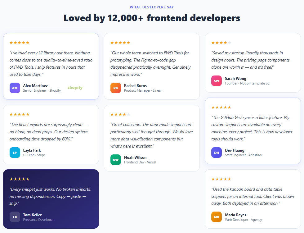
Testimonial walls are one of the most persuasive trust-building elements on SaaS and product landing pages — a dense grid of authentic customer quotes that communicates social proof at scale. A wall of 7–8 testimonials signals "many people use this" far more convincingly than a three-quote slider. This snippet builds a three-column masonry-style testimonial grid with gradient avatars, star ratings, featured card highlight, dark card variant, company attribution, and responsive column stacking.
Testimonial walls appear on the pricing pages of Notion, Linear, Stripe, Vercel, and virtually every high-converting SaaS product. The design challenge is making a dense grid of quotes feel readable rather than overwhelming — varied card heights, subtle hover lifts, featured card highlighting, and the dark card variant all create visual rhythm across the grid.
CSS Grid masonry column layout
True CSS masonry (using grid-template-rows: masonry) has limited browser support, so this implementation uses three explicit column divs with align-items: start on the grid. Each column is a flex column, and cards stack naturally within their column. Cards in different columns that have different text lengths will sit at different heights — this is the intentional "masonry" effect achieved without JavaScript. The approach is pure CSS and works in all modern browsers.
Gradient avatar system
Each testimonial uses an initials-based avatar with a --av CSS custom property accepting any CSS background value — solid colours, gradients, or even rgba for the dark card's translucent avatar. The gradient pairs (indigo/violet, sky/cyan, amber/red, emerald/green, pink/rose) are drawn from the Tailwind CSS palette and create enough visual variety that no two adjacent avatars look the same.
Featured card elevation
The .featured class applies an indigo border (#c7d2fe) and a subtle indigo box-shadow (rgba(99,102,241,.1)) — lifting the most impactful quotes slightly above the others. Featured cards are placed first in their column for maximum above-the-fold visibility. This pattern is used by Stripe's testimonial sections.
Dark card for visual rhythm
The dark card (.tcard-dark) breaks the all-white grid with a deep indigo gradient — the same technique used in pricing cards to make one option stand out. It requires careful colour handling: avatar, text, stars, and role label all need light variants. The approach uses modifier classes (.tcard-body-light, .tcard-name-light, .tcard-role-light, .stars-light) rather than descendant selectors, so the dark card is self-contained and portable.
Pair with a carousel for a testimonial slider variant that shows one quote at a time on mobile.
Build with AI
Build, Understand, Optimize, and Extend It With AI
You don't have to work out the column-based masonry trick by hand. Paste this snippet's HTML, CSS, and JS into an AI coding assistant like Claude and ask it to explain exactly why this layout uses three explicit flex columns with align-items start on the parent grid instead of a real CSS masonry value, and how the avatar's dash-av custom property lets one CSS rule accept solid colors, gradients, and translucent rgba values without any extra classes. The same assistant can help optimize it — for instance whether manually distributing testimonials into three hardcoded columns in the markup will visibly unbalance column heights as more are added, or whether the dark-card modifier classes duplicating every text-color rule could be consolidated with CSS custom properties instead. It's also useful for extending the wall: ask it to add a JavaScript-based column-balancing pass that assigns each new testimonial to the currently shortest column, animate cards in with an IntersectionObserver as they scroll into view, or swap initials avatars for real photos with a graceful fallback. Treat the code less like a finished artifact and more like a starting point for a conversation.
Prompt to recreate it
Copy this into your AI assistant of choice to build the effect from scratch, or as a jumping-off point for your own variant:
Build a three-column "testimonial masonry wall" in plain HTML and CSS (no JavaScript required for the base layout) using explicit column divs rather than native CSS masonry.

Requirements:
- A CSS grid with exactly three explicit column child elements, each column itself a flex column with a vertical gap, and align-items start set on the parent grid so columns are only as tall as their own content, allowing cards of different heights to create a staggered "masonry" look purely through natural stacking.
- Each testimonial card must contain a star-rating row, an italicized quote paragraph, and a footer with an avatar, name, and role/company line, wrapped in a semantically appropriate blockquote element.
- The avatar's background must be driven by a single CSS custom property set inline per card so the same avatar rule can accept a solid color, a gradient, or a translucent rgba value without needing separate modifier classes for each case.
- Support a "featured" card variant (a distinct border color and a soft colored box-shadow that elevates specific testimonials without changing their structure) and a "dark" card variant (an inverted color scheme requiring light-text modifier classes on every text element inside it, kept self-contained so the dark card doesn't rely on any parent context).
- Support a partial star rating (e.g. 4 out of 5) by styling one trailing star character with a distinct muted color class rather than removing it from the markup, so the row always renders five star glyphs.
- Cards must lift slightly with a transform and gain a stronger shadow on hover, and the grid must collapse from three columns to two and then to one at defined breakpoints for tablet and mobile widths.
Want to tighten it up first? Run this prompt through the AI Prompt Studio to score it across 8 quality dimensions, catch anti-patterns, and tune the wording for Claude, ChatGPT, or Gemini before you paste it in.
Step by step
How to Use
- 1Paste HTML and CSSA three-column masonry testimonial grid appears with 7 quotes. Card heights vary naturally based on quote length, creating the masonry staggered look.
- 2Identify the featured cardsAlex Martinez's and Dev Huang's cards have an indigo border and subtle shadow — the featured highlight for the most compelling quotes.
- 3Find the dark cardTom Keller's card uses a deep indigo gradient — a visual break that adds rhythm to the all-white grid.
- 4Hover over any cardCards lift with a gentle
translateY(-2px)and box-shadow on hover — a consistent interactive affordance across the grid. - 5Swap the testimonialsReplace the
<p class="tcard-body">text, update the initials in.avatar, change--avto any CSS gradient, and update name and role. - 6Adjust the column layoutMove
<blockquote>elements between the three.masonry-coldivs to balance column heights. Longer quotes should be distributed evenly.
Real-world uses
Common Use Cases
Got questions?
Frequently Asked Questions
Use JavaScript to sort testimonials by character count and distribute them to columns in a round-robin order starting with the longest quote in column 1. Alternatively, use the CSS column-count: 3 + column-gap: 16px approach with break-inside: avoid on each card — this gives true masonry but can reorder cards reading top-to-bottom per column.
Add an IntersectionObserver that adds an .visible class when cards enter the viewport. In CSS: .tcard { opacity: 0; transform: translateY(16px); transition: opacity .5s, transform .5s } and .tcard.visible { opacity: 1; transform: none }. Add staggered transition-delay based on the card's column index for a wave effect.
Replace the .avatar div with <img src="logo.png" alt="Company" class="logo-img">. Add .logo-img { width: 80px; height: 30px; object-fit: contain; opacity: .7 }. Place the logo in the .tcard-footer alongside the reviewer name and role.
Create a TestimonialCard component with {body, name, role, rating, featured, dark, avatarGradient} props. The masonry grid renders three column arrays split from a testimonials data array: [col1, col2, col3] = [0,3,6].map(i => testimonials.slice(i, i+3)). Each column renders a <div class="masonry-col"> mapping to TestimonialCard components.