More Cards Snippets
Customer Review Card — Star Rating HTML CSS JS Snippet
Customer Review Card · Cards · Plain HTML, CSS & JS · Live preview
What's included
Features
voted class toggles on click — count increments/decrements optimistically. Green state confirms the vote without a toast or page reload.--av on each .avatar sets the background colour inline — one attribute per reviewer, supports any CSS colour value..star-empty span on trailing stars + a variant class (.stars-4, .stars-3) on the parent renders 4-star and 3-star ratings with grey unfilled stars..featured adds an indigo border and subtle gradient background — highlights the editor's pick or most helpful review..negative adds a red border — shows authenticity by surfacing lower-rated reviews alongside five-star ones.<span class="verified">✓ Verified</span> inside reviewer-meta renders a green checkmark badge inline with the review date..tags-row with .tag spans categorises review aspects (Quality, Value, Support). Easy to remove — just delete the tags-row div.repeat(2, 1fr) on desktop, single column on mobile via @media(max-width:600px). Cards adapt without layout shifts.About this UI Snippet
Customer Review Card — Star Rating System, Helpful Vote Toggle & Verified Badge Pattern
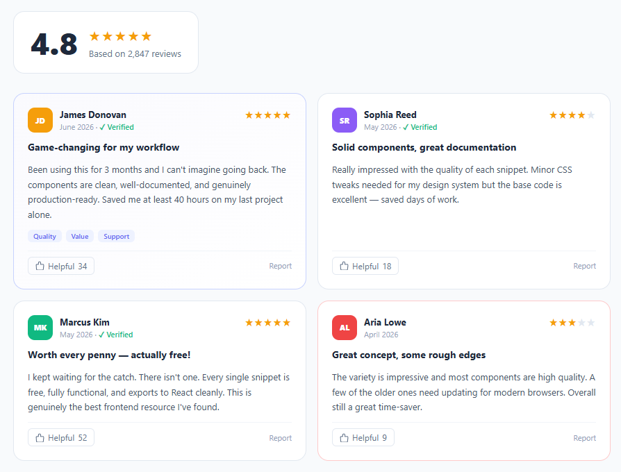
Customer review cards are a trust-building cornerstone of e-commerce, SaaS, and marketplace UIs. A well-designed review card communicates credibility — reviewer identity, star score, verification status, review content, and community validation (helpful votes) — in a compact, scannable format. This snippet builds a full review card grid with rating summary, avatar initials, star rating (full and partial), verified purchase badge, tag chips, togglable helpful vote button, and featured/negative card variants.
Review cards appear on product pages, SaaS pricing pages, testimonials sections, and marketplace listings. The design challenge is fitting reviewer identity, rating, content, and social proof signals into a card that works at both desktop (two-column grid) and mobile (single column) without feeling cramped.
Avatar initials with CSS custom property colour
Each avatar uses a two-letter initials abbreviation with a background colour set via --av CSS custom property. This approach avoids the complexity of loading user profile images while maintaining visual variety across reviewers. The gradient background uses background: var(--av) which accepts any CSS colour value — so you can pass hex, RGB, or gradient strings. The avatar is a fixed 36×36px rounded square (border-radius: 10px), matching the icon badge pattern from feature cards.
Star rating with partial fill
The full star rating uses HTML entity ★ (U+2605) styled with color: #f59e0b (amber). Partial ratings — 4-star and 3-star variants — use a .star-empty span for the unfilled portion styled in #e2e8f0 (light grey). This CSS-only approach requires no SVG masking or JavaScript calculations — just split the star characters at the rating boundary. For a more precise half-star or percentage fill, the svg-progress-ring technique applies.
Helpful vote toggle with optimistic UI
The "Helpful" button uses a voted class toggled by the vote(btn) function. On click, the count increments immediately (optimistic UI) and the button changes to green — no server round-trip required for the visual state. A second click reverses the vote. This pattern matches Amazon, Yelp, and Trustpilot's helpful vote interaction. The voted state uses background: #f0fdf4 with a green border — a clear confirmation state that doesn't require a modal or toast notification.
Featured and negative card variants
The .featured card uses a subtle indigo border (#c7d2fe) and light gradient background to elevate the highest-quality review. The .negative card uses a red border (#fecaca) — critical for authenticity; showing mixed reviews builds more trust than showing only five-star reviews. Both variants are pure CSS class additions requiring no structural HTML changes.
Rating summary bar
The section header shows the overall score as a large number (44px, weight 900) alongside star icons and review count. This "above-the-fold trust signal" pattern matches the approach used by Amazon's product pages and App Store listings. Pair this with a stats card for numeric KPI displays in dashboard contexts.
Step by step
How to Use
- 1Paste HTML, CSS, and JSA two-column review grid appears with a rating summary above. Four review cards show — featured (indigo border), standard, and negative (red border) variants.
- 2Click any Helpful buttonThe button turns green, the count increments by one. Click again to un-vote and decrement. Each button tracks its own vote state independently.
- 3Change the avatar colourEach
.avatarhas an inlinestyle="--av:#colour"attribute. Pass any CSS colour — hex, hsl, or even a gradient string — to customise each reviewer's avatar. - 4Set the star ratingUse full ★ characters for filled stars and wrap empty stars in
<span class="star-empty">★</span>. Add.stars-4or.stars-3to the parent for the right grey styling. - 5Add a featured reviewAdd
class="review-card featured"for the indigo-bordered highlight card. Addclass="review-card negative"for a red-bordered lower-rated review. - 6Swap review contentReplace reviewer name, date, title, body, and tag chips. Add or remove
<span class="tag">elements inside.tags-rowfor category labels.
Real-world uses
Common Use Cases
Got questions?
Frequently Asked Questions
Add a .rating-bars section to the rating summary. Each bar is a <div class="bar-row"> containing the star label, a <div class="bar-fill" with a percentage width, and a count. Use CSS transition on width for an animated fill on page load.
Add a "Load more" button below the grid. On click, fetch more reviews via API, create card elements from a template, and append them to .reviews-grid. For infinite scroll, use an IntersectionObserver on a sentinel element below the last card. See the infinite scroll snippet.
Add a <select> sort control above the grid. On change, read the sort value, sort the review data array, and re-render the cards. Store review objects in a JS array with date, helpful, and rating fields for easy sorting.
Create a ReviewCard component accepting {name, date, rating, title, body, tags, helpfulCount, verified, variant} props. The helpful vote state becomes const [voted, setVoted] = useState(false) and const [count, setCount] = useState(helpfulCount). The parent ReviewGrid maps a reviews array to ReviewCard instances.
Customer Review Card — Export as HTML, React, Vue, Angular & Tailwind
<!DOCTYPE html>
<html lang="en">
<head>
<meta charset="UTF-8" />
<meta name="viewport" content="width=device-width, initial-scale=1.0" />
<title>Customer Review Card</title>
<style>
*{box-sizing:border-box;margin:0;padding:0}
body{font-family:system-ui,sans-serif;background:#f8fafc;min-height:100vh;padding:32px 20px}
.page{max-width:860px;margin:0 auto}
.section-head{margin-bottom:28px}
.rating-summary{display:flex;align-items:center;gap:16px;background:#fff;border:1.5px solid #e2e8f0;border-radius:16px;padding:20px 24px;width:fit-content}
.big-score{font-size:44px;font-weight:900;color:#1e293b;line-height:1}
.stars-row{color:#f59e0b;font-size:20px;letter-spacing:2px;margin-bottom:4px}
.rating-count{font-size:13px;color:#64748b}
.reviews-grid{display:grid;grid-template-columns:repeat(2,1fr);gap:16px}
.review-card{background:#fff;border:1.5px solid #e2e8f0;border-radius:16px;padding:20px;display:flex;flex-direction:column;gap:12px;transition:box-shadow .2s,transform .2s}
.review-card:hover{box-shadow:0 8px 30px rgba(0,0,0,.08);transform:translateY(-2px)}
.review-card.featured{border-color:#c7d2fe;background:linear-gradient(145deg,#fafafe,#fff)}
.review-card.negative{border-color:#fecaca}
.review-top{display:flex;align-items:flex-start;justify-content:space-between;gap:12px}
.reviewer{display:flex;align-items:center;gap:10px}
.avatar{width:36px;height:36px;border-radius:10px;background:var(--av);display:flex;align-items:center;justify-content:center;font-size:11px;font-weight:800;color:#fff;flex-shrink:0}
.reviewer-info{display:flex;flex-direction:column;gap:2px}
.reviewer-name{font-size:13px;font-weight:700;color:#1e293b}
.reviewer-meta{font-size:11px;color:#94a3b8}
.verified{color:#10b981;font-weight:600}
.stars{color:#f59e0b;font-size:15px;letter-spacing:1px;white-space:nowrap}
.stars-4 .star-empty,.stars-3 .star-empty{color:#e2e8f0}
.review-title{font-size:14px;font-weight:700;color:#1e293b;line-height:1.3}
.review-body{font-size:13px;color:#475569;line-height:1.65;flex:1}
.tags-row{display:flex;gap:6px;flex-wrap:wrap}
.tag{font-size:10px;font-weight:600;color:#6366f1;background:#eef2ff;border-radius:6px;padding:2px 8px}
.review-footer{display:flex;align-items:center;justify-content:space-between;margin-top:auto;padding-top:8px;border-top:1px solid #f1f5f9}
.helpful-btn{display:flex;align-items:center;gap:5px;font-size:12px;color:#64748b;background:none;border:1px solid #e2e8f0;border-radius:6px;padding:4px 10px;cursor:pointer;transition:all .15s;font-family:inherit}
.helpful-btn:hover,.helpful-btn.voted{background:#f0fdf4;border-color:#86efac;color:#16a34a}
.helpful-btn.voted svg{stroke:#16a34a}
.report-btn{font-size:11px;color:#94a3b8;background:none;border:none;cursor:pointer;font-family:inherit;transition:color .15s}
.report-btn:hover{color:#ef4444}
@media(max-width:600px){.reviews-grid{grid-template-columns:1fr}}
</style>
</head>
<body>
<div class="page">
<div class="section-head">
<div class="rating-summary">
<span class="big-score">4.8</span>
<div>
<div class="stars-row">★★★★★</div>
<div class="rating-count">Based on 2,847 reviews</div>
</div>
</div>
</div>
<div class="reviews-grid">
<article class="review-card featured">
<div class="review-top">
<div class="reviewer">
<div class="avatar" style="--av:#f59e0b">JD</div>
<div class="reviewer-info">
<span class="reviewer-name">James Donovan</span>
<span class="reviewer-meta">June 2026 · <span class="verified">✓ Verified</span></span>
</div>
</div>
<div class="stars">★★★★★</div>
</div>
<h3 class="review-title">Game-changing for my workflow</h3>
<p class="review-body">Been using this for 3 months and I can't imagine going back. The components are clean, well-documented, and genuinely production-ready. Saved me at least 40 hours on my last project alone.</p>
<div class="tags-row">
<span class="tag">Quality</span><span class="tag">Value</span><span class="tag">Support</span>
</div>
<div class="review-footer">
<button class="helpful-btn" onclick="vote(this)">
<svg width="13" height="13" viewBox="0 0 24 24" fill="none" stroke="currentColor" stroke-width="2" stroke-linecap="round"><path d="M14 9V5a3 3 0 0 0-6 0v4H4a2 2 0 0 0-2 2l1 11a2 2 0 0 0 2 2h14a2 2 0 0 0 2-2l1-11a2 2 0 0 0-2-2h-4z"/></svg>
Helpful <span class="vote-count">34</span>
</button>
<button class="report-btn">Report</button>
</div>
</article>
<article class="review-card">
<div class="review-top">
<div class="reviewer">
<div class="avatar" style="--av:#8b5cf6">SR</div>
<div class="reviewer-info">
<span class="reviewer-name">Sophia Reed</span>
<span class="reviewer-meta">May 2026 · <span class="verified">✓ Verified</span></span>
</div>
</div>
<div class="stars stars-4">★★★★<span class="star-empty">★</span></div>
</div>
<h3 class="review-title">Solid components, great documentation</h3>
<p class="review-body">Really impressed with the quality of each snippet. Minor CSS tweaks needed for my design system but the base code is excellent — saved days of work.</p>
<div class="review-footer">
<button class="helpful-btn" onclick="vote(this)">
<svg width="13" height="13" viewBox="0 0 24 24" fill="none" stroke="currentColor" stroke-width="2" stroke-linecap="round"><path d="M14 9V5a3 3 0 0 0-6 0v4H4a2 2 0 0 0-2 2l1 11a2 2 0 0 0 2 2h14a2 2 0 0 0 2-2l1-11a2 2 0 0 0-2-2h-4z"/></svg>
Helpful <span class="vote-count">18</span>
</button>
<button class="report-btn">Report</button>
</div>
</article>
<article class="review-card">
<div class="review-top">
<div class="reviewer">
<div class="avatar" style="--av:#10b981">MK</div>
<div class="reviewer-info">
<span class="reviewer-name">Marcus Kim</span>
<span class="reviewer-meta">May 2026 · <span class="verified">✓ Verified</span></span>
</div>
</div>
<div class="stars">★★★★★</div>
</div>
<h3 class="review-title">Worth every penny — actually free!</h3>
<p class="review-body">I kept waiting for the catch. There isn't one. Every single snippet is free, fully functional, and exports to React cleanly. This is genuinely the best frontend resource I've found.</p>
<div class="review-footer">
<button class="helpful-btn" onclick="vote(this)">
<svg width="13" height="13" viewBox="0 0 24 24" fill="none" stroke="currentColor" stroke-width="2" stroke-linecap="round"><path d="M14 9V5a3 3 0 0 0-6 0v4H4a2 2 0 0 0-2 2l1 11a2 2 0 0 0 2 2h14a2 2 0 0 0 2-2l1-11a2 2 0 0 0-2-2h-4z"/></svg>
Helpful <span class="vote-count">52</span>
</button>
<button class="report-btn">Report</button>
</div>
</article>
<article class="review-card negative">
<div class="review-top">
<div class="reviewer">
<div class="avatar" style="--av:#ef4444">AL</div>
<div class="reviewer-info">
<span class="reviewer-name">Aria Lowe</span>
<span class="reviewer-meta">April 2026</span>
</div>
</div>
<div class="stars stars-3">★★★<span class="star-empty">★★</span></div>
</div>
<h3 class="review-title">Great concept, some rough edges</h3>
<p class="review-body">The variety is impressive and most components are high quality. A few of the older ones need updating for modern browsers. Overall still a great time-saver.</p>
<div class="review-footer">
<button class="helpful-btn" onclick="vote(this)">
<svg width="13" height="13" viewBox="0 0 24 24" fill="none" stroke="currentColor" stroke-width="2" stroke-linecap="round"><path d="M14 9V5a3 3 0 0 0-6 0v4H4a2 2 0 0 0-2 2l1 11a2 2 0 0 0 2 2h14a2 2 0 0 0 2-2l1-11a2 2 0 0 0-2-2h-4z"/></svg>
Helpful <span class="vote-count">9</span>
</button>
<button class="report-btn">Report</button>
</div>
</article>
</div>
</div>
<script>
function vote(btn) {
if (btn.classList.contains('voted')) {
btn.classList.remove('voted');
btn.querySelector('.vote-count').textContent = parseInt(btn.querySelector('.vote-count').textContent) - 1;
} else {
btn.classList.add('voted');
btn.querySelector('.vote-count').textContent = parseInt(btn.querySelector('.vote-count').textContent) + 1;
}
}
</script>
</body>
</html><!DOCTYPE html>
<html lang="en">
<head>
<meta charset="UTF-8" />
<meta name="viewport" content="width=device-width, initial-scale=1.0" />
<title>Customer Review Card</title>
<!-- Tailwind CSS v3+ — arbitrary value classes (e.g. bg-[#0f172a]) are valid -->
<script src="https://cdn.tailwindcss.com"></script>
<style>
* {
box-sizing:border-box;margin:0;padding:0
}
body {
font-family:system-ui,sans-serif;background:#f8fafc;min-height:100vh;padding:32px 20px
}
.review-card.featured {
border-color:#c7d2fe;background:linear-gradient(145deg,#fafafe,#fff)
}
.review-card.negative {
border-color:#fecaca
}
.stars-4 .star-empty,.stars-3 .star-empty {
color:#e2e8f0
}
.helpful-btn:hover,.helpful-btn.voted {
background:#f0fdf4;border-color:#86efac;color:#16a34a
}
.helpful-btn.voted svg {
stroke:#16a34a
}
</style>
</head>
<body>
<div class="max-w-[860px] my-0 mx-auto">
<div class="mb-7">
<div class="flex items-center gap-4 bg-[#fff] border rounded-2xl py-5 px-6 w-fit">
<span class="text-[44px] font-black text-[#1e293b] leading-none">4.8</span>
<div>
<div class="text-[#f59e0b] text-xl tracking-[2px] mb-1">★★★★★</div>
<div class="text-[13px] text-[#64748b]">Based on 2,847 reviews</div>
</div>
</div>
</div>
<div class="grid grid-cols-2 gap-4 max-[600px]:grid-cols-1">
<article class="review-card bg-[#fff] border rounded-2xl p-5 flex flex-col gap-3 [transition:box-shadow_.2s,transform_.2s] hover:shadow-[0_8px_30px_rgba(0,0,0,.08)] hover:[transform:translateY(-2px)] featured">
<div class="flex items-start justify-between gap-3">
<div class="flex items-center gap-2.5">
<div class="w-9 h-9 rounded-[10px] [background:var(--av)] flex items-center justify-center text-[11px] font-extrabold text-[#fff] shrink-0" style="--av:#f59e0b">JD</div>
<div class="flex flex-col gap-0.5">
<span class="text-[13px] font-bold text-[#1e293b]">James Donovan</span>
<span class="text-[11px] text-[#94a3b8]">June 2026 · <span class="text-[#10b981] font-semibold">✓ Verified</span></span>
</div>
</div>
<div class="text-[#f59e0b] text-[15px] tracking-[1px] whitespace-nowrap">★★★★★</div>
</div>
<h3 class="text-sm font-bold text-[#1e293b] leading-[1.3]">Game-changing for my workflow</h3>
<p class="text-[13px] text-[#475569] leading-[1.65] flex-1">Been using this for 3 months and I can't imagine going back. The components are clean, well-documented, and genuinely production-ready. Saved me at least 40 hours on my last project alone.</p>
<div class="flex gap-1.5 flex-wrap">
<span class="text-xs font-semibold text-[#6366f1] bg-[#eef2ff] rounded-md py-0.5 px-2">Quality</span><span class="text-xs font-semibold text-[#6366f1] bg-[#eef2ff] rounded-md py-0.5 px-2">Value</span><span class="text-xs font-semibold text-[#6366f1] bg-[#eef2ff] rounded-md py-0.5 px-2">Support</span>
</div>
<div class="flex items-center justify-between mt-auto pt-2 border-t border-t-[#f1f5f9]">
<button class="helpful-btn flex items-center gap-[5px] text-xs text-[#64748b] bg-transparent border border-[#e2e8f0] rounded-md py-1 px-2.5 cursor-pointer [transition:all_.15s] font-[inherit]" onclick="vote(this)">
<svg width="13" height="13" viewBox="0 0 24 24" fill="none" stroke="currentColor" stroke-width="2" stroke-linecap="round"><path d="M14 9V5a3 3 0 0 0-6 0v4H4a2 2 0 0 0-2 2l1 11a2 2 0 0 0 2 2h14a2 2 0 0 0 2-2l1-11a2 2 0 0 0-2-2h-4z"/></svg>
Helpful <span class="vote-count">34</span>
</button>
<button class="text-[11px] text-[#94a3b8] bg-transparent border-0 cursor-pointer font-[inherit] [transition:color_.15s] hover:text-[#ef4444]">Report</button>
</div>
</article>
<article class="review-card bg-[#fff] border rounded-2xl p-5 flex flex-col gap-3 [transition:box-shadow_.2s,transform_.2s] hover:shadow-[0_8px_30px_rgba(0,0,0,.08)] hover:[transform:translateY(-2px)]">
<div class="flex items-start justify-between gap-3">
<div class="flex items-center gap-2.5">
<div class="w-9 h-9 rounded-[10px] [background:var(--av)] flex items-center justify-center text-[11px] font-extrabold text-[#fff] shrink-0" style="--av:#8b5cf6">SR</div>
<div class="flex flex-col gap-0.5">
<span class="text-[13px] font-bold text-[#1e293b]">Sophia Reed</span>
<span class="text-[11px] text-[#94a3b8]">May 2026 · <span class="text-[#10b981] font-semibold">✓ Verified</span></span>
</div>
</div>
<div class="text-[#f59e0b] text-[15px] tracking-[1px] whitespace-nowrap stars-4">★★★★<span class="star-empty">★</span></div>
</div>
<h3 class="text-sm font-bold text-[#1e293b] leading-[1.3]">Solid components, great documentation</h3>
<p class="text-[13px] text-[#475569] leading-[1.65] flex-1">Really impressed with the quality of each snippet. Minor CSS tweaks needed for my design system but the base code is excellent — saved days of work.</p>
<div class="flex items-center justify-between mt-auto pt-2 border-t border-t-[#f1f5f9]">
<button class="helpful-btn flex items-center gap-[5px] text-xs text-[#64748b] bg-transparent border border-[#e2e8f0] rounded-md py-1 px-2.5 cursor-pointer [transition:all_.15s] font-[inherit]" onclick="vote(this)">
<svg width="13" height="13" viewBox="0 0 24 24" fill="none" stroke="currentColor" stroke-width="2" stroke-linecap="round"><path d="M14 9V5a3 3 0 0 0-6 0v4H4a2 2 0 0 0-2 2l1 11a2 2 0 0 0 2 2h14a2 2 0 0 0 2-2l1-11a2 2 0 0 0-2-2h-4z"/></svg>
Helpful <span class="vote-count">18</span>
</button>
<button class="text-[11px] text-[#94a3b8] bg-transparent border-0 cursor-pointer font-[inherit] [transition:color_.15s] hover:text-[#ef4444]">Report</button>
</div>
</article>
<article class="review-card bg-[#fff] border rounded-2xl p-5 flex flex-col gap-3 [transition:box-shadow_.2s,transform_.2s] hover:shadow-[0_8px_30px_rgba(0,0,0,.08)] hover:[transform:translateY(-2px)]">
<div class="flex items-start justify-between gap-3">
<div class="flex items-center gap-2.5">
<div class="w-9 h-9 rounded-[10px] [background:var(--av)] flex items-center justify-center text-[11px] font-extrabold text-[#fff] shrink-0" style="--av:#10b981">MK</div>
<div class="flex flex-col gap-0.5">
<span class="text-[13px] font-bold text-[#1e293b]">Marcus Kim</span>
<span class="text-[11px] text-[#94a3b8]">May 2026 · <span class="text-[#10b981] font-semibold">✓ Verified</span></span>
</div>
</div>
<div class="text-[#f59e0b] text-[15px] tracking-[1px] whitespace-nowrap">★★★★★</div>
</div>
<h3 class="text-sm font-bold text-[#1e293b] leading-[1.3]">Worth every penny — actually free!</h3>
<p class="text-[13px] text-[#475569] leading-[1.65] flex-1">I kept waiting for the catch. There isn't one. Every single snippet is free, fully functional, and exports to React cleanly. This is genuinely the best frontend resource I've found.</p>
<div class="flex items-center justify-between mt-auto pt-2 border-t border-t-[#f1f5f9]">
<button class="helpful-btn flex items-center gap-[5px] text-xs text-[#64748b] bg-transparent border border-[#e2e8f0] rounded-md py-1 px-2.5 cursor-pointer [transition:all_.15s] font-[inherit]" onclick="vote(this)">
<svg width="13" height="13" viewBox="0 0 24 24" fill="none" stroke="currentColor" stroke-width="2" stroke-linecap="round"><path d="M14 9V5a3 3 0 0 0-6 0v4H4a2 2 0 0 0-2 2l1 11a2 2 0 0 0 2 2h14a2 2 0 0 0 2-2l1-11a2 2 0 0 0-2-2h-4z"/></svg>
Helpful <span class="vote-count">52</span>
</button>
<button class="text-[11px] text-[#94a3b8] bg-transparent border-0 cursor-pointer font-[inherit] [transition:color_.15s] hover:text-[#ef4444]">Report</button>
</div>
</article>
<article class="review-card bg-[#fff] border rounded-2xl p-5 flex flex-col gap-3 [transition:box-shadow_.2s,transform_.2s] hover:shadow-[0_8px_30px_rgba(0,0,0,.08)] hover:[transform:translateY(-2px)] negative">
<div class="flex items-start justify-between gap-3">
<div class="flex items-center gap-2.5">
<div class="w-9 h-9 rounded-[10px] [background:var(--av)] flex items-center justify-center text-[11px] font-extrabold text-[#fff] shrink-0" style="--av:#ef4444">AL</div>
<div class="flex flex-col gap-0.5">
<span class="text-[13px] font-bold text-[#1e293b]">Aria Lowe</span>
<span class="text-[11px] text-[#94a3b8]">April 2026</span>
</div>
</div>
<div class="text-[#f59e0b] text-[15px] tracking-[1px] whitespace-nowrap stars-3">★★★<span class="star-empty">★★</span></div>
</div>
<h3 class="text-sm font-bold text-[#1e293b] leading-[1.3]">Great concept, some rough edges</h3>
<p class="text-[13px] text-[#475569] leading-[1.65] flex-1">The variety is impressive and most components are high quality. A few of the older ones need updating for modern browsers. Overall still a great time-saver.</p>
<div class="flex items-center justify-between mt-auto pt-2 border-t border-t-[#f1f5f9]">
<button class="helpful-btn flex items-center gap-[5px] text-xs text-[#64748b] bg-transparent border border-[#e2e8f0] rounded-md py-1 px-2.5 cursor-pointer [transition:all_.15s] font-[inherit]" onclick="vote(this)">
<svg width="13" height="13" viewBox="0 0 24 24" fill="none" stroke="currentColor" stroke-width="2" stroke-linecap="round"><path d="M14 9V5a3 3 0 0 0-6 0v4H4a2 2 0 0 0-2 2l1 11a2 2 0 0 0 2 2h14a2 2 0 0 0 2-2l1-11a2 2 0 0 0-2-2h-4z"/></svg>
Helpful <span class="vote-count">9</span>
</button>
<button class="text-[11px] text-[#94a3b8] bg-transparent border-0 cursor-pointer font-[inherit] [transition:color_.15s] hover:text-[#ef4444]">Report</button>
</div>
</article>
</div>
</div>
<script>
function vote(btn) {
if (btn.classList.contains('voted')) {
btn.classList.remove('voted');
btn.querySelector('.vote-count').textContent = parseInt(btn.querySelector('.vote-count').textContent) - 1;
} else {
btn.classList.add('voted');
btn.querySelector('.vote-count').textContent = parseInt(btn.querySelector('.vote-count').textContent) + 1;
}
}
</script>
</body>
</html>import React, { useEffect } from 'react';
// CSS — optionally move to CustomerReviewCard.module.css
const css = `
*{box-sizing:border-box;margin:0;padding:0}
body{font-family:system-ui,sans-serif;background:#f8fafc;min-height:100vh;padding:32px 20px}
.page{max-width:860px;margin:0 auto}
.section-head{margin-bottom:28px}
.rating-summary{display:flex;align-items:center;gap:16px;background:#fff;border:1.5px solid #e2e8f0;border-radius:16px;padding:20px 24px;width:fit-content}
.big-score{font-size:44px;font-weight:900;color:#1e293b;line-height:1}
.stars-row{color:#f59e0b;font-size:20px;letter-spacing:2px;margin-bottom:4px}
.rating-count{font-size:13px;color:#64748b}
.reviews-grid{display:grid;grid-template-columns:repeat(2,1fr);gap:16px}
.review-card{background:#fff;border:1.5px solid #e2e8f0;border-radius:16px;padding:20px;display:flex;flex-direction:column;gap:12px;transition:box-shadow .2s,transform .2s}
.review-card:hover{box-shadow:0 8px 30px rgba(0,0,0,.08);transform:translateY(-2px)}
.review-card.featured{border-color:#c7d2fe;background:linear-gradient(145deg,#fafafe,#fff)}
.review-card.negative{border-color:#fecaca}
.review-top{display:flex;align-items:flex-start;justify-content:space-between;gap:12px}
.reviewer{display:flex;align-items:center;gap:10px}
.avatar{width:36px;height:36px;border-radius:10px;background:var(--av);display:flex;align-items:center;justify-content:center;font-size:11px;font-weight:800;color:#fff;flex-shrink:0}
.reviewer-info{display:flex;flex-direction:column;gap:2px}
.reviewer-name{font-size:13px;font-weight:700;color:#1e293b}
.reviewer-meta{font-size:11px;color:#94a3b8}
.verified{color:#10b981;font-weight:600}
.stars{color:#f59e0b;font-size:15px;letter-spacing:1px;white-space:nowrap}
.stars-4 .star-empty,.stars-3 .star-empty{color:#e2e8f0}
.review-title{font-size:14px;font-weight:700;color:#1e293b;line-height:1.3}
.review-body{font-size:13px;color:#475569;line-height:1.65;flex:1}
.tags-row{display:flex;gap:6px;flex-wrap:wrap}
.tag{font-size:10px;font-weight:600;color:#6366f1;background:#eef2ff;border-radius:6px;padding:2px 8px}
.review-footer{display:flex;align-items:center;justify-content:space-between;margin-top:auto;padding-top:8px;border-top:1px solid #f1f5f9}
.helpful-btn{display:flex;align-items:center;gap:5px;font-size:12px;color:#64748b;background:none;border:1px solid #e2e8f0;border-radius:6px;padding:4px 10px;cursor:pointer;transition:all .15s;font-family:inherit}
.helpful-btn:hover,.helpful-btn.voted{background:#f0fdf4;border-color:#86efac;color:#16a34a}
.helpful-btn.voted svg{stroke:#16a34a}
.report-btn{font-size:11px;color:#94a3b8;background:none;border:none;cursor:pointer;font-family:inherit;transition:color .15s}
.report-btn:hover{color:#ef4444}
@media(max-width:600px){.reviews-grid{grid-template-columns:1fr}}
`;
export default function CustomerReviewCard() {
// Auto-generated escape hatch: the original snippet's vanilla JS runs once
// after mount and queries the rendered DOM. For idiomatic React, lift this
// into state + handlers.
useEffect(() => {
const _listeners = [];
const _originalAddEventListener = EventTarget.prototype.addEventListener;
EventTarget.prototype.addEventListener = function(type, listener, options) {
_listeners.push({ target: this, type, listener, options });
return _originalAddEventListener.call(this, type, listener, options);
};
function vote(btn) {
if (btn.classList.contains('voted')) {
btn.classList.remove('voted');
btn.querySelector('.vote-count').textContent = parseInt(btn.querySelector('.vote-count').textContent) - 1;
} else {
btn.classList.add('voted');
btn.querySelector('.vote-count').textContent = parseInt(btn.querySelector('.vote-count').textContent) + 1;
}
}
// Cleanup: restore addEventListener and remove all listeners
return () => {
EventTarget.prototype.addEventListener = _originalAddEventListener;
for (const { target, type, listener, options } of _listeners) {
target.removeEventListener(type, listener, options);
}
};
// Expose handlers used by inline JSX events to the global scope
if (typeof vote === 'function') window.vote = vote;
}, []);
return (
<>
<style>{css}</style>
<div className="page">
<div className="section-head">
<div className="rating-summary">
<span className="big-score">4.8</span>
<div>
<div className="stars-row">★★★★★</div>
<div className="rating-count">Based on 2,847 reviews</div>
</div>
</div>
</div>
<div className="reviews-grid">
<article className="review-card featured">
<div className="review-top">
<div className="reviewer">
<div className="avatar" style={{ '--av': '#f59e0b' }}>JD</div>
<div className="reviewer-info">
<span className="reviewer-name">James Donovan</span>
<span className="reviewer-meta">June 2026 · <span className="verified">✓ Verified</span></span>
</div>
</div>
<div className="stars">★★★★★</div>
</div>
<h3 className="review-title">Game-changing for my workflow</h3>
<p className="review-body">Been using this for 3 months and I can't imagine going back. The components are clean, well-documented, and genuinely production-ready. Saved me at least 40 hours on my last project alone.</p>
<div className="tags-row">
<span className="tag">Quality</span><span className="tag">Value</span><span className="tag">Support</span>
</div>
<div className="review-footer">
<button className="helpful-btn" onClick={(event) => { vote(event.currentTarget) }}>
<svg width="13" height="13" viewBox="0 0 24 24" fill="none" stroke="currentColor" strokeWidth="2" strokeLinecap="round"><path d="M14 9V5a3 3 0 0 0-6 0v4H4a2 2 0 0 0-2 2l1 11a2 2 0 0 0 2 2h14a2 2 0 0 0 2-2l1-11a2 2 0 0 0-2-2h-4z"/></svg>
Helpful <span className="vote-count">34</span>
</button>
<button className="report-btn">Report</button>
</div>
</article>
<article className="review-card">
<div className="review-top">
<div className="reviewer">
<div className="avatar" style={{ '--av': '#8b5cf6' }}>SR</div>
<div className="reviewer-info">
<span className="reviewer-name">Sophia Reed</span>
<span className="reviewer-meta">May 2026 · <span className="verified">✓ Verified</span></span>
</div>
</div>
<div className="stars stars-4">★★★★<span className="star-empty">★</span></div>
</div>
<h3 className="review-title">Solid components, great documentation</h3>
<p className="review-body">Really impressed with the quality of each snippet. Minor CSS tweaks needed for my design system but the base code is excellent — saved days of work.</p>
<div className="review-footer">
<button className="helpful-btn" onClick={(event) => { vote(event.currentTarget) }}>
<svg width="13" height="13" viewBox="0 0 24 24" fill="none" stroke="currentColor" strokeWidth="2" strokeLinecap="round"><path d="M14 9V5a3 3 0 0 0-6 0v4H4a2 2 0 0 0-2 2l1 11a2 2 0 0 0 2 2h14a2 2 0 0 0 2-2l1-11a2 2 0 0 0-2-2h-4z"/></svg>
Helpful <span className="vote-count">18</span>
</button>
<button className="report-btn">Report</button>
</div>
</article>
<article className="review-card">
<div className="review-top">
<div className="reviewer">
<div className="avatar" style={{ '--av': '#10b981' }}>MK</div>
<div className="reviewer-info">
<span className="reviewer-name">Marcus Kim</span>
<span className="reviewer-meta">May 2026 · <span className="verified">✓ Verified</span></span>
</div>
</div>
<div className="stars">★★★★★</div>
</div>
<h3 className="review-title">Worth every penny — actually free!</h3>
<p className="review-body">I kept waiting for the catch. There isn't one. Every single snippet is free, fully functional, and exports to React cleanly. This is genuinely the best frontend resource I've found.</p>
<div className="review-footer">
<button className="helpful-btn" onClick={(event) => { vote(event.currentTarget) }}>
<svg width="13" height="13" viewBox="0 0 24 24" fill="none" stroke="currentColor" strokeWidth="2" strokeLinecap="round"><path d="M14 9V5a3 3 0 0 0-6 0v4H4a2 2 0 0 0-2 2l1 11a2 2 0 0 0 2 2h14a2 2 0 0 0 2-2l1-11a2 2 0 0 0-2-2h-4z"/></svg>
Helpful <span className="vote-count">52</span>
</button>
<button className="report-btn">Report</button>
</div>
</article>
<article className="review-card negative">
<div className="review-top">
<div className="reviewer">
<div className="avatar" style={{ '--av': '#ef4444' }}>AL</div>
<div className="reviewer-info">
<span className="reviewer-name">Aria Lowe</span>
<span className="reviewer-meta">April 2026</span>
</div>
</div>
<div className="stars stars-3">★★★<span className="star-empty">★★</span></div>
</div>
<h3 className="review-title">Great concept, some rough edges</h3>
<p className="review-body">The variety is impressive and most components are high quality. A few of the older ones need updating for modern browsers. Overall still a great time-saver.</p>
<div className="review-footer">
<button className="helpful-btn" onClick={(event) => { vote(event.currentTarget) }}>
<svg width="13" height="13" viewBox="0 0 24 24" fill="none" stroke="currentColor" strokeWidth="2" strokeLinecap="round"><path d="M14 9V5a3 3 0 0 0-6 0v4H4a2 2 0 0 0-2 2l1 11a2 2 0 0 0 2 2h14a2 2 0 0 0 2-2l1-11a2 2 0 0 0-2-2h-4z"/></svg>
Helpful <span className="vote-count">9</span>
</button>
<button className="report-btn">Report</button>
</div>
</article>
</div>
</div>
</>
);
}import React, { useEffect } from 'react';
// Requires Tailwind CSS v3+ — https://tailwindcss.com/docs/installation
// Arbitrary value classes (e.g. bg-[#0f172a]) are valid Tailwind v3+
export default function CustomerReviewCard() {
// Auto-generated escape hatch: the original snippet's vanilla JS runs once
// after mount and queries the rendered DOM. For idiomatic React, lift this
// into state + handlers.
useEffect(() => {
const _listeners = [];
const _originalAddEventListener = EventTarget.prototype.addEventListener;
EventTarget.prototype.addEventListener = function(type, listener, options) {
_listeners.push({ target: this, type, listener, options });
return _originalAddEventListener.call(this, type, listener, options);
};
function vote(btn) {
if (btn.classList.contains('voted')) {
btn.classList.remove('voted');
btn.querySelector('.vote-count').textContent = parseInt(btn.querySelector('.vote-count').textContent) - 1;
} else {
btn.classList.add('voted');
btn.querySelector('.vote-count').textContent = parseInt(btn.querySelector('.vote-count').textContent) + 1;
}
}
// Cleanup: restore addEventListener and remove all listeners
return () => {
EventTarget.prototype.addEventListener = _originalAddEventListener;
for (const { target, type, listener, options } of _listeners) {
target.removeEventListener(type, listener, options);
}
};
// Expose handlers used by inline JSX events to the global scope
if (typeof vote === 'function') window.vote = vote;
}, []);
return (
<>
<style>{`
* {
box-sizing:border-box;margin:0;padding:0
}
body {
font-family:system-ui,sans-serif;background:#f8fafc;min-height:100vh;padding:32px 20px
}
.review-card.featured {
border-color:#c7d2fe;background:linear-gradient(145deg,#fafafe,#fff)
}
.review-card.negative {
border-color:#fecaca
}
.stars-4 .star-empty,.stars-3 .star-empty {
color:#e2e8f0
}
.helpful-btn:hover,.helpful-btn.voted {
background:#f0fdf4;border-color:#86efac;color:#16a34a
}
.helpful-btn.voted svg {
stroke:#16a34a
}
`}</style>
<div className="max-w-[860px] my-0 mx-auto">
<div className="mb-7">
<div className="flex items-center gap-4 bg-[#fff] border rounded-2xl py-5 px-6 w-fit">
<span className="text-[44px] font-black text-[#1e293b] leading-none">4.8</span>
<div>
<div className="text-[#f59e0b] text-xl tracking-[2px] mb-1">★★★★★</div>
<div className="text-[13px] text-[#64748b]">Based on 2,847 reviews</div>
</div>
</div>
</div>
<div className="grid grid-cols-2 gap-4 max-[600px]:grid-cols-1">
<article className="review-card bg-[#fff] border rounded-2xl p-5 flex flex-col gap-3 [transition:box-shadow_.2s,transform_.2s] hover:shadow-[0_8px_30px_rgba(0,0,0,.08)] hover:[transform:translateY(-2px)] featured">
<div className="flex items-start justify-between gap-3">
<div className="flex items-center gap-2.5">
<div className="w-9 h-9 rounded-[10px] [background:var(--av)] flex items-center justify-center text-[11px] font-extrabold text-[#fff] shrink-0" style={{ '--av': '#f59e0b' }}>JD</div>
<div className="flex flex-col gap-0.5">
<span className="text-[13px] font-bold text-[#1e293b]">James Donovan</span>
<span className="text-[11px] text-[#94a3b8]">June 2026 · <span className="text-[#10b981] font-semibold">✓ Verified</span></span>
</div>
</div>
<div className="text-[#f59e0b] text-[15px] tracking-[1px] whitespace-nowrap">★★★★★</div>
</div>
<h3 className="text-sm font-bold text-[#1e293b] leading-[1.3]">Game-changing for my workflow</h3>
<p className="text-[13px] text-[#475569] leading-[1.65] flex-1">Been using this for 3 months and I can't imagine going back. The components are clean, well-documented, and genuinely production-ready. Saved me at least 40 hours on my last project alone.</p>
<div className="flex gap-1.5 flex-wrap">
<span className="text-xs font-semibold text-[#6366f1] bg-[#eef2ff] rounded-md py-0.5 px-2">Quality</span><span className="text-xs font-semibold text-[#6366f1] bg-[#eef2ff] rounded-md py-0.5 px-2">Value</span><span className="text-xs font-semibold text-[#6366f1] bg-[#eef2ff] rounded-md py-0.5 px-2">Support</span>
</div>
<div className="flex items-center justify-between mt-auto pt-2 border-t border-t-[#f1f5f9]">
<button className="helpful-btn flex items-center gap-[5px] text-xs text-[#64748b] bg-transparent border border-[#e2e8f0] rounded-md py-1 px-2.5 cursor-pointer [transition:all_.15s] font-[inherit]" onClick={(event) => { vote(event.currentTarget) }}>
<svg width="13" height="13" viewBox="0 0 24 24" fill="none" stroke="currentColor" strokeWidth="2" strokeLinecap="round"><path d="M14 9V5a3 3 0 0 0-6 0v4H4a2 2 0 0 0-2 2l1 11a2 2 0 0 0 2 2h14a2 2 0 0 0 2-2l1-11a2 2 0 0 0-2-2h-4z"/></svg>
Helpful <span className="vote-count">34</span>
</button>
<button className="text-[11px] text-[#94a3b8] bg-transparent border-0 cursor-pointer font-[inherit] [transition:color_.15s] hover:text-[#ef4444]">Report</button>
</div>
</article>
<article className="review-card bg-[#fff] border rounded-2xl p-5 flex flex-col gap-3 [transition:box-shadow_.2s,transform_.2s] hover:shadow-[0_8px_30px_rgba(0,0,0,.08)] hover:[transform:translateY(-2px)]">
<div className="flex items-start justify-between gap-3">
<div className="flex items-center gap-2.5">
<div className="w-9 h-9 rounded-[10px] [background:var(--av)] flex items-center justify-center text-[11px] font-extrabold text-[#fff] shrink-0" style={{ '--av': '#8b5cf6' }}>SR</div>
<div className="flex flex-col gap-0.5">
<span className="text-[13px] font-bold text-[#1e293b]">Sophia Reed</span>
<span className="text-[11px] text-[#94a3b8]">May 2026 · <span className="text-[#10b981] font-semibold">✓ Verified</span></span>
</div>
</div>
<div className="text-[#f59e0b] text-[15px] tracking-[1px] whitespace-nowrap stars-4">★★★★<span className="star-empty">★</span></div>
</div>
<h3 className="text-sm font-bold text-[#1e293b] leading-[1.3]">Solid components, great documentation</h3>
<p className="text-[13px] text-[#475569] leading-[1.65] flex-1">Really impressed with the quality of each snippet. Minor CSS tweaks needed for my design system but the base code is excellent — saved days of work.</p>
<div className="flex items-center justify-between mt-auto pt-2 border-t border-t-[#f1f5f9]">
<button className="helpful-btn flex items-center gap-[5px] text-xs text-[#64748b] bg-transparent border border-[#e2e8f0] rounded-md py-1 px-2.5 cursor-pointer [transition:all_.15s] font-[inherit]" onClick={(event) => { vote(event.currentTarget) }}>
<svg width="13" height="13" viewBox="0 0 24 24" fill="none" stroke="currentColor" strokeWidth="2" strokeLinecap="round"><path d="M14 9V5a3 3 0 0 0-6 0v4H4a2 2 0 0 0-2 2l1 11a2 2 0 0 0 2 2h14a2 2 0 0 0 2-2l1-11a2 2 0 0 0-2-2h-4z"/></svg>
Helpful <span className="vote-count">18</span>
</button>
<button className="text-[11px] text-[#94a3b8] bg-transparent border-0 cursor-pointer font-[inherit] [transition:color_.15s] hover:text-[#ef4444]">Report</button>
</div>
</article>
<article className="review-card bg-[#fff] border rounded-2xl p-5 flex flex-col gap-3 [transition:box-shadow_.2s,transform_.2s] hover:shadow-[0_8px_30px_rgba(0,0,0,.08)] hover:[transform:translateY(-2px)]">
<div className="flex items-start justify-between gap-3">
<div className="flex items-center gap-2.5">
<div className="w-9 h-9 rounded-[10px] [background:var(--av)] flex items-center justify-center text-[11px] font-extrabold text-[#fff] shrink-0" style={{ '--av': '#10b981' }}>MK</div>
<div className="flex flex-col gap-0.5">
<span className="text-[13px] font-bold text-[#1e293b]">Marcus Kim</span>
<span className="text-[11px] text-[#94a3b8]">May 2026 · <span className="text-[#10b981] font-semibold">✓ Verified</span></span>
</div>
</div>
<div className="text-[#f59e0b] text-[15px] tracking-[1px] whitespace-nowrap">★★★★★</div>
</div>
<h3 className="text-sm font-bold text-[#1e293b] leading-[1.3]">Worth every penny — actually free!</h3>
<p className="text-[13px] text-[#475569] leading-[1.65] flex-1">I kept waiting for the catch. There isn't one. Every single snippet is free, fully functional, and exports to React cleanly. This is genuinely the best frontend resource I've found.</p>
<div className="flex items-center justify-between mt-auto pt-2 border-t border-t-[#f1f5f9]">
<button className="helpful-btn flex items-center gap-[5px] text-xs text-[#64748b] bg-transparent border border-[#e2e8f0] rounded-md py-1 px-2.5 cursor-pointer [transition:all_.15s] font-[inherit]" onClick={(event) => { vote(event.currentTarget) }}>
<svg width="13" height="13" viewBox="0 0 24 24" fill="none" stroke="currentColor" strokeWidth="2" strokeLinecap="round"><path d="M14 9V5a3 3 0 0 0-6 0v4H4a2 2 0 0 0-2 2l1 11a2 2 0 0 0 2 2h14a2 2 0 0 0 2-2l1-11a2 2 0 0 0-2-2h-4z"/></svg>
Helpful <span className="vote-count">52</span>
</button>
<button className="text-[11px] text-[#94a3b8] bg-transparent border-0 cursor-pointer font-[inherit] [transition:color_.15s] hover:text-[#ef4444]">Report</button>
</div>
</article>
<article className="review-card bg-[#fff] border rounded-2xl p-5 flex flex-col gap-3 [transition:box-shadow_.2s,transform_.2s] hover:shadow-[0_8px_30px_rgba(0,0,0,.08)] hover:[transform:translateY(-2px)] negative">
<div className="flex items-start justify-between gap-3">
<div className="flex items-center gap-2.5">
<div className="w-9 h-9 rounded-[10px] [background:var(--av)] flex items-center justify-center text-[11px] font-extrabold text-[#fff] shrink-0" style={{ '--av': '#ef4444' }}>AL</div>
<div className="flex flex-col gap-0.5">
<span className="text-[13px] font-bold text-[#1e293b]">Aria Lowe</span>
<span className="text-[11px] text-[#94a3b8]">April 2026</span>
</div>
</div>
<div className="text-[#f59e0b] text-[15px] tracking-[1px] whitespace-nowrap stars-3">★★★<span className="star-empty">★★</span></div>
</div>
<h3 className="text-sm font-bold text-[#1e293b] leading-[1.3]">Great concept, some rough edges</h3>
<p className="text-[13px] text-[#475569] leading-[1.65] flex-1">The variety is impressive and most components are high quality. A few of the older ones need updating for modern browsers. Overall still a great time-saver.</p>
<div className="flex items-center justify-between mt-auto pt-2 border-t border-t-[#f1f5f9]">
<button className="helpful-btn flex items-center gap-[5px] text-xs text-[#64748b] bg-transparent border border-[#e2e8f0] rounded-md py-1 px-2.5 cursor-pointer [transition:all_.15s] font-[inherit]" onClick={(event) => { vote(event.currentTarget) }}>
<svg width="13" height="13" viewBox="0 0 24 24" fill="none" stroke="currentColor" strokeWidth="2" strokeLinecap="round"><path d="M14 9V5a3 3 0 0 0-6 0v4H4a2 2 0 0 0-2 2l1 11a2 2 0 0 0 2 2h14a2 2 0 0 0 2-2l1-11a2 2 0 0 0-2-2h-4z"/></svg>
Helpful <span className="vote-count">9</span>
</button>
<button className="text-[11px] text-[#94a3b8] bg-transparent border-0 cursor-pointer font-[inherit] [transition:color_.15s] hover:text-[#ef4444]">Report</button>
</div>
</article>
</div>
</div>
</>
);
}<template>
<div class="page">
<div class="section-head">
<div class="rating-summary">
<span class="big-score">4.8</span>
<div>
<div class="stars-row">★★★★★</div>
<div class="rating-count">Based on 2,847 reviews</div>
</div>
</div>
</div>
<div class="reviews-grid">
<article class="review-card featured">
<div class="review-top">
<div class="reviewer">
<div class="avatar" style="--av:#f59e0b">JD</div>
<div class="reviewer-info">
<span class="reviewer-name">James Donovan</span>
<span class="reviewer-meta">June 2026 · <span class="verified">✓ Verified</span></span>
</div>
</div>
<div class="stars">★★★★★</div>
</div>
<h3 class="review-title">Game-changing for my workflow</h3>
<p class="review-body">Been using this for 3 months and I can't imagine going back. The components are clean, well-documented, and genuinely production-ready. Saved me at least 40 hours on my last project alone.</p>
<div class="tags-row">
<span class="tag">Quality</span><span class="tag">Value</span><span class="tag">Support</span>
</div>
<div class="review-footer">
<button class="helpful-btn" @click="vote($event.currentTarget)">
<svg width="13" height="13" viewBox="0 0 24 24" fill="none" stroke="currentColor" stroke-width="2" stroke-linecap="round"><path d="M14 9V5a3 3 0 0 0-6 0v4H4a2 2 0 0 0-2 2l1 11a2 2 0 0 0 2 2h14a2 2 0 0 0 2-2l1-11a2 2 0 0 0-2-2h-4z"/></svg>
Helpful <span class="vote-count">34</span>
</button>
<button class="report-btn">Report</button>
</div>
</article>
<article class="review-card">
<div class="review-top">
<div class="reviewer">
<div class="avatar" style="--av:#8b5cf6">SR</div>
<div class="reviewer-info">
<span class="reviewer-name">Sophia Reed</span>
<span class="reviewer-meta">May 2026 · <span class="verified">✓ Verified</span></span>
</div>
</div>
<div class="stars stars-4">★★★★<span class="star-empty">★</span></div>
</div>
<h3 class="review-title">Solid components, great documentation</h3>
<p class="review-body">Really impressed with the quality of each snippet. Minor CSS tweaks needed for my design system but the base code is excellent — saved days of work.</p>
<div class="review-footer">
<button class="helpful-btn" @click="vote($event.currentTarget)">
<svg width="13" height="13" viewBox="0 0 24 24" fill="none" stroke="currentColor" stroke-width="2" stroke-linecap="round"><path d="M14 9V5a3 3 0 0 0-6 0v4H4a2 2 0 0 0-2 2l1 11a2 2 0 0 0 2 2h14a2 2 0 0 0 2-2l1-11a2 2 0 0 0-2-2h-4z"/></svg>
Helpful <span class="vote-count">18</span>
</button>
<button class="report-btn">Report</button>
</div>
</article>
<article class="review-card">
<div class="review-top">
<div class="reviewer">
<div class="avatar" style="--av:#10b981">MK</div>
<div class="reviewer-info">
<span class="reviewer-name">Marcus Kim</span>
<span class="reviewer-meta">May 2026 · <span class="verified">✓ Verified</span></span>
</div>
</div>
<div class="stars">★★★★★</div>
</div>
<h3 class="review-title">Worth every penny — actually free!</h3>
<p class="review-body">I kept waiting for the catch. There isn't one. Every single snippet is free, fully functional, and exports to React cleanly. This is genuinely the best frontend resource I've found.</p>
<div class="review-footer">
<button class="helpful-btn" @click="vote($event.currentTarget)">
<svg width="13" height="13" viewBox="0 0 24 24" fill="none" stroke="currentColor" stroke-width="2" stroke-linecap="round"><path d="M14 9V5a3 3 0 0 0-6 0v4H4a2 2 0 0 0-2 2l1 11a2 2 0 0 0 2 2h14a2 2 0 0 0 2-2l1-11a2 2 0 0 0-2-2h-4z"/></svg>
Helpful <span class="vote-count">52</span>
</button>
<button class="report-btn">Report</button>
</div>
</article>
<article class="review-card negative">
<div class="review-top">
<div class="reviewer">
<div class="avatar" style="--av:#ef4444">AL</div>
<div class="reviewer-info">
<span class="reviewer-name">Aria Lowe</span>
<span class="reviewer-meta">April 2026</span>
</div>
</div>
<div class="stars stars-3">★★★<span class="star-empty">★★</span></div>
</div>
<h3 class="review-title">Great concept, some rough edges</h3>
<p class="review-body">The variety is impressive and most components are high quality. A few of the older ones need updating for modern browsers. Overall still a great time-saver.</p>
<div class="review-footer">
<button class="helpful-btn" @click="vote($event.currentTarget)">
<svg width="13" height="13" viewBox="0 0 24 24" fill="none" stroke="currentColor" stroke-width="2" stroke-linecap="round"><path d="M14 9V5a3 3 0 0 0-6 0v4H4a2 2 0 0 0-2 2l1 11a2 2 0 0 0 2 2h14a2 2 0 0 0 2-2l1-11a2 2 0 0 0-2-2h-4z"/></svg>
Helpful <span class="vote-count">9</span>
</button>
<button class="report-btn">Report</button>
</div>
</article>
</div>
</div>
</template>
<script setup>
import { onMounted } from 'vue';
function vote(btn) {
if (btn.classList.contains('voted')) {
btn.classList.remove('voted');
btn.querySelector('.vote-count').textContent = parseInt(btn.querySelector('.vote-count').textContent) - 1;
} else {
btn.classList.add('voted');
btn.querySelector('.vote-count').textContent = parseInt(btn.querySelector('.vote-count').textContent) + 1;
}
}
</script>
<style scoped>
*{box-sizing:border-box;margin:0;padding:0}
body{font-family:system-ui,sans-serif;background:#f8fafc;min-height:100vh;padding:32px 20px}
.page{max-width:860px;margin:0 auto}
.section-head{margin-bottom:28px}
.rating-summary{display:flex;align-items:center;gap:16px;background:#fff;border:1.5px solid #e2e8f0;border-radius:16px;padding:20px 24px;width:fit-content}
.big-score{font-size:44px;font-weight:900;color:#1e293b;line-height:1}
.stars-row{color:#f59e0b;font-size:20px;letter-spacing:2px;margin-bottom:4px}
.rating-count{font-size:13px;color:#64748b}
.reviews-grid{display:grid;grid-template-columns:repeat(2,1fr);gap:16px}
.review-card{background:#fff;border:1.5px solid #e2e8f0;border-radius:16px;padding:20px;display:flex;flex-direction:column;gap:12px;transition:box-shadow .2s,transform .2s}
.review-card:hover{box-shadow:0 8px 30px rgba(0,0,0,.08);transform:translateY(-2px)}
.review-card.featured{border-color:#c7d2fe;background:linear-gradient(145deg,#fafafe,#fff)}
.review-card.negative{border-color:#fecaca}
.review-top{display:flex;align-items:flex-start;justify-content:space-between;gap:12px}
.reviewer{display:flex;align-items:center;gap:10px}
.avatar{width:36px;height:36px;border-radius:10px;background:var(--av);display:flex;align-items:center;justify-content:center;font-size:11px;font-weight:800;color:#fff;flex-shrink:0}
.reviewer-info{display:flex;flex-direction:column;gap:2px}
.reviewer-name{font-size:13px;font-weight:700;color:#1e293b}
.reviewer-meta{font-size:11px;color:#94a3b8}
.verified{color:#10b981;font-weight:600}
.stars{color:#f59e0b;font-size:15px;letter-spacing:1px;white-space:nowrap}
.stars-4 .star-empty,.stars-3 .star-empty{color:#e2e8f0}
.review-title{font-size:14px;font-weight:700;color:#1e293b;line-height:1.3}
.review-body{font-size:13px;color:#475569;line-height:1.65;flex:1}
.tags-row{display:flex;gap:6px;flex-wrap:wrap}
.tag{font-size:10px;font-weight:600;color:#6366f1;background:#eef2ff;border-radius:6px;padding:2px 8px}
.review-footer{display:flex;align-items:center;justify-content:space-between;margin-top:auto;padding-top:8px;border-top:1px solid #f1f5f9}
.helpful-btn{display:flex;align-items:center;gap:5px;font-size:12px;color:#64748b;background:none;border:1px solid #e2e8f0;border-radius:6px;padding:4px 10px;cursor:pointer;transition:all .15s;font-family:inherit}
.helpful-btn:hover,.helpful-btn.voted{background:#f0fdf4;border-color:#86efac;color:#16a34a}
.helpful-btn.voted svg{stroke:#16a34a}
.report-btn{font-size:11px;color:#94a3b8;background:none;border:none;cursor:pointer;font-family:inherit;transition:color .15s}
.report-btn:hover{color:#ef4444}
@media(max-width:600px){.reviews-grid{grid-template-columns:1fr}}
</style>// @ts-nocheck
// Note: vanilla JS DOM manipulation is preserved as-is inside ngAfterViewInit().
// For idiomatic Angular, replace document.getElementById() with @ViewChild() refs
// and move state into component properties with two-way binding.
import { Component, AfterViewInit, ViewEncapsulation } from '@angular/core';
import { CommonModule } from '@angular/common';
@Component({
selector: 'app-customer-review-card',
standalone: true,
imports: [CommonModule],
encapsulation: ViewEncapsulation.None,
template: `
<div class="page">
<div class="section-head">
<div class="rating-summary">
<span class="big-score">4.8</span>
<div>
<div class="stars-row">★★★★★</div>
<div class="rating-count">Based on 2,847 reviews</div>
</div>
</div>
</div>
<div class="reviews-grid">
<article class="review-card featured">
<div class="review-top">
<div class="reviewer">
<div class="avatar" style="--av:#f59e0b">JD</div>
<div class="reviewer-info">
<span class="reviewer-name">James Donovan</span>
<span class="reviewer-meta">June 2026 · <span class="verified">✓ Verified</span></span>
</div>
</div>
<div class="stars">★★★★★</div>
</div>
<h3 class="review-title">Game-changing for my workflow</h3>
<p class="review-body">Been using this for 3 months and I can't imagine going back. The components are clean, well-documented, and genuinely production-ready. Saved me at least 40 hours on my last project alone.</p>
<div class="tags-row">
<span class="tag">Quality</span><span class="tag">Value</span><span class="tag">Support</span>
</div>
<div class="review-footer">
<button class="helpful-btn" (click)="vote($event.currentTarget)">
<svg width="13" height="13" viewBox="0 0 24 24" fill="none" stroke="currentColor" stroke-width="2" stroke-linecap="round"><path d="M14 9V5a3 3 0 0 0-6 0v4H4a2 2 0 0 0-2 2l1 11a2 2 0 0 0 2 2h14a2 2 0 0 0 2-2l1-11a2 2 0 0 0-2-2h-4z"/></svg>
Helpful <span class="vote-count">34</span>
</button>
<button class="report-btn">Report</button>
</div>
</article>
<article class="review-card">
<div class="review-top">
<div class="reviewer">
<div class="avatar" style="--av:#8b5cf6">SR</div>
<div class="reviewer-info">
<span class="reviewer-name">Sophia Reed</span>
<span class="reviewer-meta">May 2026 · <span class="verified">✓ Verified</span></span>
</div>
</div>
<div class="stars stars-4">★★★★<span class="star-empty">★</span></div>
</div>
<h3 class="review-title">Solid components, great documentation</h3>
<p class="review-body">Really impressed with the quality of each snippet. Minor CSS tweaks needed for my design system but the base code is excellent — saved days of work.</p>
<div class="review-footer">
<button class="helpful-btn" (click)="vote($event.currentTarget)">
<svg width="13" height="13" viewBox="0 0 24 24" fill="none" stroke="currentColor" stroke-width="2" stroke-linecap="round"><path d="M14 9V5a3 3 0 0 0-6 0v4H4a2 2 0 0 0-2 2l1 11a2 2 0 0 0 2 2h14a2 2 0 0 0 2-2l1-11a2 2 0 0 0-2-2h-4z"/></svg>
Helpful <span class="vote-count">18</span>
</button>
<button class="report-btn">Report</button>
</div>
</article>
<article class="review-card">
<div class="review-top">
<div class="reviewer">
<div class="avatar" style="--av:#10b981">MK</div>
<div class="reviewer-info">
<span class="reviewer-name">Marcus Kim</span>
<span class="reviewer-meta">May 2026 · <span class="verified">✓ Verified</span></span>
</div>
</div>
<div class="stars">★★★★★</div>
</div>
<h3 class="review-title">Worth every penny — actually free!</h3>
<p class="review-body">I kept waiting for the catch. There isn't one. Every single snippet is free, fully functional, and exports to React cleanly. This is genuinely the best frontend resource I've found.</p>
<div class="review-footer">
<button class="helpful-btn" (click)="vote($event.currentTarget)">
<svg width="13" height="13" viewBox="0 0 24 24" fill="none" stroke="currentColor" stroke-width="2" stroke-linecap="round"><path d="M14 9V5a3 3 0 0 0-6 0v4H4a2 2 0 0 0-2 2l1 11a2 2 0 0 0 2 2h14a2 2 0 0 0 2-2l1-11a2 2 0 0 0-2-2h-4z"/></svg>
Helpful <span class="vote-count">52</span>
</button>
<button class="report-btn">Report</button>
</div>
</article>
<article class="review-card negative">
<div class="review-top">
<div class="reviewer">
<div class="avatar" style="--av:#ef4444">AL</div>
<div class="reviewer-info">
<span class="reviewer-name">Aria Lowe</span>
<span class="reviewer-meta">April 2026</span>
</div>
</div>
<div class="stars stars-3">★★★<span class="star-empty">★★</span></div>
</div>
<h3 class="review-title">Great concept, some rough edges</h3>
<p class="review-body">The variety is impressive and most components are high quality. A few of the older ones need updating for modern browsers. Overall still a great time-saver.</p>
<div class="review-footer">
<button class="helpful-btn" (click)="vote($event.currentTarget)">
<svg width="13" height="13" viewBox="0 0 24 24" fill="none" stroke="currentColor" stroke-width="2" stroke-linecap="round"><path d="M14 9V5a3 3 0 0 0-6 0v4H4a2 2 0 0 0-2 2l1 11a2 2 0 0 0 2 2h14a2 2 0 0 0 2-2l1-11a2 2 0 0 0-2-2h-4z"/></svg>
Helpful <span class="vote-count">9</span>
</button>
<button class="report-btn">Report</button>
</div>
</article>
</div>
</div>
`,
styles: [`
*{box-sizing:border-box;margin:0;padding:0}
body{font-family:system-ui,sans-serif;background:#f8fafc;min-height:100vh;padding:32px 20px}
.page{max-width:860px;margin:0 auto}
.section-head{margin-bottom:28px}
.rating-summary{display:flex;align-items:center;gap:16px;background:#fff;border:1.5px solid #e2e8f0;border-radius:16px;padding:20px 24px;width:fit-content}
.big-score{font-size:44px;font-weight:900;color:#1e293b;line-height:1}
.stars-row{color:#f59e0b;font-size:20px;letter-spacing:2px;margin-bottom:4px}
.rating-count{font-size:13px;color:#64748b}
.reviews-grid{display:grid;grid-template-columns:repeat(2,1fr);gap:16px}
.review-card{background:#fff;border:1.5px solid #e2e8f0;border-radius:16px;padding:20px;display:flex;flex-direction:column;gap:12px;transition:box-shadow .2s,transform .2s}
.review-card:hover{box-shadow:0 8px 30px rgba(0,0,0,.08);transform:translateY(-2px)}
.review-card.featured{border-color:#c7d2fe;background:linear-gradient(145deg,#fafafe,#fff)}
.review-card.negative{border-color:#fecaca}
.review-top{display:flex;align-items:flex-start;justify-content:space-between;gap:12px}
.reviewer{display:flex;align-items:center;gap:10px}
.avatar{width:36px;height:36px;border-radius:10px;background:var(--av);display:flex;align-items:center;justify-content:center;font-size:11px;font-weight:800;color:#fff;flex-shrink:0}
.reviewer-info{display:flex;flex-direction:column;gap:2px}
.reviewer-name{font-size:13px;font-weight:700;color:#1e293b}
.reviewer-meta{font-size:11px;color:#94a3b8}
.verified{color:#10b981;font-weight:600}
.stars{color:#f59e0b;font-size:15px;letter-spacing:1px;white-space:nowrap}
.stars-4 .star-empty,.stars-3 .star-empty{color:#e2e8f0}
.review-title{font-size:14px;font-weight:700;color:#1e293b;line-height:1.3}
.review-body{font-size:13px;color:#475569;line-height:1.65;flex:1}
.tags-row{display:flex;gap:6px;flex-wrap:wrap}
.tag{font-size:10px;font-weight:600;color:#6366f1;background:#eef2ff;border-radius:6px;padding:2px 8px}
.review-footer{display:flex;align-items:center;justify-content:space-between;margin-top:auto;padding-top:8px;border-top:1px solid #f1f5f9}
.helpful-btn{display:flex;align-items:center;gap:5px;font-size:12px;color:#64748b;background:none;border:1px solid #e2e8f0;border-radius:6px;padding:4px 10px;cursor:pointer;transition:all .15s;font-family:inherit}
.helpful-btn:hover,.helpful-btn.voted{background:#f0fdf4;border-color:#86efac;color:#16a34a}
.helpful-btn.voted svg{stroke:#16a34a}
.report-btn{font-size:11px;color:#94a3b8;background:none;border:none;cursor:pointer;font-family:inherit;transition:color .15s}
.report-btn:hover{color:#ef4444}
@media(max-width:600px){.reviews-grid{grid-template-columns:1fr}}
`]
})
export class CustomerReviewCardComponent implements AfterViewInit {
ngAfterViewInit(): void {
function vote(btn) {
if (btn.classList.contains('voted')) {
btn.classList.remove('voted');
btn.querySelector('.vote-count').textContent = parseInt(btn.querySelector('.vote-count').textContent) - 1;
} else {
btn.classList.add('voted');
btn.querySelector('.vote-count').textContent = parseInt(btn.querySelector('.vote-count').textContent) + 1;
}
}
// Bind inline-handler functions to the component so the template can call them
Object.assign(this, { vote });
}
}