You Might Also Like
Learn Coding Visually
Learn to code with interactive, live-preview playgrounds — HTML, CSS, JavaScript, React & more.
 HTML Playground42 lessons · Click-based · Live preview
 CSS PlaygroundLearn CSS with a live editor
 JavaScript Playground60 lessons · DOM · Async · Canvas
 React PlaygroundLearn React with a live code editor
 GSAP PlaygroundLearn GSAP animation interactively
 SVG Playground44 lessons · shapes · paths · animation
 SCSS Playground45 lessons · Sass modules · tokens
 Tailwind PlaygroundLearn Tailwind CSS with a live editor
 Bootstrap 5 Playground50 lessons · live preview
Sunburst Chart — Hierarchical Ring Chart in SVG
Sunburst Chart · Charts · Plain HTML, CSS & JS · Live preview
What's included
Features
About this UI Snippet
Sunburst Chart — Nested Ring Hierarchy with Hover Focus
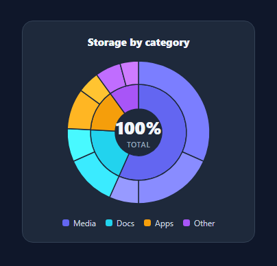
A sunburst chart shows a hierarchy as concentric rings — the inner ring is the top-level categories and each outer arc is a child nested within its parent's angular slice. It's the compact way to show part-of-whole relationships at two levels, like storage by category and file type. This snippet renders one in pure SVG with hover focus and a centre readout, in plain HTML, CSS, and vanilla JavaScript with no charting library.
Annular sector path math
Each segment is an annular sector (a slice of a ring) drawn with one SVG path: two arcs (outer and inner radius) joined by straight edges. A polar(r, a) helper converts a radius and angle to x/y around the centre (offset by −90° so angles start at the top), and a sector() function assembles the path with the correct large-arc-flag for slices over 180°. This is the same arc-drawing technique behind donut and pie charts, extended to nested rings.
Hierarchy and proportional angles
Data is a list of parents, each with children. The script sums each parent's children to get its value and the grand total, then assigns every node an angular span proportional to its value out of the total. Critically, children are laid out within their parent's span, so the outer ring nests correctly — a child's arc sits directly outside the parent slice it belongs to. Child colours are tints of the parent colour, so the family relationship reads visually.
Hover focus and the centre readout
Hovering any segment shows its label and its percentage of the total in the centre — for an outer arc it shows the full path ("Media › Photos"), so you always know where you are in the hierarchy. Leaving the chart resets the centre to the total. The centre is an overlaid HTML element, so the text is crisp and easy to style independently of the SVG.
Lightweight and legible
Thin strokes separate the segments, hover dims slightly for feedback, and a legend ties the inner-ring colours to their categories. Everything derives from the data array, so changing the hierarchy or values needs no code edits.
Dependency-free reference
The whole chart is the sector math plus a layout loop — no D3 or chart library — making it a clean, portable reference for the sunburst pattern when you need hierarchical proportions without the weight of a full visualization toolkit.
Build with AI
Build, Understand, Optimize, and Extend It With AI
You don't have to derive the annular sector path formula by hand. Paste this snippet's HTML, CSS, and JS into an AI coding assistant like Claude and ask it to explain exactly how the polar helper converts a radius and angle into coordinates, why the sector function needs the large-arc-flag calculation, and how children end up laid out within their exact parent span rather than around the full circle. The same assistant can help optimize it — for instance whether recomputing every path string on every data change is wasteful compared to only updating the segments that actually changed, or whether the shade function's simple channel-clamping produces good enough tints for many siblings. It's also useful for extending the chart: ask it to add a third nested ring for grandchildren, animate the radii on a click-to-drill-down interaction, or add keyboard focus support so each segment is reachable without a mouse. Treat the code less like a finished artifact and more like a starting point for a conversation.
Prompt to recreate it
Copy this into your AI assistant of choice to build the effect from scratch, or as a jumping-off point for your own variant:
Build a two-level "sunburst chart" in plain SVG, HTML, CSS, and JavaScript using only path math — no D3, no charting library.

Requirements:
- A data structure of parent categories, each with an array of child items that have numeric values; compute each parent's total by summing its children, and compute a grand total across all parents.
- Write a polar helper function that converts a radius and an angle into x and y coordinates around a fixed center point, with angles offset so that zero degrees points to the top of the circle (12 o'clock) rather than the SVG default of 3 o'clock.
- Write a sector function that builds a single SVG path string for an annular sector (a ring slice) given an inner radius, an outer radius, a start angle, and an end angle — using two arc commands and two straight line commands, and correctly computing the large-arc-flag for any slice spanning more than 180 degrees.
- Lay out the inner ring so each parent gets an angular span proportional to its share of the grand total, then lay out the outer ring so each parent's children are placed sequentially within that exact same angular span (not spread across the full circle), proportional to their own share of the grand total.
- Give each child segment a color that is a lightened tint of its parent's exact color (derived by adjusting the parent's RGB channels, not a hardcoded palette), so siblings are visually grouped with their parent at a glance.
- On hovering any segment (inner or outer), update a center-overlaid text element to show that segment's label (including the parent name for a child segment, e.g. "Parent › Child") and its percentage of the grand total; reset the center back to the total percentage when the mouse leaves the whole chart.
- Render a legend below the chart derived from the same data array, one swatch and label per top-level parent category.
Want to tighten it up first? Run this prompt through the AI Prompt Studio to score it across 8 quality dimensions, catch anti-patterns, and tune the wording for Claude, ChatGPT, or Gemini before you paste it in.
Step by step
How to Use
- 1Paste HTML, CSS, and JSA two-level sunburst renders with a legend and center total.
- 2Use your dataEdit DATA — parents with children and values; parents auto-sum.
- 3Hover a segmentThe center shows its label and percentage of the total.
- 4Read the ringsInner ring is categories; outer arcs are nested children.
- 5RestyleChange colors, radii, or stroke; child tints derive from parents.
- 6ResizeAdjust the viewBox and container to scale the chart.
Real-world uses
Common Use Cases
Got questions?
Frequently Asked Questions
Every segment is an annular sector — a slice of a ring — built as one SVG path: an outer arc, a line in to the inner radius, an inner arc back, and a closing line. A polar helper converts a radius and angle to coordinates around the centre (offset so angles begin at the top), and the path uses the large-arc-flag to handle slices over 180 degrees. It is the donut-arc technique applied to two radii.
Each parent gets an angular span proportional to its total. Children are then laid out sequentially within that exact span, each taking an angle proportional to its own value out of the grand total. Because the child arcs start where the parent slice starts and fill its span, the outer ring lines up directly outside the matching inner slice, which is what makes it read as a hierarchy.
Coloring children as lighter shades of their parent's color makes the family relationship obvious without a busy legend — you can see at a glance which outer arcs belong to which inner category. The snippet derives child shades by lightening the parent color by an increasing amount per child, so siblings are distinguishable but clearly related.
Yes. The sector function works for any inner/outer radius pair, so you can add a third ring by extending the layout loop to recurse into grandchildren within each child's span. For drill-down, animate radii and re-layout on click to zoom into a branch. The math stays the same; you are just adding rings and transitions.
Compute the segment list (label, path, color, value) from your data in a memo/computed and render them as SVG paths. Track the hovered node in state to drive the center readout. D3's partition/arc or a chart library can replace the math for complex cases, but the data shape and rendering approach are the same. Tailwind users swap the classes for utilities.