Learn Coding Visually
Learn to code with interactive, live-preview playgrounds — HTML, CSS, JavaScript, React & more.
 HTML Playground42 lessons · Click-based · Live preview
 CSS PlaygroundLearn CSS with a live editor
 JavaScript Playground60 lessons · DOM · Async · Canvas
 React PlaygroundLearn React with a live code editor
 GSAP PlaygroundLearn GSAP animation interactively
 SVG Playground44 lessons · shapes · paths · animation
 SCSS Playground45 lessons · Sass modules · tokens
 Tailwind PlaygroundLearn Tailwind CSS with a live editor
 Bootstrap 5 Playground50 lessons · live preview
Donut Progress — Animated Percentage Ring with Label
Donut Progress · Charts · Plain HTML, CSS & JS · Live preview
What's included
Features
About this UI Snippet
Donut Progress — Animated Percentage Donut with Counting Label and Thresholds
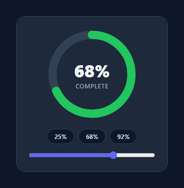
A donut progress indicator shows a single percentage as a thick ring that sweeps from empty to its value, with the number counting up in the centre and the colour shifting as it climbs — the widget for completion, storage used, goals, and scores. This snippet builds it with an SVG ring and a synced count-up, in plain HTML, CSS, and vanilla JavaScript.
The ring sweep
The progress arc is an SVG circle whose stroke-dasharray equals its circumference (2πr) and whose stroke-dashoffset is moved from the full length (empty) to a fraction of it (the percentage). The SVG is rotated −90° so the sweep starts at the top, stroke-linecap: round softens the leading edge, and a cubic-bezier transition gives the fill a satisfying fast-then-settle motion. Computing the circumference in JS (rather than hard-coding) means changing the radius just works.
A counting centre label
The percentage in the middle doesn't snap — it counts from its previous value to the new one over the same duration as the ring, driven by requestAnimationFrame with an ease-out curve. font-variant-numeric: tabular-nums keeps the digits from shifting sideways as they change. The ring and the number animate together, so the widget feels like one coordinated motion rather than two separate effects.
Colour thresholds
The arc colour reflects the value: red below ~34%, amber in the middle band, and green near completion. This encodes status at a glance — a near-empty quota or a low score reads as a warning without the user parsing the number. The thresholds are a single color(p) function you can retune to your semantics (for storage you might invert them).
Interactive demo, easy integration
Preset chips and a range slider drive the value so you can see the sweep and count respond live; in real use you'd call set(percentage) with your data. The slider path updates the number instantly for scrubbing, while the chips trigger the full animated transition — showing both an immediate and an animated update mode.
Accessible and dependency-free
The centre text always shows the real value, so the meaning survives even if the animation doesn't, and the whole widget is a couple of small functions with no chart library. It's a clean reference for the donut-progress pattern you'll reach for on dashboards, onboarding, and profile-completion cards.
Build with AI
Build, Understand, Optimize, and Extend It With AI
Rather than tracing the animation timing yourself, paste this snippet's HTML, CSS, and JS into an AI coding assistant like Claude and ask it to explain exactly how countTo() uses cancelAnimationFrame to interrupt an in-flight count and restart from the current displayed value rather than from zero, and why the cubic ease-out formula 1 minus (1 minus k) cubed is applied to the interpolation. The same assistant can help optimize it, for example checking whether the ring's CSS transition and the JS-driven count are actually kept in sync if set() is called rapidly in succession, or whether a debounce is warranted. It is also useful for extending the widget: ask it to add a second concentric ring for a comparison metric, support indeterminate/loading state before a real value is known, or emit a callback when the ring reaches 100 percent. Treat the code less like a finished artifact and more like a starting point for a conversation.
Prompt to recreate it
Copy this into your AI assistant of choice to build the effect from scratch, or as a jumping-off point for your own variant:
Build an animated donut progress ring in plain HTML, CSS, and JavaScript using SVG, with no chart library.

Requirements:
- An SVG with a background track circle and a foreground progress circle sharing the same center and radius, the SVG rotated -90 degrees so the sweep starts at the top, and the progress circle using stroke-linecap round for a soft leading edge.
- Compute the circumference in JavaScript from the radius (2 times PI times r) rather than hardcoding it, and set the progress circle's stroke-dasharray to that circumference. Represent progress by animating stroke-dashoffset from the full circumference (0 percent, fully offset/hidden) down toward zero as the percentage rises, using a CSS transition with an eased cubic-bezier curve.
- A center label showing the percentage as text, using a numeric font feature (tabular numbers) so digits don't shift width as they change, that must count from its current displayed value to a new target value using requestAnimationFrame with an ease-out easing curve over roughly 700ms, not simply snap to the new number.
- Any in-flight count animation must be cancelled with cancelAnimationFrame before starting a new one if the target changes again mid-animation, so rapid updates don't stack multiple competing animation loops.
- A pure function that maps the percentage to a stroke color across at least three bands (e.g. red under one-third, amber in the middle, green above two-thirds), applied to the ring's stroke color and easy to re-tune or invert.
- Provide both an instant-update path (e.g. a live range slider that updates the ring and label immediately without the count-up animation) and an animated path (e.g. preset buttons that always trigger the full eased sweep and count), demonstrating both modes from the same underlying set() function.
Want to tighten it up first? Run this prompt through the AI Prompt Studio to score it across 8 quality dimensions, catch anti-patterns, and tune the wording for Claude, ChatGPT, or Gemini before you paste it in.
Step by step
How to Use
- 1Paste HTML, CSS, and JSA donut progress ring renders at 68% with controls.
- 2Set a valueCall set(percentage) — the ring sweeps and the number counts.
- 3Try presetsChips jump to preset values with the full animation.
- 4Scrub the sliderDrag to update the value instantly for fine control.
- 5Tune thresholdsEdit color(p) to match your status semantics.
- 6Resize the ringChange the radius; the circumference recomputes automatically.
Real-world uses
Common Use Cases
Got questions?
Frequently Asked Questions
The arc is an SVG circle with stroke-dasharray set to its circumference (2 × π × r, computed in JavaScript) and stroke-dashoffset moved from the full circumference (empty) to circumference minus the percentage fraction (filled). The SVG is rotated −90° so it starts at the top, and a CSS transition on stroke-dashoffset animates the sweep.
On each change the label animates from its current value to the target over the same duration as the ring, using requestAnimationFrame with an ease-out curve, then snaps to the exact target. Tabular numerals keep the digits from jittering. Driving both the ring and the count over one duration makes them feel like a single coordinated animation.
Edit the color(p) function, which returns a stroke color based on the percentage — by default red below 34, amber to 67, and green above. You can change the breakpoints or invert them; for example, for storage or error rates a high value is bad, so you would flip to green-low, red-high.
Yes. Change the circle radius in the SVG and the stroke-width for thickness; the circumference is derived from the radius in JavaScript, so the fill math stays correct automatically. Adjust the viewBox and container size to match. stroke-linecap: round gives the rounded leading edge.
Hold the value in state and compute the stroke-dashoffset and threshold color as derived values bound to the circle. Animate the center number in an effect with requestAnimationFrame when the value changes, or use a count-up hook. Keep the real value as the text content for accessibility. Tailwind users swap the classes for utilities; the ring math is unchanged.