You Might Also Like
Learn Coding Visually
Learn to code with interactive, live-preview playgrounds — HTML, CSS, JavaScript, React & more.
 HTML Playground42 lessons · Click-based · Live preview
 CSS PlaygroundLearn CSS with a live editor
 JavaScript Playground60 lessons · DOM · Async · Canvas
 React PlaygroundLearn React with a live code editor
 GSAP PlaygroundLearn GSAP animation interactively
 SVG Playground44 lessons · shapes · paths · animation
 SCSS Playground45 lessons · Sass modules · tokens
 Tailwind PlaygroundLearn Tailwind CSS with a live editor
 Bootstrap 5 Playground50 lessons · live preview
Population Pyramid — Back-to-Back Bar Chart
Population Pyramid · Charts · Plain HTML, CSS & JS · Live preview
What's included
Features
About this UI Snippet
Population Pyramid — Mirrored Back-to-Back Bars Around a Center Axis
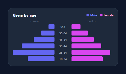
A population pyramid is a back-to-back bar chart: two groups (classically male and female by age) grow outward from a shared centre axis, so you compare their distributions side by side. It's the right chart for any two-cohort comparison across ordered categories — age bands, before/after, two segments. This snippet builds one in pure HTML and CSS, with animated mirrored bars and tooltips, in plain HTML, CSS, and vanilla JavaScript.
A three-column grid per row
Each age band is a CSS grid row of three columns: left bars, the centre age label, and right bars. The left side aligns its bar to the right edge (justify-content: flex-end) so it grows leftward toward the centre, and the right side grows rightward — producing the mirrored, spine-aligned look without any negative positioning or transforms. The centre label column keeps both sides anchored to a consistent axis.
Shared scale, fair comparison
Both groups share one maximum (the largest value across either side), so a bar of a given length means the same count on the left and the right. This shared scale is essential — mirroring two differently-scaled axes would make the comparison misleading. Bar widths are simple percentages of that max, so the chart is responsive with no pixel math.
Animated outward growth
Bars start at zero width and animate outward from the spine on load via a CSS transition triggered next frame, which makes the pyramid "open up" and naturally draws the eye from the centre out — fitting the chart's symmetry. A brightness lift on hover gives per-bar feedback.
Tooltips and legend
Hovering either side shows a tooltip with the category, group, and value, following the cursor; a two-swatch legend names the groups. Because the two sides use distinct colours and a clear axis, the chart stays readable even with many bands.
Data-driven and dependency-free
Data is an array of { category, a, b }, so changing the bands or values is a data edit and everything else follows. With no SVG and no library, it's a clean, lightweight reference for the population-pyramid / back-to-back bar pattern, useful well beyond demographics.
Build with AI
Build, Understand, Optimize, and Extend It With AI
You do not have to puzzle out the mirrored grid alignment on your own. Paste this snippet's HTML, CSS, and JS into an AI coding assistant like Claude and ask it to explain exactly how the three-column grid combined with justify-content flex-end on the left side produces the spine-aligned mirror effect without any transforms or negative margins, and why both sides must be scaled against one shared max instead of their own maximums. The same assistant can help you optimize it — for instance checking whether recomputing max and re-animating every bar is wasteful when only one row's data changes, or whether the tooltip's mousemove listener needs throttling for very tall pyramids with dozens of rows. It is also useful for extending the chart: ask it to add a third comparison group, sortable rows by total, a brush to filter the visible age range, or CSV import for the DATA array. Treat the code less like a finished artifact and more like a starting point for a conversation.
Prompt to recreate it
Copy this into your AI assistant of choice to build the effect from scratch, or as a jumping-off point for your own variant:
Build a population pyramid (back-to-back bar chart) in plain HTML, CSS, and JavaScript using only CSS grid — no SVG, no canvas, no charting library.

Requirements:
- Each category row is a CSS grid with three columns: a left bar column, a centered category label column, and a right bar column.
- The left column must right-align its bar (so it grows toward the center) and the right column must left-align its bar (so it grows away from the center), both meeting at the shared label column, using only justify-content — no negative margins or transform-based positioning.
- Compute a single shared maximum across both groups' values (not a separate maximum per side), and size every bar's width as a percentage of that one shared maximum so bar lengths are directly comparable between the two sides.
- On load, bars must start at 0% width and animate outward to their final percentage via a CSS width transition triggered on the next animation frame (not immediately, so the transition actually plays).
- Add a two-swatch legend labeling the two groups with matching colors, and a hover tooltip that follows the cursor and shows the category name, the group name, and the exact value when hovering either bar.
- Keep the whole thing data-driven from a single array of objects (one per category, with a value for each of the two groups) so adding or reordering categories requires no changes to the rendering logic.
Want to tighten it up first? Run this prompt through the AI Prompt Studio to score it across 8 quality dimensions, catch anti-patterns, and tune the wording for Claude, ChatGPT, or Gemini before you paste it in.
Step by step
How to Use
- 1Paste HTML, CSS, and JSA population pyramid renders with two groups across age bands.
- 2Use your dataEdit DATA — each row is { age, a, b } for the two groups.
- 3Watch it openBars animate outward from the center axis on load.
- 4Hover a barA tooltip shows the band, group, and value.
- 5Relabel the groupsChange the legend and colors for any two cohorts.
- 6Reorder bandsList categories top-to-bottom in the order you want.
Real-world uses
Common Use Cases
Got questions?
Frequently Asked Questions
Each row is a three-column CSS grid: left bars, the center label, and right bars. The left column right-aligns its bar so it grows toward the center, and the right column left-aligns so it grows away — both meeting at the label column. This produces the spine-aligned, mirrored look using normal layout, with no negative margins or transforms.
So that equal bar lengths mean equal values on both sides. If each side scaled to its own maximum, a left bar and a right bar of the same length could represent very different counts, making the comparison misleading. The snippet takes the maximum across both groups and sizes every bar as a percentage of it, keeping the two halves honest.
Absolutely. A population pyramid is just a back-to-back bar chart, so any two-group comparison across ordered categories works: before vs after, two segments, two products, win vs loss by stage. Rename the legend, recolor the two sides, and provide your categories — the layout and scaling are unchanged.
The bands render top-to-bottom in the order of the DATA array, so reorder the array to reorder the rows. Population pyramids conventionally put the oldest band at the top and youngest at the bottom, but you can use any ordered sequence that suits your categories.
Map DATA to grid rows in JSX/templates and set each bar's width from value/max as an inline style. Trigger the outward animation with a mounted effect or a class toggled after render, and track hover state for the tooltip. Tailwind users apply the grid, alignment, and widths with utilities; the shared-scale calculation stays in a small helper.