You Might Also Like
Learn Coding Visually
Learn to code with interactive, live-preview playgrounds — HTML, CSS, JavaScript, React & more.
 HTML Playground42 lessons · Click-based · Live preview
 CSS PlaygroundLearn CSS with a live editor
 JavaScript Playground60 lessons · DOM · Async · Canvas
 React PlaygroundLearn React with a live code editor
 GSAP PlaygroundLearn GSAP animation interactively
 SVG Playground44 lessons · shapes · paths · animation
 SCSS Playground45 lessons · Sass modules · tokens
 Tailwind PlaygroundLearn Tailwind CSS with a live editor
 Bootstrap 5 Playground50 lessons · live preview
Bump Chart — Ranking Over Time Line Chart
Bump Chart · Charts · Plain HTML, CSS & JS · Live preview
What's included
Features
About this UI Snippet
Bump Chart — Rank-Over-Time Lines with Highlight and Toggle
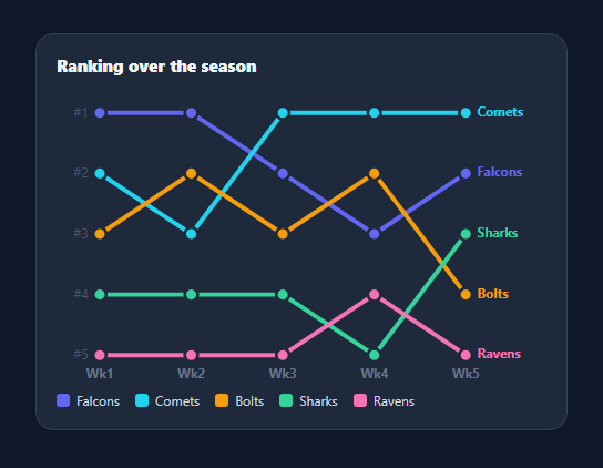
A bump chart visualises how items move up and down a ranking over time — each line is a competitor, the y-axis is rank (1 at the top), and crossings show overtakes. It's the chart for league tables, chart positions, keyword rankings, and leaderboards over a season. This snippet renders one in pure SVG with end labels, hover highlighting, and a toggling legend, in plain HTML, CSS, and vanilla JavaScript.
Rank, not value, on the y-axis
The key difference from a line chart is the scale: the y-axis is rank, with #1 at the top and the lowest rank at the bottom, evenly spaced regardless of the underlying values. Each item's path connects its rank at each period, so the slope encodes movement up or down the table and where lines cross, positions were swapped. Mapping rank to y is a simple linear scale across the number of ranks.
Lines, nodes, and end labels
Each item gets a coloured polyline through its rank points, a circular node at every period, and its name drawn at its final position — so you can read who's who without hunting in the legend. Round line caps and joins keep the bends smooth, and the period labels sit along the bottom with rank labels (#1…#n) down the side.
Highlight to follow one line
With several crossing lines a bump chart can get busy, so hovering a line (or its legend entry) dims the others and thickens the hovered one, letting you trace a single item's journey through the overtakes. This focus-by-dimming is the standard technique for making dense multi-series charts readable.
Toggle series via the legend
Clicking a legend entry removes or restores that line, so you can declutter to compare just two or three contenders. Because the chart redraws from the data (with an off flag per item), toggling is just a re-render — no fragile show/hide bookkeeping.
Data-driven and dependency-free
Each team is { name, color, ranks } where ranks is the position per period, and the periods are a labels array — so changing the contest is a data edit. With no chart library, it's a clean reference for the bump-chart pattern that's otherwise surprisingly hard to find outside D3.
Build with AI
Build, Understand, Optimize, and Extend It With AI
You don't have to reconstruct the rank-to-pixel mapping by hand to see why this chart reads correctly. Paste this snippet's HTML, CSS, and JS into an AI coding assistant like Claude and ask it to explain exactly why the y function maps rank 1 to the top of the chart rather than the bottom, and how the draw function's full innerHTML rebuild interacts with the off flag on each team to implement legend toggling without any separate show/hide state. The same assistant can help optimize it — asking whether rebuilding every path, node, and label from scratch on every legend toggle click is wasteful for a bump chart with many teams and periods, or whether the highlight function's full querySelectorAll sweep on every hover could be scoped more narrowly. It's also useful for extending the chart: ask it to animate lines drawing in on load, add a tie-breaking visual for teams sharing the same rank, or support clicking a node to show that team's exact rank history in a tooltip. Treat the code less like a finished artifact and more like a starting point for a conversation.
Prompt to recreate it
Copy this into your AI assistant of choice to build the effect from scratch, or as a jumping-off point for your own variant:
Build a "bump chart" that visualizes ranking changes over time in plain HTML, CSS, and SVG built with vanilla JavaScript — no D3, no charting library.

Requirements:
- Accept data as an array of period labels (e.g. weeks) and an array of items, each with a name, a color, and an array of rank numbers (one per period, where 1 is the best/top rank).
- Write a y-scaling function that maps rank number to a vertical pixel position using a linear scale across the total number of distinct ranks, with rank 1 mapping to the top of the chart and the highest rank number mapping to the bottom — the opposite of SVG's natural top-to-bottom growth for a "higher is better" reading.
- Write an x-scaling function that spaces each period evenly across the chart width based on its index and the total number of periods.
- For each item, draw a single connected polyline path through all of its rank points across periods (with rounded line caps and joins), a circular node marker at every period's rank point, and a text label with the item's name positioned at its final period's point so it can be identified without a separate legend lookup.
- Implement hover interaction where hovering any item's line (or its corresponding legend entry) visually dims every other line and thickens only the hovered line, and moving away restores all lines to their normal appearance.
- Build a legend below the chart listing every item by color and name; clicking a legend entry must toggle that item's visibility by flagging it in the underlying data array and fully re-rendering the chart from that data (not by directly hiding/showing a DOM node), so the visible set of lines is always a direct function of the data's visibility flags.
Want to tighten it up first? Run this prompt through the AI Prompt Studio to score it across 8 quality dimensions, catch anti-patterns, and tune the wording for Claude, ChatGPT, or Gemini before you paste it in.
Step by step
How to Use
- 1Paste HTML, CSS, and JSA bump chart renders five teams ranked across five weeks.
- 2Use your dataEdit TEAMS ({ name, color, ranks }) and the ROUNDS labels.
- 3Read the ranks#1 is at the top; crossings show overtakes.
- 4Hover a lineOthers dim so you can follow one item's path.
- 5Toggle the legendClick an entry to hide or restore that line.
- 6RestyleChange colors, node size, or chart dimensions.
Real-world uses
Common Use Cases
Got questions?
Frequently Asked Questions
A line chart plots values on the y-axis; a bump chart plots rank, with #1 at the top and ranks evenly spaced regardless of the actual values. This makes overtakes explicit — when two lines cross, those items swapped positions — and keeps the focus on relative order over time rather than absolute magnitude. It is ideal when ranking, not value, is the story.
Bump charts get visually busy because lines cross frequently. Dimming every line except the hovered one (and thickening that one) lets you trace a single item's path through all the overtakes without losing it among the crossings. It is the standard focus technique for dense multi-series charts and keeps the chart readable as you add competitors.
Yes. Each legend entry toggles an off flag on its team and re-renders, so clicking removes or restores that line. This lets you declutter to just the contenders you care about. Because the chart redraws from the data each time, there is no fragile show/hide state to manage — the visible set is always derived from the flags.
An array of periods (labels) and an array of items, each { name, color, ranks }, where ranks is that item's position at each period in order. Ranks should run 1..n with no gaps for a clean axis. The chart computes positions from the number of periods and ranks, so changing either is just a data edit.
Compute each item's path and node positions from rank using a linear scale, and render them as SVG path and circle elements. Hold a hovered item and a hidden set in state to drive the dimming and toggling. D3 or visx can replace the math for advanced cases, but the rank-to-y mapping stays the same. Tailwind users swap the classes for utilities.