You Might Also Like
Learn Coding Visually
Learn to code with interactive, live-preview playgrounds — HTML, CSS, JavaScript, React & more.
 HTML Playground42 lessons · Click-based · Live preview
 CSS PlaygroundLearn CSS with a live editor
 JavaScript Playground60 lessons · DOM · Async · Canvas
 React PlaygroundLearn React with a live code editor
 GSAP PlaygroundLearn GSAP animation interactively
 SVG Playground44 lessons · shapes · paths · animation
 SCSS Playground45 lessons · Sass modules · tokens
 Tailwind PlaygroundLearn Tailwind CSS with a live editor
 Bootstrap 5 Playground50 lessons · live preview
Timeline Chart — Horizontal Schedule / Gantt Bars
Timeline Chart · Charts · Plain HTML, CSS & JS · Live preview
What's included
Features
About this UI Snippet
Timeline Chart — Task Bars on a Horizontal Time Axis
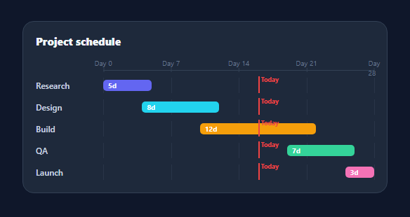
A timeline chart places events or tasks along a shared horizontal time axis, each as a bar spanning its start to end — the visual behind project schedules, roadmaps, and Gantt views. This snippet builds a clean, lightweight timeline with a time scale, per-row duration bars, gridlines, a "today" marker, and tooltips, in plain HTML, CSS, and vanilla JavaScript with no SVG or library.
One scale, many rows
Every task is a grid row: a fixed label column and a track. Within the track, the bar's left and width are percentages derived from the task's start and end mapped onto the chart's time range — (day - min) / (max - min). Because every row shares that same pct() mapping, all bars line up under one time axis, so you can read overlaps and dependencies vertically at a glance. The scale across the top marks the range at regular intervals.
A today line across the chart
A red vertical marker at the current point cuts across every row, instantly showing what's in progress, done, or upcoming relative to now — the single most useful annotation on a schedule. It's positioned with the same percentage mapping as the bars, so it always stays aligned as the range changes.
Duration at a glance
Each bar shows its length in days and is coloured per task, and faint gridlines behind the bars give reference points for reading start and end without a precise axis. A brightness lift and a tooltip on hover reveal the exact start–end range, so the chart stays uncluttered while detail is one hover away.
Animated reveal
Bars grow from their start edge (a scaleX transition from 0, anchored left) on load, which animates the schedule into place and reinforces the left-to-right reading of time. The transform-origin at the left means each bar appears to "draw" from its start date.
Data-driven and portable
Tasks are { name, start, end, color } over an integer day range, so swapping in real dates (convert to day offsets) or adding rows is a data edit; the scale, gridlines, today marker, and bars all derive from the range. With no dependencies, it's a compact reference for the timeline/Gantt pattern when a full project-management library is overkill.
Build with AI
Build, Understand, Optimize, and Extend It With AI
Ask an AI coding assistant like Claude to explain why pct(day) is the single function every bar, gridline, and the today marker all call — and what would visually break across the chart if just one row's bar computed its position a different way. It's also worth an optimization pass: with a double nested requestAnimationFrame used purely to trigger the scaleX grow-in transition after the browser paints, ask whether that's the minimal reliable pattern or whether it could be simplified. For extending the chart, ask for draggable bars that let a user reschedule a task and see the connector lines update live, a way to show task dependencies as arrows between bars, or a zoom control that changes the MIN/MAX day range without breaking the gridline spacing. Treat the code less like a finished artifact and more like a starting point for a conversation.
Prompt to recreate it
Copy this into your AI assistant of choice to build the effect from scratch, or as a jumping-off point for your own variant:
Build a horizontal timeline/Gantt-style chart in plain HTML, CSS, and JavaScript — no SVG, no charting library, positioned entirely with percentages.

Requirements:
- A single percentage-mapping function that converts any day number in the chart's range to a horizontal percentage position, and use that exact same function for every bar's position, every scale tick mark, every row's gridlines, and the "today" marker — there must be only one place in the code that does this math.
- Render a top scale with tick marks and labels at a fixed interval (such as every 7 days) across the configured min/max day range.
- Each task is a row with a fixed-width label column and a track; within the track, compute each task bar's left position and width purely from its start and end day mapped through the shared percentage function.
- Draw a vertical "today" line that spans every row at the current day's mapped position, visually distinguished (e.g. a different color) from the per-row gridlines.
- Animate each bar growing in from its left edge using a CSS transform: scaleX transition with transform-origin set to the left, staggered per row with an increasing animation delay, triggered after the bars are inserted into the DOM (using a double requestAnimationFrame so the browser has painted the starting state first).
- Add a hover tooltip on each bar showing its task name and its exact start-to-end day range, positioned near the cursor using the pointer event's coordinates relative to the chart container, and hide it on mouseleave.
Want to tighten it up first? Run this prompt through the AI Prompt Studio to score it across 8 quality dimensions, catch anti-patterns, and tune the wording for Claude, ChatGPT, or Gemini before you paste it in.
Step by step
How to Use
- 1Paste HTML, CSS, and JSA project timeline renders with task bars and a today marker.
- 2Use your dataEdit TASKS ({ name, start, end, color }) and the MIN/MAX range.
- 3Set todayChange TODAY to position the red current-time line.
- 4Hover a barA tooltip shows the task and its start–end range.
- 5Read overlapsBars share one axis, so concurrency reads vertically.
- 6Use real datesConvert dates to day offsets from your range start.
Real-world uses
Common Use Cases
Got questions?
Frequently Asked Questions
Each task's start and end are mapped to percentages across the chart's time range with (value − min) / (max − min). The bar's left is the start percentage and its width is the end minus start percentage. Because every row uses the same mapping, all bars align under one shared axis, which is what lets you read overlaps and sequencing vertically.
Yes. Convert each date to a numeric offset — for example milliseconds via Date.getTime(), or days since your range start — and set MIN and MAX to the range bounds in the same units. The percentage mapping works on any numeric scale, so dates, weeks, or hours all work; just format the axis marks to match.
It is a vertical line drawn across every row at the current point in the range, using the same percentage mapping as the bars. It instantly communicates progress — tasks left of the line are in the past, the bar it crosses is in progress, and tasks to the right are upcoming. Update its value to move it as time passes.
It is essentially a lightweight Gantt: tasks as bars on a shared time axis. A full Gantt typically adds dependencies (arrows between tasks), drag-to-reschedule, and resource rows. This snippet focuses on the core read-only visualization — duration bars, a scale, gridlines, and a today marker — which covers most roadmap and schedule needs without a heavy library.
Map your tasks to rows and compute each bar's left and width from start/end percentages as inline styles. Render the scale marks and today line from the same mapping. Trigger the draw-on animation with a mounted effect or a class toggled after render, and track hover state for the tooltip. Tailwind users apply the grid and positioning with utilities.