You Might Also Like
Learn Coding Visually
Learn to code with interactive, live-preview playgrounds — HTML, CSS, JavaScript, React & more.
 HTML Playground42 lessons · Click-based · Live preview
 CSS PlaygroundLearn CSS with a live editor
 JavaScript Playground60 lessons · DOM · Async · Canvas
 React PlaygroundLearn React with a live code editor
 GSAP PlaygroundLearn GSAP animation interactively
 SVG Playground44 lessons · shapes · paths · animation
 SCSS Playground45 lessons · Sass modules · tokens
 Tailwind PlaygroundLearn Tailwind CSS with a live editor
 Bootstrap 5 Playground50 lessons · live preview
Lollipop Chart — Stem-and-Dot Bar Alternative
Lollipop Chart · Charts · Plain HTML, CSS & JS · Live preview
What's included
Features
About this UI Snippet
Lollipop Chart — Animated, Sortable Stem-and-Dot Chart
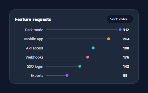
A lollipop chart is a lighter alternative to a bar chart: instead of a heavy filled bar, each value is a thin stem ending in a dot. With less ink per item it reads cleanly when you have many categories — feature votes, survey results, rankings. This snippet builds a horizontal lollipop chart with animated stems, sorting, and tooltips, in plain HTML, CSS, and vanilla JavaScript.
Stem and dot from one value
Each row is a CSS grid of three columns: the label, the track, and the value. Inside the track, a thin .lp-stem grows from the left to a width proportional to the value, and a .lp-dot is positioned at that same percentage — so the stem's end and the dot always coincide. Driving both from one percentage (value / max) keeps them locked together and makes the chart responsive with no pixel math.
Why lollipops over bars
When a bar chart has many categories, the solid bars create a dense block of colour that's tiring to scan and exaggerates small differences. Lollipops keep the same positional encoding — length still means value — while reducing visual weight to a line and a point, so a long list stays airy and the dots give a precise read of where each value lands. It's the same data, less ink.
Animated draw-on
On render the stems grow and the dots pop in (a scale transition with a slight delay) from zero, which animates the chart into place and draws the eye along each value. Re-rendering on sort replays the animation, reinforcing the reordering.
Sortable
A toggle re-sorts the rows ascending or descending by value, re-rendering with the animation so the change is easy to follow. Sorting a ranking chart is the most common interaction, and here it's a one-line comparator flip over a copy of the data (the source order is preserved).
Tooltips and data-driven setup
Each dot carries a native title with its label and value for an instant tooltip, and the whole chart derives from a { name, value, color } array — add or change items by editing data. With no SVG and no library, it's a compact, readable reference for the lollipop-chart pattern when a bar chart feels too heavy.
Build with AI
Build, Understand, Optimize, and Extend It With AI
You do not need to trace the double requestAnimationFrame call by guessing. Paste this snippet's HTML, CSS, and JS into an AI coding assistant like Claude and ask it to explain exactly why render() wraps the stem-width and dot-position assignment in two nested requestAnimationFrame calls instead of one, and how that relates to the stem and dot both being driven from the same value-over-max percentage. The same assistant can help optimize it, for instance asking whether rebuilding rows.innerHTML from scratch on every sort toggle could be replaced with reordering existing DOM nodes via a FLIP animation for a smoother re-sort with many rows. It is also useful for extending the chart: ask it to add a secondary comparison lollipop per row for before/after values, support clicking a dot to filter or drill into that category, or add keyboard-navigable focus states to the dots for accessibility. Treat the code less like a finished artifact and more like a starting point for a conversation.
Prompt to recreate it
Copy this into your AI assistant of choice to build the effect from scratch, or as a jumping-off point for your own variant:
Build a sortable "lollipop chart" in plain HTML, CSS, and JavaScript with no SVG and no charting library.

Requirements:
- Accept an array of category objects, each with a name, a numeric value, and a color, and render one row per category as a CSS grid with three columns: a right-aligned truncated label, a track area, and a left-aligned value.
- Inside each row's track, render a thin horizontal stem element and a circular dot element, both positioned using the exact same percentage (that category's value divided by the maximum value across all categories) — the stem's width and the dot's left offset must be driven from one shared calculation so they always end at the same point.
- On every render, the stem must start at zero width and the dot must start scaled to zero, then animate to their final width/position/scale using a CSS transition, triggered via a nested double requestAnimationFrame so the browser reliably commits the zero-state before the transition to the final state begins.
- A sort toggle button must flip between descending and ascending order by value, re-rendering all rows from a sorted copy of the original data (never mutating the source array), and replaying the draw-on animation each time it is clicked.
- Each dot must expose its category name and value through a native title attribute so hovering it shows a tooltip with no custom tooltip markup required.
- The chart must remain fully responsive by using percentage-based widths and positions for the stem and dot, with no fixed pixel coordinate math anywhere in the row layout.
Want to tighten it up first? Run this prompt through the AI Prompt Studio to score it across 8 quality dimensions, catch anti-patterns, and tune the wording for Claude, ChatGPT, or Gemini before you paste it in.
Step by step
How to Use
- 1Paste HTML, CSS, and JSA lollipop chart renders with animated stems and dots.
- 2Use your dataEdit DATA — each item is { name, value, color }.
- 3SortClick the sort toggle to reorder ascending or descending.
- 4Hover a dotA native tooltip shows the label and value.
- 5Read the valuesDot position along the track encodes each value.
- 6RestyleChange dot size, stem color, or row spacing.
Real-world uses
Common Use Cases
Got questions?
Frequently Asked Questions
When you have many categories and the solid mass of a bar chart becomes hard to scan or visually overstates differences. A lollipop keeps the same length-equals-value encoding but reduces each item to a line and a dot, so a long list stays light and the dots give a precise endpoint to compare. For a few large values, a bar chart is often fine; for many items, lollipops read better.
Both are positioned from one number: value divided by the maximum, as a percentage. The stem's width is that percentage and the dot's left offset is the same percentage, so the dot always sits exactly at the end of the stem. Because it is a percentage of the track, everything scales fluidly when the container resizes.
The sort toggle flips a descending flag and re-renders. Rendering sorts a copy of the data with a comparator (descending or ascending by value), so the original order is preserved and you can always toggle back. The draw-on animation replays on each sort, which makes the reordering easy to follow visually.
Yes — the value already renders in the third grid column, so each row shows its number. The dot's native title adds an on-hover tooltip on top. If you prefer a label that floats next to the dot, you can position a small text element at the same percentage as the dot using the same value/max calculation.
Map your data to rows and set the stem width and dot offset from value/max as inline styles. Hold the sort direction in state and sort a copy in render; trigger the draw-on animation with a mounted effect or a class toggled after render. Tailwind users apply the grid and positioning with utilities; the value/max math stays in a small helper.