You Might Also Like
Learn Coding Visually
Learn to code with interactive, live-preview playgrounds — HTML, CSS, JavaScript, React & more.
 HTML Playground42 lessons · Click-based · Live preview
 CSS PlaygroundLearn CSS with a live editor
 JavaScript Playground60 lessons · DOM · Async · Canvas
 React PlaygroundLearn React with a live code editor
 GSAP PlaygroundLearn GSAP animation interactively
 SVG Playground44 lessons · shapes · paths · animation
 SCSS Playground45 lessons · Sass modules · tokens
 Tailwind PlaygroundLearn Tailwind CSS with a live editor
 Bootstrap 5 Playground50 lessons · live preview
Range Area Chart — Min/Max Band with Average Line
Range Area Chart · Charts · Plain HTML, CSS & JS · Live preview
What's included
Features
About this UI Snippet
Range Area Chart — Min/Max Band, Average Line and Hover Readout
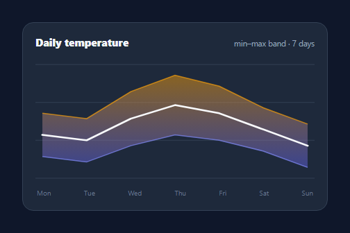
A range area chart fills the band between a low and a high series over time — daily temperature min/max, price ranges, confidence intervals, best/worst case. It shows spread, not just a single line, so you see both the trend and its uncertainty. This snippet renders one in pure SVG with a gradient band, edge lines, an average line, and a hover guide, in plain HTML, CSS, and vanilla JavaScript.
The band path
The shaded range is a single closed SVG path: it traces the high series left-to-right across the points, then the low series right-to-left back to the start, and closes — enclosing the area between them. A vertical linearGradient fill (warm at the top edge, cool at the bottom) reinforces that the top is "high" and the bottom is "low". This is the same boundary-tracing technique as an area chart, applied to two series instead of one and a baseline.
Edge and average lines
Thin lines stroke the high and low boundaries so each series stays legible at its edge, and a bright average line (the midpoint of low and high at each point) runs through the middle to show the central trend. Together they let you read the typical value and the spread around it in one glance — the whole point of a range chart over a plain line.
Responsive SVG with a clean scale
A fixed viewBox with preserveAspectRatio="none" stretches the chart to any width while the math stays in tidy coordinates, and the y-scale is padded a couple of units beyond the data so the band doesn't touch the edges. Horizontal gridlines give reference levels.
Hover guide and dual readout
Hovering shows a dashed vertical guide and dots on both the high and low edges at that point, with a tooltip giving the range ("9° to 17°"). Invisible column hit areas spanning the midpoints between points make the nearest day select reliably anywhere in its column, even near the thin edges.
Data-driven and dependency-free
The chart takes parallel LOW and HIGH arrays and an axis labels array, so changing the data or adding points needs no code edits — the band, lines, scale, and hit areas all derive from them. With no chart library, it's a clean reference for the range-band pattern used in weather, finance, and forecast UIs.
Build with AI
Build, Understand, Optimize, and Extend It With AI
You do not have to trace the path-building loop by hand to understand this chart. Paste this snippet's HTML, CSS, and JS into an AI coding assistant like Claude and ask it to explain exactly how the band path string is assembled by walking the HIGH array forward and the LOW array backward before closing with Z, and why that specific ordering is what makes the fill enclose only the area between the two boundaries. The same assistant can help you optimize it — ask whether recreating every hit-area rect and listener inside build() on each call is necessary, or whether a single delegated mousemove handler over the SVG with a coordinate-to-index calculation would scale better for charts with many more points. It's also useful for extending the chart: ask it to support unevenly-spaced x values instead of a fixed N-1 division, add a secondary comparison band, or make the guide line and tooltip follow touch drag instead of only mouse hover. Treat the code less like a finished artifact and more like a starting point for a conversation.
Prompt to recreate it
Copy this into your AI assistant of choice to build the effect from scratch, or as a jumping-off point for your own variant:
Build a range area chart (a min-max band over time) in plain HTML, CSS, and JavaScript using inline SVG created with createElementNS — no charting library, no canvas.

Requirements:
- Take two parallel arrays of numbers (a low series and a high series) plus a labels array, and compute a shared x() function that maps an index evenly across the chart width and a shared y() function that maps a value into the chart height using one combined min/max scale (padded a little beyond the actual data range) derived from both arrays together.
- Build the shaded band as a single closed SVG path: trace the high series left to right using the shared x/y functions, then trace the low series right to left back to the starting point, then close the path — do not draw the band as two separate filled areas.
- Fill that band path with a vertical linearGradient (defined in an SVG defs block) that visually distinguishes the top of the band from the bottom.
- Draw two additional thin stroked paths tracing the high edge and the low edge on top of the band fill, plus a third bold path tracing the midpoint (average) of low and high at each index.
- Add horizontal gridlines at a few evenly spaced levels across the chart height.
- Implement hover interaction using invisible rectangle "hit areas" — one per data point, each spanning from the midpoint between it and its previous neighbor to the midpoint between it and its next neighbor (not just a thin strip at the exact point) — so hovering anywhere in that point's column shows a dashed vertical guide line, a dot on both the high and low edge at that x position, and a tooltip reporting the exact low-to-high range as text.
Want to tighten it up first? Run this prompt through the AI Prompt Studio to score it across 8 quality dimensions, catch anti-patterns, and tune the wording for Claude, ChatGPT, or Gemini before you paste it in.
Step by step
How to Use
- 1Paste HTML, CSS, and JSA min–max temperature band renders with an average line.
- 2Use your dataEdit the LOW and HIGH arrays and the DAYS labels.
- 3Hover the chartA guide and dots show the range at that point.
- 4Read the spreadBand height is the range; the bright line is the average.
- 5RecolorChange the gradient stops and edge line colors.
- 6ResizeIt stretches to its container via preserveAspectRatio.
Real-world uses
Common Use Cases
Got questions?
Frequently Asked Questions
It is one closed SVG path: the high series is traced left-to-right across the points, then the low series is appended right-to-left back to the start, and the path is closed. This encloses exactly the area between the two boundaries. A vertical linear gradient fills it so the top reads as high and the bottom as low — the same approach as an area chart, with the low series acting as the baseline instead of zero.
The band shows spread, but readers also want the central tendency. Drawing a line through the midpoint of low and high at each point gives the typical value, so you can see both the trend and the uncertainty around it at once. Without it, a wide band can obscure where the "expected" value actually sits.
Invisible rectangle hit areas span the midpoints between points, so hovering anywhere in a column selects that point reliably. On hover, a dashed vertical guide and two dots (on the high and low edges) appear at that x, and a tooltip shows the range. Using columns rather than hit-testing the thin edge lines makes the interaction robust at any size.
Two parallel arrays — LOW and HIGH — with one value per point, plus a labels array for the x-axis. The chart computes the scale from the combined min and max (with padding) and derives the band, edge lines, average, and hit areas from these, so changing the data or adding points is just an array edit. Keep LOW, HIGH, and labels the same length.
Compute the band path, edge paths, and average path from your low/high arrays in a memo/computed and render them as SVG paths. Track the hovered index in state to drive the guide, dots, and tooltip via pointer handlers on the column rects. Recharts (Area with two bounds) or visx can replace the math; the data shape is the same. Tailwind users swap the classes for utilities.