You Might Also Like
Learn Coding Visually
Learn to code with interactive, live-preview playgrounds — HTML, CSS, JavaScript, React & more.
 HTML Playground42 lessons · Click-based · Live preview
 CSS PlaygroundLearn CSS with a live editor
 JavaScript Playground60 lessons · DOM · Async · Canvas
 React PlaygroundLearn React with a live code editor
 GSAP PlaygroundLearn GSAP animation interactively
 SVG Playground44 lessons · shapes · paths · animation
 SCSS Playground45 lessons · Sass modules · tokens
 Tailwind PlaygroundLearn Tailwind CSS with a live editor
 Bootstrap 5 Playground50 lessons · live preview
Stacked Area Chart — SVG Multi-Series Area Graph
Stacked Area Chart · Charts · Plain HTML, CSS & JS · Live preview
What's included
Features
About this UI Snippet
Stacked Area Chart — Cumulative Multi-Series SVG Areas with Hover Tooltip
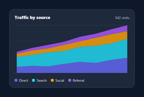
A stacked area chart shows how several series add up to a total over time, with each band sitting on top of the one below — ideal for traffic by source, revenue by product, or usage by tier. This snippet renders one from a data array in pure SVG, with gridlines, a hover guide, and a per-series tooltip, in plain HTML, CSS, and vanilla JavaScript with no charting library.
Stacking, done correctly
The core is the cumulative stack: for each series, the band's lower boundary is the running total of all series beneath it, and its upper boundary is that total plus the series' own values. The script walks the series keeping a lower array, computes upper, and builds a closed area path that traces the top edge left-to-right then the bottom edge back. Series are drawn in order so each sits cleanly on its predecessor, and the y-scale is based on the maximum stacked total so the tallest column just fits.
Scalable SVG with responsive width
The chart uses a fixed viewBox with preserveAspectRatio="none", so it stretches to its container's width while the math stays in tidy 0–320 coordinates. Horizontal gridlines give the eye reference levels. Everything is vector, so it's crisp at any size and weighs nothing.
Column hover with a shared guide
Hovering reveals a dashed vertical guide and a tooltip listing every series' value at that time point plus the stacked total — the read you actually want from a stacked chart ("what made up Friday?"). Rather than per-shape hit-testing, the chart lays invisible rectangle "columns" spanning the midpoints between points, so the nearest time index is selected reliably anywhere in that column, even over thin bands.
Tooltip positioning
The tooltip is an HTML element positioned over the SVG by converting chart coordinates to pixels using the SVG's rendered size, so it stays anchored to the hovered column at any width. Color chips in the tooltip tie each value back to its band.
Data-driven and portable
Series are an array of { name, color, data }, so adding a series or swapping the numbers needs no code changes — the stack, scale, legend, and tooltip all derive from the data. It's a compact, dependency-free reference for the stacked-area pattern that you'd otherwise pull in a chart library for.
Build with AI
Build, Understand, Optimize, and Extend It With AI
You don't need to work out the lower/upper boundary accumulation by hand. Paste this snippet's HTML, CSS, and JS into an AI coding assistant like Claude and ask it to explain exactly how the build function walks the SERIES array to accumulate a running lower array into each band's closed SVG path, or why the invisible hit rectangles span the midpoints between data points rather than sitting directly on each plotted x coordinate. The same assistant can help optimize it, for example checking whether rebuilding the entire SVG's innerHTML on every call (rather than updating existing path d attributes) matters for a chart that might update live. It's also useful for extending the feature: ask it to add a percentage-stacked mode where each column always fills to 100%, animate the areas growing in on load, or add keyboard navigation between hit columns for accessibility. Treat the code less like a finished artifact and more like a starting point for a conversation.
Prompt to recreate it
Copy this into your AI assistant of choice to build the effect from scratch, or as a jumping-off point for your own variant:
Build a stacked area chart rendered entirely in raw SVG, in plain HTML, CSS, and JavaScript, no charting library.

Requirements:
- Accept a SERIES array of objects, each with a name, a color, and a data array of equal-length numeric values, plus a matching LABELS array for the x-axis positions.
- Compute per-column stacked totals across all series and use the maximum total (not the maximum single series value) to set the y-axis scale, so the tallest stacked column exactly fits the chart height.
- Build each series' area as one closed SVG path by tracking a running lower-boundary array across series (each series' upper boundary is the previous lower boundary plus that series' own values), drawing the path along the top edge left to right and then back along the bottom edge right to left before closing it, so bands stack correctly with earlier series at the bottom.
- Use a viewBox with preserveAspectRatio set to none so the chart's width fills its container responsively while all coordinate math stays in fixed chart-space units.
- Implement hover detection using invisible rectangles that span the midpoint between each pair of adjacent data points (not just a thin strip at each exact point), so hovering anywhere between two points reliably selects the nearer one.
- On hover, show a dashed vertical guide line at the selected x position and an HTML tooltip (positioned by converting chart coordinates into pixels using the SVG's actual rendered bounding rect, not fixed pixel math) listing every series' value at that point plus the summed total.
- Generate a color-coded legend from the same SERIES array used to build the chart, so adding or recoloring a series requires only a data change.
Want to tighten it up first? Run this prompt through the AI Prompt Studio to score it across 8 quality dimensions, catch anti-patterns, and tune the wording for Claude, ChatGPT, or Gemini before you paste it in.
Step by step
How to Use
- 1Paste HTML, CSS, and JSA four-series stacked area chart renders with a legend.
- 2Use your dataEdit the SERIES array of { name, color, data } and the LABELS.
- 3Hover the chartA guide and tooltip show each series and the total at that point.
- 4Read the stackBand heights show each source's contribution to the total.
- 5RestyleChange colors, gridline count, or chart height.
- 6ResizeIt stretches to its container via preserveAspectRatio.
Real-world uses
Common Use Cases
Got questions?
Frequently Asked Questions
The script keeps a running lower-boundary array, starting at zero. For each series it computes the upper boundary as lower plus that series' values, draws a closed area between the two boundaries, then sets lower to upper for the next series. This makes each band sit exactly on top of the ones below, and the y-scale uses the maximum stacked total so the tallest column fits.
Hit-testing the actual area shapes is unreliable — thin bands are hard to hover, and you want the same time index whether the cursor is over the top or bottom of the stack. Laying transparent rectangles that span the midpoints between points means hovering anywhere in a column selects that time index, which is how production charts handle tooltips.
The SVG uses a fixed viewBox (0 0 320 180) with preserveAspectRatio="none", so it scales to its container width while the drawing math stays in simple coordinates. The HTML tooltip is positioned by converting chart coordinates to pixels using the SVG's measured size, so it stays anchored to the right column at any width.
Edit the SERIES array — each entry is { name, color, data }, with data an array of values aligned to the LABELS. The stacking, scale, legend, and tooltip all derive from this array, so adding a series or changing numbers needs no other code. Keep every series' data the same length as the labels.
Compute the stacked paths from your series in a memo/computed and render them as SVG path elements. Track the hovered index in state for the guide and tooltip, driven by pointer handlers on the column rects. Libraries like Recharts or visx can replace the math, but the data shape stays the same. Tailwind users swap the classes for utilities.