You Might Also Like
Learn Coding Visually
Learn to code with interactive, live-preview playgrounds — HTML, CSS, JavaScript, React & more.
 HTML Playground42 lessons · Click-based · Live preview
 CSS PlaygroundLearn CSS with a live editor
 JavaScript Playground60 lessons · DOM · Async · Canvas
 React PlaygroundLearn React with a live code editor
 GSAP PlaygroundLearn GSAP animation interactively
 SVG Playground44 lessons · shapes · paths · animation
 SCSS Playground45 lessons · Sass modules · tokens
 Tailwind PlaygroundLearn Tailwind CSS with a live editor
 Bootstrap 5 Playground50 lessons · live preview
Glass Stat Card — Free HTML CSS JS Glassmorphism KPI Card
Glass Stat Card · Dashboards · Plain HTML, CSS & JS · Live preview
What's included
Features
About this UI Snippet
Glass Stat Card — Frosted KPI Tiles With Sparklines
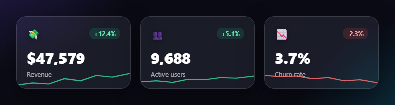
The glass stat card is the frosted, translucent KPI tile that floats over a colourful dashboard background — blurred glass, a trend pill, a big animated number, and a tiny sparkline. This snippet builds a responsive grid of them with plain HTML, CSS glassmorphism, and a small vanilla JavaScript count-up, with no charting library.
Real glassmorphism
The frosted effect is genuine backdrop-filter: blur(18px) saturate(140%) over a semi-transparent white background, so the colourful page behind the cards blurs through them rather than being faked with a flat panel. A thin gradient sheen on the top edge (::before) and a soft drop shadow sell the "pane of glass" look. The -webkit- prefix is included for Safari, where backdrop-filter still needs it.
Trend pills from a data attribute
Each card declares its direction with a data-trend of up or down, and CSS colours the delta pill green or red and the sparkline to match — one attribute drives the whole positive/negative theme of the card. This keeps the markup semantic and makes flipping a card's sentiment a single-value change.
Count-up figures
The big numbers animate from zero to their target with requestAnimationFrame and an ease-out cubic curve, reading their value and formatting from data attributes: data-to, optional data-decimals, data-prefix (like $), and data-suffix (like %). A formatter inserts thousands separators, and font-variant-numeric: tabular-nums keeps the digits from jittering as they roll. The same routine handles currency, counts, and percentages without per-card code.
Self-drawing sparklines
Each card's trend line is an inline SVG <polyline> animated with the stroke-dasharray/stroke-dashoffset "line draw" technique: the dash is set to the line's length and offset to hide it, then the offset animates to zero so the line draws itself left to right. It's pure CSS once the points are in place — a lightweight way to add a chart feel without a library.
Scroll-triggered, once
An IntersectionObserver starts the count-ups when the grid is 30% in view and disconnects, so the numbers animate exactly once as the dashboard appears. The sparkline draw runs on a short CSS delay so the line and the numbers feel coordinated.
Customizing it
Swap the emoji icons for SVGs, change the blur and tint, point the polylines at real data, or feed the figures from an API. The grid wraps responsively at any card count. Pair the cards with a metric card grid, a gradient stat ring, or a sparkline chart.
Build with AI
Build, Understand, Optimize, and Extend It With AI
Instead of stepping through the animation timing by hand, paste this snippet's HTML, CSS, and JS into an AI coding assistant like Claude and ask it to walk through exactly how the countUp function's ease-out cubic curve (1 minus (1 minus progress) to the third power) produces a decelerating roll, and how the stroke-dasharray/stroke-dashoffset pairing on the sparkline polyline makes the line appear to draw itself. It's also a good way to optimize the card, for example asking whether the IntersectionObserver threshold and the single shared count-up loop scale cleanly to a dashboard with dozens of these tiles instead of three. For extending it, ask it to wire the data-to values and polyline points to a live API response, add a tooltip that shows the exact value on sparkline hover, or support a compact single-row layout for narrow sidebars. Treat the code less like a finished artifact and more like a starting point for a conversation.
Prompt to recreate it
Copy this into your AI assistant of choice to build the effect from scratch, or as a jumping-off point for your own variant:
Build a row of frosted-glass KPI stat cards in plain HTML, CSS, and JavaScript using only backdrop-filter, inline SVG, and the Intersection Observer API — no canvas, no chart library.

Requirements:
- Each card must use real glassmorphism: backdrop-filter: blur combined with saturate over a semi-transparent white background, plus a thin gradient sheen on the top edge, so the colorful page behind genuinely blurs through rather than a flat panel with the same look.
- Each card must declare its trend direction as a single data attribute (up or down) on the card element, and CSS alone must use that attribute to color both a trend delta pill and a sparkline stroke, so changing a card's sentiment requires editing only that one attribute.
- Each card's headline number must be driven from data attributes: a numeric target value, and optional prefix, suffix, and decimal-place attributes, so the same formatting function handles currency, plain counts, and percentages.
- Write a count-up function that animates the number from zero to its target using requestAnimationFrame with an ease-out cubic easing curve over roughly 1.4 seconds, inserting thousands separators into the formatted output, and use font-variant-numeric: tabular-nums so the digits don't jitter horizontally while rolling.
- Include an inline SVG polyline sparkline in each card whose line "draws itself" using the stroke-dasharray and stroke-dashoffset technique animated via a CSS keyframe.
- Use a single IntersectionObserver watching the card grid to start every card's count-up animation once, the first time the grid scrolls into view at roughly 30% visibility, then disconnect so it never re-triggers.
Want to tighten it up first? Run this prompt through the AI Prompt Studio to score it across 8 quality dimensions, catch anti-patterns, and tune the wording for Claude, ChatGPT, or Gemini before you paste it in.
Step by step
How to Use
- 1Paste HTML, CSS, and JSThree glass KPI cards render over a gradient.
- 2Scroll them inThe figures count up and sparklines draw.
- 3Note the trend pillsUp is green, down is red, from one attribute.
- 4See the glassThe background blurs through each card.
- 5Set a valueEdit data-to, prefix, suffix, decimals.
- 6Use real dataPoint the polyline points at your series.
Real-world uses
Common Use Cases
Got questions?
Frequently Asked Questions
It is real glassmorphism: backdrop-filter: blur with saturate over a semi-transparent white background, so the colourful page behind the cards actually blurs through them. A thin gradient sheen on the top edge and a soft drop shadow complete the glass look. The -webkit- prefix is included because Safari still needs it for backdrop-filter.
Each card declares data-trend of up or down, and CSS colours both the delta pill (green or red) and the sparkline stroke to match. One attribute drives the entire positive or negative theme of the card, so flipping a card's sentiment is a single-value change with no extra classes.
Each trend line is an inline SVG polyline animated with the stroke-dasharray and stroke-dashoffset line-draw technique: the dash is set to the line's length and the offset hides it, then the offset animates to zero so the line draws left to right. It is pure CSS once the points are set — a lightweight chart feel without a library.
An IntersectionObserver starts the count-ups when the grid is 30% in view, then disconnects so they run once. Each figure animates from zero with requestAnimationFrame and an ease-out curve, reading its value and prefix, suffix, and decimals from data attributes, with thousands separators and tabular figures so it stays steady while rolling.
Render cards from a data array with value, trend, and series. Run each count-up in a mount effect with requestAnimationFrame writing to a ref'd node (not state) to avoid per-frame re-renders, started from an IntersectionObserver. Build the sparkline points from the series. The glass and line-draw CSS port unchanged; in Tailwind use backdrop-blur utilities.