Learn Coding Visually
Learn to code with interactive, live-preview playgrounds — HTML, CSS, JavaScript, React & more.
 HTML Playground42 lessons · Click-based · Live preview
 CSS PlaygroundLearn CSS with a live editor
 JavaScript Playground60 lessons · DOM · Async · Canvas
 React PlaygroundLearn React with a live code editor
 GSAP PlaygroundLearn GSAP animation interactively
 SVG Playground44 lessons · shapes · paths · animation
 SCSS Playground45 lessons · Sass modules · tokens
 Tailwind PlaygroundLearn Tailwind CSS with a live editor
 Bootstrap 5 Playground50 lessons · live preview
Feature Checklist — Free HTML CSS JS Checklist Card
Feature Checklist · Cards · Plain HTML, CSS & JS · Live preview
What's included
Features
About this UI Snippet
Feature Checklist — A Progress-Tracking Onboarding Card
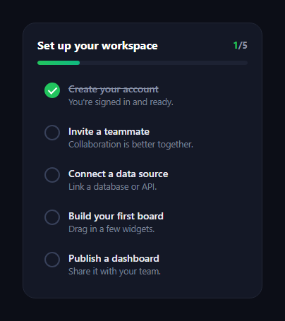
The feature checklist is the getting-started card that walks new users through setup tasks, ticking each one off with a satisfying check and filling a progress bar as they go — the onboarding pattern that boosts activation. This snippet builds it with plain HTML, CSS, and a small vanilla JavaScript tracker, including an animated check mark and a completion celebration.
The drawn check mark
Each item's checkbox is a circle whose tick is a ::after made from two borders forming an L, rotated 45°. At rest the tick is scaled to zero; when the item gains is-done it scales to one with a slight overshoot bezier, so the check "pops" in as if drawn. The circle fills green at the same time. Building the check from borders rather than an icon means it animates smoothly and recolours with a property — no SVG or icon font needed.
Toggle and derive
Clicking anywhere on an item toggles its is-done class — the whole row is the target, not just the box, which is a larger, friendlier hit area. A single update() function then derives everything from the current state: it counts done items, sets the counter, sets the progress bar width to that fraction, and shows the completion banner when all are done. Deriving the UI from one count keeps it impossible for the bar and the checks to disagree.
Animated progress bar
The progress bar fill is a gradient whose width transitions with an ease-out curve, so it glides to the new percentage each time an item toggles rather than jumping. The counter beside the heading ("3/5") updates in step, giving both a visual and a numeric read on progress.
Completing the list
Done items get a struck-through, dimmed title so finished tasks visibly recede, keeping attention on what's left. When the last item is checked, a celebration banner slides and fades in beneath the list; unchecking drops it back below 100% and hides the banner. This open/close on the completion state models the real reward moment of finishing onboarding.
Accessible, extendable structure
The list is a real <ul> of items with a title and description each, so it reads clearly and is easy to extend. In production you'd drive is-done from real completion data (account created, teammate invited) and persist progress, calling update() whenever a task completes in the background.
Customizing it
Add or remove tasks — the counter and bar adapt to the list length automatically — change the accent, the celebration copy, or make items links to the relevant setup screen. Pair it with an onboarding checklist widget, a progress wizard, or a profile completion meter.
Build with AI
Build, Understand, Optimize, and Extend It With AI
You don't have to trace the derived-state logic by memory to be confident it's correct. Paste this snippet's HTML, CSS, and JS into an AI coding assistant like Claude and ask it to explain exactly how the single update function recomputes the counter text, the progress bar width, and the completion banner's visibility all from one filtered count of done items, and why that single-source-of-truth approach guarantees the bar and the checkmarks can never visually disagree. The same assistant can help optimize it — ask whether re-querying all list items on every single click is worth caching, and whether the border-built checkmark's overshoot easing curve should be tuned differently for a checklist with many more items animating in quick succession. It's also useful for extending it: ask it to persist checked state to localStorage so progress survives a page reload, drive is-done from real async completion events instead of a click, or add a subtle confetti burst tied to the completion banner appearing. Treat the code less like a finished artifact and more like a starting point for a conversation.
Prompt to recreate it
Copy this into your AI assistant of choice to build the effect from scratch, or as a jumping-off point for your own variant:
Build an onboarding feature checklist card in plain HTML, CSS, and JavaScript with an animated progress bar and completion banner — no library.

Requirements:
- A list of task items, each with a title, a short description, and a circular checkbox indicator, where the checkmark itself is built from two CSS borders forming an L-shape rotated 45 degrees (not an SVG icon or icon font), scaled to zero by default and animated to full scale with a bouncy overshoot easing curve when the item is marked done.
- Clicking anywhere on an item's row (not just its small checkbox) must toggle that item's done state, since a larger click target is more forgiving on both touch and desktop.
- A single function must derive every dependent piece of UI from one count of currently-done items: the numeric counter text (e.g. "3/5"), the progress bar's fill width as a percentage, and whether a completion banner is shown — there must be no separate, independently-maintained state for the bar or the counter.
- The progress bar's fill must be a gradient element whose width transitions smoothly with an ease-out timing function whenever the done count changes, rather than snapping instantly to the new percentage.
- Completed items must visually recede: strike through the title text and mute its color, so attention naturally stays on the remaining unchecked items.
- When the done count reaches the total item count, a celebration banner must slide and fade into view beneath the list; unchecking any item so the count drops below the total must hide that banner again.
- The counter, the progress bar's percentage math, and the completion check must all be computed relative to the actual number of list items rendered, so adding or removing a task from the list requires no other code changes.
Want to tighten it up first? Run this prompt through the AI Prompt Studio to score it across 8 quality dimensions, catch anti-patterns, and tune the wording for Claude, ChatGPT, or Gemini before you paste it in.
Step by step
How to Use
- 1Paste HTML, CSS, and JSA 5-task checklist renders with one done.
- 2Click a taskIts check pops in and the bar advances.
- 3Watch the counterThe x/5 count tracks completion.
- 4Finish the listA celebration banner slides in at 100%.
- 5Uncheck a taskThe bar drops and the banner hides.
- 6Add a taskDrop in another item — totals adapt.
Real-world uses
Common Use Cases
Got questions?
Frequently Asked Questions
Each checkbox is a circle whose tick is a ::after made from two borders forming an L, rotated 45 degrees. At rest it is scaled to zero; when the item is done it scales to one with a slight overshoot bezier, so the check pops in as if drawn, while the circle fills green. Building it from borders means it animates smoothly with no SVG or icon font.
A single update function derives everything from the current state: it counts the done items, sets the counter, sets the progress bar width to that fraction, and toggles the completion banner. Because the whole UI is computed from one count, the bar and the checked items can never disagree.
Making the entire item the toggle target gives a much larger, friendlier hit area than a small checkbox, which is easier to tap on touch devices and quicker on desktop. The checkbox is purely visual; clicking anywhere on the row flips the is-done class.
Drive each item's is-done class from your real completion signals — account created, teammate invited, data source connected — and call update whenever one completes in the background. Persist the state so progress survives reloads. The check, bar, and banner all follow from the class, so your code only sets is-done per task.
Hold the tasks as an array of objects with a done flag in state. Render each item from the array, toggle its done flag on click, and derive the completed count, bar width, and banner visibility with computed values rather than manual DOM updates. The check and bar CSS port unchanged; persist the array to localStorage or your backend.