
Learn Coding Visually
Learn to code with interactive, live-preview playgrounds — HTML, CSS, JavaScript, React & more.
 HTML Playground42 lessons · Click-based · Live preview
 CSS PlaygroundLearn CSS with a live editor
 JavaScript Playground60 lessons · DOM · Async · Canvas
 React PlaygroundLearn React with a live code editor
 GSAP PlaygroundLearn GSAP animation interactively
 SVG Playground44 lessons · shapes · paths · animation
 SCSS Playground45 lessons · Sass modules · tokens
 Tailwind PlaygroundLearn Tailwind CSS with a live editor
 Bootstrap 5 Playground50 lessons · live preview
Empty State — Free HTML CSS Snippet
Empty State · Layouts · Plain HTML & CSS · Live preview
What's included
Features
About this UI Snippet
Empty State — Centred Illustration, Heading & CTA for Zero-Data Screens
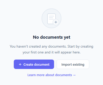
An empty state is shown when a page section has no data to display — an empty inbox, a search with no results, a new user with no items yet. It is the counterpart to the skeleton loader, which covers the loading phase before data either arrives or comes back empty. Good empty states don't just show nothing — they explain the situation, reassure the user, and provide a clear action to take next.
This snippet implements the standard empty state layout: a large emoji or illustration, a heading, a description, and one or two action buttons.
The layout
.empty uses display: flex; flex-direction: column; align-items: center; gap: 14px; text-align: center — a vertically stacked, centred layout. max-width: 360px keeps the content compact and readable.
The illustration
A large emoji in a soft-tinted circle communicates the context of the empty state at a glance. Replace the emoji with an SVG illustration for a more branded look.
Primary and secondary CTAs
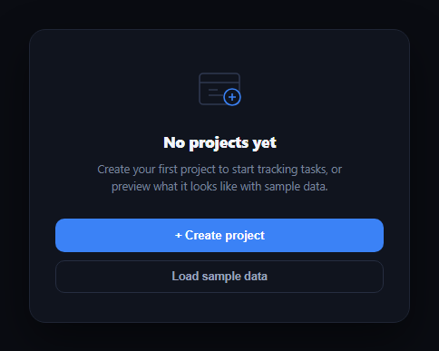
The primary CTA (filled button) is the most likely next action: "Create your first project", "Add an item", "Invite a teammate". The secondary CTA (ghost button) is an alternative: "Browse examples", "Learn more" — use the button group variants for the filled/ghost pairing. Showing two options without overwhelming the user is the standard empty state pattern.
Different empty state types
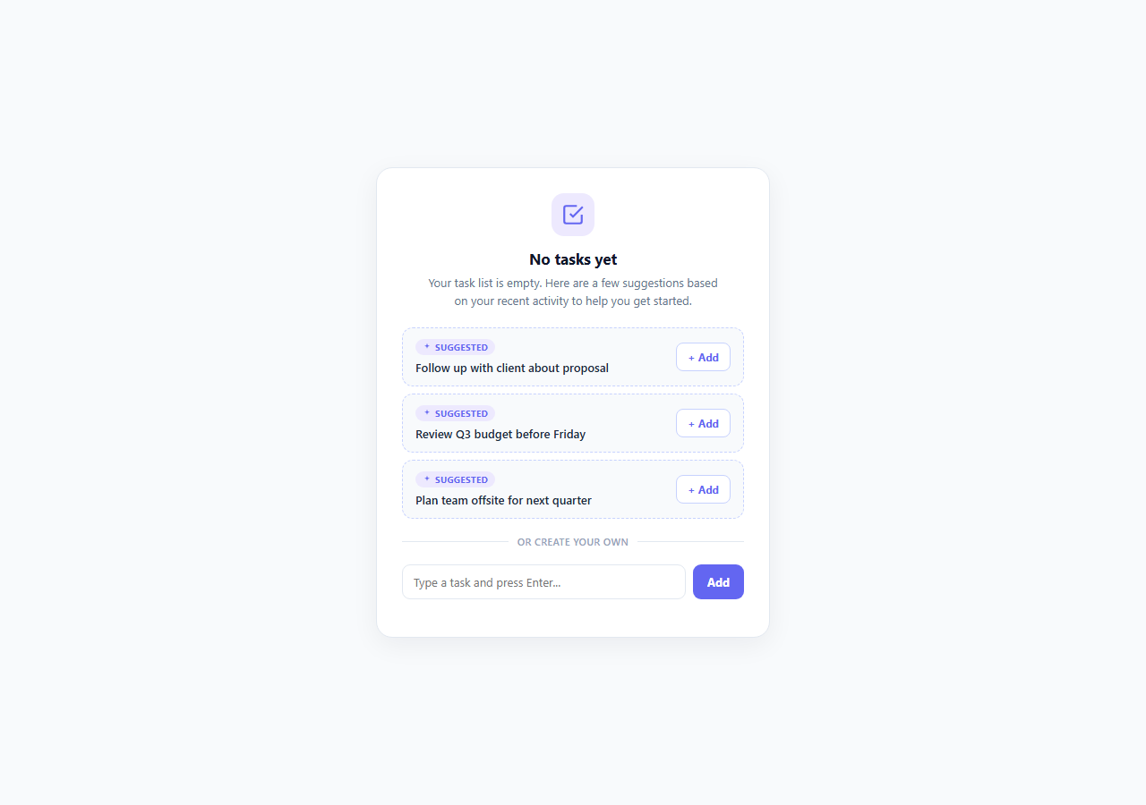
Three distinct empty state scenarios need different messaging: (1) First use — the user has not created anything yet. Use encouraging language: "Create your first project". (2) Empty search — a search box returned no results. Show what was searched: 'No results for "design"'. (3) No permissions — the user cannot see this content. Explain why and offer an alternative action.
The emoji vs SVG illustration choice
Emoji icons are quick to implement and universally recognised but vary by platform. SVG illustrations are fully branded but require design work. The emoji-in-circle pattern in this snippet is a practical middle ground for most applications. Replace the emoji div with an <img> element pointing to an SVG illustration for production use.
Microcopy guidelines
The heading should be factual and brief: "No projects yet", "Nothing here", "All caught up". The description should explain why and what to do next: "Projects you create will appear here. Start by adding your first one." Avoid technical jargon or system-internal error terminology in empty states that users see regularly.
Placement and sizing
Centre the empty state vertically and horizontally within its container. For dashboard widgets, use a reduced size (smaller emoji, smaller text). For full-page empty states (empty inbox, empty search), use the full-size variant. The max-width: 360px constraint keeps it readable on wide screens without the content stretching too far.
Build with AI
Build, Understand, Optimize, and Extend It With AI
You don't have to just trust that the illustration and copy are doing their job. Paste this snippet's HTML, CSS, and JS into an AI coding assistant like Claude and ask it to review the specific heading and description text against real empty-state microcopy guidelines, and to explain why the inline SVG illustration was built from simple shapes instead of an emoji or an external image file. The same assistant can help optimize it — ask whether the max-width constraint on the centered content block holds up inside a narrow dashboard widget versus a full-page empty state, and whether the primary button's temporary "Creating…" text swap should instead reflect a real async operation with a disabled state. It's also useful for extending the component: ask it to build three or four contextual variants (empty search, no permissions, connection error) that swap the illustration, heading, and CTA set based on a passed-in type, or to add a subtle entrance animation. Treat the code less like a finished artifact and more like a starting point for a conversation.
Prompt to recreate it
Copy this into your AI assistant of choice to build the effect from scratch, or as a jumping-off point for your own variant:
Build a reusable empty-state component in plain HTML, CSS, and JavaScript — no library, no framework.

Requirements:
- A centered, vertically stacked layout (flex column, centered alignment, text-align center) with a constrained max-width so the content stays readable and doesn't stretch across a wide container.
- An inline SVG illustration built from simple primitive shapes (circles, rectangles) rather than an emoji or an external image file, so it renders identically across platforms and requires no network request.
- A short, factual heading (not a generic "No data") and a supporting description that explains why the area is empty and what the user can do about it.
- A primary, visually filled call-to-action button representing the single most likely next action, and a secondary, lower-emphasis "ghost" style button (border only, no fill) offering an alternative path.
- The primary button's click handler should visually acknowledge the action was taken (for example, temporarily swapping its label to a "working" state) before resolving, without a full page reload.
- A lower-emphasis text link beneath the buttons for a "learn more" style secondary action that doesn't compete visually with the two buttons.
- Make sure every piece of text and every button label is easy to swap out to produce different empty-state variants (no items yet, no search results, no permission to view) from the same structural component.
Want to tighten it up first? Run this prompt through the AI Prompt Studio to score it across 8 quality dimensions, catch anti-patterns, and tune the wording for Claude, ChatGPT, or Gemini before you paste it in.
Source Code
<div class="scene">
  <div class="empty">
    <div class="illustration">
      <svg width="80" height="80" viewBox="0 0 80 80" fill="none">
        <circle cx="40" cy="40" r="38" fill="#f1f5f9" stroke="#e2e8f0" stroke-width="2"/>
        <rect x="24" y="22" width="32" height="40" rx="4" fill="#fff" stroke="#cbd5e1" stroke-width="1.5"/>
        <rect x="30" y="30" width="20" height="2.5" rx="1.25" fill="#e2e8f0"/>
        <rect x="30" y="36" width="16" height="2.5" rx="1.25" fill="#e2e8f0"/>
        <rect x="30" y="42" width="18" height="2.5" rx="1.25" fill="#e2e8f0"/>
        <circle cx="57" cy="55" r="12" fill="#f8fafc" stroke="#e2e8f0" stroke-width="1.5"/>
        <line x1="53" y1="55" x2="61" y2="55" stroke="#94a3b8" stroke-width="2" stroke-linecap="round"/>
        <line x1="57" y1="51" x2="57" y2="59" stroke="#94a3b8" stroke-width="2" stroke-linecap="round"/>
      </svg>
    </div>
    <h3>No documents yet</h3>
    <p>You haven't created any documents. Start by creating your first one and it will appear here.</p>
    <div class="actions">
      <button class="btn primary" onclick="this.textContent='Creating…';setTimeout(()=>this.textContent='Create document',1500)">
        <svg width="14" height="14" viewBox="0 0 24 24" fill="none" stroke="currentColor" stroke-width="2.5" stroke-linecap="round"><line x1="12" y1="5" x2="12" y2="19"/><line x1="5" y1="12" x2="19" y2="12"/></svg>
        Create document
      </button>
      <button class="btn ghost">Import existing</button>
    </div>
    <a href="#" class="learn-link">Learn more about documents →</a>
  </div>
</div>
* { box-sizing: border-box; margin: 0; padding: 0; }
body { font-family: system-ui, sans-serif; background: #f8fafc; display: flex; align-items: center; justify-content: center; min-height: 100vh; padding: 24px; }
.empty { display: flex; flex-direction: column; align-items: center; gap: 14px; text-align: center; max-width: 340px; }
.illustration { margin-bottom: 4px; }
h3 { font-size: 17px; font-weight: 700; color: #1e293b; }
p { font-size: 14px; color: #64748b; line-height: 1.65; }
.actions { display: flex; gap: 10px; flex-wrap: wrap; justify-content: center; margin-top: 4px; }
.btn { display: inline-flex; align-items: center; gap: 6px; padding: 9px 18px; font-size: 13px; font-weight: 600; border-radius: 8px; cursor: pointer; font-family: inherit; transition: all 0.15s; }
.btn.primary { background: #6366f1; color: #fff; border: none; }
.btn.primary:hover { background: #4f46e5; }
.btn.ghost { background: #fff; color: #475569; border: 1.5px solid #e2e8f0; }
.btn.ghost:hover { border-color: #6366f1; color: #6366f1; }
.learn-link { font-size: 13px; color: #6366f1; text-decoration: none; font-weight: 500; }
.learn-link:hover { text-decoration: underline; }Step by step
How to Use
- 1Load the snippetClick "Empty State" in the sidebar. The preview shows the centred empty state with illustration, heading, description, and CTA buttons.
- 2Update the illustrationIn the HTML panel, change the emoji inside .illustration to match your context.
- 3Update heading and descriptionChange the h2 and p text to explain the empty state context and reassure the user.
- 4Update CTA labels and actionsChange the primary and secondary button text to the most relevant actions for this empty state.
- 5Change the illustration colourUpdate the background colour on .illustration in the CSS panel to match your brand.
- 6Export in your formatClick "HTML" for a standalone file, "JSX" for a React component, or "Tailwind" for a React + Tailwind version.
Real-world uses
Common Use Cases
Got questions?
Frequently Asked Questions
A good empty state explains why it is empty (no items yet, no search results), reassures the user (this is normal), and gives them a clear action to take next (create the first item, try a different search). Avoid generic "No data" — that's unhelpful.
Replace the emoji span with an <img src="empty-illustration.svg"> or inline SVG. Set width and height to match the circle size (80px). Remove the background circle styling if the SVG already has its own background.
Change all three text elements: the emoji (to match the type of missing content), the heading ("No invoices yet" vs "No messages"), and the description ("Create your first invoice to get started").
Yes. Remove the min-height: 100vh from the body and set a fixed height on the .empty container. The flex centring works in any container size.
Yes. Click "JSX" for a React component. Pass icon, heading, description, and CTA props. Render conditionally: {items.length === 0 && <EmptyState ... />}.
Add a fadeIn CSS animation to .empty: @keyframes fadeIn { from { opacity: 0; transform: translateY(10px) } to { opacity: 1; transform: translateY(0) } }. The illustration, text, and buttons fade up together.