You Might Also Like
Learn Coding Visually
Learn to code with interactive, live-preview playgrounds — HTML, CSS, JavaScript, React & more.
 HTML Playground42 lessons · Click-based · Live preview
 CSS PlaygroundLearn CSS with a live editor
 JavaScript Playground60 lessons · DOM · Async · Canvas
 React PlaygroundLearn React with a live code editor
 GSAP PlaygroundLearn GSAP animation interactively
 SVG Playground44 lessons · shapes · paths · animation
 SCSS Playground45 lessons · Sass modules · tokens
 Tailwind PlaygroundLearn Tailwind CSS with a live editor
 Bootstrap 5 Playground50 lessons · live preview
Link in Bio Page — Free HTML CSS Template Snippet
Link in Bio Page · Layouts · Plain HTML, CSS & JS · Live preview
What's included
Features
About this UI Snippet
Link in Bio Page — Conic-Gradient Avatar Ring, Glassy Link Cards, Staggered Entrances & a Sheen-Highlighted Featured Link
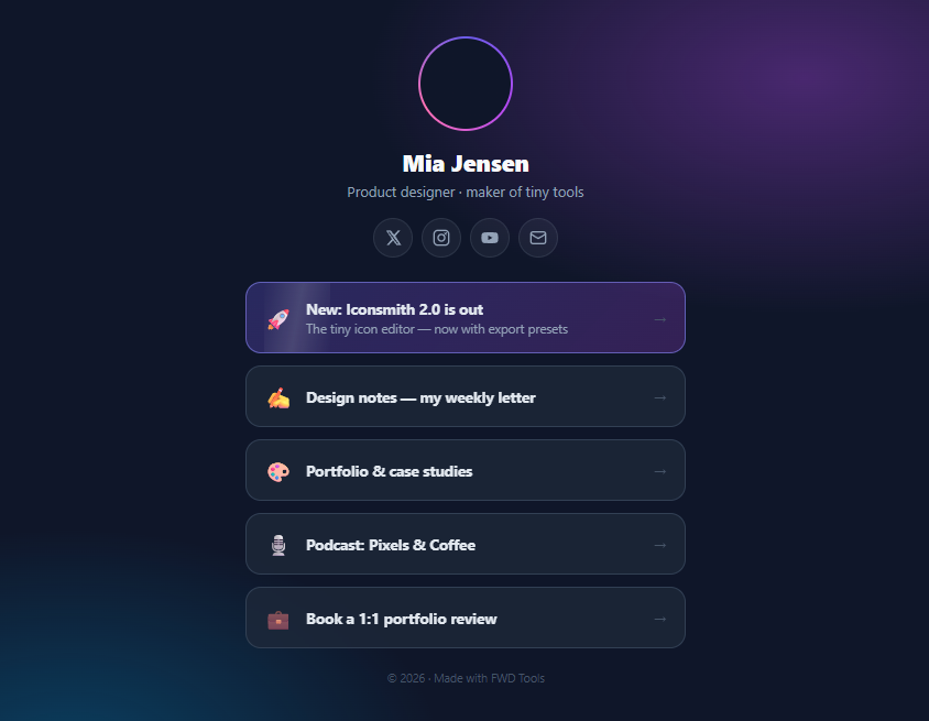
"Link in bio" pages are one of the most-created page types on the internet — every creator, freelancer, and small brand needs the one-URL hub that Instagram and TikTok bios demand, and "linktree clone HTML CSS" is a perennially high-volume search precisely because the page is so buildable: it's a column of links, styled with intent. This snippet is a complete, self-hostable bio page in pure HTML and CSS (the only JavaScript is an optional click-analytics hook): animated gradient avatar ring, name and tagline, a social icon row, a featured link with a moving sheen, four standard link cards with staggered entrances, and the ambient two-tone background glow.
The avatar ring: an animated conic gradient border
The profile ring uses the double-background border technique — the modern way to get gradient borders on rounded elements: the ring element paints linear-gradient(#0f172a, #0f172a) padding-box (a solid fill covering the inner area) over conic-gradient(#6366f1, #a855f7, #f472b6, #6366f1) border-box (the gradient, visible only through the 2px transparent border). Because the conic gradient starts and ends on the same colour, rotating the whole ring with a 6s linear spin is seamless — the Instagram-story-ring effect with no SVG and no extra elements. The initials avatar sits inset inside it; swap the <span> for an <img> with border-radius: 50%; object-fit: cover for a real photo.
Link cards: the anatomy that converts
Each link is a real <a> styled as a card: emoji icon, title (plus an optional subtitle on the featured link), and an arrow that nudges right on hover. The cards are translucent slate with backdrop-filter: blur so the background glow bleeds through — the glassy treatment that separates a designed bio page from default Linktree. Hover lifts the card 2px with a scale to 1.015 and an indigo-tinted shadow; :active compresses to 0.985 for tactile press feedback. Entrances are staggered with pure CSS: a shared link-in keyframe with animation: … backwards (so cards hold their pre-animation state during the delay) and per-card nth-of-type delays stepping 70ms — the cascade that makes the page feel alive on load without a line of JavaScript.
The featured link and its sheen
Creators always have one link that matters most right now — the launch, the drop, the new video — and bio tools converged on pinning it in a highlighted card. The featured card gets a gradient fill and stronger border, plus the attention detail: a periodic sheen — a skewed white gradient stripe (::after) that sweeps across every 3.2 seconds via a left-position keyframe with a long idle phase (0–60% parked off-canvas), so it glints rather than strobes. overflow: hidden clips the stripe to the card. All three animations on the page (ring, entrances, sheen) sit behind prefers-reduced-motion guards.
Structure, sharing, and the analytics hook
The page is a single centred 400px column — the width bio pages settled on because they're consumed inside in-app browsers on phones — over an ambient background of two radial colour washes on deep slate. Every interactive element is semantic (<a> links with aria-labels on the icon-only socials), so the page is fully functional as static HTML: host it on GitHub Pages or Netlify for free, and it *is* your Linktree replacement with no subscription and full design control. The only JS included is the hook those services charge for: a delegated click listener with commented one-liners for gtag or a fetch beacon, logging which link was clicked — swap in your analytics and you have click-through stats too.
Build with AI
Build, Understand, Optimize, and Extend It With AI
A bio page is the rare snippet you'll actually deploy as-is, so point an AI assistant at the deployment seams first: paste this into Claude with your name, links, and colours and ask for the personalised version plus the head section a real hosted page needs — title, OG tags, favicon — and the two-minute GitHub Pages walkthrough; that conversation ends with a live URL. Then improve what the services can't: ask for a light/dark auto theme via prefers-color-scheme keeping the four identity colours, a scheduled featured link (JS that swaps the featured class based on date ranges, so launches promote themselves), and the Cloudflare Worker + KV click-counter endpoint for the analytics hook if you want owned stats. The two CSS techniques are worth interrogating separately — have it explain why the ring's inner gradient must match the page background and what breaks visually when it doesn't, and why removing the animation-fill-mode backwards from the entrance animation makes cards flash — both answers transfer to every gradient border and staggered list you'll build after this one.
Prompt to recreate it
Copy this into your AI assistant of choice to build the effect from scratch, or as a jumping-off point for your own variant:
Build a complete link-in-bio profile page in pure HTML and CSS (JavaScript only as an optional click-analytics hook) — a self-hostable Linktree replacement. No libraries.

Requirements:
- A centred ~400px column over a deep slate body with two soft radial colour washes (violet top-right, cyan bottom-left) as ambient glow.
- Profile header: an initials avatar inside an animated gradient ring built with the double-background technique — a solid padding-box layer over a conic-gradient border-box layer showing through a 2px transparent border, the conic gradient closing its colour loop so a 6s linear rotation is seamless (comment why both parts matter); then name, one-line tagline, and an icon-only social row (X, Instagram, YouTube, email as inline SVGs) with aria-labels and hover lift.
- Link cards as real anchors: emoji slot, bold title, right arrow that nudges 3px on hover; translucent slate background with backdrop-blur, hover lifting 2px with slight scale and an indigo-tinted shadow, :active compressing for press feedback.
- One FEATURED card variant with a subtitle line, gradient fill, stronger border, and a periodic sheen: a skewed white gradient stripe ::after sweeping across on a ~3.2s keyframe whose first 60% parks it off-canvas so it glints rather than strobes, clipped by overflow: hidden.
- Staggered pure-CSS entrances: one shared fade-and-rise keyframe applied with animation-fill-mode: backwards and per-card nth-of-type delays stepping ~70ms (comment why backwards prevents the pre-delay flash).
- Guard all three animations (ring, entrances, sheen) with prefers-reduced-motion, and end with a small muted footer line.
- Include a delegated click listener that logs each clicked link's title with commented one-line swaps for gtag and a fetch beacon — and comment that with UTM parameters on the hrefs instead, the page runs with zero JavaScript.
Want to tighten it up first? Run this prompt through the AI Prompt Studio to score it across 8 quality dimensions, catch anti-patterns, and tune the wording for Claude, ChatGPT, or Gemini before you paste it in.
Step by step
How to Use
- 1Make it yoursReplace the initials (or swap the avatar span for <img src="you.jpg" style="border-radius:50%;object-fit:cover">), name, tagline, and footer. Point each bio-link's href at your real destinations and edit titles/emojis. Fill the social row's hrefs — the four icons (X, Instagram, YouTube, email) cover most creators; copy a wrapper <a> and paste any SVG icon for more.
- 2Choose the featured linkMove the featured class (and its subtitle line) to whichever card matters most right now — launches, latest video, active campaign. One featured card is the rule: the sheen and gradient lose all meaning when two cards carry them. When nothing is launching, remove the class entirely; an all-equal list reads more honest than a permanently "featured" newsletter.
- 3Retheme in four valuesThe identity colours live in four spots: the avatar gradient, the ring conic-gradient, the featured card gradient/border, and the two body-background radial washes. Swap the indigo/violet/pink trio for your palette and everything else (slate cards, greys) is neutral. For light mode, invert the base (#f8fafc body, white cards with rgba(15,23,42,0.06) borders) — the structure is theme-agnostic.
- 4Wire the click analyticsThe delegated listener already fires per link with its title. Uncomment the gtag line if you run Google Analytics, or point the fetch at a tiny endpoint (a Cloudflare Worker writing to KV is the classic free stack) to own your stats. For UTM tracking instead, append ?utm_source=bio&utm_medium=link to each href and skip the JS entirely — the page then needs zero JavaScript.
- 5Deploy it freeThis is a single static page: export the HTML, drop it in a GitHub repo with Pages enabled (or Netlify/Vercel drag-and-drop), and put your custom domain on it. Add <meta> OG tags (title, description, og:image of your avatar) so the link unfurls nicely when shared, and a <title> — in-app browsers show it. Total cost: the domain.
- 6Extend and composeNatural additions from this library: an embedded Newsletter Signup card between links, the Social Proof Popup for live activity, a QR Code Generator card for offline-to-online, Video Testimonial Card for coaches, and the Noise Background grain layer over the ambient glow for extra texture. Click JSX to export a React version where links render from a data array.
Real-world uses
Common Use Cases
Got questions?
Frequently Asked Questions
It exploits background-clip. The ring element has a 2px transparent border and two stacked backgrounds: the top layer is a "gradient" from the page colour to itself — effectively a solid fill — clipped to padding-box, so it covers everything inside the border; the bottom layer is the conic gradient clipped to border-box, covering the full element including the border area. Result: the conic gradient is visible only through the 2px transparent border strip — a gradient border that respects border-radius: 50%, which plain border-image cannot do (border-image ignores radius). The spin works because the conic gradient's colour stops start and end on the same indigo, so the seam at 0°/360° is invisible and a linear rotate loops seamlessly. Two practical notes: the inner solid layer must match the page background (change both together when retheming), and if you need the avatar image itself to sit flush against the ring, an alternative single-element version puts the conic gradient on the avatar's own border with the photo as a third background layer — the two-element version here is simpler to reason about and lets the ring spin independently of the content.
Because of what delayed elements show before their animation starts. The stagger gives card 5 a 0.33s delay — but by default, an element with a pending animation renders in its normal styled state during the delay, so all five cards would appear instantly and then card-by-card jump back to invisible and animate in: a visible flash of the end state that ruins the cascade. fill-mode: backwards makes each element adopt its animation's from-state (opacity 0, translateY 12px) for the duration of its delay, so cards are genuinely hidden until their turn arrives. The shorthand animation: link-in 0.5s backwards encodes it. The alternative approaches each cost more: setting initial opacity: 0 in the base styles works but leaves the page permanently blank if CSS animations are disabled or fail (the fill-mode version degrades to visible content); JS-driven staggering (IntersectionObserver + class toggling) is warranted only when items enter on scroll rather than on load. The 70ms step is the sweet spot for a five-item list — perceptible as a cascade, finished in under half a second.
Four additions to the exported HTML, all in the head. A <title> ("Mia Jensen — links") since in-app browsers display it; Open Graph tags so the URL unfurls when shared — og:title, og:description, og:image (a square version of your avatar works; 1200×630 for the full card), and twitter:card summary; a viewport meta (width=device-width, initial-scale=1) which any export already includes; and a favicon. Then deploy: GitHub Pages (push, enable Pages), Netlify/Vercel (drag the folder in), or Cloudflare Pages all host static files free with HTTPS, and each supports custom domains — the domain is the only cost. Replace the onclick="return false" demo guards with real hrefs, and add rel="noopener" to external links along with target="_blank" if you want them opening outside the in-app browser (opinions differ: same-tab keeps the back-button flow Instagram users expect). For analytics without a backend, the UTM-parameter approach in the how-to needs nothing; for owned click counts, a Cloudflare Worker + KV endpoint receiving the fetch beacon is the standard free stack.
React: the page becomes two small components over data — const LINKS = [{ emoji, title, sub?, href, featured? }] mapped to <BioLink> cards, and a profile object for the header; the stagger translates to style={{ animationDelay: i * 70 + "ms" }} on each card (nth-of-type can't see array order, so inline delays replace it), and the analytics hook becomes an onClick handler receiving the link object — which is also where a bio-page builder product would swap in editable state. Tailwind: cards are flex items-center gap-3 bg-slate-800/75 backdrop-blur-md border border-slate-700 rounded-2xl px-4 py-3.5 mb-3 transition hover:-translate-y-0.5 hover:scale-[1.015] hover:border-indigo-500 hover:shadow-lg hover:shadow-indigo-500/20 active:scale-[0.985]; the featured variant adds bg-gradient-to-br from-indigo-500/30 to-purple-500/20 border-indigo-400/60 relative overflow-hidden with the sheen as a custom keyframe in the config (arbitrary keyframes don't inline); the ring needs its double-background as an arbitrary value or a small CSS snippet — [background:linear-gradient(#0f172a,#0f172a)padding-box,conic-gradient(#6366f1,#a855f7,#f472b6,#6366f1)border-box] border-2 border-transparent rounded-full animate-[spin_6s_linear_infinite] — and the entrance stagger uses animate-[link-in_0.5s_backwards] with inline delays as in React.