You Might Also Like
Learn Coding Visually
Learn to code with interactive, live-preview playgrounds — HTML, CSS, JavaScript, React & more.
 HTML Playground42 lessons · Click-based · Live preview
 CSS PlaygroundLearn CSS with a live editor
 JavaScript Playground60 lessons · DOM · Async · Canvas
 React PlaygroundLearn React with a live code editor
 GSAP PlaygroundLearn GSAP animation interactively
 SVG Playground44 lessons · shapes · paths · animation
 SCSS Playground45 lessons · Sass modules · tokens
 Tailwind PlaygroundLearn Tailwind CSS with a live editor
 Bootstrap 5 Playground50 lessons · live preview
Noise Grain Background — Free HTML CSS Snippet
Noise Grain Background · Animations · Plain HTML, CSS & JS · Live preview
What's included
Features
About this UI Snippet
Noise Grain Background — feTurbulence Data URI, mix-blend-mode: overlay, Oversized steps() Jitter & Custom-Property Controls
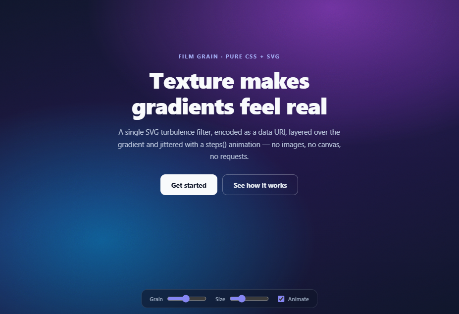
Flat gradients read as digital; grainy gradients read as designed. The noise-texture overlay — subtle film grain over rich colour — is the finishing move of current landing-page design (Linear, Stripe blog art, every "lights on dark" hero of the past three years) because it breaks banding, adds perceived depth, and makes cheap CSS gradients feel like photographed material. This snippet produces the entire effect from *zero assets*: one inline SVG feTurbulence filter encoded as a data URI, blended over a layered gradient, and optionally animated into living film grain with a steps() jitter — all controllable through two CSS custom properties.
The noise source: feTurbulence in a data URI
The grain is an SVG the browser renders on the fly: a 300×300 <svg> containing a <filter> with feTurbulence type="fractalNoise" baseFrequency="0.9" numOctaves="2", applied to a rect and URL-encoded into background-image: url("data:image/svg+xml,…"). feTurbulence is a Perlin-noise generator living inside the SVG filter spec — the same primitive behind the Liquid Blob and gooey effects — and at high base frequency it produces exactly the fine monochrome static of film grain. Because it's a data URI there are no network requests, no PNG assets to version, and the noise is resolution-independent: background-size (exposed as --grain-size) rescales the tile, with stitchTiles='stitch' making edges wrap seamlessly. Key encoding detail: inside a data URI the # of url(#n) must be escaped as %23, the classic gotcha that silently breaks copied snippets.
Why mix-blend-mode: overlay
A naive grain layer with plain opacity just greys the design — it sits *on* the colours. mix-blend-mode: overlay makes the noise interact with them: overlay lightens where the grain is light and darkens where it's dark, pivoting around mid-grey, which is precisely how physical grain behaves in film emulsion. The gradient's hues stay saturated while gaining texture; highlights sparkle slightly, shadows deepen. The layer is a ::after pseudo-element with pointer-events: none (grain must never eat clicks), sitting under the z-index: 1 content. Practical opacity lives between 0.05 (barely-there paper texture) and 0.25 (heavy analog mood) — the demo's Grain slider covers exactly this range via --grain-opacity.
Living grain: the oversized steps() jitter
Static grain can look like a dirty screen; *moving* grain reads as film. Real grain doesn't slide — every frame is a completely different random field — so animating with smooth motion is wrong. The trick is two-part: the grain layer is oversized with inset: -100% (nine times the area of its container), and a steps(8) animation teleports it between five translate positions per 0.7s cycle. steps() removes interpolation — the layer *jumps*, and because each jump shows a different patch of the oversized noise field, the eye reads successive independent grain frames at ~11fps, the flicker cadence of projected film. The oversizing guarantees no jump ever exposes an edge. A prefers-reduced-motion block disables the jitter (grain stays, flicker stops), and the demo's Animate checkbox toggles the same class.
Zero-JS core, custom-property API
The JavaScript in this snippet exists only for the demo controls: sliders write --grain-opacity and --grain-size, the checkbox toggles .grain-animated. The effect itself is a copy-paste ::after block — drop it on any hero, card, or full page, tune two variables, done. That custom-property surface is also the right production API: theme-level grain intensity, per-section overrides, or a "reduce effects" user setting all become one setProperty call. The backdrop is itself a lesson in layered gradients — two radial color washes over a diagonal base — because grain shows best over exactly such soft, band-prone gradients.
Build with AI
Build, Understand, Optimize, and Extend It With AI
Noise is a parameter space, and an AI assistant explores it faster than slider-fiddling: paste this snippet into Claude and ask it to generate five named grain presets — "35mm portrait", "VHS static", "paper stock", "banding fix", "brutalist concrete" — as sets of baseFrequency, numOctaves, type, size, opacity, and blend-mode values, with a sentence on when each fits; then have it explain why fractalNoise versus turbulence changes the character, which is the conceptual core of feTurbulence. For integration, hand it your actual hero markup and ask it to graft the ::after layer non-destructively (it will catch the position/overflow/z-index prerequisites and the existing-pseudo-element conflict), or ask for the Tailwind config entry so the data URI lives in one place. Two extensions worth requesting: an IntersectionObserver that pauses the flicker off-screen, and a canvas-based true-per-frame grain variant with an honest comparison of when its cost is justified over this zero-JS version — the trade-off is the real lesson.
Prompt to recreate it
Copy this into your AI assistant of choice to build the effect from scratch, or as a jumping-off point for your own variant:
Build a film-grain noise background in pure HTML and CSS (JavaScript only for demo controls) — a textured gradient hero where the grain is generated entirely by an SVG filter, no image assets, no canvas.

Requirements:
- A full-viewport hero with a layered backdrop: two soft radial colour washes (violet and cyan) over a dark diagonal linear gradient — deliberately the kind of smooth dark gradient that shows banding, which the grain will fix.
- Generate the grain with an inline SVG encoded as a background-image data URI: a filter containing feTurbulence with type fractalNoise, baseFrequency around 0.9, numOctaves 2, and stitchTiles='stitch' for seamless tiling, applied to a full-size rect — and encode the URI correctly, especially # as %23 in the filter reference (comment this gotcha).
- Apply the grain as a ::after pseudo-element with pointer-events: none, blended via mix-blend-mode: overlay so the noise lightens highlights and darkens shadows instead of greying the colours; expose intensity and tile size as the custom properties --grain-opacity and --grain-size with sensible defaults.
- Make the grain "live" like projected film: oversize the layer with inset: -100% and animate it with a ~0.7s steps(8) keyframe cycle that teleports it between several translate positions — steps() must remove interpolation so each jump shows an uncorrelated patch of the oversized noise field, and the oversizing must guarantee no jump ever exposes an edge (comment both invariants).
- Include a prefers-reduced-motion block that stops the flicker but keeps the static texture, and keep hero content above the grain with a z-index: 1 wrapper.
- Add a small glassy control bar pinned to the bottom with three demo controls wired in minimal JS: a Grain slider (0–0.30 opacity), a Size slider (80–300px background-size), and an Animate checkbox toggling the flicker class — the effect itself must work with JavaScript disabled.
- Style the hero content (kicker, clamp()-sized headline, subline, two buttons) so the demo doubles as a usable landing-page hero.
Want to tighten it up first? Run this prompt through the AI Prompt Studio to score it across 8 quality dimensions, catch anti-patterns, and tune the wording for Claude, ChatGPT, or Gemini before you paste it in.
Step by step
How to Use
- 1Feel the difference grain makesDrag the Grain slider to 0 and look at the gradient — smooth, slightly banded, "digital". Bring it back to ~14 and the surface gains tooth and depth. Push to 25+ for a heavy analog mood. Toggle Animate off to compare static grain (paper texture) against the living film flicker. Resize Size to see coarse 35mm-style grain (larger) versus fine digital grain (smaller).
- 2Drop it on your own elementCopy the .hero::after block onto any positioned container (position: relative; overflow: hidden required — the layer is oversized on purpose). It works over gradients, photos, and solid colours alike. Set --grain-opacity and --grain-size on the container to tune. For whole-page grain, put the ::after on a fixed full-viewport wrapper — but keep pointer-events: none and stay below modal z-indexes.
- 3Tune the noise characterInside the data URI: baseFrequency (0.9) is grain fineness at the source — 0.5 gives blobbier organic noise, 1.2 near-white static; numOctaves (2) adds detail layers, 1 is flatter and cheaper. type="fractalNoise" is soft and filmic; type="turbulence" is stringier, good for fabric or concrete textures. After editing, re-URL-encode: # → %23 is mandatory, quotes and angle brackets should be encoded as in the snippet.
- 4Choose the right blend modeoverlay is the default for colour-preserving texture. soft-light is gentler (safe over photography and text-heavy sections). multiply only darkens — moody, good over light backgrounds where overlay washes out. For monochrome grain on near-black designs, plain normal blending at 4–6% opacity often beats blend modes. If the container creates no stacking context for blending (rare), add isolation: isolate to scope the blend.
- 5Watch the two performance detailsThe steps() animation transforms a compositor-only property on a pseudo-element — cheap — but the layer is 9× the container's area; on very large containers (full-page heroes on 4K), drop inset to -50% and shrink the jitter translates to ±1.5% accordingly. And mix-blend-mode forces the section into its own compositing layer: fine in isolation, but avoid stacking many blended grain layers in one scroll view.
- 6Export and combineClick JSX/HTML export for your framework — the effect is pure CSS so it ports as a class. Grain composes beautifully with this library's other backdrop snippets: over the Gradient Mesh Hero or Aurora Background for texture, behind Glass Cards (grain outside, blur inside), or with the Spotlight hover effect where grain keeps the lit area from looking sterile.
Real-world uses
Common Use Cases
Got questions?
Frequently Asked Questions
Three practical wins and one aesthetic one. No asset: the data URI ships inside the CSS, so there is no texture file to host, version, or lose — the snippet is genuinely copy-paste. No resolution ceiling: a PNG tile blurs on high-DPR screens or when scaled up, while feTurbulence renders sharp at any background-size because the browser rasterises the SVG at display resolution. No requests: PNG textures are render-blocking-adjacent decoration; the data URI costs ~400 bytes inline. Canvas noise (filling ImageData with random values) is the alternative for truly per-frame random grain, but it costs JavaScript, a resize handler, and main-thread work — while this approach is zero-JS and compositor-animated. The aesthetic point: fractalNoise is Perlin-based, so its grain has the slightly clustered, organic distribution of film emulsion rather than the harsh uniform static of raw Math.random() — which is why the same filter at low frequency produces natural-looking blobs and terrain.
Because real grain does not move — it is reborn every frame. Film grain is a fresh random field 24 times a second; if you slide a noise texture smoothly, the eye immediately locks onto the pattern and tracks it, reading "a dirty texture drifting" instead of "living grain". steps(8) removes interpolation entirely: the layer teleports between the keyframe positions, and each teleport presents a visually uncorrelated patch of noise, which at ~11 effective fps convincingly imitates the per-frame rebirth (slightly under film rate, which reads as more textural). The oversizing (inset: -100%) exists because the layer must have somewhere to jump to: translating a container-sized layer by 3% would drag blank space into view at the edges; a 3×3-sized layer can jump anywhere in a ±33% range with the container always fully covered. The translate percentages are of the layer's own (tripled) size, so the demo's ±3% jumps are actually ±9% of the container — enough to decorrelate the visible patch completely.
Kept as shipped, it is one of the cheaper effects in this library: the noise rasterises once per size change (then it is a cached background tile), the jitter animates transform only (compositor-thread, no layout or paint), and there is no JavaScript in the loop. The two costs to watch: mix-blend-mode promotes the blended subtree into its own compositing group — one grain hero is nothing, but a page with six independently-blended grain sections forces the compositor to maintain six groups, so prefer one page-level grain layer over many; and the oversized pseudo-element's memory footprint scales with container area × 9 — on a full-viewport 4K hero that is a large layer, so reduce inset to -50% (with proportionally smaller jumps) if profiling shows memory pressure. Two free optimisations: freeze the animation off-screen with an IntersectionObserver toggling the grain-animated class, and respect the already-included prefers-reduced-motion block, which also saves the compositor work entirely for those users.
Tailwind: the layer maps to after:content-[''] after:absolute after:-inset-full after:pointer-events-none after:mix-blend-overlay after:opacity-[var(--grain-opacity,0.14)] with the data URI as an arbitrary background — after:bg-[url('data:image/svg+xml,…')] works but the URI's commas must be URL-encoded (%2C) to survive Tailwind's arbitrary-value parser, so most teams register it once in the config as backgroundImage: { grain: "url(…)" } and use after:bg-grain; the steps() keyframes go in the config's keyframes/animation blocks. React/Vue/Angular: nothing framework-specific exists here — ship the CSS globally or in a styled/module file and toggle the grain-animated class from state; the slider-to-custom-property wiring becomes style={{ "--grain-opacity": intensity }} on the container. Over existing brand backgrounds: the ::after approach needs position: relative and overflow: hidden on the host and will sit above the host's children unless they carry z-index — the demo's z-index: 1 content wrapper is the pattern; if the host already uses ::after, nest one dedicated grain <div aria-hidden> as the last child with the same inset/blend styles instead.