You Might Also Like
Learn Coding Visually
Learn to code with interactive, live-preview playgrounds — HTML, CSS, JavaScript, React & more.
 HTML Playground42 lessons · Click-based · Live preview
 CSS PlaygroundLearn CSS with a live editor
 JavaScript Playground60 lessons · DOM · Async · Canvas
 React PlaygroundLearn React with a live code editor
 GSAP PlaygroundLearn GSAP animation interactively
 SVG Playground44 lessons · shapes · paths · animation
 SCSS Playground45 lessons · Sass modules · tokens
 Tailwind PlaygroundLearn Tailwind CSS with a live editor
 Bootstrap 5 Playground50 lessons · live preview
Cursor Text Label Effect — HTML CSS JS Snippet
Cursor Text Label · Animations · Plain HTML, CSS & JS · Live preview
What's included
Features
About this UI Snippet
Cursor Text Label — Lerp Follower, Dot-to-Pill Morph, data-Attribute Zones & Hover-Capability Guards
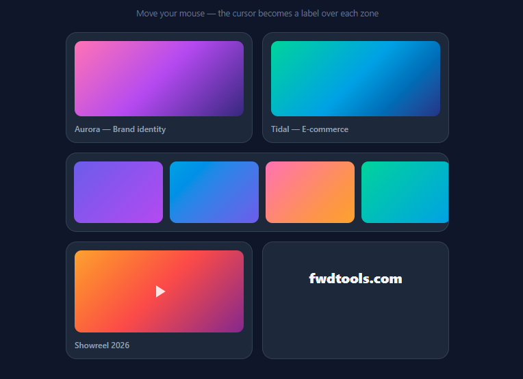
The contextual cursor — a dot that follows the pointer and blooms into "View" over a project card, "Drag" over a gallery, "Play" over a showreel — is the signature interaction of premium agency and portfolio sites (Locomotive, Studio Freight lineage, every Awwwards winner of the last five years). It works because it moves affordance *to the point of attention*: instead of scanning for buttons, the user's own cursor tells them what a click will do right here. This snippet implements the complete pattern in vanilla JavaScript — smooth lagged following, the dot-to-pill morph, per-zone styling, a genuinely draggable gallery to prove the "Drag" label honest, and the capability guards that make custom cursors safe to ship.
The follower: lerp on requestAnimationFrame
The cursor never snaps to the pointer. mousemove only updates a *target* (tx, ty); a permanent requestAnimationFrame loop moves the rendered position a fixed fraction toward the target each frame — x += (tx - x) * 0.18 — the classic exponential lerp. The result is the trademark elastic lag: fast flicks leave the dot trailing behind, then it catches up with an implied spring. One number tunes the whole personality (0.1 is dreamy, 0.3 is snappy). Because position updates run in the rAF loop and only write left/top on a position: fixed element with transform: translate(-50%,-50%) centering, the effect stays off the layout hot path; pointer-events: none guarantees the cursor element never steals hovers or clicks from the page beneath it.
The morph: transitioning between dot and pill
The resting state is a 12px dot. Entering a labelled zone adds .has-text, which switches width: auto with a min-width, 34px height, and horizontal padding — and the border-radius (already 20px) rounds the resulting pill automatically. The size transition uses a back-eased cubic-bezier (0.34, 1.3, 0.64, 1) so the pill *pops* slightly past its final size, while the label fades and scales in on a 60ms delay — the stagger that makes the morph read as growth rather than a swap. On exit, the text is deliberately kept in the DOM during the shrink (cleared on a timeout only if no new zone was entered) so the pill never collapses around vanished text mid-transition.
Zones by data attribute, resolved by delegation
Zones declare themselves with data-cursor="View" — content authors add the attribute, nothing else. A single delegated mouseover listener on the document resolves e.target.closest('[data-cursor]'), and an activeZone guard makes the handler idempotent across the many mouseover events child elements fire. Optional data-cursor-style="drag" adds a style-drag class for per-zone colour (indigo for drag, amber for play) — the label and the look both travel with the markup. The drag zone is real: pointer-captured dragging translates the gallery track with clamped bounds, because a cursor that says "Drag" over something undraggable is worse than no cursor at all.
The guards that make it shippable
Custom cursors have two classic failure modes, both handled here. Touch devices: @media (hover: none), (pointer: coarse) hides the cursor element entirely, and the cursor: none that suppresses the native cursor is itself wrapped in the *opposite* query — (hover: hover) and (pointer: fine) — so touch and stylus users keep completely standard behaviour. Initial paint: the cursor starts at opacity: 0 off-screen and only appears on the first mousemove, avoiding the dead dot in the corner before the user moves. Click feedback scales the dot to 0.9 on mousedown, and mouseleave on the document hides it when the pointer exits the window. What this snippet deliberately does not do is remove focus outlines — keyboard users never see a custom cursor, so all native focus behaviour remains intact.
Build with AI
Build, Understand, Optimize, and Extend It With AI
This effect is one of those where the last 20% — the guards — is worth more than the headline trick, and an AI assistant can audit that for you: paste the snippet into Claude and ask it to list every failure mode a naive custom cursor has (touch devices, stolen clicks, corner flash, focus-outline vandalism, reduced-motion) and point to the exact line here that handles each — then ask which one is still missing (reduced-motion) and have it add the prefers-reduced-motion EASE snap. For creative direction, ask it to build variants on the same chassis: the mix-blend-mode difference inversion cursor with the solid-pill-on-text exception explained in the how-to, magnetic attraction by intercepting the target coordinates near zone centres, or a cursor that previews a thumbnail image instead of text over gallery items. And if you're integrating into React or Angular, ask specifically for the refs-not-state / runOutsideAngular version with cleanup — the rAF-loop-in-a-framework part is where copy-pasted cursors typically leak or lag, and the assistant can explain why while writing it.
Prompt to recreate it
Copy this into your AI assistant of choice to build the effect from scratch, or as a jumping-off point for your own variant:
Build an agency-style contextual cursor in plain HTML, CSS, and JavaScript — a dot that follows the pointer with elastic lag and morphs into text labels over designated zones. No libraries.

Requirements:
- A fixed-position follower element (12px dot, translate(-50%,-50%) centred, pointer-events: none, high z-index) that trails the pointer using the target/rendered-position split: mousemove only updates target coordinates, and a requestAnimationFrame loop lerps the rendered position toward them by a fixed fraction (~0.18) per frame — the single constant that tunes the elastic feel.
- The follower starts invisible and appears on first mousemove, hides when the pointer leaves the window, and scales to 0.9 while the mouse button is down.
- Zones opt in via data-cursor="Label" attributes, resolved by ONE delegated mouseover listener using closest() with an active-zone guard for idempotency; entering a zone morphs the dot into a pill — width auto with min-width, taller height, horizontal padding, back-eased overshoot transition — while the label fades and scales in on a ~60ms delay; on exit, keep the old text during the shrink (clear it on a timeout only if no new zone was entered) so the pill never collapses around vanished text.
- Support per-zone styling via an optional data-cursor-style attribute mapped to style-* classes (e.g. an indigo Drag variant and an amber Play variant).
- Demo zones in a card grid: two project cards labelled "View", a wide gallery labelled "Drag" that ACTUALLY drags (pointer capture, translateX clamped to the track's bounds — the label must be honest), a video card labelled "Play" with a play glyph, and a link zone labelled "Visit ↗".
- Ship the capability guards: hide the follower entirely under @media (hover: none), (pointer: coarse), and apply cursor: none to the page ONLY inside @media (hover: hover) and (pointer: fine) so touch and stylus users keep fully native behaviour; leave all keyboard focus outlines untouched and mark the follower aria-hidden.
- Comment the code on why targets-plus-lerp beats direct assignment and why the two media queries must be separate.
Want to tighten it up first? Run this prompt through the AI Prompt Studio to score it across 8 quality dimensions, catch anti-patterns, and tune the wording for Claude, ChatGPT, or Gemini before you paste it in.
Step by step
How to Use
- 1Explore the zonesMove the mouse (desktop only — on touch the effect disables itself). The white dot trails your pointer with an elastic lag. Over the two project cards it blooms into a "View" pill; over the gallery it becomes an indigo "Drag" — and the gallery really drags, with clamped bounds; over the showreel it turns amber "Play"; over the link it reads "Visit ↗". Click anywhere to see the press-scale feedback.
- 2Label your own elementsAdd data-cursor="Read more" to any element — card, section, link — and the delegated listener picks it up with zero extra JS. Add data-cursor-style="accent" plus a .cursor.style-accent { background: … } rule for per-zone colouring. Remove the attribute and the element reverts to the plain dot. This attribute-driven contract is what makes the pattern maintainable across a CMS-driven site.
- 3Tune the feelEASE (0.18) is the personality dial: 0.1 for a dreamy luxury lag, 0.25–0.3 for a tight productive feel. The morph timing lives in the .cursor transition (0.28s back-eased) and the label's 60ms delay — lengthen both for a softer bloom. Dot size (12px), pill height (34px), and the click scale (0.9) are single values in the CSS.
- 4Blend mode variantFor the inverted-circle look many agencies use, set the resting cursor to background: #fff; mix-blend-mode: difference and remove per-zone backgrounds — the dot then inverts whatever it crosses. Keep mix-blend-mode off the has-text state (text on difference-blended pills becomes unreadable on mid-tone backgrounds); switch to a solid pill when a label shows, which is exactly why the two states are separate classes.
- 5Add magnetic attractionCombine with the Magnetic Button technique: on mousemove inside a zone, offset the target (tx, ty) toward the zone's centre by ~20% of the distance, so the cursor "sticks" to interactive elements. Because the follower already works on targets rather than raw pointer position, magnetism is a two-line interception in the mousemove handler.
- 6Export and composeClick JSX for React — run the rAF loop in a useEffect with cleanup, keep positions in refs (never state — 60 renders/sec), and drive zone state from the delegated listener. Pairs with the Custom Cursor base pattern, Hover Image Trail for gallery flourishes, Quickto Cursor for the GSAP-powered equivalent, and the Drag Scroll Row for the full draggable-gallery treatment.
Real-world uses
Common Use Cases
Got questions?
Frequently Asked Questions
Direct assignment produces a cursor glued to the pointer — technically fine, but visually identical to the native cursor and prone to jitter, since mousemove events fire at input-device rate (often 125–1000Hz) out of sync with display refresh. The target/rendered split fixes both: mousemove merely records intent (tx, ty), and a requestAnimationFrame loop — locked to the display — moves the rendered position a fixed fraction of the remaining distance each frame. That exponential approach curve is what reads as elasticity: the gap grows during fast movement (the trail) and closes smoothly at rest, with the EASE fraction controlling the time constant. It also creates the architecture bonus the how-to exploits: because everything downstream works on targets, effects like magnetic attraction or freeze-on-zone are two-line interceptions of the target rather than rewrites of the render path.
On touch there is no persistent pointer, so a custom cursor is meaningless — worse, cursor: none left active would suppress nothing (no cursor exists) while the follower element could still flash at its last position. Two complementary queries handle the two halves: @media (hover: none), (pointer: coarse) hides the follower element entirely, and — the half most implementations forget — the cursor: none suppression is itself wrapped in the positive @media (hover: hover) and (pointer: fine), so touch, stylus, and hybrid users keep fully native cursor behaviour rather than inheriting cursor: none from a stylesheet written for mice. Hybrid devices (Surface, iPad with trackpad) resolve per the active input: the queries re-evaluate when a trackpad attaches. The interaction remains functional throughout because the follower is decorative — zones are still real links and draggable regions with native semantics underneath.
The follower itself is aria-hidden decoration with pointer-events: none — screen readers and keyboards never encounter it. The accessibility risks are in what implementations remove around it, and this snippet deliberately removes nothing: keyboard focus outlines stay (keyboard users never see the cursor, so suppressing :focus-visible styling to "match the aesthetic" is pure harm); zones remain semantic elements (the Visit zone is a real <a>, the gallery a real scrollable region), so the cursor label supplements rather than replaces affordance; and the native cursor is only hidden where the replacement is guaranteed present. Two additions worth making in production: honour prefers-reduced-motion by snapping EASE to 1 (position still follows, elasticity removed), and ensure any information the label conveys ("Play", "Drag") is also available non-cursor ways — visible on focus, or implicit in the element's role — since the label is invisible to keyboard and touch users by design.
React: create the follower once in a component mounted at the app root; run the rAF loop inside useEffect (returning cancelAnimationFrame cleanup), and keep tx/ty/x/y in refs — routing them through useState would schedule 60 renders per second for an element React doesn't need to reconcile. Zone state can stay delegated exactly as in the vanilla version (one document listener in the same effect), which conveniently keeps it working across route changes without per-component wiring; alternatively expose a useCursorLabel(label) hook that sets data-cursor via a ref for component-scoped ergonomics. Angular: a CursorDirective with @HostListener is tempting but per-element; better is a singleton service starting the rAF loop outside the zone (NgZone.runOutsideAngular — critical, or change detection runs per frame) with the delegated listener, plus an optional [cursorLabel] attribute directive that just writes the data attribute. Tailwind: the follower is fixed left-0 top-0 z-[999] size-3 bg-slate-100 rounded-full pointer-events-none -translate-x-1/2 -translate-y-1/2 transition-[width,height,background] with the pill state as data-[text]:w-auto data-[text]:h-8 data-[text]:px-3, per-zone colours as data-[style=drag]:bg-indigo-500 — only the back-eased timing function needs an arbitrary value or config entry.