Source Code
<div class="player-wrap">
  <div class="player" id="player">

    <!-- Video element (replace src with your video URL) -->
    <video
      id="vid"
      class="video"
      preload="auto"
      poster="https://images.unsplash.com/photo-1469474968028-56623f02e42e?w=680&q=80"
      onclick="togglePlay()"
    >
      <source src="https://interactive-examples.mdn.mozilla.net/media/cc0-videos/flower.webm" type="video/webm">
      <source src="https://interactive-examples.mdn.mozilla.net/media/cc0-videos/flower.mp4" type="video/mp4">
    </video>

    <!-- Big play overlay -->
    <div class="play-overlay" id="play-overlay" onclick="togglePlay()">
      <svg width="56" height="56" viewBox="0 0 24 24" fill="currentColor"><polygon points="5 3 19 12 5 21 5 3"/></svg>
    </div>

    <!-- Controls -->
    <div class="controls" id="controls">
      <!-- Progress bar -->
      <div class="progress-wrap" id="progress-wrap" onclick="seek(event)">
        <div class="progress-bg"></div>
        <div class="progress-buf" id="progress-buf"></div>
        <div class="progress-fill" id="progress-fill"></div>
        <div class="progress-thumb" id="progress-thumb"></div>
      </div>

      <div class="ctrl-row">
        <!-- Play/pause -->
        <button class="ctrl-btn" id="play-btn" onclick="togglePlay()" aria-label="Play/pause">
          <svg id="play-icon" width="16" height="16" viewBox="0 0 24 24" fill="currentColor"><polygon points="5 3 19 12 5 21 5 3"/></svg>
        </button>

        <!-- Volume -->
        <div class="vol-wrap">
          <button class="ctrl-btn" id="vol-btn" onclick="toggleMute()" aria-label="Toggle mute">
            <svg id="vol-icon" width="16" height="16" viewBox="0 0 24 24" fill="none" stroke="currentColor" stroke-width="2.2" stroke-linecap="round"><polygon points="11 5 6 9 2 9 2 15 6 15 11 19 11 5"/><path d="M15.54 8.46a5 5 0 0 1 0 7.07"/><path d="M19.07 4.93a10 10 0 0 1 0 14.14"/></svg>
          </button>
          <input type="range" class="vol-range" id="vol-range" min="0" max="1" step="0.05" value="1" oninput="setVol(this.value)">
        </div>

        <!-- Time -->
        <span class="time-display" id="time-display">0:00 / 0:00</span>

        <div class="ctrl-right">
          <!-- Playback speed -->
          <button class="ctrl-btn speed-btn" id="speed-btn" onclick="cycleSpeed()" title="Playback speed">1×</button>

          <!-- Fullscreen -->
          <button class="ctrl-btn" onclick="toggleFS()" aria-label="Fullscreen">
            <svg width="14" height="14" viewBox="0 0 24 24" fill="none" stroke="currentColor" stroke-width="2.2" stroke-linecap="round"><polyline points="15 3 21 3 21 9"/><polyline points="9 21 3 21 3 15"/><line x1="21" y1="3" x2="14" y2="10"/><line x1="3" y1="21" x2="10" y2="14"/></svg>
          </button>
        </div>
      </div>
    </div>
  </div>
</div>
* { box-sizing: border-box; margin: 0; padding: 0; }
body { font-family: system-ui, sans-serif; background: #0f172a; min-height: 100vh; display: flex; align-items: center; justify-content: center; padding: 24px; }
.player-wrap { width: 100%; max-width: 680px; }
.player { position: relative; background: #000; border-radius: 12px; overflow: hidden; aspect-ratio: 16/9; }
.video { width: 100%; height: 100%; display: block; object-fit: contain; cursor: pointer; }
/* Big play overlay */
.play-overlay { position: absolute; inset: 0; display: flex; align-items: center; justify-content: center; color: rgba(255,255,255,0.9); cursor: pointer; transition: opacity 0.2s; }
.play-overlay.hidden { opacity: 0; pointer-events: none; }
.play-overlay svg { filter: drop-shadow(0 2px 8px rgba(0,0,0,0.5)); }
/* Controls */
.controls { position: absolute; bottom: 0; left: 0; right: 0; background: linear-gradient(to top, rgba(0,0,0,0.85) 0%, transparent 100%); padding: 20px 12px 10px; opacity: 0; transition: opacity 0.25s; }
.player:hover .controls { opacity: 1; }
.player.paused .controls { opacity: 1; }
/* Progress bar */
.progress-wrap { position: relative; height: 18px; cursor: pointer; display: flex; align-items: center; margin-bottom: 6px; }
.progress-bg, .progress-buf, .progress-fill { position: absolute; height: 3px; border-radius: 2px; left: 0; }
.progress-bg { width: 100%; background: rgba(255,255,255,0.2); }
.progress-buf { background: rgba(255,255,255,0.3); width: 0%; transition: width 0.5s; }
.progress-fill { background: #6366f1; width: 0%; }
.progress-thumb { position: absolute; width: 12px; height: 12px; border-radius: 50%; background: #fff; top: 50%; transform: translate(-50%,-50%); left: 0%; box-shadow: 0 1px 4px rgba(0,0,0,0.4); opacity: 0; transition: opacity 0.15s; pointer-events: none; }
.progress-wrap:hover .progress-thumb { opacity: 1; }
.progress-wrap:hover .progress-fill { height: 5px; }
.progress-wrap:hover .progress-bg { height: 5px; }
/* Control row */
.ctrl-row { display: flex; align-items: center; gap: 8px; }
.ctrl-btn { background: none; border: none; color: #fff; cursor: pointer; padding: 4px; border-radius: 4px; display: flex; align-items: center; justify-content: center; transition: background 0.12s; flex-shrink: 0; }
.ctrl-btn:hover { background: rgba(255,255,255,0.15); }
.speed-btn { font-size: 12px; font-weight: 700; min-width: 28px; font-family: inherit; }
.vol-wrap { display: flex; align-items: center; gap: 4px; }
.vol-range { width: 60px; -webkit-appearance: none; height: 3px; border-radius: 2px; background: rgba(255,255,255,0.4); outline: none; cursor: pointer; accent-color: #6366f1; }
.time-display { font-size: 12px; color: rgba(255,255,255,0.8); flex: 1; white-space: nowrap; font-variant-numeric: tabular-nums; }
.ctrl-right { margin-left: auto; display: flex; gap: 4px; }const vid = document.getElementById('vid');
const player = document.getElementById('player');
const playBtn = document.getElementById('play-btn');
const playIcon = document.getElementById('play-icon');
const overlay = document.getElementById('play-overlay');
const fill = document.getElementById('progress-fill');
const buf = document.getElementById('progress-buf');
const thumb = document.getElementById('progress-thumb');
const timeLbl = document.getElementById('time-display');
const volRange = document.getElementById('vol-range');
const speedBtn = document.getElementById('speed-btn');
const PLAY_SVG = '<polygon points="5 3 19 12 5 21 5 3"/>';
const PAUSE_SVG = '<rect x="6" y="4" width="4" height="16"/><rect x="14" y="4" width="4" height="16"/>';
const SPEEDS = [0.5, 0.75, 1, 1.25, 1.5, 2];
let speedIdx = 2;
function fmt(s) {
const m = Math.floor(s/60), ss = Math.floor(s%60);
return m + ':' + String(ss).padStart(2,'0');
}
function togglePlay() {
if (vid.paused) {
vid.play().catch(() => {});
playIcon.innerHTML = PAUSE_SVG;
overlay.classList.add('hidden');
player.classList.remove('paused');
} else {
vid.pause();
playIcon.innerHTML = PLAY_SVG;
overlay.classList.remove('hidden');
player.classList.add('paused');
}
}
vid.addEventListener('timeupdate', () => {
if (!vid.duration) return;
const pct = (vid.currentTime / vid.duration) * 100;
fill.style.width = pct + '%';
thumb.style.left = pct + '%';
timeLbl.textContent = fmt(vid.currentTime) + ' / ' + fmt(vid.duration);
});
vid.addEventListener('progress', () => {
if (!vid.duration) return;
const b = vid.buffered;
if (b.length) buf.style.width = (b.end(b.length-1)/vid.duration*100) + '%';
});
vid.addEventListener('ended', () => {
playIcon.innerHTML = PLAY_SVG;
overlay.classList.remove('hidden');
player.classList.add('paused');
});
vid.addEventListener('loadedmetadata', () => {
timeLbl.textContent = '0:00 / ' + fmt(vid.duration);
player.classList.add('paused');
});
function seek(e) {
if (!vid.duration) return;
const rect = e.currentTarget.getBoundingClientRect();
const pct = Math.max(0, Math.min(1, (e.clientX - rect.left) / rect.width));
vid.currentTime = pct * vid.duration;
}
function toggleMute() {
vid.muted = !vid.muted;
volRange.value = vid.muted ? 0 : vid.volume;
}
function setVol(v) {
vid.volume = +v;
vid.muted = +v === 0;
}
function cycleSpeed() {
speedIdx = (speedIdx + 1) % SPEEDS.length;
vid.playbackRate = SPEEDS[speedIdx];
speedBtn.textContent = SPEEDS[speedIdx] + '×';
}
function toggleFS() {
if (document.fullscreenElement) document.exitFullscreen();
else player.requestFullscreen?.();
}
// Space bar toggle
document.addEventListener('keydown', e => {
if (e.code === 'Space' && e.target.tagName !== 'INPUT') { e.preventDefault(); togglePlay(); }
});Learn Coding Visually
Learn to code with interactive, live-preview playgrounds — HTML, CSS, JavaScript, React & more.
 HTML Playground42 lessons · Click-based · Live preview
 CSS PlaygroundLearn CSS with a live editor
 JavaScript Playground60 lessons · DOM · Async · Canvas
 React PlaygroundLearn React with a live code editor
 GSAP PlaygroundLearn GSAP animation interactively
 SVG Playground44 lessons · shapes · paths · animation
 SCSS Playground45 lessons · Sass modules · tokens
 Tailwind PlaygroundLearn Tailwind CSS with a live editor
 Bootstrap 5 Playground50 lessons · live preview
Video Player — Free HTML CSS JS Custom Controls Snippet
Video Player · Layouts · Plain HTML, CSS & JS · Live preview
What's included
Features
About this UI Snippet
Video Player — Progress Bar, Buffer Indicator, Speed Control, Volume & Fullscreen
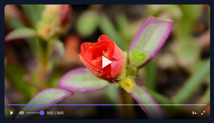
The browser's default video controls are a small grey bar stamped with whatever the OS vendor shipped — Chrome's look different from Safari's, both look different from Firefox's, and none of them match anything you've actually designed. Replace them once with a custom player and you own the entire surface: the font, the colours, the shape of the scrubber thumb, and which controls even appear. This snippet builds a complete replacement from the HTML5 Video API up: a three-layer progress bar with a buffer indicator and click-to-seek, volume slider, mute toggle, playback speed cycling through six presets, fullscreen, a spacebar shortcut that ignores input fields, and controls that fade away while playing and reappear on hover or pause.
Three layers, one click: the progress bar
The scrubber is built from three absolutely-positioned <span> elements stacked inside one container: a dim white track at 20% opacity for the full width, a slightly brighter buffer fill, and an indigo playback fill on top. The seek() function handles a click anywhere on that container — const pct = (e.clientX - rect.left) / rect.width turns a raw pixel position into a 0-to-1 fraction, clamped by Math.max(0, Math.min(1, ...)), then vid.currentTime = pct * vid.duration jumps there immediately. There's no separate "drag" mode — a single click is enough, which keeps the interaction model simple without sacrificing precision.
Reading the buffer without polling
Networks aren't instant: the browser downloads a video in chunks, and a good player tells you how far ahead it has buffered. The progress event fires whenever a new chunk arrives; at that point vid.buffered.end(vid.buffered.length - 1) returns the furthest buffered position in seconds, and dividing by vid.duration converts it to the width percentage for the buffer-fill span. That single read-on-progress pattern is cheaper than a polling loop and exactly as accurate — the browser already knows when data arrives, so there's no reason to ask on a timer.
Controls that appear when you need them, vanish when you don't
The control bar has opacity: 0 and transition: opacity 0.2s by default. Two CSS rules do the rest: .player:hover .controls brings them back whenever a mouse is nearby, and .player.paused .controls keeps them fully visible whenever the video is stopped — because a paused player with invisible controls looks broken. JavaScript only needs to manage the .paused class; the hover state is handled entirely by CSS selectors with no event listeners involved.
Speed cycling as a mod-wrapped index
SPEEDS = [0.5, 0.75, 1, 1.25, 1.5, 2] lives in an array; speedIdx tracks the current position. Every click does speedIdx = (speedIdx + 1) % SPEEDS.length, picks the next value, sets vid.playbackRate, and updates the button label. The modulo wraps 2× back to 0.5× without any branching. It's the same compact cycling pattern the Music Player Card uses for its shuffle-and-repeat state — one index, one array, one % operator, done.
A spacebar shortcut that minds its manners
The keydown listener is attached to document, so it fires regardless of where focus sits on the page — press space anywhere and the video toggles. The guard e.target.tagName !== 'INPUT' (extended here to also skip TEXTAREA) prevents the shortcut from firing when a user is typing somewhere on the same page and happens to press the space bar. It's the same "global listener with an escape hatch" pattern behind the keyboard shortcuts modal in the Keyboard Shortcuts Modal snippet.
Swapping in your own video
Update the <source src="..."> with your video URL. For self-hosted files, list a .webm source first (smaller, faster in Chrome and Firefox) with an .mp4 fallback — the browser picks the first format it can play. The poster attribute on <video> sets a thumbnail shown before playback starts and while paused at currentTime = 0; for anything with a representative frame, it's the difference between a player that looks ready and a black rectangle.
Build with AI
Build, Understand, Optimize, and Extend It With AI
Instead of tracing the event wiring by hand, paste this snippet's HTML, CSS, and JS into an AI coding assistant like Claude and ask it to explain exactly why the buffer indicator is updated from the video's progress event using vid.buffered.end() rather than from timeupdate or a polling interval, and why seek() computes its percentage from getBoundingClientRect() instead of any stored pixel width. It's also worth asking it to reason about the speed-cycling index — have it explain why speedIdx = (speedIdx + 1) % SPEEDS.length is preferable to a chain of if/else comparisons as more speed presets are added. For extending it, have it add chapter markers rendered as small ticks on the progress bar at specific timestamps, picture-in-picture support via requestPictureInPicture, or a captions/subtitles toggle wired to a track element. Treat the code less like a finished artifact and more like a starting point for a conversation.
Prompt to recreate it
Copy this into your AI assistant of choice to build the effect from scratch, or as a jumping-off point for your own variant:
Build a custom HTML5 video player with fully custom controls in plain HTML, CSS, and vanilla JavaScript with no libraries, replacing every native browser control.

Requirements:
- A video element with multiple source formats, a poster image, and a large centered play/pause overlay icon that hides once playback starts and reappears on pause or when the video ends.
- A progress/seek bar built from three stacked layers: a dim full-width track, a buffer-fill layer, and a playback-fill layer, plus a draggable-looking thumb that only becomes visible on hover. Clicking anywhere on the bar must compute the click position as a fraction of the bar's width using getBoundingClientRect and jump the video's currentTime to that fraction of its duration.
- Update the playback-fill layer's width and the thumb's position on every timeupdate event, and update the buffer-fill layer's width by reading the video's buffered time ranges on the progress event (not on a timer and not on timeupdate).
- A time display showing "current / total" formatted as minutes:seconds, updated alongside the progress fill.
- A volume control combining a mute-toggle button (which must swap its icon and also update the slider's displayed value) and a range slider bound to the video's volume property, where setting the slider to zero should also set the muted property to true.
- A playback speed button that cycles forward through a fixed array of speed multipliers (e.g. 0.5x through 2x) using modulo arithmetic on an index, updating both vid.playbackRate and its own label text on each click.
- A fullscreen toggle button using the Fullscreen API, and control bar visibility that fades in on hover or whenever the video is paused, and fades out otherwise.
- A global spacebar keydown handler that toggles play/pause, but must not fire when the currently focused element is an input field.
Want to tighten it up first? Run this prompt through the AI Prompt Studio to score it across 8 quality dimensions, catch anti-patterns, and tune the wording for Claude, ChatGPT, or Gemini before you paste it in.
Step by step
How to Use
- 1Click the play button or video area to startThe video starts playing and the controls fade to a lower opacity. Hover over the player to show controls. The space bar also toggles play/pause from anywhere on the page.
- 2Click the progress bar to seekClick anywhere on the progress bar to jump to that position. The indigo fill shows playback progress; the lighter fill shows how much is buffered.
- 3Adjust volume and speedDrag the volume slider to set volume. Click the speaker icon to mute/unmute. Click the speed button to cycle through 0.5×, 0.75×, 1×, 1.25×, 1.5×, 2× speeds.
- 4Replace the video sourceUpdate the <source src="..."> tag with your video URL. Use an MP4 source for widest browser compatibility. Add a WebM source as the first option for better performance in Firefox and Chrome.
- 5Add a poster imageSet the poster attribute on the <video> element: <video poster="thumbnail.jpg">. The poster shows before the video loads and while it is paused at the start position.
- 6Export in your formatClick "HTML" for a standalone file, "JSX" for a React component using useRef for the video element, or "Tailwind" for a React + Tailwind CSS version.
Real-world uses
Common Use Cases
Got questions?
Frequently Asked Questions
The snippet uses a sample Big Buck Bunny MP4 from Google's CDN. The iframe sandbox may block external resources in some environments. For production, host the video file on your own domain or CDN and set the correct CORS headers. If you need a test video, use a data URI for very short clips, or host locally with a simple HTTP server.
Add chapter data as an array: const chapters = [{time:0,label:"Intro"},{time:120,label:"Main"},{time:300,label:"Summary"}]. After the progress bar, map each chapter to a position marker: const marker = document.createElement("div"); marker.className = "chapter-marker"; marker.style.left = (chapter.time/vid.duration*100)+"%"; progressWrap.appendChild(marker). Style .chapter-marker as a 2px white vertical line.
Add a <track> element inside the <video>: <track kind="subtitles" src="subtitles.vtt" srclang="en" label="English" default>. The browser renders the WebVTT captions automatically. For a custom subtitle display, use vid.textTracks[0].oncuechange to read the current cue text and update a custom overlay element instead of using the native caption rendering.
Click "JSX" to download. Use useRef(null) for vidRef, playerRef, etc. Replace document.getElementById calls with ref.current. Attach event listeners in useEffect: vidRef.current.addEventListener("timeupdate", handleTimeUpdate). Return cleanup: () => vidRef.current.removeEventListener("timeupdate", handleTimeUpdate). For the keyboard listener, attach to document in useEffect with cleanup to prevent multiple listeners.