Learn Coding Visually
Learn to code with interactive, live-preview playgrounds — HTML, CSS, JavaScript, React & more.
 HTML Playground42 lessons · Click-based · Live preview
 CSS PlaygroundLearn CSS with a live editor
 JavaScript Playground60 lessons · DOM · Async · Canvas
 React PlaygroundLearn React with a live code editor
 GSAP PlaygroundLearn GSAP animation interactively
 SVG Playground44 lessons · shapes · paths · animation
 SCSS Playground45 lessons · Sass modules · tokens
 Tailwind PlaygroundLearn Tailwind CSS with a live editor
 Bootstrap 5 Playground50 lessons · live preview
Coverflow Carousel — 3D Cards HTML CSS JS Snippet
Coverflow Carousel · Cards · Plain HTML, CSS & JS · Live preview
What's included
Features
current, so one layout function defines the entire 3D arrangement.translateX/translateZ/rotateY/scale and transition: transform, running on the GPU and exporting cleanly to Tailwind/React.perspective: 1200px and preserve-3d turn per-card rotateY/translateZ into genuine depth, not flat skew.z-index follows distance so the active card is on top, and cards beyond two steps fade out and disable pointer events.goTo reads a card's data-index and recentres it, so any visible card is one click from active.prev/next as the buttons.::after overlay darkens non-active cards and clears on the centre one, drawing the eye to the active item.About this UI Snippet
Coverflow Carousel — Perspective Rotation, Depth Scaling & Centred Active Card
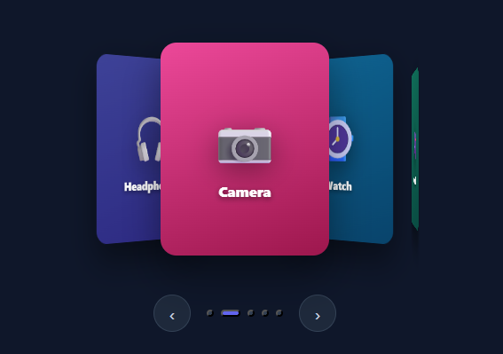
Coverflow — the 3D carousel that fans cards out in perspective with the active one front-and-centre and its neighbours angled and receding — is one of the most visually impressive ways to browse a small set of items. Made famous by iTunes, it instantly communicates "there's more on either side". This snippet implements it in plain HTML, CSS, and vanilla JavaScript using only transforms, so it animates on the GPU and exports cleanly to every framework: cards rotate and scale by their distance from centre, with prev/next buttons, clickable cards, position dots, and arrow-key support.
One layout function, pure transforms
Every card's appearance is derived from a single number: its offset from the current index. layout loops the cards and, for each, computes off = i - current and builds one transform: translateX to fan it out, translateZ to push non-active cards back in space, rotateY to angle it like an album cover, and scale to shrink it slightly with distance. The active card (off === 0) sits flat, large, and forward. Because everything is a transform with a transition: transform, the rearrangement runs on the compositor — smooth, and it survives a Tailwind/React export intact (utility frameworks animate transforms, not layout).
Perspective and stacking
The track sets perspective: 1200px and transform-style: preserve-3d, which is what turns the per-card rotateY/translateZ into real 3D depth rather than flat skewing. layout also sets each card's z-index to 100 - distance so the active card stacks above its neighbours, and fades/disables cards more than two steps away (opacity: 0, pointer-events: none) so the wings don't pile up infinitely or capture clicks.
Click, buttons, dots, and keyboard
Four navigation paths all funnel into layout: clicking any visible card calls goTo (centring it), the prev/next buttons step the index with bounds checks, the auto-generated dots jump straight to a slide, and Left/Right arrow keys move through. A dimming overlay (::after) darkens every non-active card and clears on the active one, focusing attention on the centre.
Dynamic dots
The dots are built in JS from the card count, so the indicator always matches the number of slides — add or remove a card and the dots follow. The active dot widens into a pill for a clear position cue.
Because the whole thing is driven by current and layout, wiring it to real data (product images, album art) is just swapping the card contents. Pair this with a carousel for a flat slider, a scroll-snap gallery for swipe galleries, or a product card grid.
Build with AI
Build, Understand, Optimize, and Extend It With AI
You don't have to work out the offset math by hand to see why the whole 3D fan is driven by one number per card. Paste this snippet's HTML, CSS, and JS into an AI coding assistant like Claude and ask it to explain exactly how a single "distance from current index" value feeds into the translateX, translateZ, rotateY, and scale terms simultaneously, and why perspective and preserve-3d have to be set on different elements (the track versus nothing on the cards themselves) for the depth effect to render correctly. The same assistant can help optimize it — for instance asking whether recalculating and rewriting every card's transform on every navigation step is necessary versus only updating the cards whose distance-from-current actually changed. It's also useful for extending the carousel: ask it to add touch/drag support so users can swipe through cards with their finger, make the spread and rotation angles responsive so the effect looks right on narrow phone screens, or add momentum so a fast swipe skips multiple cards instead of always stepping one at a time. Treat the code less like a finished artifact and more like a starting point for a conversation.
Prompt to recreate it
Copy this into your AI assistant of choice to build the effect from scratch, or as a jumping-off point for your own variant:
Build a 3D "coverflow" carousel in plain HTML, CSS, and JavaScript using only CSS 3D transforms — no carousel library, no scroll-snap.

Requirements:
- A perspective-enabled container holding a set of absolutely-positioned cards, where transform-style preserve-3d is set on the appropriate parent so child rotateY and translateZ values produce genuine depth rather than flat 2D transforms.
- A single layout function that is the only place that writes each card's transform: for every card, compute its integer offset from the currently active index, then derive a horizontal translateX proportional to that offset, a translateZ that pushes the card backward the further it is from center, a rotateY that angles it like an album cover tilted away from center, and a scale that shrinks it slightly with distance — all four values driven by that one offset number, not tracked independently.
- The active card (offset zero) must end up flat, full-size, and topmost via z-index, with z-index for every other card assigned according to how far it is from center so nearer-to-active cards always stack above farther ones.
- Cards more than a couple of steps from center must fade to fully transparent and have pointer-events disabled, so they don't visually clutter the edges or intercept clicks while still existing in the DOM.
- Clicking any visible (non-culled) card must animate it into the center position by updating the current index and re-running the layout function.
- Provide previous/next buttons that step the current index by one with bounds checking so it can't go below the first or past the last card, plus a row of position-indicator dots generated dynamically from the card count (not hardcoded) where clicking a dot jumps straight to that index and the active dot is visually distinguished from the rest.
- Support left/right arrow key navigation that calls the same previous/next logic as the buttons.
- All motion must use CSS transitions on the transform property only, so the animation stays smooth and compositor-driven rather than triggering layout.
Want to tighten it up first? Run this prompt through the AI Prompt Studio to score it across 8 quality dimensions, catch anti-patterns, and tune the wording for Claude, ChatGPT, or Gemini before you paste it in.
Step by step
How to Use
- 1Paste HTML, CSS, and JSA 3D coverflow appears with five cards; the centre one faces you while its neighbours angle back into perspective.
- 2Use prev/nextClick the ‹ and › buttons — the cards rotate and slide so the next item swings to the centre.
- 3Click a side cardClick any angled card — it animates to the centre and flattens, becoming the active item.
- 4Use the dotsClick a position dot to jump straight to that card; the active dot widens into a pill.
- 5Arrow keysPress Left/Right to move through the carousel without the mouse.
- 6Swap in real contentReplace each card's gradient and emoji with an image and caption for album art or product covers.
Real-world uses
Common Use Cases
Got questions?
Frequently Asked Questions
Track touchstart/touchmove (and optional mousedown/mousemove) on the track: record the start X, and on release compare the delta to a threshold to call next() or prev(). For live drag, map the horizontal delta to a fractional offset and pass it into a tweaked layout so the cards follow the finger before snapping to the nearest index.
Edit the constants in layout: the off * 115 term controls horizontal spacing, off * -48 the rotation per step, -abs * 120 how far back neighbours recede, and 1 - abs * 0.06 the size falloff. Increase rotation and translateZ for a more dramatic 3D look, or reduce them for a subtler fan.
Transforms (translate, rotate, scale) are GPU-accelerated and do not trigger layout, so the animation is smooth even with shadows and many cards. Crucially for this site's exports, Tailwind's transition utility animates transform but not left/margin, so a transform-based coverflow behaves identically in the React + Tailwind build.
Provide real controls (the snippet uses <button>s with aria-labels) and arrow-key support so it is keyboard-operable. Mark the active card with aria-current and consider an aria-live announcement of the centred item's title on change. Ensure non-active, faded cards are not focusable (this snippet disables their pointer events; also set tabindex="-1" on them).
In React, hold current in useState and compute each card's transform inline from its index versus current in render — no manual DOM writes. In Vue, use a ref for current and bind :style per card in a v-for. In Angular, track current and bind [style.transform]. The perspective/preserve-3d CSS and the offset math port unchanged.