Learn Coding Visually
Learn to code with interactive, live-preview playgrounds — HTML, CSS, JavaScript, React & more.
 HTML Playground42 lessons · Click-based · Live preview
 CSS PlaygroundLearn CSS with a live editor
 JavaScript Playground60 lessons · DOM · Async · Canvas
 React PlaygroundLearn React with a live code editor
 GSAP PlaygroundLearn GSAP animation interactively
 SVG Playground44 lessons · shapes · paths · animation
 SCSS Playground45 lessons · Sass modules · tokens
 Tailwind PlaygroundLearn Tailwind CSS with a live editor
 Bootstrap 5 Playground50 lessons · live preview
App Download Hero — iOS Android Store Buttons HTML CSS
App Download Hero · Heroes · Plain HTML & CSS · Live preview
What's included
Features
background-clip: text with an indigo-to-pink gradient — the CSS gradient text technique used by Linear, Vercel, and Stripe for hero headings..hero-bg and one on ::before — create depth without images. The phone has its own blurred glow beneath it.margin-right: -6px) — the "people are using this" social proof pattern.About this UI Snippet
App Download Hero — Phone Mockup, Store Buttons, Gradient Text & Social Proof Row
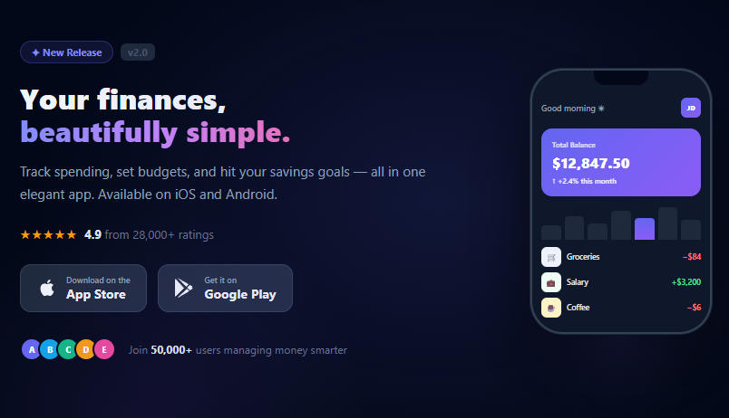
The app download hero is the most critical section of any mobile app landing page — it must communicate the app's value proposition, show what the app looks like, and drive users to download in under 5 seconds. This snippet builds a complete dark-theme app download hero: animated gradient text headline, App Store and Google Play buttons, a CSS phone frame mockup with a realistic app UI inside, star rating with review count, overlapping social proof avatars, and a radial glow background effect.
App landing pages from Notion, Linear, Robinhood, and Revolut all use this hero layout — left-side text and CTAs, right-side phone mockup showing the actual app UI. The phone mockup removes the need for actual screenshots and loads instantly, while the social proof row (overlapping avatars + user count) provides the "this is popular" signal that drives downloads.
CSS phone frame mockup
The phone frame is built entirely in CSS — no images, no SVGs. A dark rounded rectangle (border-radius: 36px) with a double border (inner border via box-shadow: 0 0 0 1px #1e293b) simulates a phone bezel. The notch is a centred dark rectangle at the top. The screen content is a flex column of app UI elements: header, balance card, bar chart, and transaction list.
The balance card uses an actual gradient (linear-gradient(135deg, #6366f1, #8b5cf6)) matching the hero's accent colour — this creates visual cohesion between the phone mockup and the surrounding hero content. The bar chart uses flex-aligned divs of varying heights — the active bar gets the gradient fill, all others remain dark.
Gradient text headline
The "beautifully simple." gradient uses background: linear-gradient(90deg, #818cf8, #c084fc, #f472b6) with -webkit-background-clip: text and -webkit-text-fill-color: transparent. The cross-browser approach uses both -webkit-background-clip: text (Safari/Chrome) and the standard background-clip: text (Firefox). The gradient runs from indigo through purple to pink — a colour story that complements the dark navy hero background.
Store buttons
Both store buttons use the same .store-btn base class with the native platform icon SVG. The layout is icon + two-line text block: a small "Download on the" / "Get it on" label and a larger platform name. This matches the exact layout of the official Apple and Google store badge design guidelines. Pair with a floating dock for a mobile navigation pattern that complements the app download theme.
Radial glow background
The hero background combines two radial gradients on the .hero-bg element and its ::before pseudo-element. The main glow is centred toward the phone side of the layout; the secondary glow appears at the bottom-left for depth. The phone itself has a separate .phone-glow div with a blurred radial gradient beneath it — simulating the ambient light effect used in Apple's product photography.
Build with AI
Build, Understand, Optimize, and Extend It With AI
This one has no JavaScript at all, so the interesting questions are all about the CSS. Paste the HTML and CSS into an AI coding assistant like Claude and ask it to explain exactly why the gradient headline needs both the -webkit-background-clip and standard background-clip declarations, or how the two stacked radial gradients on hero-bg and its pseudo-element combine with the separate phone-glow blur to build depth without a single image file. The same assistant can help optimize it too — ask whether the grid-template-columns 1fr auto layout could reflow more gracefully at in-between viewport widths than the current single breakpoint, or whether the balance card gradient and chart bar colors could be pulled into CSS custom properties so a brand recolor touches one place instead of a dozen. It's also worth using to extend the hero: ask it to swap the static chart bars for an animated fill-in on scroll, add a second phone screen state that cross-fades in on an interval, or wire the phone content to real props for a component library. Treat the code less like a finished artifact and more like a starting point for a conversation.
Prompt to recreate it
Copy this into your AI assistant of choice to build the effect from scratch, or as a jumping-off point for your own variant:
Build a dark-theme "app download hero" in plain HTML and CSS only — no JavaScript, no images, no external icon libraries.

Requirements:
- A two-column layout using CSS grid (grid-template-columns: 1fr auto) with left-side copy (badge, headline, description, star rating, store buttons, social proof avatars) and a right-side CSS-only phone mockup, collapsing to a single centered column with the phone hidden below a defined breakpoint.
- The headline's accent phrase must use a multi-stop linear-gradient clipped to the text using both the -webkit-background-clip: text and standard background-clip: text properties with a transparent text fill, not an image or SVG.
- Build the phone entirely from nested divs: an outer frame with border-radius and a border simulating the bezel, a small notch element, and an inner screen containing a greeting row, a gradient balance card, a row of flex-aligned bars of varying heights forming a simple bar chart, and a short transaction list — no screenshot images anywhere.
- The background must combine at least two radial-gradient layers (one on the hero container, one on a pseudo-element) at different positions and sizes to create a layered ambient glow, plus a separate blurred radial-gradient glow positioned directly behind the phone mockup.
- App Store and Google Play buttons must use inline SVG brand icons (not image files or icon fonts) with a two-line text label (small "Download on the / Get it on" line above a bold store name line), with a hover state that lifts the button with translateY and adds a shadow.
- Social proof must show several overlapping circular avatars using negative margins, next to a user-count sentence with a bolded number.
Want to tighten it up first? Run this prompt through the AI Prompt Studio to score it across 8 quality dimensions, catch anti-patterns, and tune the wording for Claude, ChatGPT, or Gemini before you paste it in.
Step by step
How to Use
- 1Paste HTML and CSSA full-screen dark hero appears with text content on the left and a phone mockup on the right. The phone shows a finance app UI with balance, chart, and transactions.
- 2Read the app UI in the phoneThe phone mockup contains a greeting, a gradient balance card showing $12,847.50, a bar chart with one highlighted bar, and three transaction rows.
- 3Hover the store buttonsApp Store and Google Play buttons lift with a subtle shadow on hover — identical to native platform badge interaction patterns.
- 4Check the social proof rowFive overlapping avatar initials plus "Join 50,000+ users managing money smarter" — the social proof row sits below the store buttons.
- 5Customise the headlineChange the main title text. The second line (
.gradient-word) has the purple-to-pink gradient — swap it to any text or add your own gradient colours. - 6Update the phone UI contentChange the balance amount, chart bar heights (via inline
style="height:X%"), and transaction rows. Update colours and emoji icons to match your app's brand.
Real-world uses
Common Use Cases
Got questions?
Frequently Asked Questions
Replace .phone-screen content with an <img> element: <img src="screenshot.png" style="width:100%;display:block;">. Set the phone-frame height to match the image aspect ratio. Use object-fit: cover if the screenshot doesn't exactly match the phone dimensions.
Add a <canvas id="qr"> or <img src="qr.svg"> element below the store buttons. For a real QR code, use the qr-code-generator snippet — generate the QR targeting your app store deep link URL.
Add opacity: 0; transform: translateY(10px) to each phone UI section and a CSS animation that fades/slides them in with staggered delays. The balance card at 0.2s, chart at 0.4s, transactions at 0.6s — creating a "loading" reveal effect inside the phone.
Create an AppHero component with props: {title, gradientText, description, appName, rating, reviewCount, userCount, balance, transactions}. The store buttons are always present. The phone mockup renders from the balance and transactions arrays. The gradient text headline uses a <span style={{background: gradient, WebkitBackgroundClip: 'text', WebkitTextFillColor: 'transparent'}}>.