

Learn Coding Visually
Learn to code with interactive, live-preview playgrounds — HTML, CSS, JavaScript, React & more.
 HTML Playground42 lessons · Click-based · Live preview
 CSS PlaygroundLearn CSS with a live editor
 JavaScript Playground60 lessons · DOM · Async · Canvas
 React PlaygroundLearn React with a live code editor
 GSAP PlaygroundLearn GSAP animation interactively
 SVG Playground44 lessons · shapes · paths · animation
 SCSS Playground45 lessons · Sass modules · tokens
 Tailwind PlaygroundLearn Tailwind CSS with a live editor
 Bootstrap 5 Playground50 lessons · live preview
AI Assistant Sidebar — Free HTML CSS JS Snippet
AI Assistant Sidebar · Layouts · Plain HTML, CSS & JS · Live preview
What's included
Features
About this UI Snippet
AI Assistant Sidebar — Slide-In Copilot Panel, Suggestion Chips, Streamed Replies & Collapsed Launcher
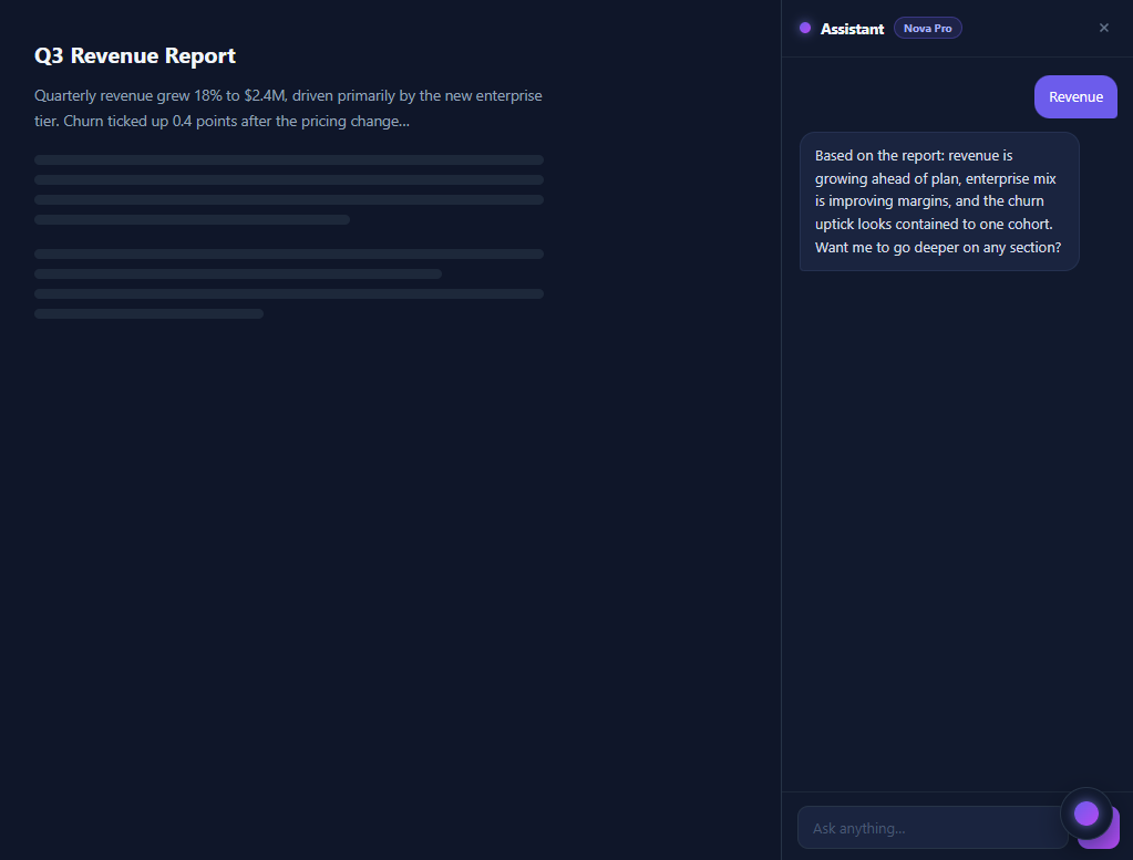
The AI sidebar is 2026's fastest-spreading app surface: Notion AI, GitHub Copilot Chat, Microsoft 365 Copilot, and every SaaS "assistant" tab share the same anatomy — a right-docked panel that slides in beside your content, aware of what the user is looking at, with suggestion chips for cold starts, a streamed reply thread, and a floating orb launcher when collapsed. This snippet implements that full pattern in vanilla HTML, CSS, and JavaScript beside a mock document view, so you can see the defining property of the layout: the assistant lives *next to* the work, not over it.
The layout: flex column + negative margin slide
The app is a flex row — main content flexing to fill, and a fixed 320px <aside> on the right. The open/close mechanic is the negative-margin technique: .ai-panel.closed { margin-right: -320px } with a transition on margin-right. Unlike transform: translateX, a margin transition *reflows the neighbouring content*, so the document area smoothly expands to reclaim the space as the panel leaves — the behaviour users expect from a docked panel rather than an overlay (compare the Side Drawer, which overlays). On narrow screens a media query switches the panel to position: fixed, because reflowing a 320px panel out of a 375px viewport makes no sense — there it behaves as an overlay drawer.
Panel anatomy: header, thread, composer
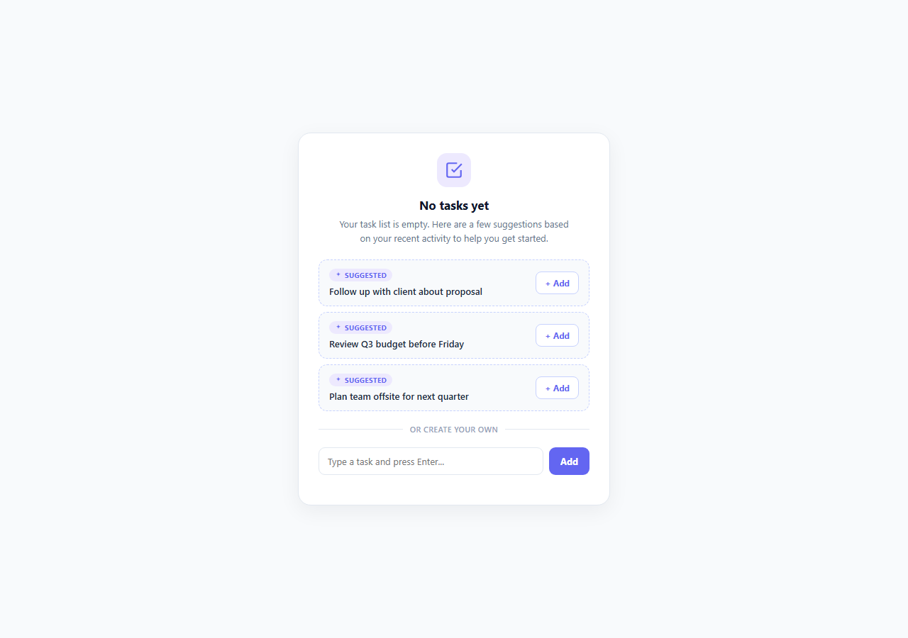
The panel is itself a flex column: a header row (glowing gradient orb, title, model badge in the translucent-pill style, close button), a scrollable thread (flex: 1; overflow-y: auto), and a composer form pinned at the bottom. This three-slot skeleton — fixed header, growing scroll region, fixed footer — is the canonical chat-panel layout and the part most beginners get wrong by scrolling the whole panel instead of just the thread. The empty state fills the thread before any message: a prompt line plus three suggestion chips, each carrying its question in a data-q attribute. Chips are the highest-leverage element in real copilots — they teach users what the assistant can do and convert far better than an empty input box.
Messages and the streamed reply
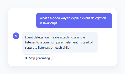
User messages are indigo bubbles aligned right with an asymmetric corner radius; assistant replies are bordered slate bubbles aligned left. Both animate in with a 6px rise-and-fade keyframe. Replies stream: the answer text reveals a few characters per 30ms tick with a blinking block cursor riding the end — implemented by inserting a text node before the cursor span and growing it, the light-weight version of the technique the AI Streaming Response snippet develops fully (tag-safe rich text, stop buttons, token counters). A typing guard prevents a second question while a reply is mid-stream, and the thread auto-scrolls to bottom on every append.
The demo brain and where the real API goes
Replies come from a tiny intent table — regexes matched against the question, each mapped to a canned answer about the mock report, with a fallback — which makes the demo feel conversational with zero dependencies. The single integration point is ask(): in production, replace the interval with a fetch to your chat endpoint, and — the part that makes a *sidebar* assistant different from a chatbot — include the current app context in the request (the open document's text, selected rows, the active record), because context-awareness is the entire value proposition of embedding the assistant beside the work. The collapsed state is a fixed-position orb launcher in the bottom-right; open and close simply toggle the margin class and the launcher's hidden attribute.
Build with AI
Build, Understand, Optimize, and Extend It With AI
The distance from this demo to a working copilot is one function, and an AI assistant can write it with you: paste the snippet into Claude along with a description of your app's main view, and ask it to implement getAppContext() for that view plus the fetch-and-stream replacement for the interval inside ask() — request the version that streams via reader.read() so the cursor behaviour survives. Then have it make the chips dynamic: given your app's page types, ask for a per-route suggestion map and the re-render that shows follow-up chips after each reply. On the layout side, ask it to explain the negative-margin-versus-translateX tradeoff in its own words and to add the polish items real copilots have — thread persistence keyed by record id, a "Using: <context>" transparency line, Escape-to-close, and focus moving into the input on open. If you already run the [AI Streaming Response] or [AI Source Citations] snippets, ask it to merge those into this panel's reply bubbles; the three components were designed to nest.
Prompt to recreate it
Copy this into your AI assistant of choice to build the effect from scratch, or as a jumping-off point for your own variant:
Build a Copilot-style AI assistant sidebar in plain HTML, CSS, and JavaScript — a right-docked panel beside app content, with suggestion chips and streamed replies, no frameworks or API keys.

Requirements:
- A flex-row app layout: a mock document view (heading, paragraph, skeleton lines) that flexes to fill, and a fixed-width 320px aside panel on the right; closing the panel must animate margin-right to its negative width so the document REFLOWS to reclaim the space (not transform, which would leave a hole), and a media query must switch the panel to a fixed overlay on narrow screens.
- Panel skeleton as a flex column with exactly three slots: a header (glowing gradient orb, title, small translucent model-badge pill, close button), a thread region that is the only scrollable part (flex: 1, overflow-y auto), and a composer form pinned at the bottom with a rounded input and gradient send button.
- An empty state inside the thread showing a prompt line and three suggestion chips, each carrying its question in a data attribute; clicking a chip or submitting the form clears the empty state and asks the question.
- User messages render as right-aligned accent bubbles with an asymmetric corner radius, assistant replies as left-aligned bordered bubbles; both animate in with a small rise-and-fade.
- Replies must stream: reveal the answer a few characters per ~30ms tick with a blinking block cursor riding the end of the text (grow a text node inserted before the cursor span), auto-scroll the thread on every tick, and guard against a second question while one is streaming.
- Answer questions from a small intent table — regex patterns matched against the question, each mapped to a canned answer about the mock document, plus a fallback — and comment clearly that ask() is the single integration point where a real fetch with app context (the visible document text) would replace the interval.
- When closed, show a fixed circular orb launcher in the bottom-right that reopens the panel; wire close/open by toggling one class and the launcher's hidden attribute.
Want to tighten it up first? Run this prompt through the AI Prompt Studio to score it across 8 quality dimensions, catch anti-patterns, and tune the wording for Claude, ChatGPT, or Gemini before you paste it in.
Source Code
<div class="app">
  <!-- Fake app content -->
  <div class="app-main" id="app-main">
    <div class="doc">
      <h2>Q3 Revenue Report</h2>
      <p>Quarterly revenue grew 18% to $2.4M, driven primarily by the new enterprise tier. Churn ticked up 0.4 points after the pricing change…</p>
      <div class="doc-lines"><span></span><span></span><span></span><span style="width:62%"></span></div>
      <div class="doc-lines"><span></span><span style="width:80%"></span><span></span><span style="width:45%"></span></div>
    </div>
  </div>

  <!-- AI sidebar -->
  <aside class="ai-panel" id="ai-panel" aria-label="AI assistant">
    <div class="ai-head">
      <div class="ai-title">
        <span class="ai-orb"></span>
        <span>Assistant</span>
        <span class="ai-model">Nova Pro</span>
      </div>
      <button class="ai-close" id="ai-close" aria-label="Close assistant">
        <svg width="14" height="14" viewBox="0 0 24 24" fill="none" stroke="currentColor" stroke-width="2.5"><path d="M18 6L6 18M6 6l12 12"/></svg>
      </button>
    </div>

    <div class="ai-thread" id="ai-thread">
      <div class="ai-empty" id="ai-empty">
        <p class="ai-empty-title">Ask about this document</p>
        <div class="ai-chips">
          <button class="chip" data-q="Summarize this report">Summarize this report</button>
          <button class="chip" data-q="Why did churn increase?">Why did churn increase?</button>
          <button class="chip" data-q="Draft an exec summary email">Draft an exec email</button>
        </div>
      </div>
    </div>

    <form class="ai-composer" id="ai-composer">
      <input class="ai-input" id="ai-input" type="text" placeholder="Ask anything…" autocomplete="off">
      <button class="ai-send" type="submit" aria-label="Send">
        <svg width="14" height="14" viewBox="0 0 24 24" fill="none" stroke="currentColor" stroke-width="2.2"><path d="M22 2L11 13M22 2l-7 20-4-9-9-4z"/></svg>
      </button>
    </form>
  </aside>

  <!-- Launcher (shown when panel closed) -->
  <button class="ai-launcher" id="ai-launcher" aria-label="Open AI assistant" hidden>
    <span class="ai-orb big"></span>
  </button>
</div>
* { box-sizing: border-box; margin: 0; padding: 0; }
body { font-family: system-ui, sans-serif; background: #0f172a; min-height: 100vh; }
.app { display: flex; min-height: 100vh; }
/* — Fake app content — */
.app-main { flex: 1; padding: 36px 32px; min-width: 0; }
.doc { max-width: 460px; }
.doc h2 { color: #f1f5f9; font-size: 20px; margin-bottom: 12px; }
.doc p { color: #94a3b8; font-size: 13.5px; line-height: 1.7; margin-bottom: 20px; }
.doc-lines { display: flex; flex-direction: column; gap: 9px; margin-bottom: 22px; }
.doc-lines span { display: block; height: 9px; border-radius: 5px; background: #1e293b; width: 100%; }
/* — Sidebar panel — */
.ai-panel {
width: 320px; flex-shrink: 0;
display: flex; flex-direction: column;
background: #111a2e; border-left: 1px solid #283548;
transition: margin-right 0.32s cubic-bezier(0.4, 0, 0.2, 1);
}
.ai-panel.closed { margin-right: -320px; }
.ai-head {
display: flex; align-items: center; justify-content: space-between;
padding: 14px 16px; border-bottom: 1px solid #1e293b;
}
.ai-title { display: flex; align-items: center; gap: 9px; font-size: 13.5px; font-weight: 700; color: #f1f5f9; }
.ai-model {
font-size: 10px; font-weight: 700; color: #a5b4fc;
background: rgba(99,102,241,0.15); border: 1px solid rgba(99,102,241,0.35);
padding: 2px 8px; border-radius: 20px;
}
.ai-orb {
width: 10px; height: 10px; border-radius: 50%;
background: linear-gradient(135deg, #6366f1, #a855f7);
box-shadow: 0 0 10px rgba(129,140,248,0.8);
}
.ai-orb.big { width: 22px; height: 22px; }
.ai-close { background: none; border: none; color: #64748b; cursor: pointer; padding: 5px; border-radius: 7px; display: flex; }
.ai-close:hover { background: #1e293b; color: #e2e8f0; }
/* — Thread — */
.ai-thread { flex: 1; overflow-y: auto; padding: 16px; display: flex; flex-direction: column; gap: 12px; }
.ai-empty { text-align: center; margin-top: 28px; }
.ai-empty-title { font-size: 12.5px; color: #64748b; margin-bottom: 14px; }
.ai-chips { display: flex; flex-direction: column; gap: 8px; }
.chip {
background: #1e293b; border: 1px solid #283548; color: #cbd5e1;
border-radius: 10px; padding: 9px 12px;
font-size: 12.5px; font-family: inherit; cursor: pointer;
transition: border-color 0.15s;
text-align: left;
}
.chip:hover { border-color: #6366f1; }
.msg { max-width: 88%; font-size: 13px; line-height: 1.6; animation: msg-in 0.25s ease; }
@keyframes msg-in { from { opacity: 0; transform: translateY(6px); } }
.msg.user {
align-self: flex-end;
background: #6366f1; color: #fff;
padding: 9px 13px; border-radius: 14px 14px 4px 14px;
}
.msg.bot {
align-self: flex-start; color: #d7dee9;
background: #1a2540; border: 1px solid #253352;
padding: 10px 13px; border-radius: 14px 14px 14px 4px;
}
.msg.bot .cursor {
display: inline-block; width: 7px; height: 13px;
background: #a5b4fc; border-radius: 2px; vertical-align: text-bottom;
animation: blink 0.8s steps(2, start) infinite;
}
@keyframes blink { 50% { opacity: 0; } }
/* — Composer — */
.ai-composer {
display: flex; gap: 8px; padding: 12px 14px;
border-top: 1px solid #1e293b;
}
.ai-input {
flex: 1; background: #1a2540; border: 1px solid #283548;
border-radius: 10px; padding: 10px 13px;
color: #f1f5f9; font-size: 13px; font-family: inherit; outline: none;
min-width: 0;
}
.ai-input:focus { border-color: #6366f1; }
.ai-input::placeholder { color: #4a5a76; }
.ai-send {
width: 38px; border: none; border-radius: 10px;
background: linear-gradient(135deg, #6366f1, #a855f7);
color: #fff; cursor: pointer;
display: flex; align-items: center; justify-content: center;
transition: opacity 0.15s;
}
.ai-send:hover { opacity: 0.9; }
/* — Launcher — */
.ai-launcher {
position: fixed; right: 20px; bottom: 20px;
width: 48px; height: 48px; border-radius: 50%;
background: #111a2e; border: 1px solid #283548;
cursor: pointer; display: flex; align-items: center; justify-content: center;
box-shadow: 0 8px 24px rgba(0,0,0,0.4);
transition: transform 0.15s, border-color 0.15s;
}
.ai-launcher:hover { transform: scale(1.08); border-color: #6366f1; }
@media (max-width: 560px) {
.ai-panel { position: fixed; right: 0; top: 0; bottom: 0; z-index: 40; }
}const panel = document.getElementById('ai-panel');
const launcher = document.getElementById('ai-launcher');
const thread = document.getElementById('ai-thread');
const emptyEl = document.getElementById('ai-empty');
const input = document.getElementById('ai-input');
// Canned answers keyed by loose topic match — stand-ins for a real API call.
const ANSWERS = [
{ match: /summar/i, text: 'Q3 revenue reached $2.4M (+18% QoQ), led by the enterprise tier which now accounts for 41% of MRR. Churn rose 0.4pts to 3.1% following the March pricing change — concentrated in the legacy Starter cohort. Net revenue retention held at 112%.' },
{ match: /churn/i, text: 'Churn increased mainly in the legacy Starter cohort after the pricing change: 68% of cancelled accounts cited price, and 80% of those were on plans grandfathered below the new floor. Enterprise churn was flat. A targeted migration offer for the ~140 affected accounts would likely recover most of the delta.' },
{ match: /email|draft/i, text: 'Subject: Q3 results — strong growth, one watch item\n\nTeam — Q3 closed at $2.4M revenue, up 18%. Enterprise is now our largest segment. One watch item: churn ticked up 0.4pts after repricing, isolated to legacy Starter accounts; we\u2019re proposing a migration offer to address it. Full report attached.' },
];
const FALLBACK = 'Based on the report: revenue is growing ahead of plan, enterprise mix is improving margins, and the churn uptick looks contained to one cohort. Want me to go deeper on any section?';
function openPanel() { panel.classList.remove('closed'); launcher.hidden = true; }
function closePanel() { panel.classList.add('closed'); launcher.hidden = false; }
document.getElementById('ai-close').addEventListener('click', closePanel);
launcher.addEventListener('click', openPanel);
function addMsg(cls, text) {
const el = document.createElement('div');
el.className = 'msg ' + cls;
el.textContent = text;
thread.appendChild(el);
thread.scrollTop = thread.scrollHeight;
return el;
}
let typing = null;
function ask(q) {
if (typing) return; // one response at a time
if (emptyEl) emptyEl.remove(); // clear the empty state on first message
addMsg('user', q);
const found = ANSWERS.find(a => a.match.test(q));
const answer = found ? found.text : FALLBACK;
// Streamed reply with a trailing cursor.
const el = addMsg('bot', '');
const cur = document.createElement('span');
cur.className = 'cursor';
el.appendChild(cur);
const node = document.createTextNode('');
el.insertBefore(node, cur);
let i = 0;
typing = setInterval(() => {
i = Math.min(i + 2 + Math.floor(Math.random() * 3), answer.length);
node.nodeValue = answer.slice(0, i);
thread.scrollTop = thread.scrollHeight;
if (i >= answer.length) {
clearInterval(typing); typing = null;
cur.remove();
}
}, 30);
}
document.getElementById('ai-composer').addEventListener('submit', e => {
e.preventDefault();
const q = input.value.trim();
if (!q) return;
input.value = '';
ask(q);
});
thread.addEventListener('click', e => {
const chip = e.target.closest('.chip');
if (chip) ask(chip.dataset.q);
});Step by step
How to Use
- 1Try the panel flowThe sidebar opens docked beside the mock report. Click a suggestion chip — the empty state clears, your question appears as an indigo bubble, and the reply streams in with a blinking cursor (ask about "churn" or "summarize" for topical answers). Type your own question in the composer. Click × to collapse: the panel slides out, the document reflows to full width, and the orb launcher appears bottom-right to reopen it.
- 2Connect a real AI backendEverything funnels through ask(q). Replace the interval block with: const res = await fetch("/api/assistant", { method: "POST", body: JSON.stringify({ question: q, context: getAppContext() }) }) — where getAppContext() returns whatever the user is looking at (document text, selected table rows, current record). Stream the response into the bubble with the reader.read() loop from the AI Streaming Response snippet, keeping the cursor element.
- 3Customise the suggestion chipsChips live in the empty state with their question in data-q. Make them context-sensitive in production — generate 3 suggestions from the current page type ("Summarize this ticket", "Draft a reply", "Find similar issues") since relevant chips are what convert first-time users. After the first exchange, you can re-render chips below the latest reply as follow-up suggestions, the pattern Copilot uses.
- 4Tune the panel behaviourWidth is the 320px in .ai-panel and its matching -320px closed margin — change both together (a CSS variable keeps them in sync). To start collapsed, add the closed class and remove hidden from the launcher in the HTML. The 560px media query switches from docked-reflow to fixed-overlay mode; raise it to ~900px if your app has a dense main view that shouldn't compress.
- 5Persist the conversationSerialise the thread by mapping message elements to { role, text } and storing in sessionStorage keyed by the current document/record id, restoring on mount — an assistant that forgets everything on refresh feels broken. For multi-conversation history, add a small history dropdown in the header row and pair with the Chat Conversation List pattern.
- 6Export and composeClick JSX for a React version — panel open state and messages in useState, the stream written via a ref. This shell composes with the rest of the AI cluster: AI Streaming Response for production-grade streaming, AI Model Selector in the header where the model badge sits, AI Source Citations inside replies, and the Floating Chat Widget if you want a launcher-first, overlay-only variant.
Real-world uses
Common Use Cases
Got questions?
Frequently Asked Questions
Because of what happens to the content beside it. transform moves an element visually but leaves its layout box in place — the document area would keep its squeezed width with a 320px hole where the panel was. Negative margin actually removes the panel's footprint from the flex row, so the transition animates a real reflow: the main content smoothly expands to fill the reclaimed space, which is the defining behaviour of a docked panel (VS Code's sidebar, Notion's AI panel). The cost is that margin transitions run on the main thread and trigger layout each frame — fine for one panel toggled occasionally, not for something animating continuously. The media-query fallback to position: fixed on small screens exists because reflowing content in a 375px viewport would compress it unusably; there the panel becomes an overlay and translateX would be an equally valid mechanic.
Send the app state with every question. Implement a getAppContext() that returns what the user can see: for a document view, the document text (or its visible section); for a table, the selected rows serialised; for a form, the field values. Then POST { question, context, history } to your endpoint and prompt the model with the context prepended ("You are assisting inside [app]. The user is viewing: …"). Three practical rules: cap context size (send the relevant section, not the whole database — retrieval if needed), refresh it per question rather than per session (the user navigates), and show the user what was shared (a small "Using: Q3 Revenue Report" line above the reply builds trust and debuggability). This context plumbing — not the chat UI — is what differentiates a sidebar copilot from a generic chatbot, and it is why the integration point in this snippet is a single ask() function where the context injection has an obvious home.
Key the thread to its context. Store messages as [{ role, text }] in sessionStorage under a key like ai-thread:<documentId> — navigating between records then gives each its own conversation, which matches user expectations (questions about invoice #1042 make no sense on invoice #1043). Restore on mount by replaying addMsg() without animation. Use sessionStorage rather than localStorage for the default (conversations about work-in-progress usually should not outlive the tab), promote to server-side persistence when you add a history UI, and always keep a "clear conversation" affordance in the header. One caution: if replies contain generated content the user may rely on (drafted emails), persist before navigation, not on an interval — losing a draft to a route change is the most common complaint against sidebar assistants.
Tailwind: the panel is w-80 shrink-0 flex flex-col bg-slate-900 border-l border-slate-700 transition-[margin] duration-300 with the closed state as -mr-80 via a data-attribute variant (data-[closed]:-mr-80); the thread is flex-1 overflow-y-auto p-4 flex flex-col gap-3; bubbles are self-end bg-indigo-500 rounded-2xl rounded-br-sm px-3 py-2 and self-start bg-slate-800 border border-slate-700 rounded-2xl rounded-bl-sm; the launcher is fixed bottom-5 right-5 size-12 rounded-full. In React, hold open and messages in state, render the thread from the array, and do the streaming into a ref'd element (or via the Vercel AI SDK's useChat, which replaces the whole demo brain); auto-scroll in a useEffect on messages.length. In Angular, a signal for open bound to [class.closed], @for over a messages signal, and the stream appended via Renderer2 or by updating a WritableSignal<string> per streaming message — with the context provider injected as a service so any route can supply getAppContext().