
Learn Coding Visually
Learn to code with interactive, live-preview playgrounds — HTML, CSS, JavaScript, React & more.
 HTML Playground42 lessons · Click-based · Live preview
 CSS PlaygroundLearn CSS with a live editor
 JavaScript Playground60 lessons · DOM · Async · Canvas
 React PlaygroundLearn React with a live code editor
 GSAP PlaygroundLearn GSAP animation interactively
 SVG Playground44 lessons · shapes · paths · animation
 SCSS Playground45 lessons · Sass modules · tokens
 Tailwind PlaygroundLearn Tailwind CSS with a live editor
 Bootstrap 5 Playground50 lessons · live preview
Feature List — Checkmark Included/Excluded Snippet
Feature List · Cards · Plain HTML, CSS & JS · Live preview
What's included
Features
About this UI Snippet
Feature List — Green Check Included vs Muted X Excluded, in a Plan Card
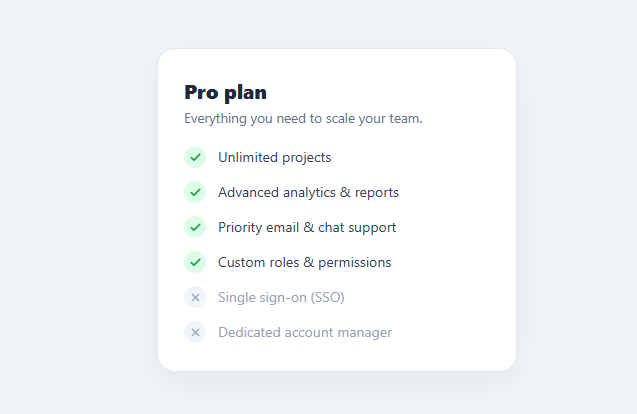
A feature list — a vertical list of capabilities with checkmarks — is one of the most-searched UI snippets because every pricing card, plan comparison table, product page, and feature showcase needs to show "what you get" in a way that is instantly scannable. This snippet is a clean, card-wrapped feature list that distinguishes included features (green checkmark) from excluded ones (muted X), so a single list can communicate exactly what a plan does and does not include. It is pure CSS, with the included/excluded state driven by one class per row.
Included vs excluded in one list
The key idea is that a feature list is more persuasive when it shows both what is included *and* what is not — it sets honest expectations and, on a pricing page, nudges users toward a higher tier to unlock the greyed-out items. Each <li class="feat"> carries either yes (included) or no (excluded). The yes rows get a green check in a soft green circle and full-strength text; the no rows get a muted X in a neutral circle and greyed-out text. So at a glance the reader sees a column of green checks (what they get) with the unavailable items clearly de-emphasized below — a far more informative pattern than a list of checks alone.
The icon chip pattern
Each feature's marker is a small circular chip (.mark) containing an SVG. The chip has a tinted background that matches the state — light green for included, light grey for excluded — and the icon inside inherits a matching stroke color. This "icon in a soft colored circle" treatment is what makes the list feel polished rather than like plain bullet points; the colored chip gives each row a clear visual anchor and reinforces the included/excluded distinction with both shape (check vs X) and color (green vs grey). The chips are flex-shrink: 0 so they never squash when a feature label wraps to two lines.
Why not rely on color alone
Color-blind users struggle with green-vs-red or green-vs-grey distinctions, so this list never uses color as the only signal. Included items use a checkmark and excluded items use an X — two clearly different shapes — and the excluded rows are also lower contrast (muted text). That means the included/excluded status is communicated three ways: icon shape, color, and text contrast. A reader who cannot distinguish the colors can still tell a check from an X and notice the dimmer rows, which is the accessible way to build any "yes/no" list.
Using a real list element
The features are a genuine <ul>/<li> list, not a stack of divs. This matters for accessibility: screen readers announce "list, 6 items" and let users navigate item by item, and the semantics correctly convey that these are a set of related features. The default list bullets and indentation are removed with list-style: none and reset margins (important because CSS frameworks like Tailwind reset lists too), and the layout is rebuilt with flexbox so each row aligns its chip and label cleanly. Keeping the list element means the component is both semantic and styled.
Designed to sit in a plan card
The list is wrapped in a rounded card with a plan title and subtitle, because feature lists almost always appear inside a pricing or plan card. The card gives the list context ("Pro plan — everything you need to scale") and a contained, elevated surface. You can drop just the <ul class="features"> into your own pricing card, or use the whole card as-is. The spacing and type sizes are tuned for a narrow pricing-column width, so multiple cards line up neatly side by side in a pricing grid.
Customizing the list
Re-theme by changing the included chip color (green here) and the icon stroke to your brand's "success" color, and adjust the muted grey for excluded rows. Add features by adding <li class="feat yes"> (or no) rows — the script-free design means any number of rows just work. To show a tooltip explaining a feature, wrap the label in a title attribute or a CSS tooltip. For a comparison table across plans, repeat the same yes/no rows per column. To highlight a key feature, add a "popular" badge or bold the label. Because each row's state is one class, generating the list from plan data is straightforward.
Accessibility checklist
Keep the <ul>/<li> structure so the set is announced as a list. The icons are decorative (the text label and the included/excluded distinction carry the meaning), so they need no alt text; if you want screen readers to announce "included/not included" explicitly, add visually-hidden text inside each chip (e.g. a span with "Included:" / "Not included:" that is off-screen). Maintain enough contrast on the muted excluded rows that the text is still readable (grey on white here stays legible). Because the component is plain semantic HTML and CSS, it works with keyboard navigation and assistive tech without any extra code.
Build with AI
Build, Understand, Optimize, and Extend It With AI
You don't have to just take the accessibility reasoning on faith. Paste this snippet's HTML, CSS, and JS into an AI coding assistant like Claude and ask it to explain exactly why the excluded rows use three separate signals (icon shape, color, and text contrast) instead of relying on color alone, and how that specific combination holds up for a color-blind reader. The same assistant can help optimize it — ask whether the check and X SVGs should be deduplicated into shared symbol definitions if this list is repeated across many plan cards on the same page, and whether the muted-row contrast ratio still passes accessibility guidelines against the card's white background. It's also useful for extending the list: ask it to add a tooltip that explains what an excluded feature actually does when hovered, generate the yes/no rows dynamically from a plan-comparison data object shared across multiple pricing cards, or add a subtle "upgrade to unlock" link on excluded rows. Treat the code less like a finished artifact and more like a starting point for a conversation.
Prompt to recreate it
Copy this into your AI assistant of choice to build the effect from scratch, or as a jumping-off point for your own variant:
Build a plan feature list in plain HTML and CSS (no JavaScript required) that clearly distinguishes included from excluded features — no icon font, no library.

Requirements:
- A real semantic unordered list (not a stack of divs) where each list item represents one feature and carries a class indicating whether that feature is included or excluded for this plan.
- Each list item's marker must be a small circular chip containing an inline SVG icon: included items show a checkmark icon in a tinted "success" circle, excluded items show an X icon in a neutral gray circle — using two distinct icon shapes, not the same icon recolored.
- Excluded items must also render their label text at a visibly lower contrast (muted gray) compared to included items, so the included/excluded distinction is communicated through three independent signals at once: icon shape, background color, and text contrast — never color alone, since a reader who cannot distinguish colors must still be able to tell every row apart.
- Reset the list's default bullet and indentation styling and rebuild the row layout with flexbox so the icon chip and the label align cleanly on one line, and the chip must never shrink or distort if a feature's label wraps onto two lines.
- Wrap the list in a card with a plan name and a one-line subtitle, sized appropriately for a narrow pricing-column width so multiple such cards could sit side by side in a pricing grid.
- Explain how this same yes/no row pattern could be repeated identically across multiple plan cards to build a full side-by-side plan comparison, using the same feature order in every column.
Want to tighten it up first? Run this prompt through the AI Prompt Studio to score it across 8 quality dimensions, catch anti-patterns, and tune the wording for Claude, ChatGPT, or Gemini before you paste it in.
Source Code
<div class="plan">
<h3 class="plan-title">Pro plan</h3>
<p class="plan-sub">Everything you need to scale your team.</p>
<ul class="features">
<li class="feat yes"><span class="mark"><svg viewBox="0 0 24 24"><polyline points="20 6 9 17 4 12"/></svg></span>Unlimited projects</li>
<li class="feat yes"><span class="mark"><svg viewBox="0 0 24 24"><polyline points="20 6 9 17 4 12"/></svg></span>Advanced analytics & reports</li>
<li class="feat yes"><span class="mark"><svg viewBox="0 0 24 24"><polyline points="20 6 9 17 4 12"/></svg></span>Priority email & chat support</li>
<li class="feat yes"><span class="mark"><svg viewBox="0 0 24 24"><polyline points="20 6 9 17 4 12"/></svg></span>Custom roles & permissions</li>
<li class="feat no"><span class="mark"><svg viewBox="0 0 24 24"><line x1="18" y1="6" x2="6" y2="18"/><line x1="6" y1="6" x2="18" y2="18"/></svg></span>Single sign-on (SSO)</li>
<li class="feat no"><span class="mark"><svg viewBox="0 0 24 24"><line x1="18" y1="6" x2="6" y2="18"/><line x1="6" y1="6" x2="18" y2="18"/></svg></span>Dedicated account manager</li>
</ul>
</div>* { box-sizing: border-box; margin: 0; padding: 0; }
body {
font-family: system-ui, sans-serif;
background: #f1f5f9;
min-height: 100vh;
display: flex; align-items: center; justify-content: center;
padding: 24px;
}
.plan {
width: 100%; max-width: 360px;
background: #fff;
border: 1px solid #e2e8f0;
border-radius: 18px;
padding: 28px 26px;
box-shadow: 0 10px 30px rgba(15,23,42,0.06);
}
.plan-title { font-size: 20px; font-weight: 800; color: #1e293b; }
.plan-sub { font-size: 13.5px; color: #64748b; margin: 4px 0 20px; }
.features { list-style: none; display: flex; flex-direction: column; gap: 13px; }
.feat {
display: flex; align-items: center; gap: 12px;
font-size: 14px; color: #334155; line-height: 1.4;
}
.mark {
flex-shrink: 0;
width: 22px; height: 22px;
display: grid; place-items: center;
border-radius: 50%;
}
.mark svg { width: 13px; height: 13px; fill: none; stroke-width: 3; stroke-linecap: round; stroke-linejoin: round; }
/* Included */
.feat.yes .mark { background: #dcfce7; }
.feat.yes .mark svg { stroke: #16a34a; }
/* Not included — muted text + neutral X */
.feat.no { color: #94a3b8; }
.feat.no .mark { background: #f1f5f9; }
.feat.no .mark svg { stroke: #94a3b8; stroke-width: 2.5; }// 100% pure CSS — no JavaScript. Each .feat row is "yes" (included) or "no" (excluded).Step by step
How to Use
- 1Copy the listCopy the .plan card with its <ul class="features">, or just the <ul> to drop into your own pricing card. Each row is an <li class="feat yes"> or <li class="feat no">.
- 2Mark included vs excludedUse the yes class (green check) for included features and the no class (muted X) for excluded ones. Edit the label text in each <li>.
- 3Re-theme the chipsChange the included chip background and icon stroke to your success color, and the muted grey for excluded rows.
- 4Add or remove featuresAdd more <li> rows with the right state class — the script-free design handles any number of items.
- 5Announce state for screen readers (optional)Add visually-hidden "Included:" / "Not included:" text inside each chip if you want the status spoken explicitly.
- 6Export in your formatClick "HTML" for a standalone file, "JSX" for a React component, or "Tailwind" for a React + Tailwind version.
Real-world uses
Common Use Cases
Got questions?
Frequently Asked Questions
Give each <li> a yes or no class. The yes rows get a green checkmark in a soft green chip with full-strength text; the no rows get a muted X in a neutral chip with greyed-out text. Showing both is more persuasive on pricing pages because it makes the value of upgrading clear.
Color-blind users struggle with color-only distinctions. This list uses three signals: a check vs X icon shape, green vs grey color, and full vs muted text contrast. So the included/excluded status is readable even if the colors are indistinguishable.
A real list is announced by screen readers as "list, N items" and lets users navigate item by item, correctly conveying that the features are a related set. The default bullets are removed with list-style: none and the layout is rebuilt with flexbox.
Add <li class="feat yes"> (or no) rows and edit the label text. The component is pure CSS with no script, so any number of rows works automatically. Re-theme the chip colors to your brand's success and neutral colors.
Repeat the same set of yes/no rows in multiple plan cards or columns, keeping the feature order identical. Each column marks each feature as included or excluded for that plan, producing a clear side-by-side comparison.
Yes. Click "JSX" for a React component or "Tailwind" for a React + Tailwind version. In React, map an array of features (each with an included boolean) to <li> rows, setting the yes/no class from the boolean and rendering the check or X icon accordingly.