Learn Coding Visually
Learn to code with interactive, live-preview playgrounds — HTML, CSS, JavaScript, React & more.
 HTML Playground42 lessons · Click-based · Live preview
 CSS PlaygroundLearn CSS with a live editor
 JavaScript Playground60 lessons · DOM · Async · Canvas
 React PlaygroundLearn React with a live code editor
 GSAP PlaygroundLearn GSAP animation interactively
 SVG Playground44 lessons · shapes · paths · animation
 SCSS Playground45 lessons · Sass modules · tokens
 Tailwind PlaygroundLearn Tailwind CSS with a live editor
 Bootstrap 5 Playground50 lessons · live preview
Mega Footer — Multi-Column Site Footer UI Snippet
Mega Footer · Footers · Plain HTML, CSS & JS · Live preview
What's included
Features
About this UI Snippet
Mega Footer — Brand Column, Link Groups, Newsletter Form & Language Selector
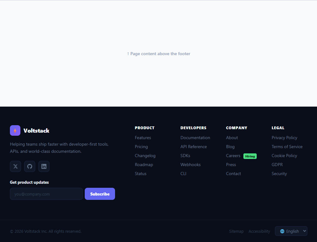
A mega footer is a full-width, multi-column site footer that consolidates navigation, legal links, brand identity, social links, and a newsletter sign-up in one structured section. It is a staple of SaaS product sites, developer tools, e-commerce platforms, and marketing pages — and a frequently-searched component because getting the layout right across column counts and screen sizes requires careful grid design. This snippet provides a complete mega footer with a brand and social column, four navigational link columns, a newsletter input, a language selector, and a responsive bottom bar.
The two-zone layout
The footer splits into two horizontal zones: a wide brand column on the left (brand logo, description, social icons, newsletter) and a four-column link grid on the right. This is achieved with a CSS grid of grid-template-columns: 340px 1fr — a fixed brand column and a fluid link area. The link grid inside uses grid-template-columns: repeat(4, 1fr) for equal-width columns. Both grids collapse gracefully: at 900px the footer stacks brand above links; at 520px the four link columns become a 2×2 grid.
Brand column
The brand section contains a logo mark (emoji swappable for an SVG), a company name in bold, a short tagline description, social icon buttons, and a newsletter input row. Grouping all brand-level content in the first column follows the standard mega-footer convention and ensures the most important "who we are" information is always visible without scrolling the link columns.
Social icon buttons
Social links use inline SVG icons (Twitter/X, GitHub, LinkedIn) inside square icon buttons. Inline SVGs ensure they load with the page, scale perfectly at any size, and can be recoloured with CSS color. The buttons have a dark background that lightens on hover, providing visible interactivity without bright colour.
Newsletter form
The newsletter subscribe() function validates the email client-side before submission, shows a green confirmation message, and disables the input and button to prevent re-submission. In production this POSTs to an email service endpoint (Mailchimp, ConvertKit, Resend, or a custom API).
Hiring badge and contextual labels
The Careers link in the Company column has a green "Hiring" badge — a small detail that drives qualified candidates directly from the footer and saves the marketing site team from building a separate recruitment banner. Contextual badge patterns like this are easy to add to any link.
Bottom bar
The footer-bottom row contains the copyright notice, Sitemap and Accessibility links, and a language selector. These bottom-bar elements are separated from the main footer content by a border-top and kept in a flex row that wraps on small screens.
Build with AI
Build, Understand, Optimize, and Extend It With AI
You do not need to trace the nested grid breakpoints by resizing the window repeatedly. Paste this snippet's HTML, CSS, and JS into an AI coding assistant like Claude and ask it to explain exactly how the outer footer-inner grid-template-columns of 340px 1fr collapses at the 900px media query, and how that interacts with the separate inner link-cols grid collapsing from four columns to two at the same breakpoint and to a 2x2 layout at 520px. The same assistant can help optimize it, for instance asking whether the hardcoded anchor lists for each link column should be refactored into a data array that both the component and a CMS could drive, to avoid editing raw markup every time a link changes. It is also useful for extending the footer: ask it to wire the subscribe() function to a real email-marketing API with a proxied CORS-safe request, add a dynamically generated copyright year, or make the language selector actually trigger a locale change. Treat the code less like a finished artifact and more like a starting point for a conversation.
Prompt to recreate it
Copy this into your AI assistant of choice to build the effect from scratch, or as a jumping-off point for your own variant:
Build a "mega footer" in plain HTML, CSS, and JavaScript with no libraries.

Requirements:
- An outer two-column CSS grid with a fixed-width brand column (logo, name, description, inline SVG social icons, and a newsletter form) and a fluid column containing a four-column grid of link groups, each with a heading and a list of anchor links.
- The outer grid must collapse to a single stacked column at a defined tablet breakpoint, and independently, the inner four-column link grid must collapse to two columns at that same breakpoint and further to a different two-column arrangement at a narrower mobile breakpoint.
- A newsletter subscribe function that validates the entered email with a basic regex, shows a red inline error message for invalid or empty input without submitting anything, and on a valid email shows a green confirmation message while disabling both the input and the subscribe button so the same email cannot be submitted twice.
- At least one link in the link columns must carry a small contextual badge (e.g. a "Hiring" tag) styled distinctly from the surrounding link text, demonstrating how to attach a call-out to an individual navigation item without a separate component.
- A bottom bar, visually separated from the main footer content by a top border, containing a copyright line, secondary utility links, and a language/locale select dropdown, laid out in a flex row that wraps gracefully on narrow screens.
- All social icons must be inline SVG (not external image requests or an icon font), each sitting inside a square icon button with a background that visibly lightens on hover.
Want to tighten it up first? Run this prompt through the AI Prompt Studio to score it across 8 quality dimensions, catch anti-patterns, and tune the wording for Claude, ChatGPT, or Gemini before you paste it in.
Step by step
How to Use
- 1Replace the brandSwap the ⚡ emoji for your logo SVG, update the brand name, and edit the description tagline to match your product.
- 2Update the link columnsEdit the four link column sections (Product, Developers, Company, Legal) to match your site's navigation structure. Add or remove columns by adjusting the grid-template-columns value.
- 3Connect social linksReplace the # hrefs with your actual Twitter, GitHub, and LinkedIn URLs. Add or remove social buttons by duplicating or deleting .social elements.
- 4Wire the newsletterIn subscribe(), POST the validated email to your mailing list endpoint. The form already handles disabling after submit and showing a confirmation.
- 5Update the copyright and language optionsChange the year and company name in the copyright line. Update the language dropdown options to match the locales your site supports.
- 6Export for your frameworkClick "React" for a component with the newsletter form in useState. Click "Vue" for a Vue 3 SFC with reactive form state.
Real-world uses
Common Use Cases
Got questions?
Frequently Asked Questions
Change .link-cols { grid-template-columns: repeat(4, 1fr) } to repeat(5, 1fr) or repeat(6, 1fr). You may also need to narrow the brand column (from 340px to 280px) in the footer-inner grid to give the link grid more space. On mobile, the existing 2-column responsive breakpoint at 520px still works — extra columns just wrap into more rows.
Replace the ⚡ text inside .brand-logo with an <svg> or <img> element. Set the SVG to width: 20px; height: 20px (or the natural aspect ratio) and fill: white for a white icon. The .brand-logo container already handles the size (34×34px) and background gradient, so the logo just needs to fit inside it.
In subscribe(), after validation passes, POST to your provider's API endpoint. For Mailchimp, POST to their /3.0/lists/{listId}/members endpoint with Authorization: apikey {key}. For ConvertKit, POST to their /v2/forms/{formId}/subscribe endpoint with api_key and email. Both APIs are CORS-restricted so the POST should go through a proxy (a serverless function or Next.js API route) rather than directly from the browser.
Create a Footer component that accepts optional linkGroups and socialLinks as props (or hardcodes them as constants). Keep nlEmail and nlStatus in useState for the newsletter form. The link groups render from an array.map() — { heading, links: [{label, href}] }. The bottom bar is a separate div with the copyright string (derived from new Date().getFullYear()) and a static language select. The component has no side effects and no API calls, so no useEffect is needed. For the Tailwind version, click "Tailwind" to get the same markup with utility classes instead of a scoped stylesheet.