Learn Coding Visually
Learn to code with interactive, live-preview playgrounds — HTML, CSS, JavaScript, React & more.
 HTML Playground42 lessons · Click-based · Live preview
 CSS PlaygroundLearn CSS with a live editor
 JavaScript Playground60 lessons · DOM · Async · Canvas
 React PlaygroundLearn React with a live code editor
 GSAP PlaygroundLearn GSAP animation interactively
 SVG Playground44 lessons · shapes · paths · animation
 SCSS Playground45 lessons · Sass modules · tokens
 Tailwind PlaygroundLearn Tailwind CSS with a live editor
 Bootstrap 5 Playground50 lessons · live preview
Footer with Mobile Accordion Collapse — Same Markup, Grid on Desktop, Accordion on Mobile
Footer with Mobile Accordion Collapse · Footers · Plain HTML, CSS & JS · Live preview
What's included
Features
About this UI Snippet
Footer with Mobile Accordion Collapse — One Markup Structure, Two Behaviors
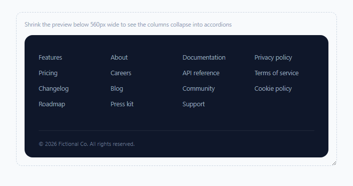
A footer with four or five link columns is fine on desktop, but stacked vertically on a phone it can push several hundred pixels of link text between the page's actual content and anything below the footer. This snippet solves that by making each footer column an accordion on narrow screens only, collapsed by default so a mobile visitor sees just the column headings, while leaving the desktop layout as a plain, always-expanded CSS grid — using exactly the same HTML for both.
CSS media query decides which behavior is even active
The .col-toggle button is display: none by default and only becomes display: flex inside the @media (max-width: 560px) block — so above that breakpoint, the toggle buttons don't just look inactive, they're not interactive or present in the layout at all, and .col-links has no max-height restriction, showing every link permanently. Below the breakpoint, the same .col-links gets max-height: 0 with overflow: hidden, and only the .footer-col.open state raises that to 240px — the accordion mechanic is entirely dormant until the media query itself makes it relevant.
Keeping aria-expanded honest across the breakpoint
This is the detail most footer-accordion implementations get wrong: a column's .open class might be toggled while the page is narrow, but if the user then resizes the browser wider (or rotates a tablet), the links become permanently visible again via the desktop CSS grid — yet without correction, aria-expanded="false" would still be sitting on that toggle button, telling a screen reader the content is collapsed when it's now actually fully visible on screen. syncState(), driven by a matchMedia('(max-width: 560px)') listener, corrects exactly this: whenever the layout crosses the breakpoint in either direction, it forces aria-expanded="true" for every column while desktop-width (since the content is always visible there), and only defers to each column's actual .open class once back in mobile width.
Why max-height instead of display:none for the collapse
.col-links transitions max-height rather than toggling display, which is what makes the accordion open/close animate smoothly — display can't be transitioned at all, and height: auto isn't animatable either, so a generous fixed max-height (240px, comfortably larger than the tallest link list) is the standard workaround that still gives a smooth, real slide animation.
One shared JS listener per column, not one per link
Only four toggle buttons need click listeners regardless of how many links each column holds — the accordion behavior is entirely about the column-level open/closed state, so the JavaScript footprint stays constant no matter how much link content is inside.
Build with AI
Build, Understand, Optimize, and Extend It With AI
Ask an AI assistant to explain exactly why aria-expanded needs to be actively re-synced with matchMedia here rather than just reading each column's .open class directly, and what a screen reader user would actually experience if that sync were missing. It's also worth asking for a version where only one footer column can be open at a time on mobile (accordion-exclusive behavior), or one that persists which columns were left open across page loads using sessionStorage.
Prompt to recreate it
Copy this into your AI assistant of choice to build the effect from scratch, or as a jumping-off point for your own variant:
Build a responsive site footer in HTML, CSS and vanilla JavaScript that renders as a plain multi-column grid on desktop and automatically becomes independently collapsible accordions per column on narrow screens, using the same markup for both — no external libraries.

Requirements:
- A footer with at least four columns, each containing a heading/toggle button and a list of links, laid out as a CSS grid on wide viewports with all links always visible and the toggle buttons entirely hidden (not just visually, but removed from layout).
- Below a defined breakpoint (e.g. 560px), each column's toggle button must become visible and clicking it must independently expand or collapse that column's link list with a smooth animated transition — do not use display:none/block toggling for the animation, since that cannot be transitioned.
- Each toggle button must have an accurate aria-expanded attribute reflecting whether its links are currently visible. Critically, when the layout is at desktop width where links are always shown regardless of any stored "open" state, aria-expanded must report true for every column — and must correctly re-sync back to each column's real open/closed state if the window is resized back to mobile width.
- Use a JavaScript matchMedia listener on the same breakpoint value used in the CSS media query to detect layout changes and keep the aria-expanded values correct in both directions as the viewport crosses that breakpoint.
- A chevron icon on each toggle button should visually rotate to indicate the current open/closed state on mobile.
Want to tighten it up first? Run this prompt through the AI Prompt Studio to score it across 8 quality dimensions, catch anti-patterns, and tune the wording for Claude, ChatGPT, or Gemini before you paste it in.
Step by step
How to Use
- 1Add or remove footer columns freelyEach .footer-col is self-contained with its own toggle button and link list — copy the block structure to add more columns.
- 2Resize the preview to see both behaviorsDrag the dashed demo container narrower than 560px to see the desktop grid become mobile accordions.
- 3Adjust the collapse breakpointChange the 560px value in the @media query (and the matching value in the JS matchMedia call) together — they must stay in sync.
- 4Adjust the open max-heightIf a column has more links than fits within 240px, increase the .footer-col.open .col-links max-height value to accommodate it.
- 5Pre-open a column by default on mobileAdd the .open class to any .footer-col in the HTML if you want that column expanded by default on narrow screens.
Real-world uses
Common Use Cases
Got questions?
Frequently Asked Questions
They exist in the DOM but are display: none above the 560px breakpoint, meaning they take up no layout space and are not part of the accessibility tree's interactive elements in that state, correctly reflecting that they have no function on desktop.
Because the links are always visible on desktop regardless of whether a column happens to have the .open class from a previous mobile session, aria-expanded must report true whenever the desktop grid layout is active, and only defer to the real .open state once back at mobile width — otherwise a screen reader could be told content is collapsed when it's actually fully visible.
CSS cannot transition the display property, and height: auto is not animatable either, so max-height (set generously higher than the tallest possible content) is the standard technique that allows a genuinely smooth slide-open/closed animation.
The extra content would be clipped by overflow: hidden during the transition; increase the max-height value on .footer-col.open .col-links in the CSS to accommodate your actual tallest column's content.
Yes — a matchMedia listener on the same breakpoint re-runs syncState() any time the layout crosses it, so aria-expanded values are corrected immediately on resize, not just on page load.
Yes — add the .open class directly to any .footer-col element in the HTML to have that specific column start expanded on narrow screens; columns without .open start collapsed by default.