You Might Also Like
Learn Coding Visually
Learn to code with interactive, live-preview playgrounds — HTML, CSS, JavaScript, React & more.
 HTML Playground42 lessons · Click-based · Live preview
 CSS PlaygroundLearn CSS with a live editor
 JavaScript Playground60 lessons · DOM · Async · Canvas
 React PlaygroundLearn React with a live code editor
 GSAP PlaygroundLearn GSAP animation interactively
 SVG Playground44 lessons · shapes · paths · animation
 SCSS Playground45 lessons · Sass modules · tokens
 Tailwind PlaygroundLearn Tailwind CSS with a live editor
 Bootstrap 5 Playground50 lessons · live preview
Out of Stock Overlay — Free HTML CSS JS Product Card Sold-Out Ribbon Snippet
Out of Stock Overlay · Cards · Plain HTML, CSS & JS · Live preview
What's included
Features
About this UI Snippet
Out of Stock Overlay — HTML & CSS Sold-Out Product Card Pattern
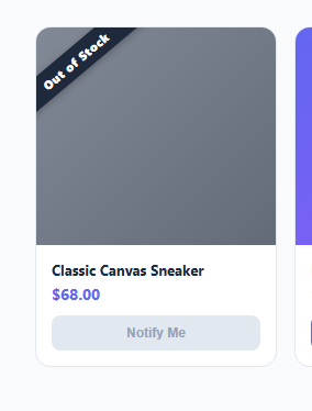
Showing an out-of-stock product without any visual distinction from an available one leads to frustrated clicks on an "Add to Cart" button that can't actually do anything. This snippet gives sold-out products a clearly distinct treatment: a dimmed, slightly desaturated product image, a diagonal "Out of Stock" ribbon across it, and a disabled, muted "Notify Me" button in place of the normal purchase action.
How the diagonal ribbon is built
The ribbon reuses the same rotated-rectangle technique as the environment badge snippet in this library: a span positioned absolutely, rotated -40deg, and nudged with a negative left offset so the rotated band spans cleanly across the image corner-to-corner rather than floating off it at an odd angle. Because the ribbon sits inside a .stock-overlay div with position: absolute; inset: 0, it scales correctly regardless of the specific pixel size of the product image beneath it.
How the dimming effect works
The .out-of-stock modifier class applies filter: grayscale(0.4) and a slightly reduced opacity directly to .product-thumb, desaturating the image just enough to read as "unavailable" without making it illegible — a full grayscale or heavy opacity drop can make product photos hard to identify, so this uses a partial value tuned to stay recognizable. A separate semi-transparent .stock-overlay layer sits on top of the image (not affecting the "in stock" sibling card), adding a subtle darkening wash that further reinforces the disabled feel.
How the button swap works
Rather than showing a disabled "Add to Cart" button (which implies the button itself is broken), the out-of-stock card swaps in an entirely different action: "Notify Me." It's rendered with the native disabled attribute and muted grey styling by default in this static demo, representing a state where the notify signup hasn't been wired up yet; the CSS also includes a :not(:disabled) style so that once you enable the button (after wiring up an email capture flow), it automatically picks up an active, on-brand appearance with no extra classes needed.
Toggling stock state programmatically
The included setStock(cardEl, inStock) helper function is what a real integration would call once inventory data loads from an API — it toggles the .out-of-stock class, shows or hides the ribbon overlay, and enables or disables the Notify button accordingly, so the same card markup can represent either state depending on live data rather than being hardcoded per product.
Build with AI
Build, Understand, Optimize, and Extend It With AI
Ask an AI assistant to explain the rotation and offset math behind the diagonal ribbon and how you'd need to adjust it if your product card had different image dimensions or aspect ratio than the one in this demo. It's also a good prompt for wiring the setStock helper function to a real inventory API response, or for adding an actual email-capture form that appears in a small popover when "Notify Me" is clicked, since the base version only disables the button as a visual placeholder.
Prompt to recreate it
Copy this into your AI assistant of choice to build the effect from scratch, or as a jumping-off point for your own variant:
Build an "out of stock overlay" product card in plain HTML, CSS, and vanilla JavaScript.

Requirements:
- A product card showing a thumbnail image, product name, and price, in two states: in-stock (showing a normal, enabled "Add to Cart" button) and out-of-stock (showing a partially desaturated/dimmed image, a diagonal "Out of Stock" ribbon built from a single rotated element positioned over the image, and a disabled "Notify Me" button in place of the purchase button entirely — not just a disabled version of the same button).
- The diagonal ribbon must be created with a CSS transform rotation on a plain element (no image asset), sized and offset so it spans cleanly across the image regardless of the specific product photo underneath.
- Both card states must share identical layout dimensions and structure so a grid of mixed in-stock and out-of-stock cards stays visually aligned with no layout shift.
- Include one JavaScript helper function that takes a card element and a boolean "in stock" flag, and toggles all the relevant classes/attributes (the out-of-stock styling class, the ribbon overlay's visibility, and the Notify button's disabled state) so the same markup can represent either state driven by real inventory data.
- The disabled Notify Me button's CSS must be structured so that simply removing the disabled attribute automatically gives it an active, on-brand appearance with no additional classes required.
Want to tighten it up first? Run this prompt through the AI Prompt Studio to score it across 8 quality dimensions, catch anti-patterns, and tune the wording for Claude, ChatGPT, or Gemini before you paste it in.
Step by step
How to Use
- 1Load the snippetClick "Out of Stock Overlay" in the sidebar Library tab to see both an out-of-stock and an in-stock card side by side.
- 2Compare the two statesNotice the dimmed image, ribbon, and disabled "Notify Me" button on the first card versus the normal "Add to Cart" on the second.
- 3Wire up real inventory dataCall setStock(cardElement, inStock) once your product data loads, passing whether the item currently has stock.
- 4Adjust the ribbon angle or colorTune the rotate(-40deg) value and background color on .ribbon in the CSS panel to fit your card's proportions and brand.
- 5Enable the Notify Me signupRemove the disabled attribute once you wire an actual email-capture handler to the button's click event.
- 6Export and saveExport as HTML/JSX/Tailwind or click "Save as" to reuse this card pattern across your product catalog.
Real-world uses
Common Use Cases
Got questions?
Frequently Asked Questions
A single span element is positioned absolutely over the product image and rotated with a CSS transform (rotate(-40deg)), with a negative left offset so the rotated band spans the image corner-to-corner. It is the same technique used for the diagonal corner-ribbon environment badge snippet.
A full grayscale filter or a heavy opacity reduction can make it hard to identify the actual product. A partial grayscale(0.4) plus a slightly reduced opacity communicates "unavailable" clearly while keeping the image recognizable.
A disabled Add to Cart button implies something is broken with the purchase flow itself. Replacing it with a distinct "Notify Me" action gives the shopper something useful to do and can capture their interest for a future restock.
Remove the disabled attribute and add a click handler that opens an email capture form or calls your notification-signup API. The CSS already includes a :not(:disabled) style so the button automatically looks active once enabled.
Call the included setStock(cardElement, inStock) function with the card's DOM element and a boolean. It toggles the out-of-stock class, shows or hides the ribbon overlay, and disables or enables the Notify Me button accordingly.
No — both card variants share identical dimensions and structure. Only the overlay, ribbon, and button content differ, so cards in the same grid stay perfectly aligned regardless of stock state.
Yes — the .ribbon technique is generic. Change the background color, text, and rotation angle to repurpose it for a sale badge, a "New Arrival" flag, or any other diagonal corner label.