You Might Also Like
Learn Coding Visually
Learn to code with interactive, live-preview playgrounds — HTML, CSS, JavaScript, React & more.
 HTML Playground42 lessons · Click-based · Live preview
 CSS PlaygroundLearn CSS with a live editor
 JavaScript Playground60 lessons · DOM · Async · Canvas
 React PlaygroundLearn React with a live code editor
 GSAP PlaygroundLearn GSAP animation interactively
 SVG Playground44 lessons · shapes · paths · animation
 SCSS Playground45 lessons · Sass modules · tokens
 Tailwind PlaygroundLearn Tailwind CSS with a live editor
 Bootstrap 5 Playground50 lessons · live preview
Annual vs Monthly Cost Chart — Free HTML CSS JS Snippet, No Library
Annual vs Monthly Cost Chart · Pricing · Plain HTML, CSS & JS · Live preview
What's included
Features
About this UI Snippet
Annual vs Monthly Cost Chart — Real Cumulative Data, Pure SVG, No Charting Library
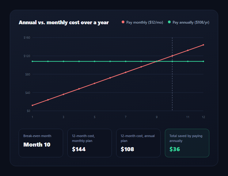
Pricing pages routinely claim "save by paying annually" without showing why — this snippet makes the crossover point visually undeniable by plotting two real, computed lines across 12 months: cumulative cost when paying monthly, and the flat cost of paying annually upfront. There's no charting library involved; the SVG path data is generated directly from two small arrays of actual numbers.
The two lines, computed, not illustrated
monthlyLine is built as months.map((m) => MONTHLY_RATE * m) — literally the monthly rate multiplied by the month number, so month 1 is \$12, month 6 is \$72, month 12 is \$144. annualLine is a flat array of the same \$108 value repeated 12 times, representing money paid once upfront in month 1 that then simply sits flat as a comparison baseline. Nothing here is a hand-drawn bar height standing in for "roughly what it might cost" — every point is the literal formula result.
Finding the real break-even month
A loop walks monthlyLine and returns the first month where the cumulative monthly cost exceeds the flat annual price: at \$12/month against a \$108 annual price, month 9 totals \$108 (equal) and month 10 totals \$120 (the first month strictly *greater* than \$108) — so the chart correctly reports month 10 as the break-even point, with a dashed vertical marker drawn at that exact x-position, computed from the same data the lines are drawn from, not eyeballed.
Building the SVG path by hand
pathFor(values) maps each data point through xFor(month) and yFor(value) — linear scales computed from the chart's pixel dimensions, the data range, and a "nice" rounded-up maximum for clean gridlines — and joins them into a standard SVG path d string (M for the first point, L for every subsequent one). This is the same technique every JS charting library uses internally; writing it directly keeps the snippet dependency-free and the data flow fully transparent, from raw numbers to rendered pixels.
Why cumulative, not per-month, cost is the right comparison
A bar chart of "cost this month" would show the annual plan as one big spike in month 1 and nothing after — technically accurate but visually misleading about ongoing value. Plotting *cumulative* spend makes the actual trade-off legible: you pay more upfront with the annual plan, and month-by-month the monthly plan looks cheaper, right up until the point its running total crosses and then permanently exceeds the annual price. That crossing point, not the raw prices, is the number that actually matters to a buyer deciding which to choose.
Customizing it
Change MONTHLY_RATE and ANNUAL_PRICE to your real plan pricing — every derived stat, line, and the break-even marker recalculate automatically. Pair this with a pricing toggle so switching a monthly/annual toggle elsewhere on the page could drive the same two constants.
Build with AI
Build, Understand, Optimize, and Extend It With AI
Paste this snippet's HTML, CSS, and JS into an AI coding assistant like Claude and ask it to walk through exactly how monthlyLine and annualLine are computed from MONTHLY_RATE and ANNUAL_PRICE, and how the break-even loop finds the first month where cumulative cost actually crosses the annual price rather than approximating it. It's also a strong candidate to extend — ask it to convert the line chart into a bar chart using the same xFor/yFor scale functions, add a second break-even scenario for a different rate side-by-side, or make MONTHLY_RATE and ANNUAL_PRICE driven by a billing-frequency toggle elsewhere on the page so the chart updates live.
Prompt to recreate it
Copy this into your AI assistant of choice to build the effect from scratch, or as a jumping-off point for your own variant:
Build an "annual vs monthly cost" comparison chart in plain HTML, CSS, and JavaScript, using pure inline SVG with no charting library.

Requirements:
- Define a monthly rate constant and a flat annual price constant as the only hardcoded inputs.
- Compute a 12-point cumulative cost array for the monthly plan (rate multiplied by month number for months 1 through 12) and a 12-point flat array for the annual plan (the same annual price repeated for every month, representing money paid once upfront) — these must be real derived arrays, not hand-placed illustrative values.
- Compute the actual break-even month by finding the first month index where the cumulative monthly cost strictly exceeds the flat annual price, and verify this arithmetic is correct for your chosen constants before finalizing any copy that references a specific month number.
- Render both data series as SVG line paths built by mapping each data point through linear x/y scale functions into a padded chart area, generating the path's d attribute directly from the data arrays (do not hardcode path coordinates).
- Draw horizontal gridlines with dollar-value labels using a "nice" rounded-up maximum, x-axis month labels, and a dashed vertical marker positioned at the exact computed break-even month.
- Below the chart, show four stat cards: the break-even month, the 12-month total cost for each plan, and the total amount saved by paying annually — all four values must be computed from the same data arrays the chart renders, not restated as separate hardcoded numbers.
- Make the chart responsive using an SVG viewBox with a horizontal-scroll wrapper for narrow viewports.
Want to tighten it up first? Run this prompt through the AI Prompt Studio to score it across 8 quality dimensions, catch anti-patterns, and tune the wording for Claude, ChatGPT, or Gemini before you paste it in.
Step by step
How to Use
- 1Read the two linesRed is cumulative pay-monthly cost; green is the flat annual price paid upfront.
- 2Find the dashed markerIt sits exactly at the computed break-even month, not an estimate.
- 3Check the stat cardsBreak-even month, 12-month totals for each plan, and total savings are all computed values.
- 4Change the ratesEdit MONTHLY_RATE and ANNUAL_PRICE — every line and stat recalculates.
- 5Resize the browserThe chart scales via viewBox; a horizontal scroll wrapper protects small screens.
- 6Swap the chart typeChange the line paths to rect elements for a bar-chart variant using the same data arrays.
Real-world uses
Common Use Cases
Got questions?
Frequently Asked Questions
It is computed at runtime: a loop walks the monthlyLine array (cumulative monthly cost) and returns the first month whose value strictly exceeds ANNUAL_PRICE. With the default $12/month rate and $108 annual price, month 9 totals exactly $108 and month 10 totals $120 — the first month greater than $108 — so the chart correctly marks month 10, not an approximation.
A per-month bar chart would show the annual plan as one large spike in month 1 and nothing afterward, which is technically accurate but obscures the actual trade-off. Cumulative cost shows the monthly plan looking cheaper early on and the annual plan's upfront cost paying off once the monthly running total crosses it — the comparison a buyer actually needs to make a decision.
The xFor() and yFor() functions are linear scale functions mapping data values to pixel coordinates within the chart's padded area, and pathFor() joins each data point into a standard SVG path d string. This is the same core technique charting libraries use internally — writing it directly keeps this snippet dependency-free.
Every derived value recalculates: both data arrays, the maxY and rounded gridline maximum, the break-even month, all four stat cards, and the SVG path coordinates. Nothing downstream is hardcoded separately, so the chart stays mathematically correct for any rate you set.
Yes — keep monthlyLine, annualLine, xFor(), and yFor() exactly as they are, and replace the two path elements with a set of rect elements per data point (using yFor(value) for the rect's y and height), since the scale functions already convert your real data into correct pixel coordinates regardless of which SVG shape renders them.