
Learn Coding Visually
Learn to code with interactive, live-preview playgrounds — HTML, CSS, JavaScript, React & more.
 HTML Playground42 lessons · Click-based · Live preview
 CSS PlaygroundLearn CSS with a live editor
 JavaScript Playground60 lessons · DOM · Async · Canvas
 React PlaygroundLearn React with a live code editor
 GSAP PlaygroundLearn GSAP animation interactively
 SVG Playground44 lessons · shapes · paths · animation
 SCSS Playground45 lessons · Sass modules · tokens
 Tailwind PlaygroundLearn Tailwind CSS with a live editor
 Bootstrap 5 Playground50 lessons · live preview
App Download Hero — Free HTML CSS Snippet
App Download Hero · Heroes · Plain HTML & CSS · Live preview
What's included
Features
About this UI Snippet
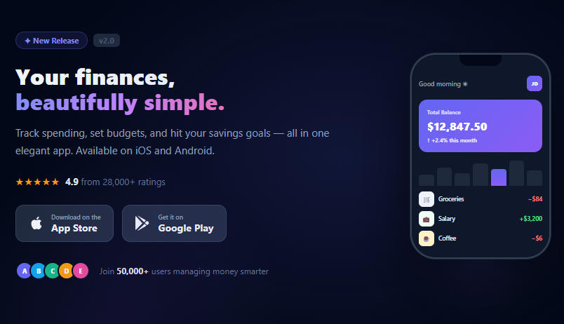
App Download Hero — Phone Mockup, App Store Badges, Rating Row & Social Proof
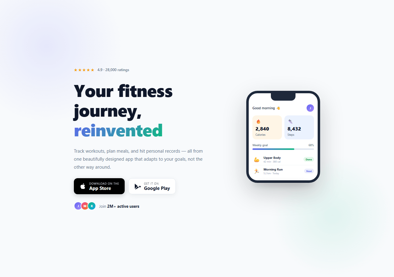
If you are building a mobile app landing page and need an above-the-fold hero that shows the app in action, communicates quality via ratings, and drives downloads via store badges, this snippet gives you everything in a two-column layout: left side has the star rating, headline, subtitle, App Store and Google Play badges, and a user count social proof row; the right side shows a CSS phone mockup with a realistic app UI.
The CSS phone mockup
The phone frame is built entirely with CSS — no images, no SVG. A 240px wide div with border-radius: 36px, border: 8px solid #1e293b, and box-shadow: 0 30px 80px rgba(0,0,0,0.2) creates the handset. A narrower div at the top with border-radius: 0 0 14px 14px simulates the notch. Inside, the app UI shows a greeting header, a stats grid (calories and steps), a weekly goal progress bar, and a workout list — all CSS layout with no images.
App Store and Google Play badges
Both badges are built with HTML and inline SVG icons — no image files needed. The Apple badge uses background: #000 and the Google Play badge uses a white card with border. Both have hover lift effects via translateY(-2px) and box-shadow. The SVG paths are Apple's and Google Play's actual brand icons, safe to use in personal and commercial projects.
The star rating row
The five stars use the ★ Unicode character with letter-spacing: 2px and amber colour. The rating text shows the score and review count. This pattern is the strongest trust signal above the fold on an app landing page — place it immediately above the headline.
The gradient phone progress bar
The weekly goal progress bar inside the phone mockup uses background: linear-gradient(90deg, indigo, green) for a branded gradient fill — communicating goal completion visually without a number.
Making it your own
Update the app greeting, stat values, workout names, and progress percentage in the HTML. Change the phone border colour to match your app brand. Replace the placeholder content with your actual app screens using a screenshot in the .phone-screen background.
Using with real App Store data
For production, pull real store ratings via the App Store Connect API or iTunes Search API and inject them server-side. Replace the hardcoded "4.9 · 28,000 ratings" with fetched data rendered at build time in Next.js via getStaticProps or an RSC fetch. This keeps the rating current without client-side fetching on the landing page load, maintaining fast first-paint performance.
Build with AI
Build, Understand, Optimize, and Extend It With AI
There's no JavaScript here to step through, so the real work is understanding the layering that makes the CSS phone mockup and glow background feel real. Paste the HTML and CSS into an AI coding assistant like Claude and ask it to explain exactly how the glow-l and glow-r radial gradients are positioned to avoid competing with each other, or why the phone-notch uses a fixed width with rounded bottom corners rather than a clip-path. The same assistant is a good partner for optimizing it — ask whether the flex-wrap based responsive layout could be replaced with a cleaner container-query approach, or whether the repeated gradient color stops across accent, prog-fill, and app-av could be consolidated into CSS custom properties. It's equally useful for extending the hero: ask it to animate the prog-fill bar filling in on scroll into view, swap the workout list for a real data-driven prop in a component library, or add a second phone screen that cross-fades in in place of the static one. Treat the code less like a finished artifact and more like a starting point for a conversation.
Prompt to recreate it
Copy this into your AI assistant of choice to build the effect from scratch, or as a jumping-off point for your own variant:
Build a light-theme "app download hero" in plain HTML and CSS only — no JavaScript, no images, no icon libraries.

Requirements:
- A flex layout (not grid) with flex-wrap so the two-column split — left-side copy, right-side phone mockup — collapses to a single stacked column on narrow viewports without a media query being strictly required for the reflow itself.
- Two independent radial-gradient glow layers positioned at opposite corners of the hero (top-left and bottom-right) using absolutely positioned, pointer-events: none divs, layered behind the content with z-index.
- The headline's accent word must be clipped from a diagonal two-color linear-gradient using background-clip: text with a transparent text fill color, matching one of the two glow colors for visual cohesion.
- Build a phone mockup from plain divs only: an outer frame with a thick solid border and large border-radius simulating an iPhone bezel, a centered notch div with rounded bottom corners, and an inner screen containing a header row, a two-column stats grid with icon/value/label cells, a labeled progress bar whose fill width is set from a percentage, and a short list of workout rows each ending in a status badge.
- Store badges (Apple and Google) must be built with inline SVG brand icons and a two-line text label, with distinct visual treatments — one dark filled badge, one white bordered badge — and a hover lift transform.
- A row of overlapping circular initials avatars (using negative margin) next to bold user-count social proof text.
Want to tighten it up first? Run this prompt through the AI Prompt Studio to score it across 8 quality dimensions, catch anti-patterns, and tune the wording for Claude, ChatGPT, or Gemini before you paste it in.
Source Code
<section class="hero">
  <div class="glow-l"></div>
  <div class="glow-r"></div>

  <div class="left">
    <div class="rating-row">
      <span class="stars">★★★★★</span>
      <span class="rating-text">4.9 · 28,000 ratings</span>
    </div>

    <h1 class="headline">Your fitness<br>journey, <span class="accent">reinvented</span></h1>

    <p class="sub">Track workouts, plan meals, and hit personal records — all from one beautifully designed app that adapts to your goals, not the other way around.</p>

    <div class="badges">
      <a href="#" class="store-badge apple">
        <svg class="store-icon" viewBox="0 0 24 24" fill="currentColor"><path d="M18.71 19.5c-.83 1.24-1.71 2.45-3.05 2.47-1.34.03-1.77-.79-3.29-.79-1.53 0-2 .77-3.27.82-1.31.05-2.3-1.32-3.14-2.53C4.25 17 2.94 12.45 4.7 9.39c.87-1.52 2.43-2.48 4.12-2.51 1.28-.02 2.5.87 3.29.87.78 0 2.26-1.07 3.8-.91.65.03 2.47.26 3.64 1.98-.09.06-2.17 1.28-2.15 3.81.03 3.02 2.65 4.03 2.68 4.04-.03.07-.42 1.44-1.38 2.83M13 3.5c.73-.83 1.94-1.46 2.94-1.5.13 1.17-.34 2.35-1.04 3.19-.69.85-1.83 1.51-2.95 1.42-.15-1.15.41-2.35 1.05-3.11z"/></svg>
        <div class="store-text">
          <span class="store-sub">Download on the</span>
          <span class="store-name">App Store</span>
        </div>
      </a>
      <a href="#" class="store-badge google">
        <svg class="store-icon" viewBox="0 0 24 24" fill="currentColor"><path d="M3.18 23.76c.3.17.65.2.98.09l12.46-7.19-2.78-2.78-10.66 9.88zm-1.12-20.8a1.54 1.54 0 0 0-.06.44v17.19c0 .15.02.3.06.44l.08.07 9.62-9.63v-.22L2.14 2.89l-.08.07zm20.4 9.04-2.72-1.57-3.06 3.06 3.06 3.07 2.75-1.59a1.56 1.56 0 0 0 0-2.97zm-19.28 10.6 12.46-7.19-2.78-2.77-9.68 9.96z"/></svg>
        <div class="store-text">
          <span class="store-sub">Get it on</span>
          <span class="store-name">Google Play</span>
        </div>
      </a>
    </div>

    <div class="users-row">
      <div class="user-avs">
        <div class="uav" style="background:linear-gradient(135deg,#6366f1,#a78bfa)">J</div>
        <div class="uav" style="background:linear-gradient(135deg,#ec4899,#f97316)">M</div>
        <div class="uav" style="background:linear-gradient(135deg,#10b981,#0ea5e9)">R</div>
      </div>
      <span class="users-text">Join <strong>2M+ active users</strong></span>
    </div>
  </div>

  <div class="right">
    <div class="phone">
      <div class="phone-notch"></div>
      <div class="phone-screen">
        <div class="app-header">
          <span class="app-greeting">Good morning 👋</span>
          <div class="app-av">J</div>
        </div>
        <div class="stats-grid">
          <div class="stat-card orange">
            <div class="stat-icon">🔥</div>
            <div class="stat-val">2,840</div>
            <div class="stat-lbl">Calories</div>
          </div>
          <div class="stat-card blue">
            <div class="stat-icon">👟</div>
            <div class="stat-val">8,432</div>
            <div class="stat-lbl">Steps</div>
          </div>
        </div>
        <div class="prog-section">
          <div class="prog-label"><span>Weekly goal</span><span>68%</span></div>
          <div class="prog-track"><div class="prog-fill" style="width:68%"></div></div>
        </div>
        <div class="workout-list">
          <div class="workout-item">
            <div class="w-icon">💪</div>
            <div class="w-info"><div class="w-name">Upper Body</div><div class="w-meta">42 min · 380 cal</div></div>
            <div class="w-badge done">Done</div>
          </div>
          <div class="workout-item">
            <div class="w-icon">🏃</div>
            <div class="w-info"><div class="w-name">Morning Run</div><div class="w-meta">5.2 km · Today</div></div>
            <div class="w-badge upcoming">Next</div>
          </div>
        </div>
      </div>
    </div>
    <div class="phone-shadow"></div>
  </div>
</section>
* { box-sizing: border-box; margin: 0; padding: 0; }
body { font-family: system-ui, sans-serif; background: #f8fafc; min-height: 100vh; }
.hero { position: relative; min-height: 100vh; display: flex; align-items: center; justify-content: center; gap: 60px; padding: 60px 48px; overflow: hidden; flex-wrap: wrap; }
.glow-l { position: absolute; width: 500px; height: 500px; background: radial-gradient(circle, rgba(99,102,241,0.12), transparent 70%); top: -100px; left: -100px; pointer-events: none; }
.glow-r { position: absolute; width: 400px; height: 400px; background: radial-gradient(circle, rgba(16,185,129,0.1), transparent 70%); bottom: 0; right: 0; pointer-events: none; }
/* Left copy */
.left { flex: 1; min-width: 280px; max-width: 500px; display: flex; flex-direction: column; gap: 24px; position: relative; z-index: 1; }
.rating-row { display: flex; align-items: center; gap: 8px; }
.stars { color: #f59e0b; font-size: 14px; letter-spacing: 2px; }
.rating-text { font-size: 12px; color: #64748b; font-weight: 500; }
.headline { font-size: clamp(32px, 5vw, 56px); font-weight: 900; color: #0f172a; line-height: 1.15; letter-spacing: -1px; }
.accent { background: linear-gradient(135deg, #6366f1, #10b981); -webkit-background-clip: text; -webkit-text-fill-color: transparent; background-clip: text; }
.sub { font-size: 15px; color: #64748b; line-height: 1.75; max-width: 420px; }
.badges { display: flex; gap: 12px; flex-wrap: wrap; }
.store-badge { display: flex; align-items: center; gap: 10px; padding: 10px 18px; border-radius: 12px; text-decoration: none; transition: transform 0.15s, box-shadow 0.15s; }
.store-badge:hover { transform: translateY(-2px); }
.apple { background: #000; color: #fff; box-shadow: 0 4px 16px rgba(0,0,0,0.2); }
.google { background: #fff; color: #0f172a; border: 1.5px solid #e2e8f0; box-shadow: 0 4px 16px rgba(0,0,0,0.06); }
.store-icon { width: 22px; height: 22px; flex-shrink: 0; }
.store-text { display: flex; flex-direction: column; }
.store-sub { font-size: 9px; text-transform: uppercase; letter-spacing: 0.8px; opacity: 0.7; }
.store-name { font-size: 15px; font-weight: 700; line-height: 1.2; }
.users-row { display: flex; align-items: center; gap: 10px; }
.user-avs { display: flex; }
.uav { width: 28px; height: 28px; border-radius: 50%; font-size: 10px; font-weight: 700; color: #fff; display: flex; align-items: center; justify-content: center; margin-left: -6px; border: 2px solid #f8fafc; }
.uav:first-child { margin-left: 0; }
.users-text { font-size: 13px; color: #64748b; }
.users-text strong { color: #1e293b; }
/* Phone mockup */
.right { position: relative; z-index: 1; display: flex; flex-direction: column; align-items: center; }
.phone { width: 240px; background: #fff; border-radius: 36px; border: 8px solid #1e293b; box-shadow: 0 30px 80px rgba(0,0,0,0.2); overflow: hidden; position: relative; }
.phone-notch { height: 24px; background: #1e293b; border-radius: 0 0 14px 14px; width: 80px; margin: 0 auto; }
.phone-screen { padding: 12px; display: flex; flex-direction: column; gap: 12px; }
.app-header { display: flex; align-items: center; justify-content: space-between; }
.app-greeting { font-size: 11px; font-weight: 600; color: #1e293b; }
.app-av { width: 24px; height: 24px; border-radius: 50%; background: linear-gradient(135deg,#6366f1,#a78bfa); color: #fff; font-size: 9px; font-weight: 700; display: flex; align-items: center; justify-content: center; }
.stats-grid { display: grid; grid-template-columns: 1fr 1fr; gap: 8px; }
.stat-card { border-radius: 12px; padding: 10px; display: flex; flex-direction: column; gap: 3px; }
.stat-card.orange { background: rgba(245,158,11,0.1); }
.stat-card.blue { background: rgba(59,130,246,0.1); }
.stat-icon { font-size: 14px; }
.stat-val { font-size: 16px; font-weight: 800; color: #0f172a; }
.stat-lbl { font-size: 9px; color: #64748b; font-weight: 500; }
.prog-section { display: flex; flex-direction: column; gap: 5px; }
.prog-label { display: flex; justify-content: space-between; font-size: 9px; color: #64748b; font-weight: 600; }
.prog-track { height: 5px; background: #e2e8f0; border-radius: 3px; overflow: hidden; }
.prog-fill { height: 100%; background: linear-gradient(90deg, #6366f1, #10b981); border-radius: 3px; }
.workout-item { display: flex; align-items: center; gap: 8px; padding: 6px 0; border-bottom: 1px solid #f1f5f9; }
.workout-item:last-child { border-bottom: none; }
.w-icon { font-size: 16px; width: 28px; text-align: center; }
.w-info { flex: 1; }
.w-name { font-size: 10px; font-weight: 700; color: #1e293b; }
.w-meta { font-size: 8px; color: #94a3b8; }
.w-badge { font-size: 8px; font-weight: 700; padding: 2px 7px; border-radius: 8px; }
.w-badge.done { background: rgba(34,197,94,0.12); color: #16a34a; }
.w-badge.upcoming { background: rgba(99,102,241,0.12); color: #6366f1; }
.phone-shadow { width: 200px; height: 16px; background: rgba(0,0,0,0.12); border-radius: 50%; margin-top: -4px; filter: blur(8px); }Step by step
How to Use
- 1Update the rating and headlineChange the star rating score ("4.9") and review count ("28,000 ratings") to your App Store or Play Store actual ratings. Edit the headline to match your app value proposition.
- 2Wire the store badge linksSet href="#" on .store-badge.apple to your App Store URL (https://apps.apple.com/...) and on .store-badge.google to your Play Store URL. Both open with standard link behaviour.
- 3Update the phone screen contentIn the HTML, change the greeting text, stat values (calories, steps), progress percentage (style="width:68%"), and workout item names and metadata to match your actual app content.
- 4Replace the CSS phone with a screenshotTo show a real screenshot: remove the .phone-notch and .phone-screen content, set background: url("screenshot.png") center top / cover on the phone div, and adjust height: 500px. Keep the border and shadow CSS for the frame.
- 5Update the user countChange "2M+ active users" to your real download or user count. Update the avatar initials and gradients. Replace the badge colour from indigo/green to your app brand colours in .accent and .prog-fill.
- 6Export in your formatClick "HTML" for a standalone file, "JSX" to download as a React component, or "Tailwind" for a React + Tailwind CSS version.
Real-world uses
Common Use Cases
Got questions?
Frequently Asked Questions
The phone frame is a 240px div with border-radius: 36px (matching iPhone corner radius), border: 8px solid #1e293b (the dark bezel), and box-shadow: 0 30px 80px rgba(0,0,0,0.2) for depth. The notch is a separate div inside the phone positioned at the top — width: 80px, border-radius: 0 0 14px 14px, with the same dark background as the bezel. The phone shadow below is a blurred, elliptical div with filter: blur(8px) at 12% black opacity.
Replace the .phone-screen div content with an img tag: <img src="screenshot.png" style="width:100%; display:block;" alt="App screenshot" />. Or set background: url("screenshot.png") center top / cover no-repeat; height: 480px on the .phone-screen div and remove its child elements. For a crisp result, export the screenshot at the phone display width × 2 (480px × 2 = 960px wide) for Retina/HiDPI screens.
Both Apple and Google provide usage guidelines for their app store badges. The standard policy: use official badge artwork in your marketing materials to promote your listed app. Apple provides official badge assets at apple.com/app-store/marketing/guidelines/. Google provides them at play.google.com/intl/en_us/badges/. For production, download the official badge image assets — the SVG icons in this snippet are functional placeholders that match the standard badge appearance.
The .hero already uses flex-wrap: wrap so the layout collapses to a single column when the viewport is too narrow to fit both columns. The .left has min-width: 280px so it never gets squeezed below 280px. For better mobile control, add @media (max-width: 640px) { .right { display: none; } } to hide the phone mockup on small screens and let the copy take full width, or add flex-direction: column-reverse to show the phone above the copy on mobile.