Learn Coding Visually
Learn to code with interactive, live-preview playgrounds — HTML, CSS, JavaScript, React & more.
 HTML Playground42 lessons · Click-based · Live preview
 CSS PlaygroundLearn CSS with a live editor
 JavaScript Playground60 lessons · DOM · Async · Canvas
 React PlaygroundLearn React with a live code editor
 GSAP PlaygroundLearn GSAP animation interactively
 SVG Playground44 lessons · shapes · paths · animation
 SCSS Playground45 lessons · Sass modules · tokens
 Tailwind PlaygroundLearn Tailwind CSS with a live editor
 Bootstrap 5 Playground50 lessons · live preview
Us vs. Them Comparison Hero — Free HTML CSS JS Snippet
Hero Framed as Us vs. Them · Heroes · Plain HTML & CSS · Live preview
What's included
Features
About this UI Snippet
Us vs. Them Comparison Hero — The Checklist Is the Hero, Not a Footnote
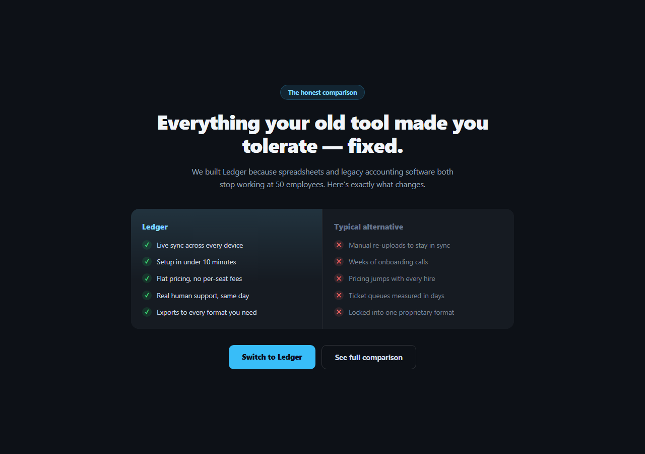
Comparison content usually lives far down the page, in a table most visitors never scroll to. This snippet moves the comparison itself into the hero — a two-column "us / typical alternative" checklist sits directly under the headline, doing the persuasive work that a headline and screenshot alone can't. It's built entirely in HTML and CSS, no JavaScript required.
Why the comparison belongs above the fold
A visitor evaluating a switch already has a mental model of what's wrong with their current tool. Restating generic benefits ("fast," "easy," "powerful") doesn't engage with that model — a direct, specific comparison does. By putting five concrete contrasts (sync behavior, setup time, pricing structure, support speed, export flexibility) in the hero itself, the page answers "why should I switch" before asking for any commitment, which is a stronger opening than a generic value-prop headline followed by a screenshot.
The two-column contrast structure
.cvh-compare is a two-column grid with a 2px gap that reads as a dividing line between the columns. The left "us" column gets a subtle blue-tinted gradient background and a colored logo label; the right "typical alternative" column stays flat and its logo label is deliberately muted grey — a visual hierarchy that makes clear which side to prefer without needing bold claims. Each row pairs a small circular icon (green check or red X) with a specific, falsifiable statement — not "better," but "flat pricing, no per-seat fees."
Specificity over superlatives
Every line in both columns names a concrete behavior a prospect can verify themselves, rather than an abstract quality. "Live sync across every device" versus "manual re-uploads to stay in sync" is checkable; "we're better at syncing" is not. This specificity is what makes an us-vs-them comparison credible instead of feeling like marketing copy — replace these five points with your product's actual differentiators, written the same concrete way.
Framing without naming a competitor
The right column is labeled "Typical alternative" rather than a specific competitor's name, which keeps the comparison legally safe and evergreen (it doesn't need updating when a competitor changes their pricing) while still being unambiguous to anyone shopping in the category. If you do want to name a specific competitor, swap the label and keep the same structure — just make sure every claim you make about them is accurate and current.
Customizing it
Replace the five comparison points with your product's real differentiators — keep them specific and verifiable. Update the two CTAs: a primary "switch" action and a secondary link to a fuller comparison table elsewhere on the site for visitors who want more detail. Pair this hero with a pricing card section below for visitors who are already convinced and want to see numbers.
Build with AI
Build, Understand, Optimize, and Extend It With AI
You don't have to guess which comparison points will land. Paste this snippet's HTML and CSS into an AI coding assistant like Claude and ask it to explain why putting a specific, verifiable comparison in the hero is a stronger persuasive structure than a generic headline followed by a screenshot, or how the subtle gradient and muted logo label on the two columns create a preference hierarchy without needing bold claims. The same assistant can help you sharpen the copy — ask it to review your five comparison points for vague superlatives versus concrete, checkable claims. It's also useful for extending the pattern: ask it to add a third column for a second competitor, make the comparison points expandable with more detail on click, or turn the static list into a component that pulls its claims from a CMS. Treat the code less like a finished artifact and more like a starting point for a conversation.
Prompt to recreate it
Copy this into your AI assistant of choice to build the effect from scratch, or as a jumping-off point for your own variant:
Build a marketing hero section in plain HTML and CSS (no JavaScript needed) that puts a compact "us vs. typical alternative" comparison directly beneath the headline as the hero's primary persuasive content.

Requirements:
- A centered hero with a small eyebrow badge, a bold headline, and a short subheading.
- Below the subheading, a two-column comparison grid with a thin visual divider between the columns: a left "us" column with a colored logo label and a subtle tinted gradient background, and a right "typical alternative" column with a muted grey label and a flat background.
- Each column lists exactly five rows, and each row pairs a small circular icon (a green checkmark for the "us" column, a red X for the "alternative" column) with one short, specific, verifiable claim — not a vague adjective like "better" or "faster" but a concrete behavior (for example "flat pricing, no per-seat fees" versus "pricing jumps with every hire").
- Below the comparison grid, a row with two call-to-action buttons: a solid primary "switch" button and an outlined secondary button linking to a fuller comparison page.
- Make it fully responsive: the two comparison columns stack vertically on narrow screens, and the headline scales down.
- Use a dark background so the colored checkmarks, X marks, and the tinted "us" column stand out clearly.
Want to tighten it up first? Run this prompt through the AI Prompt Studio to score it across 8 quality dimensions, catch anti-patterns, and tune the wording for Claude, ChatGPT, or Gemini before you paste it in.
Step by step
How to Use
- 1Paste the HTML and CSSA dark hero renders with a headline and a two-column comparison checklist beneath it.
- 2Review the five comparison pointsEach row pairs a green check (your product) with a red X (the alternative) on a specific claim.
- 3Replace the claims with your ownKeep every point concrete and verifiable — avoid vague superlatives.
- 4Decide whether to name a competitorKeep "Typical alternative" for an evergreen comparison, or name a specific competitor if every claim is accurate.
- 5Wire the CTAsPoint the primary button at signup and the secondary link at a fuller comparison table page.
- 6Check the mobile stackBelow 640px the two columns stack vertically.
Real-world uses
Common Use Cases
Got questions?
Frequently Asked Questions
A visitor evaluating a switch already has a mental model of what's wrong with their current tool. Putting the comparison directly under the headline engages with that model immediately, rather than making the visitor scroll past generic value-prop copy to find the content that actually addresses their hesitation.
The default "Typical alternative" label keeps the comparison evergreen and legally safe — it doesn't need updating when a competitor changes pricing, and it's unambiguous to anyone shopping in the category. Naming a specific competitor is more direct but requires every claim to be accurate and kept current, and may need legal review depending on your market.
Specificity. "Live sync across every device" is a claim a prospect can verify themselves; "we're better at syncing" is not. Every point in both columns should name a concrete, checkable behavior — replace the placeholder claims with your product's real, specific differentiators written the same way.
Add more <li> elements to both .cvh-us and .cvh-them lists — keep the same number of items in each column so the rows stay visually aligned across the two sides. For a much longer list, consider linking to a dedicated comparison table page instead of growing the hero indefinitely.
Since there's no JavaScript, the conversion is a direct markup translation — map your comparison points array to two lists of items. Click JSX, Vue, or Angular in the export panel to download the converted component.