You Might Also Like
Learn Coding Visually
Learn to code with interactive, live-preview playgrounds — HTML, CSS, JavaScript, React & more.
 HTML Playground42 lessons · Click-based · Live preview
 CSS PlaygroundLearn CSS with a live editor
 JavaScript Playground60 lessons · DOM · Async · Canvas
 React PlaygroundLearn React with a live code editor
 GSAP PlaygroundLearn GSAP animation interactively
 SVG Playground44 lessons · shapes · paths · animation
 SCSS Playground45 lessons · Sass modules · tokens
 Tailwind PlaygroundLearn Tailwind CSS with a live editor
 Bootstrap 5 Playground50 lessons · live preview
Empty State with Sample Data Toggle — Free Dashboard UI (HTML/CSS/JS)
Empty State with Sample Data Toggle · Cards · Plain HTML, CSS & JS · Live preview
What's included
Features
About this UI Snippet
Empty State with Sample Data Toggle — Let New Users Preview Before They Commit
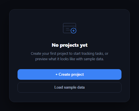
A first-run empty state has one job: get the user to create their first real thing. But a blank "No projects yet" screen with a single button asks for commitment before the user has any idea what the feature actually looks like in use. This snippet solves that with a secondary "Load sample data" action that swaps the empty state for a small, clearly-labeled preview of a populated view — letting a new user see the feature working before they invest effort in setting it up themselves.
Two states, one toggle
The card has exactly two states — an empty illustration-and-CTA view, and a populated preview with 2–3 fake rows — controlled by simple hidden attribute toggles in showSample() and showEmpty(). There's no partial or ambiguous state in between; either the empty state or the sample view is visible, never both, which keeps the interaction easy to reason about and easy to test.
Clearly marked as a sample
The populated view carries a persistent "Sample data" tag in its header so a user can never mistake the preview rows for their real, saved data — a mistake that would be confusing and potentially destructive if they later tried to "delete" one of the fake rows. A "Clear sample data" action sits right next to that tag, so returning to the empty state is always one click away and clearly labeled as the inverse of "Load sample data."
A second path back to creation
The populated preview ends with its own "Create your first real project" button — because seeing the feature in action is often exactly what convinces a hesitant user to commit. Rather than making them clear the sample data first and re-find the original CTA, the creation action is available directly from the state that sold them on it.
Realistic but obviously fake data
The sample rows use varied, plausible content (different statuses, task counts, and relative timestamps) rather than lorem-ipsum placeholders, because the whole point is to demonstrate what a *real*, in-use dashboard looks like — a grid of "Item 1, Item 2, Item 3" wouldn't sell the feature the way "Mobile app v2 · 11 tasks · at risk" does.
Where it fits
Pair it with an empty state for simpler no-CTA-needed cases, an onboarding checklist widget for the broader first-run flow, or empty-state-ai-suggestions for an AI-assisted variant of the same "help them get started" problem.
Customizing it
Swap the illustration and copy for your own resource type (contacts, invoices, campaigns), adjust the sample row count, or auto-clear the sample data after a set time or on the user's first real save so it never lingers past its usefulness.
Build with AI
Build, Understand, Optimize, and Extend It With AI
You don't have to design the empty-state-to-preview interaction from scratch. Paste this snippet's HTML, CSS, and JS into an AI coding assistant like Claude and ask it to explain why the populated view keeps a persistent "Sample data" tag and a "Clear sample data" action adjacent to each other, and why the create CTA appears in both the empty state and the sample-data preview rather than only one. The same assistant can help you harden it — ask whether the sample rows should be non-interactive by default to avoid a user mistaking them for editable real data, or how you'd auto-clear sample data if the user navigates away without creating anything real. It's also useful for extending the pattern: ask it to add a subtle fade or slide transition between the two states, generalize SAMPLE_ROWS into a reusable prop for different resource types, or add a "why am I seeing this" tooltip explaining the sample-data feature to first-time users. Treat the code less like a finished artifact and more like a starting point for a conversation.
Prompt to recreate it
Copy this into your AI assistant of choice to build the effect from scratch, or as a jumping-off point for your own variant:
Build an "empty state with sample data toggle" component in plain HTML, CSS, and JavaScript with no framework or library.

Requirements:
- Render an empty state with an icon/illustration, a heading like "No projects yet", explanatory copy, a primary "Create project" button, and a secondary "Load sample data" button.
- Clicking "Load sample data" must hide the empty state and show a populated preview view containing 2-3 sample rows of realistic, varied fake content (not lorem ipsum) — each row representing one item with a title, some metadata, and a status badge.
- The populated preview must display a persistent, clearly visible "Sample data" label so it can never be mistaken for real saved data, and must include a "Clear sample data" button that returns the view to the original empty state.
- Also include a "Create your first real project" call-to-action directly within the populated sample-data preview, separate from the empty state's own create button, so a user convinced by the preview doesn't have to clear it first to start creating.
- Ensure the two states (empty vs. populated) are mutually exclusive — never show both at once, and never show a state that is neither fully empty nor fully populated.
- Keep the sample data and creation-flow logic simple and swappable, so the resource type (projects, contacts, invoices, etc.), the sample content, and the click handlers can all be easily replaced.
Want to tighten it up first? Run this prompt through the AI Prompt Studio to score it across 8 quality dimensions, catch anti-patterns, and tune the wording for Claude, ChatGPT, or Gemini before you paste it in.
Step by step
How to Use
- 1Paste HTML, CSS, and JSA "No projects yet" empty state renders with two actions.
- 2Click Load sample dataThe empty state swaps for 3 sample project rows, tagged "Sample data."
- 3Try the sample-view CTA"Create your first real project" is available directly from the preview.
- 4Click Clear sample dataThe view returns cleanly to the original empty state.
- 5Wire up the create actionsReplace the alert() calls with your real project-creation flow.
- 6Swap in your resourceAdjust the illustration, copy, and sample rows for your own data type.
Real-world uses
Common Use Cases
Got questions?
Frequently Asked Questions
The populated preview always carries a visible "Sample data" tag in its header, distinct from any real content styling, and a "Clear sample data" button sits directly next to it — so a user always knows they're looking at a preview and always has an obvious, adjacent way back to the empty state.
In this snippet the sample rows are display-only (no edit or delete controls), which is the safest default. If you add interactivity to sample rows, keep the "Sample data" tag visible at all times and consider disabling destructive actions specifically on sample content.
Seeing the feature working with realistic content is often what convinces a hesitant user to invest the effort of creating their first real item — so the CTA is placed directly in the state that just sold them on the feature, rather than requiring them to clear the sample data first and hunt for the original button.
Generally no — an explicit toggle keeps the user in control and avoids ambiguity about whether what they're seeing is real. If you want a zero-click preview, consider auto-loading it only on a true first visit and pairing it with an even more prominent "this is sample data" treatment.
Track a single boolean (e.g. showSample) in component state instead of toggling hidden attributes directly, and conditionally render the empty or populated block based on it. The SAMPLE_ROWS array and its rendering map over directly into JSX or a template loop.