You Might Also Like
Learn Coding Visually
Learn to code with interactive, live-preview playgrounds — HTML, CSS, JavaScript, React & more.
 HTML Playground42 lessons · Click-based · Live preview
 CSS PlaygroundLearn CSS with a live editor
 JavaScript Playground60 lessons · DOM · Async · Canvas
 React PlaygroundLearn React with a live code editor
 GSAP PlaygroundLearn GSAP animation interactively
 SVG Playground44 lessons · shapes · paths · animation
 SCSS Playground45 lessons · Sass modules · tokens
 Tailwind PlaygroundLearn Tailwind CSS with a live editor
 Bootstrap 5 Playground50 lessons · live preview
Property Listing Card — Free Real Estate Card UI Snippet
Property Listing Card · Cards · Plain HTML, CSS & JS · Live preview
What's included
Features
About this UI Snippet
Property Listing Card — Real Estate Photo, Stats, and Save Toggle in One Card
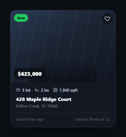
The property listing card is the unit every real-estate search result, map pin popup, and "similar homes" rail is built from — a photo, a price, the beds/baths/sqft trio, an address, and a way to shortlist it without leaving the grid. This snippet builds that card with a pure-CSS photo placeholder (a layered gradient with a faint window-and-roofline silhouette, no image request required), a floating price tag, a status badge, and an accessible heart toggle.
A CSS-only photo placeholder
Instead of a real photo, the media area layers a diagonal gradient, two repeating-linear-gradient textures for subtle grain, and a clipped polygon that reads as a simple roofline silhouette against the horizon. It's deliberately abstract — the point is to demonstrate the card's layout and states without depending on a licensed image — and it's trivial to swap for a real <img> or background photo in production.
Stats row with inline icon SVGs
Beds, baths, and square footage sit in a row of small inline SVG icons paired with bold numerals, the scannable pattern buyers pattern-match on instantly across every major listing site. Each icon is a tiny hand-drawn path (a bed frame, a tub, a floor-plan grid) rather than an icon-font dependency, keeping the snippet free of external requests — consistent with how a product card keeps its rating stars inline rather than font-based.
An accessible save toggle
The heart button is a real <button> with aria-pressed reflecting saved state and an aria-label that updates between "Save property" and "Remove from saved properties" — the same accessible toggle-button pattern used by favorite button and wishlist heart button. The heart fills and briefly scales up on save, giving immediate visual confirmation without a network round trip.
Status badge for urgency and updates
A top-left badge flags listing status — "New" in green for a fresh listing, or "Price reduced" in amber when the seller drops the price — the kind of contextual signal that drives clicks in a search results grid. In this demo, clicking the badge toggles between the two states so you can preview both without editing the markup.
Built for a grid, and for a calculator handoff
The card's fixed-ratio media and consistent footer height make it safe to repeat in a CSS grid of any column count. Once a buyer taps into a listing, the natural next step is affordability — hand the price straight into a mortgage calculator or the fuller mortgage payment breakdown so they can see a monthly payment before they ever contact an agent.
Build with AI
Build, Understand, Optimize, and Extend It With AI
You don't have to work out the layered placeholder or the toggle accessibility on your own. Paste this snippet's HTML, CSS, and JS into an AI coding assistant like Claude and ask it to explain how the .plc-media pseudo-elements combine a diagonal gradient, a repeating-linear-gradient texture, and a clip-path polygon to fake a photo without an image request, or why the heart button's aria-pressed attribute and dynamic aria-label matter more than just toggling a CSS class. The same assistant can help optimize it — ask whether the card's fixed aspect-ratio media area is the right approach for a masonry-style grid versus a uniform grid, or whether the badge and price tag's z-index stacking will still work once a real photo replaces the gradient. It's also useful for extending the card: ask it to add a horizontal photo carousel with dots, a "compare" checkbox alongside the heart, or a skeleton loading state for when listing data is still fetching. Treat the code less like a finished artifact and more like a starting point for a conversation.
Prompt to recreate it
Copy this into your AI assistant of choice to build the effect from scratch, or as a jumping-off point for your own variant:
Build a "property listing card" for a real-estate site in plain HTML, CSS, and JavaScript — no frameworks, no external images.

Requirements:
- A photo area built entirely from CSS (gradients, repeating-linear-gradient texture, and a clip-path shape) rather than a real image, since this must render with zero network requests — but structured so it can be swapped for a real background-image or <img> without changing the layered elements sitting on top of it (badge, price tag, save button).
- A status badge in the top-left corner of the photo area (e.g. "New" in green, or "Price reduced" in amber) and a price tag overlaid on the photo's bottom-left corner, both above the photo layer via z-index.
- A save/favorite toggle button in the photo's top-right corner built as a real <button> (not a div) with an SVG heart icon that fills with color and briefly scales up when toggled on; the button must expose its state via aria-pressed and update its aria-label between "Save property" and "Remove from saved properties" based on that state.
- A stats row below the photo showing bed count, bath count, and square footage, each with a small inline SVG icon (not an icon font) directly beside the number.
- An address heading, a city/state/zip subline, and a footer row with "listed X days ago" text and an agent or brokerage name, separated from the stats above by a thin top border.
- A fixed aspect-ratio on the photo area so the card stays visually consistent when repeated in a responsive CSS grid at any column count, and hover elevation (a subtle lift and shadow increase) on the whole card.
Want to tighten it up first? Run this prompt through the AI Prompt Studio to score it across 8 quality dimensions, catch anti-patterns, and tune the wording for Claude, ChatGPT, or Gemini before you paste it in.
Step by step
How to Use
- 1Paste HTML, CSS, and JSA listing card renders with a gradient photo placeholder, price tag, badge, and stats row.
- 2Click the heartThe icon fills and scales up; aria-pressed and aria-label update for screen readers.
- 3Click the badgeToggles between "New" and "Price reduced" so you can preview both states.
- 4Swap in a real photoReplace the .plc-media gradient with a background-image or an <img>.
- 5Repeat it in a gridWrap several cards in a CSS grid — the fixed aspect-ratio keeps rows aligned.
- 6Wire up the click targetAdd a link or click handler on the card to open the full listing page.
Real-world uses
Common Use Cases
Got questions?
Frequently Asked Questions
So the snippet renders instantly with zero network requests and no licensing concerns while you evaluate the layout. In production, swap the .plc-media background for a real photo via background-image or an absolutely positioned <img> with object-fit: cover — the badge, price tag, and heart button are already positioned with z-index above the media layer, so they'll sit correctly on top of a real photo too.
It's a real <button>, not a styled <div>, so it's keyboard-focusable and clickable via Enter or Space by default. Its aria-pressed attribute reflects saved state as a boolean, and its aria-label switches between "Save property" and "Remove from saved properties" on toggle, so a screen reader announces both the current state and the action the next press will take.
Wrap the .plc-card in an <a> tag, or add a click handler on the card that navigates — but keep the heart button's click handler calling event.stopPropagation() so saving a listing doesn't also trigger navigation. That's the same pattern used by any card with a nested interactive control, like a product card with an add-to-cart button.
The badge is just a span with a modifier class (.reduced) that swaps its background color. Add more modifier classes — for example .pending or .open-house — each with its own background, and set the class and text based on the listing's actual status field when you render the card from data.
Pass address, price, stats, photo URL, and a saved boolean as props; render the heart button's aria-pressed and fill class from that boolean and toggle it in a click handler. In React, that's useState(false) with an onClick that flips it and calls a save callback; in Vue, a reactive ref bound with :aria-pressed and @click. The CSS ports unchanged.