You Might Also Like
Learn Coding Visually
Learn to code with interactive, live-preview playgrounds — HTML, CSS, JavaScript, React & more.
 HTML Playground42 lessons · Click-based · Live preview
 CSS PlaygroundLearn CSS with a live editor
 JavaScript Playground60 lessons · DOM · Async · Canvas
 React PlaygroundLearn React with a live code editor
 GSAP PlaygroundLearn GSAP animation interactively
 SVG Playground44 lessons · shapes · paths · animation
 SCSS Playground45 lessons · Sass modules · tokens
 Tailwind PlaygroundLearn Tailwind CSS with a live editor
 Bootstrap 5 Playground50 lessons · live preview
Image Zoom Card — Free HTML CSS JS Hover Zoom Product Card
Image Zoom Card · Cards · Plain HTML, CSS & JS · Live preview
What's included
Features
About this UI Snippet
Image Zoom Card — Magnify Toward the Cursor on Hover
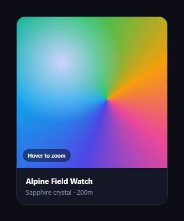
The image zoom card is the product-photo interaction from e-commerce sites: hovering the image magnifies it, and the zoom centres on wherever your cursor is, so you can inspect any part of the product. This snippet builds it with plain HTML, CSS transforms, and a four-line JavaScript handler — no magnifier lens, no high-res second image, and no library.
Zoom by scaling, focus by transform-origin
The trick is two CSS properties working together. On hover the image element scales up (transform: scale(2.1)), and the part that stays centred is set by transform-origin. JavaScript updates that origin on every mousemove to the cursor's position as a percentage of the frame, so the magnified region is always whatever you're pointing at. Scaling toward the cursor — rather than a fixed centre — is what makes it feel like a real magnifier sweeping across the product.
Clipping with the frame
The image lives in a .iz-frame with overflow: hidden and a fixed aspect-ratio, so the scaled-up image is clipped to the card and never spills over its neighbours. The frame also carries a cursor: zoom-in to signal the interaction before the user even hovers.
Two-speed transitions
The transition is tuned for feel: scaling in on hover is quick (~120ms) so the zoom responds instantly, while scaling back out on mouseleave is slower with an ease-out curve so it settles gently. Setting different transition durations for the hover and rest states is a small detail that makes the interaction feel polished rather than mechanical.
A self-contained demo image
So the snippet works with zero assets, the "photo" is built from layered CSS gradients (a conic colour wheel plus a soft radial highlight). In your own card you'd replace the background with a background-image: url(...) of a real product shot — everything else, including the cursor tracking, works identically because the zoom operates on whatever the element's background is.
Why CSS scale beats a lens
Classic zoom widgets load a second, larger image and float a lens over a thumbnail — more markup, more bytes, and a sliding panel to manage. Scaling the existing image with transform keeps it to one element and runs entirely on the GPU compositor, so it's lighter and smoother, at the cost of needing a reasonably high-resolution source for the zoomed detail to stay crisp.
Customizing it
Change the zoom factor, the transition speeds, or the cursor; swap the gradient for a real image; or add a fade for the "Hover to zoom" hint, which disappears on hover here. Pair it with a product card, an image magnifier, or a photo gallery.
Build with AI
Build, Understand, Optimize, and Extend It With AI
You do not have to puzzle out the coordinate math on your own. Paste this snippet's HTML, CSS, and JS into an AI coding assistant like Claude and ask it to explain exactly how the mousemove handler converts clientX and clientY into the percentage-based transformOrigin the CSS scale reads, or why the frame needs overflow hidden for the effect to look correct. The same assistant can help optimize it — asking whether writing transformOrigin on every mousemove event should be throttled with requestAnimationFrame for lower-end devices, or whether the two-speed transition timing could be tuned further. It is just as useful for extending the card — ask it to add pinch-to-zoom or a draggable pan for touch devices, layer in a small magnifier lens as an alternative to full-card scaling, or swap the gradient placeholder for a real lazy-loaded product photo with a loading state. Treat the code less like a finished artifact and more like a starting point for a conversation.
Prompt to recreate it
Copy this into your AI assistant of choice to build the effect from scratch, or as a jumping-off point for your own variant:
Build a hover-to-zoom product image card in plain HTML, CSS, and JavaScript using only CSS transforms and a mousemove listener — no canvas, no second high-res image swap, no libraries.

Requirements:
- A card containing a fixed aspect-ratio frame with overflow hidden, holding a single image element (or background) that fills the frame.
- On hover, the image must scale up (for example transform: scale(2.1)) with a fast transition (around 120ms) so the zoom feels immediate, while scaling back down on mouse leave must use a slower, eased transition so it settles gently — the two states need different transition durations.
- A mousemove listener on the frame must compute the cursor's position as a percentage of the frame's width and height using getBoundingClientRect, and set that as the image's transform-origin so the zoomed-in region is always centered on wherever the cursor currently is, not a fixed point.
- On mouseleave, reset transform-origin back to center so the next hover starts from a clean, predictable state.
- Add a small pill-shaped hint label (like "Hover to zoom") absolutely positioned over the frame that fades out on hover so it doesn't obscure the zoomed image.
- Give the frame a zoom-in cursor so the interaction is signaled before the user hovers.
- Everything must be clippable to the card's rounded corners, and the zoom must never cause the image to overflow into surrounding layout.
Want to tighten it up first? Run this prompt through the AI Prompt Studio to score it across 8 quality dimensions, catch anti-patterns, and tune the wording for Claude, ChatGPT, or Gemini before you paste it in.
Step by step
How to Use
- 1Paste HTML, CSS, and JSA product card with an image renders.
- 2Hover the imageIt magnifies and the hint fades out.
- 3Move the cursorThe zoom focal point follows the pointer.
- 4Move awayThe image eases back to its normal size.
- 5Use a real photoSet background-image on the .iz-img element.
- 6Tune the zoomChange the scale factor on hover.
Real-world uses
Common Use Cases
Got questions?
Frequently Asked Questions
On hover the image scales up with transform: scale, and which part stays centred is controlled by transform-origin. A mousemove handler sets that origin to the cursor's position as a percentage of the frame, so the magnified region is always whatever you point at — scaling toward the cursor rather than a fixed centre is what makes it feel like a real magnifier.
Classic zoom widgets load a larger second image and float a lens over a thumbnail, which means more markup, more bytes, and a sliding panel to manage. Scaling the existing image with transform keeps it to one element on the GPU compositor, so it is lighter and smoother — you just need a reasonably high-resolution source for the zoomed detail to stay crisp.
The image sits in a frame with overflow: hidden and a fixed aspect-ratio, so when it scales up it is clipped to the frame and never spills onto neighbouring content. The frame also carries cursor: zoom-in to hint the interaction before the user hovers.
Replace the .iz-img background gradients with background-image: url(your-photo) and keep background-size: cover. Everything else, including the cursor tracking and the scale, works identically because the zoom operates on the element's background whatever it is. Use a high-resolution image so the zoomed detail stays sharp.
Render the figure as normal markup and attach an onMouseMove handler that writes transformOrigin to the image via a ref, imperatively, so you do not re-render per pointer move; reset it on mouse leave. The scale and transition CSS port unchanged. In Tailwind use scale and origin utilities, setting the dynamic origin through an inline style.