

Learn Coding Visually
Learn to code with interactive, live-preview playgrounds — HTML, CSS, JavaScript, React & more.
 HTML Playground42 lessons · Click-based · Live preview
 CSS PlaygroundLearn CSS with a live editor
 JavaScript Playground60 lessons · DOM · Async · Canvas
 React PlaygroundLearn React with a live code editor
 GSAP PlaygroundLearn GSAP animation interactively
 SVG Playground44 lessons · shapes · paths · animation
 SCSS Playground45 lessons · Sass modules · tokens
 Tailwind PlaygroundLearn Tailwind CSS with a live editor
 Bootstrap 5 Playground50 lessons · live preview
Product Quick View — Shop Modal HTML CSS JS
Product Quick View · Modals · Plain HTML, CSS & JS · Live preview
What's included
Features
About this UI Snippet
Product Quick View — Quick-Shop Modal with Gallery, Variants & Add to Cart
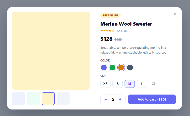
A product quick-view lets shoppers inspect an item — see more photos, pick a size and color, set a quantity, and add to cart — without leaving the listing or category page they're browsing. It's one of the highest-impact conversion patterns in e-commerce because it removes a full page load between "interested" and "in cart." This snippet builds a complete quick-view modal in plain HTML, CSS, and vanilla JavaScript: an image gallery with thumbnails, color swatches that re-skin the preview, a size picker with out-of-stock handling, a quantity stepper, and an add-to-cart button that reflects the running total.
A gallery driven by the selected color
The main image area and a row of thumbnails are both generated from a COLORS array, and selecting a color (via either a thumbnail or a swatch) re-skins the main preview and keeps the two controls in sync. In this demo the "images" are colored panels for portability, but the structure — main view plus clickable thumbnails, each tied to a variant — is exactly what you'd populate with real product photos, swapping the panel's background for an <img>. Selecting a swatch updates the thumbnail highlight and vice versa, so there's never a mismatched active state.
Variant selection with out-of-stock states
Color swatches and size chips are both rendered from data, with the current selection clearly ringed. Sizes carry an out flag: an out-of-stock size renders struck-through, dimmed, and disabled, so it can't be selected — and if the user somehow tries to add an out-of-stock variant, the add-to-cart handler blocks it with an inline message ("That size is out of stock — pick another"). This guards against the most frustrating e-commerce moment: adding something to your cart only to discover at checkout that it was never available.
Quantity and a live total
A bounded quantity stepper (1–10) drives a running total shown right inside the add-to-cart button — "Add to cart · $256" — so the price the shopper will pay is never hidden behind another click. The decrement button disables at one, preventing a zero-quantity add.
Add-to-cart feedback that confirms the action
Clicking add (with a valid in-stock variant) flips the button to a green "✓ Added to cart" state for a moment before reverting, giving immediate confirmation that the action registered. The handler is where you'd push the selected { color, size, qty } to your real cart state or POST it to a cart API; the confirmation animation is intentionally optimistic so the UI feels instant.
Responsive, accessible, and animation-safe
The modal is a two-column grid (gallery + info) that collapses to a single column below 560px, is role="dialog" with aria-modal="true", and closes via the ✕ button, a backdrop click, or the Escape key — all through one close() function. It animates in with opacity and transform only, keeping the entrance smooth across every framework export, and the body scrolls internally (max-height: 90vh; overflow: auto) so even a tall product fits any viewport.
Build with AI
Build, Understand, Optimize, and Extend It With AI
You don't have to trace every piece of shared state by hand. Paste this snippet's HTML, CSS, and JS into an AI coding assistant like Claude and ask it to explain exactly how selecting a color from either the thumbnail row or the swatch row keeps both controls' active states synchronized through the same state.color value, and why the out-of-stock guard in the add-to-cart handler exists even though disabled size buttons should already prevent that selection. The same assistant can help optimize it, for example checking whether re-rendering the entire thumbs/swatches/sizes markup on every single interaction is more work than necessary versus updating just the changed active classes, or whether the modal's open/close animation stays smooth if the product description is much longer. It's also useful for extending the effect: ask it to swap the colored placeholder panels for real product photography with a loading state, add a quantity-based bulk discount that updates the live total, or persist the last-viewed product's selected variant in sessionStorage so reopening quick view remembers the choice. Treat the code less like a finished artifact and more like a starting point for a conversation.
Prompt to recreate it
Copy this into your AI assistant of choice to build the effect from scratch, or as a jumping-off point for your own variant:
Build an e-commerce product quick-view modal in plain HTML, CSS, and vanilla JavaScript — no libraries, no modal framework.

Requirements:
- A trigger button that opens a centered modal dialog (with a semi-transparent backdrop) containing, in a two-column layout: a gallery side with one large main preview and a row of small clickable thumbnails, and an info side with a product tag, title, star rating, current and struck-through original price, description, a color swatch picker, a size picker, a quantity stepper, and an add-to-cart button.
- Both the thumbnail row and a separate swatch row must represent the exact same set of color variants and must always show the same variant as "active" — selecting a color from either control must update the main preview and keep both controls' active-state highlighting in sync with each other.
- Render the size picker from a data array where some sizes are flagged as out of stock; those specific size buttons must be visually struck-through, dimmed, and given the native disabled attribute so they cannot be clicked at all.
- A quantity stepper bounded between 1 and 10, where the decrement button becomes disabled at the minimum, and the add-to-cart button's label must always show quantity multiplied by unit price as a live-updating total (for example "Add to cart · $256"), not just a static "Add to cart" label.
- Clicking add-to-cart must first check whether the currently selected size is flagged out of stock — if so, show an inline warning message instead of adding anything; otherwise, briefly show a green "Added to cart" confirmation on the button before it reverts to its normal label and total after roughly two seconds.
- The modal must be dismissible via a close button, a backdrop click, or the Escape key (all routed through one shared close function), have proper role="dialog" and aria-modal attributes, animate in and out using only opacity and transform (no layout-affecting properties), and collapse to a single-column layout on narrow viewports.
Want to tighten it up first? Run this prompt through the AI Prompt Studio to score it across 8 quality dimensions, catch anti-patterns, and tune the wording for Claude, ChatGPT, or Gemini before you paste it in.
Source Code
<div class="pqv-page">
  <button type="button" class="pqv-open" id="pqvOpen">Quick view</button>
</div>

<div class="pqv-backdrop" id="pqvBackdrop"></div>
<div class="pqv-modal" id="pqvModal" role="dialog" aria-modal="true" aria-label="Product quick view">
  <button type="button" class="pqv-close" id="pqvClose" aria-label="Close">✕</button>

  <div class="pqv-gallery">
    <div class="pqv-main" id="pqvMain" style="background:#eef2ff"></div>
    <div class="pqv-thumbs" id="pqvThumbs"></div>
  </div>

  <div class="pqv-info">
    <span class="pqv-tag">Bestseller</span>
    <h2>Merino Wool Sweater</h2>
    <div class="pqv-rating">★★★★<span class="pqv-star-half">★</span> <span class="pqv-rating-num">4.6 (218)</span></div>
    <div class="pqv-price"><strong id="pqvPrice">$128</strong> <s>$160</s></div>
    <p class="pqv-desc">Breathable, temperature-regulating merino in a relaxed fit. Machine-washable, ethically sourced.</p>

    <div class="pqv-opt">
      <label>Color</label>
      <div class="pqv-swatches" id="pqvSwatches"></div>
    </div>
    <div class="pqv-opt">
      <label>Size</label>
      <div class="pqv-sizes" id="pqvSizes"></div>
    </div>

    <div class="pqv-actions">
      <div class="pqv-qty">
        <button type="button" id="pqvMinus" aria-label="Decrease">−</button>
        <span id="pqvQty">1</span>
        <button type="button" id="pqvPlus" aria-label="Increase">+</button>
      </div>
      <button type="button" class="pqv-add" id="pqvAdd">Add to cart · <span id="pqvTotal">$128</span></button>
    </div>
    <p class="pqv-note" id="pqvNote" hidden></p>
  </div>
</div>*{box-sizing:border-box;margin:0;padding:0}
body{font-family:system-ui,-apple-system,sans-serif;background:#f1f5f9;min-height:100vh}
.pqv-page{min-height:100vh;display:flex;align-items:center;justify-content:center}
.pqv-open{background:#0f172a;color:#fff;border:none;border-radius:10px;padding:12px 24px;font-size:14px;font-weight:700;cursor:pointer}
.pqv-backdrop{position:fixed;inset:0;background:rgba(15,23,42,.5);opacity:0;pointer-events:none;transition:opacity .25s;z-index:90}
.pqv-backdrop.show{opacity:1;pointer-events:all}
.pqv-modal{position:fixed;top:50%;left:50%;transform:translate(-50%,-46%) scale(.97);opacity:0;pointer-events:none;
width:min(720px,94vw);max-height:90vh;overflow:auto;background:#fff;border-radius:18px;z-index:91;
display:grid;grid-template-columns:1fr 1fr;box-shadow:0 30px 70px rgba(15,23,42,.3);transition:opacity .26s,transform .26s}
.pqv-modal.show{opacity:1;transform:translate(-50%,-50%) scale(1);pointer-events:all}
.pqv-close{position:absolute;top:12px;right:12px;width:30px;height:30px;border-radius:50%;border:none;background:rgba(255,255,255,.85);color:#334155;cursor:pointer;font-size:14px;z-index:2}
.pqv-close:hover{background:#fff}
.pqv-gallery{padding:18px}
.pqv-main{aspect-ratio:1;border-radius:14px;transition:background .2s}
.pqv-thumbs{display:flex;gap:8px;margin-top:10px}
.pqv-thumb{width:54px;height:54px;border-radius:9px;cursor:pointer;border:2px solid transparent;transition:border-color .15s}
.pqv-thumb.active{border-color:#6366f1}
.pqv-info{padding:24px 24px 22px;display:flex;flex-direction:column}
.pqv-tag{align-self:flex-start;background:#fef3c7;color:#b45309;font-size:10.5px;font-weight:800;padding:3px 9px;border-radius:999px;text-transform:uppercase;letter-spacing:.04em;margin-bottom:10px}
.pqv-info h2{font-size:20px;font-weight:800;color:#0f172a;margin-bottom:7px}
.pqv-rating{font-size:13px;color:#f59e0b;letter-spacing:1px;margin-bottom:10px}
.pqv-star-half{opacity:.4}
.pqv-rating-num{color:#94a3b8;font-size:12px;letter-spacing:0;margin-left:3px}
.pqv-price{display:flex;align-items:baseline;gap:8px;margin-bottom:12px}
.pqv-price strong{font-size:22px;font-weight:800;color:#0f172a}
.pqv-price s{font-size:14px;color:#94a3b8}
.pqv-desc{font-size:13px;color:#64748b;line-height:1.55;margin-bottom:16px}
.pqv-opt{margin-bottom:14px}
.pqv-opt label{display:block;font-size:11.5px;font-weight:700;color:#64748b;text-transform:uppercase;letter-spacing:.03em;margin-bottom:8px}
.pqv-swatches{display:flex;gap:8px}
.pqv-swatch{width:28px;height:28px;border-radius:50%;cursor:pointer;border:2px solid #fff;box-shadow:0 0 0 1.5px #e2e8f0;transition:box-shadow .15s}
.pqv-swatch.active{box-shadow:0 0 0 2px #6366f1}
.pqv-sizes{display:flex;gap:8px;flex-wrap:wrap}
.pqv-size{min-width:42px;padding:8px 10px;border:1.5px solid #e2e8f0;border-radius:9px;background:#fff;font-size:13px;font-weight:700;color:#1e293b;cursor:pointer;transition:border-color .15s,background .15s}
.pqv-size:hover{border-color:#cbd5e1}
.pqv-size.active{border-color:#6366f1;background:#eef2ff;color:#4f46e5}
.pqv-size.out{opacity:.4;cursor:not-allowed;text-decoration:line-through}
.pqv-actions{display:flex;gap:10px;margin-top:auto;padding-top:8px}
.pqv-qty{display:flex;align-items:center;gap:14px;border:1.5px solid #e2e8f0;border-radius:10px;padding:0 12px}
.pqv-qty button{background:none;border:none;font-size:18px;font-weight:700;color:#6366f1;cursor:pointer;width:18px}
.pqv-qty button:disabled{opacity:.35;cursor:not-allowed}
.pqv-qty span{font-size:14px;font-weight:800;min-width:14px;text-align:center}
.pqv-add{flex:1;background:#6366f1;color:#fff;border:none;border-radius:10px;padding:12px;font-size:14px;font-weight:700;cursor:pointer;transition:background .15s}
.pqv-add:hover{background:#4f46e5}
.pqv-add.added{background:#16a34a}
.pqv-note{font-size:12px;color:#dc2626;font-weight:600;margin-top:9px}
@media(max-width:560px){.pqv-modal{grid-template-columns:1fr}}var COLORS = [
{ name: 'Indigo', hex: '#6366f1', bg: '#eef2ff' },
{ name: 'Forest', hex: '#16a34a', bg: '#ecfdf5' },
{ name: 'Clay', hex: '#d97706', bg: '#fef3c7' },
{ name: 'Slate', hex: '#475569', bg: '#f1f5f9' },
];
var SIZES = [
{ label: 'XS', out: false }, { label: 'S', out: false }, { label: 'M', out: false },
{ label: 'L', out: false }, { label: 'XL', out: true },
];
var UNIT_PRICE = 128;
var state = { color: 0, size: 2, qty: 1 };
var backdrop = document.getElementById('pqvBackdrop');
var modal = document.getElementById('pqvModal');
var main = document.getElementById('pqvMain');
var addBtn = document.getElementById('pqvAdd');
function renderThumbs() {
document.getElementById('pqvThumbs').innerHTML = COLORS.map(function (c, i) {
return '<div class="pqv-thumb' + (i === state.color ? ' active' : '') + '" data-i="' + i + '" style="background:' + c.bg + '"></div>';
}).join('');
}
function renderSwatches() {
document.getElementById('pqvSwatches').innerHTML = COLORS.map(function (c, i) {
return '<div class="pqv-swatch' + (i === state.color ? ' active' : '') + '" data-i="' + i + '" title="' + c.name + '" style="background:' + c.hex + '"></div>';
}).join('');
}
function renderSizes() {
document.getElementById('pqvSizes').innerHTML = SIZES.map(function (s, i) {
return '<button type="button" class="pqv-size' + (i === state.size ? ' active' : '') + (s.out ? ' out' : '') + '" data-i="' + i + '"' + (s.out ? ' disabled' : '') + '>' + s.label + '</button>';
}).join('');
}
function syncColor() {
main.style.background = COLORS[state.color].bg;
}
function syncQty() {
document.getElementById('pqvQty').textContent = state.qty;
document.getElementById('pqvMinus').disabled = state.qty <= 1;
var total = '$' + (UNIT_PRICE * state.qty);
document.getElementById('pqvTotal').textContent = total;
}
function open() { backdrop.classList.add('show'); modal.classList.add('show'); }
function close() { backdrop.classList.remove('show'); modal.classList.remove('show'); }
document.getElementById('pqvOpen').addEventListener('click', open);
document.getElementById('pqvClose').addEventListener('click', close);
backdrop.addEventListener('click', close);
document.addEventListener('keydown', function (e) {
if (e.key === 'Escape' && modal.classList.contains('show')) close();
});
document.getElementById('pqvThumbs').addEventListener('click', function (e) {
var t = e.target.closest('.pqv-thumb'); if (!t) return;
state.color = +t.dataset.i; renderThumbs(); renderSwatches(); syncColor();
});
document.getElementById('pqvSwatches').addEventListener('click', function (e) {
var s = e.target.closest('.pqv-swatch'); if (!s) return;
state.color = +s.dataset.i; renderThumbs(); renderSwatches(); syncColor();
});
document.getElementById('pqvSizes').addEventListener('click', function (e) {
var b = e.target.closest('.pqv-size'); if (!b || b.disabled) return;
state.size = +b.dataset.i; renderSizes();
document.getElementById('pqvNote').hidden = true;
});
document.getElementById('pqvMinus').addEventListener('click', function () { if (state.qty > 1) { state.qty--; syncQty(); } });
document.getElementById('pqvPlus').addEventListener('click', function () { if (state.qty < 10) { state.qty++; syncQty(); } });
addBtn.addEventListener('click', function () {
var note = document.getElementById('pqvNote');
if (SIZES[state.size].out) { note.textContent = 'That size is out of stock — pick another.'; note.hidden = false; return; }
// Add { color, size, qty } to your cart here.
addBtn.classList.add('added');
addBtn.innerHTML = '✓ Added to cart';
setTimeout(function () {
addBtn.classList.remove('added');
addBtn.innerHTML = 'Add to cart · <span id="pqvTotal">$' + (UNIT_PRICE * state.qty) + '</span>';
}, 1800);
});
renderThumbs(); renderSwatches(); renderSizes(); syncColor(); syncQty();Step by step
How to Use
- 1Paste HTML, CSS, and JSA "Quick view" button renders. Click it to open the product modal with gallery, variants, and add-to-cart.
- 2Pick a colorClick a swatch or thumbnail — the main preview re-skins and both controls stay in sync on the selected color.
- 3Choose a sizeClick a size chip; out-of-stock sizes (XL here) are struck-through and disabled so they can't be selected.
- 4Adjust quantityUse the +/− stepper (1–10) — the add-to-cart button's total updates live to reflect quantity × price.
- 5Add to cartClick add — it confirms with a green "✓ Added" state, or blocks with an inline message if an out-of-stock variant is somehow selected.
- 6Wire up real product dataReplace the COLORS/SIZES arrays and the color panels with your product's variants and images, and push { color, size, qty } to your cart in the add handler.
Real-world uses
Common Use Cases
Got questions?
Frequently Asked Questions
Replace the main panel's inline background with an <img> whose src comes from the selected color's image, and give each COLORS entry an image URL (and a thumbnail URL). The thumbnail/swatch click handlers already drive the active variant — just point them at real assets and update the <img> src in syncColor() instead of the background.
In the add button's click handler (after the out-of-stock guard), push the selected { color, size, qty } and the product id to your cart state (a store, context, or localStorage) or POST it to your cart/checkout API, then show the success state on success — keep the optimistic confirmation so the UI feels instant.
Give each size (and optionally each color) its own stock count and price in the data, look them up by the current state.size/state.color when rendering, and recompute the total from the selected variant's price rather than a single UNIT_PRICE — disable add entirely when the selected combination is out of stock.
Give each color an array of image URLs, render one thumbnail per image, and on thumbnail click swap the main image rather than the color. For zoom, pair the main image with an image magnifier that follows the cursor over a high-resolution source.
In React, hold { color, size, qty } in useState and derive the rendered swatches/sizes/total from it, calling your cart action in the add handler; in Vue, use reactive() with computed totals; in Angular, use component fields with getters. The open/close modal logic and out-of-stock guard port directly.