


Learn Coding Visually
Learn to code with interactive, live-preview playgrounds — HTML, CSS, JavaScript, React & more.
 HTML Playground42 lessons · Click-based · Live preview
 CSS PlaygroundLearn CSS with a live editor
 JavaScript Playground60 lessons · DOM · Async · Canvas
 React PlaygroundLearn React with a live code editor
 GSAP PlaygroundLearn GSAP animation interactively
 SVG Playground44 lessons · shapes · paths · animation
 SCSS Playground45 lessons · Sass modules · tokens
 Tailwind PlaygroundLearn Tailwind CSS with a live editor
 Bootstrap 5 Playground50 lessons · live preview
Size Guide Modal — Size Chart HTML CSS JS
Size Guide Modal · Modals · Plain HTML, CSS & JS · Live preview
What's included
Features
About this UI Snippet
Size Guide Modal — Size Chart with Unit Toggle & Measurement Finder
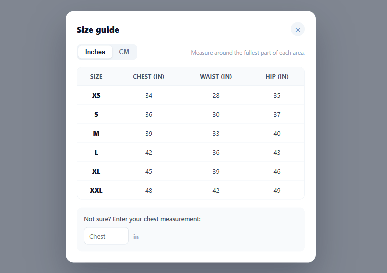
Sizing uncertainty is one of the biggest causes of apparel cart abandonment and returns — shoppers either guess and hope, or leave to measure something and never come back. A good size-guide modal answers "which size am I?" right there on the product page, without a page load. This snippet builds the complete pattern in plain HTML, CSS, and vanilla JavaScript: a measurements table, an inches/centimetres toggle that re-renders every value, and a measurement finder that highlights the recommended size as the shopper types.
One unit toggle, every value converts
All measurements are stored once in inches, and the centimetre values are derived on the fly (× 2.54, rounded) when the user flips the units toggle. This single-source-of-truth approach means the table can never show inconsistent in/cm values, and adding a size is one data row, not two columns of hand-converted numbers. The column headers update their unit suffix too ("Chest (in)" → "Chest (cm)"), and crucially, if the shopper has already typed a measurement into the finder, that value is converted as well so their recommendation stays correct across the switch.
A finder that turns a measurement into a size
The real anxiety-killer is the chest-measurement finder. The shopper enters one number — their chest measurement in the current unit — and bestSize() walks the size table to find the smallest size whose chest measurement is at or above their input, the standard "size up to fit" rule for body measurements. The matching table row highlights in indigo and a "→ You're a M" result appears instantly. This converts the abstract table into a direct, personal answer, which is exactly what reduces both hesitation and wrong-size returns.
The table is data, the highlight is derived
The whole table renders from a SIZES array and a COLS list, so changing the garment's measurements, adding a chest/waist/hip column, or supporting more sizes is a data edit. The finder's highlight isn't stored state — it's recomputed from the current input and unit every time either changes, so it can never get out of sync with the displayed numbers. Clearing the input clears the highlight and result cleanly.
Modal mechanics done right
The guide opens from a subtle "Size guide" link beside the size selector (where shoppers actually look for it), as a role="dialog" modal with aria-modal="true". It closes via the ✕, a backdrop click, or the Escape key — all through one close() function — and animates in with opacity and transform only, staying smooth across every framework export. The table scrolls horizontally inside its wrapper and the modal body scrolls vertically (max-height: 90vh), so even a long size chart fits any screen.
Adapting it to your products
Different garment types need different columns — a shirt uses chest/waist, trousers use waist/inseam/hip, shoes use length. Because the columns and rows are both data-driven, you adapt the guide per product category by swapping the SIZES and COLS definitions, and the finder can key off whichever measurement is most diagnostic for that category. The FAQs cover per-product charts and international size mappings (US/UK/EU).
Build with AI
Build, Understand, Optimize, and Extend It With AI
You don't have to trace the unit-conversion and size-matching logic by hand. Paste this snippet's HTML, CSS, and JS into an AI coding assistant like Claude and ask it to explain exactly why measurements are stored only in inches with centimetres derived on the fly, or how bestSize walks the SIZES array to implement the "size up to fit" rule. The same assistant can help you optimize it, for example checking whether render() is doing unnecessary DOM rebuilding on every unit toggle versus only updating the cells that changed. It is just as useful for extending the modal: ask it to add waist- or hip-based finder logic for garments where chest isn't the diagnostic measurement, support a second measurement system like US/UK/EU labels, or remember the shopper's last unit choice across visits. Treat the code less like a finished artifact and more like a starting point for a conversation.
Prompt to recreate it
Copy this into your AI assistant of choice to build the effect from scratch, or as a jumping-off point for your own variant:
Build a size-guide modal for an apparel product page in plain HTML, CSS, and JavaScript — no framework, no dependencies.

Requirements:
- A modal dialog with role="dialog" and aria-modal="true", opened by a "Size guide" link and closable via a close button, a backdrop click, and the Escape key, all routed through one shared close function. Animate the open/close purely with opacity and transform so it stays smooth across any framework port.
- A size table rendered entirely from a data array of size objects (each with a size label and measurements) and a separate column-definition array — no hardcoded table rows in the HTML.
- A unit toggle between inches and centimetres. Store every measurement once, in inches, and derive centimetre values on the fly with a single conversion function (multiply by 2.54 and round) rather than maintaining separate inch and centimetre data — the table, including the column header unit suffixes, must fully re-render from that one conversion function when the toggle changes.
- A "chest measurement finder": a number input where, on every keystroke, a function walks the size array in order and returns the first (smallest) size whose chest measurement is at or above the entered value — the standard size-up-to-fit rule — then highlights that matching row in the table and shows a "You're a [size]" result text.
- When the user switches units after already typing a measurement, convert the entered value in place (inches to cm or back) so the highlighted recommendation stays correct instead of becoming wrong or resetting.
- The matching-row highlight must never be stored as separate state — it must be recomputed from the current input value and current unit every time either one changes, so it cannot drift out of sync with the displayed numbers.
Want to tighten it up first? Run this prompt through the AI Prompt Studio to score it across 8 quality dimensions, catch anti-patterns, and tune the wording for Claude, ChatGPT, or Gemini before you paste it in.
Source Code
<div class="sgm-page">
  <div class="sgm-product">
    <label>Size</label>
    <button type="button" class="sgm-link" id="sgmOpen">
      <svg width="14" height="14" viewBox="0 0 24 24" fill="none" stroke="currentColor" stroke-width="2"><path d="M2 12h20M6 8l-4 4 4 4M18 8l4 4-4 4"/></svg>
      Size guide
    </button>
  </div>
</div>

<div class="sgm-backdrop" id="sgmBackdrop"></div>
<div class="sgm-modal" id="sgmModal" role="dialog" aria-modal="true" aria-label="Size guide">
  <div class="sgm-head">
    <h3>Size guide</h3>
    <button type="button" class="sgm-close" id="sgmClose" aria-label="Close">✕</button>
  </div>

  <div class="sgm-controls">
    <div class="sgm-units" role="group" aria-label="Units">
      <button type="button" class="sgm-unit active" data-unit="in">Inches</button>
      <button type="button" class="sgm-unit" data-unit="cm">CM</button>
    </div>
    <p class="sgm-tip">Measure around the fullest part of each area.</p>
  </div>

  <div class="sgm-table-wrap">
    <table class="sgm-table" id="sgmTable"></table>
  </div>

  <div class="sgm-finder">
    <p>Not sure? Enter your chest measurement:</p>
    <div class="sgm-finder-row">
      <input type="number" id="sgmChest" min="20" max="60" placeholder="Chest">
      <span class="sgm-finder-unit" id="sgmFinderUnit">in</span>
      <span class="sgm-finder-result" id="sgmResult"></span>
    </div>
  </div>
</div>*{box-sizing:border-box;margin:0;padding:0}
body{font-family:system-ui,-apple-system,sans-serif;background:#f1f5f9;min-height:100vh}
.sgm-page{min-height:100vh;display:flex;align-items:center;justify-content:center}
.sgm-product{background:#fff;border-radius:14px;padding:18px 22px;box-shadow:0 8px 24px rgba(15,23,42,.08);display:flex;align-items:center;gap:30px}
.sgm-product label{font-size:13px;font-weight:700;color:#0f172a}
.sgm-link{display:inline-flex;align-items:center;gap:6px;background:none;border:none;color:#6366f1;font-size:13px;font-weight:700;cursor:pointer;font-family:inherit;text-decoration:underline;text-underline-offset:2px}
.sgm-backdrop{position:fixed;inset:0;background:rgba(15,23,42,.5);opacity:0;pointer-events:none;transition:opacity .25s;z-index:90}
.sgm-backdrop.show{opacity:1;pointer-events:all}
.sgm-modal{position:fixed;top:50%;left:50%;transform:translate(-50%,-46%) scale(.97);opacity:0;pointer-events:none;
width:min(500px,94vw);max-height:90vh;overflow:auto;background:#fff;border-radius:16px;padding:22px;z-index:91;
box-shadow:0 30px 70px rgba(15,23,42,.3);transition:opacity .26s,transform .26s}
.sgm-modal.show{opacity:1;transform:translate(-50%,-50%) scale(1);pointer-events:all}
.sgm-head{display:flex;align-items:center;justify-content:space-between;margin-bottom:16px}
.sgm-head h3{font-size:17px;font-weight:800;color:#0f172a}
.sgm-close{width:28px;height:28px;border-radius:50%;border:none;background:#f1f5f9;color:#64748b;cursor:pointer;font-size:13px}
.sgm-close:hover{background:#e2e8f0}
.sgm-controls{display:flex;align-items:center;justify-content:space-between;gap:12px;margin-bottom:14px;flex-wrap:wrap}
.sgm-units{display:inline-flex;background:#f1f5f9;border-radius:9px;padding:3px}
.sgm-unit{border:none;background:transparent;padding:6px 14px;border-radius:7px;font-size:12.5px;font-weight:700;color:#64748b;cursor:pointer;transition:background .15s,color .15s}
.sgm-unit.active{background:#fff;color:#0f172a;box-shadow:0 1px 3px rgba(15,23,42,.12)}
.sgm-tip{font-size:11.5px;color:#94a3b8}
.sgm-table-wrap{overflow-x:auto;border:1px solid #f1f5f9;border-radius:10px}
.sgm-table{width:100%;border-collapse:collapse;font-size:13px;min-width:380px}
.sgm-table th,.sgm-table td{padding:10px 12px;text-align:center;white-space:nowrap}
.sgm-table thead th{background:#f8fafc;color:#475569;font-weight:700;font-size:11.5px;text-transform:uppercase;letter-spacing:.03em;border-bottom:1.5px solid #e2e8f0}
.sgm-table tbody td{border-bottom:1px solid #f1f5f9;color:#334155;font-variant-numeric:tabular-nums}
.sgm-table tbody td:first-child{font-weight:800;color:#0f172a}
.sgm-table tbody tr:last-child td{border-bottom:none}
.sgm-table tbody tr.match td{background:#eef2ff}
.sgm-table tbody tr.match td:first-child{color:#4f46e5}
.sgm-finder{margin-top:16px;background:#f8fafc;border-radius:10px;padding:14px}
.sgm-finder p{font-size:12.5px;color:#475569;font-weight:600;margin-bottom:9px}
.sgm-finder-row{display:flex;align-items:center;gap:9px}
.sgm-finder-row input{width:90px;border:1.5px solid #e2e8f0;border-radius:8px;padding:8px 10px;font-size:13px;font-family:inherit}
.sgm-finder-row input:focus{outline:none;border-color:#6366f1}
.sgm-finder-unit{font-size:12px;color:#94a3b8;font-weight:700}
.sgm-finder-result{font-size:13px;font-weight:700;color:#16a34a;margin-left:4px}// Base measurements stored in inches; CM derived by ×2.54.
var SIZES = [
{ size: 'XS', chest: 34, waist: 28, hip: 35 },
{ size: 'S', chest: 36, waist: 30, hip: 37 },
{ size: 'M', chest: 39, waist: 33, hip: 40 },
{ size: 'L', chest: 42, waist: 36, hip: 43 },
{ size: 'XL', chest: 45, waist: 39, hip: 46 },
{ size: 'XXL',chest: 48, waist: 42, hip: 49 },
];
var COLS = ['Size', 'Chest', 'Waist', 'Hip'];
var unit = 'in';
var modal = document.getElementById('sgmModal');
var backdrop = document.getElementById('sgmBackdrop');
var table = document.getElementById('sgmTable');
var chestInput = document.getElementById('sgmChest');
function conv(inches) {
return unit === 'cm' ? Math.round(inches * 2.54) : inches;
}
function bestSize(value) {
// value is in current unit; compare against converted chest, pick nearest at-or-above.
var match = null;
for (var i = 0; i < SIZES.length; i++) {
if (conv(SIZES[i].chest) >= value) { match = SIZES[i].size; break; }
}
return match || SIZES[SIZES.length - 1].size;
}
function render() {
var head = '<thead><tr>' + COLS.map(function (c) { return '<th>' + c + (c === 'Size' ? '' : ' (' + unit + ')') + '</th>'; }).join('') + '</tr></thead>';
var body = '<tbody>' + SIZES.map(function (s) {
return '<tr data-size="' + s.size + '"><td>' + s.size + '</td><td>' + conv(s.chest) + '</td><td>' + conv(s.waist) + '</td><td>' + conv(s.hip) + '</td></tr>';
}).join('') + '</tbody>';
table.innerHTML = head + body;
document.getElementById('sgmFinderUnit').textContent = unit;
highlightFinder();
}
function highlightFinder() {
var val = parseFloat(chestInput.value);
table.querySelectorAll('tr').forEach(function (r) { r.classList.remove('match'); });
var result = document.getElementById('sgmResult');
if (!val) { result.textContent = ''; return; }
var size = bestSize(val);
var row = table.querySelector('[data-size="' + size + '"]');
if (row) row.classList.add('match');
result.textContent = '→ You\'re a ' + size;
}
function open() { backdrop.classList.add('show'); modal.classList.add('show'); }
function close() { backdrop.classList.remove('show'); modal.classList.remove('show'); }
document.getElementById('sgmOpen').addEventListener('click', open);
document.getElementById('sgmClose').addEventListener('click', close);
backdrop.addEventListener('click', close);
document.addEventListener('keydown', function (e) {
if (e.key === 'Escape' && modal.classList.contains('show')) close();
});
document.querySelectorAll('.sgm-unit').forEach(function (btn) {
btn.addEventListener('click', function () {
document.querySelectorAll('.sgm-unit').forEach(function (b) { b.classList.remove('active'); });
btn.classList.add('active');
var prevVal = parseFloat(chestInput.value);
unit = btn.dataset.unit;
// Convert any entered value so the recommendation stays correct.
if (prevVal) chestInput.value = unit === 'cm' ? Math.round(prevVal * 2.54) : Math.round(prevVal / 2.54);
render();
});
});
chestInput.addEventListener('input', highlightFinder);
render();Step by step
How to Use
- 1Paste HTML, CSS, and JSA product row with a "Size guide" link renders. Click the link to open the size-chart modal.
- 2Toggle unitsSwitch between Inches and CM — every measurement in the table re-renders, and the column headers update their unit.
- 3Use the size finderEnter your chest measurement in the box — the matching size row highlights and a "You're a M" result appears instantly.
- 4Switch units with a value enteredFlip the unit toggle after typing — your entered measurement converts too, so the recommendation stays correct.
- 5Close the modalClick ✕, the backdrop, or press Escape to dismiss the guide.
- 6Adapt to your productsEdit the SIZES and COLS arrays to match your garment's real measurements and the columns that matter for it.
Real-world uses
Common Use Cases
Got questions?
Frequently Asked Questions
Because the table is built from the SIZES and COLS arrays, give each product (or category) its own measurement data and pass it into the component when opening the modal. A t-shirt uses chest/waist, trousers use waist/inseam/hip, shoes use length — swap the arrays and the table, headers, and finder all adapt with no other changes.
bestSize() walks the sizes from smallest up and returns the first whose chest measurement is at or above the entered value — the standard "size up to fit" rule, since a garment must be at least as large as the body measurement. For ease-of-fit you can add a small allowance, or pick the nearest size rather than rounding up, depending on the garment's intended fit.
Add the international labels as extra columns in COLS and corresponding fields in each SIZES entry, rendering them like the measurement columns. Since they're just labels (not measurements), they don't need unit conversion — they display as-is regardless of the in/cm toggle.
A single source of truth prevents the classic bug where the inch and cm columns drift out of sync after an edit. Storing one unit and deriving the other (× 2.54) guarantees consistency and halves the data you maintain — you change one number and both unit views update together.
In React, hold the unit and the finder input in useState and derive the table values and recommended size with useMemo; in Vue, use ref()/computed(); in Angular, use component fields with getters or pipes. The conversion and bestSize logic are plain functions that port unchanged, and the modal open/close maps to each framework's event handlers.