You Might Also Like
Learn Coding Visually
Learn to code with interactive, live-preview playgrounds — HTML, CSS, JavaScript, React & more.
 HTML Playground42 lessons · Click-based · Live preview
 CSS PlaygroundLearn CSS with a live editor
 JavaScript Playground60 lessons · DOM · Async · Canvas
 React PlaygroundLearn React with a live code editor
 GSAP PlaygroundLearn GSAP animation interactively
 SVG Playground44 lessons · shapes · paths · animation
 SCSS Playground45 lessons · Sass modules · tokens
 Tailwind PlaygroundLearn Tailwind CSS with a live editor
 Bootstrap 5 Playground50 lessons · live preview
Before/After Slider — Image Comparison Snippet
Before/After Image Comparison Slider · Cards · Plain HTML, CSS & JS · Live preview
What's included
Features
About this UI Snippet
Before/After Image Comparison Slider — clip-path Reveal with Pointer Capture
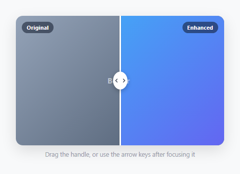
A before/after slider stacks two images and lets a visitor drag a divider to reveal how much of each is showing — the standard pattern for photo editing demos, before/after room renovations, and product comparison shots. This snippet builds the reveal with a single CSS property, clip-path, rather than the older technique of resizing an overflow: hidden container.
The clip-path reveal
Both images are stacked with position: absolute; inset: 0, fully overlapping. The top ("after") image has clip-path: inset(0 0 0 50%) applied, which clips away everything to the left of the 50% mark, letting the bottom ("before") image show through in that region. Dragging the handle simply rewrites the left inset percentage on every move — inset(0 0 0 ${pct}%). This is cheaper for the browser than the historical technique of width-clipping an inner wrapper, because clip-path doesn't affect layout at all; it only changes what's painted, so there's no reflow on every drag frame.
Pointer Events with capture
A single set of pointerdown/pointermove/pointerup handlers covers mouse, touch, and pen with no separate touch-event code path. handle.setPointerCapture(e.pointerId) on pointerdown is the detail that keeps the drag working smoothly on a touchscreen — without it, a finger that drifts slightly off the handle element mid-drag can lose the pointermove events entirely, since by default they're only delivered to whatever element is directly under the pointer.
Position math
positionFromEvent() reads compare.getBoundingClientRect() on every move and computes ((clientX - rect.left) / rect.width) * 100 to convert a raw pixel coordinate into a percentage. Recomputing the bounding rect on every event (rather than caching it once at drag-start) means the slider stays correct even if the container's size changes mid-drag, for example from a responsive layout shift or an orientation change on mobile.
Keyboard accessibility
The handle carries role="slider", tabindex="0", and aria-valuemin/aria-valuemax/aria-valuenow — the standard ARIA slider pattern. ArrowLeft/ArrowRight nudge the position by 5%, and Home/End jump to the extremes. This means the entire comparison is fully operable without a pointer at all, which a pure drag-only implementation would miss completely; screen readers announce the current percentage from aria-valuenow, which is kept in sync with the visual position on every update.
Why the grip has two chevrons
The circular handle grip contains two small chevrons pointing left and right rather than a single icon, which visually communicates "this drags both directions" at a glance — a subtle affordance cue that a plain circle or single-arrow icon doesn't convey.
Swapping in real images
The demo uses two CSS gradients as stand-ins so the snippet has no external image dependency. To use real photos, replace .swatch-before/.swatch-after's background with background-image: url(...); background-size: cover; background-position: center on the two .pane elements, and make sure both images share the exact same dimensions and framing — a comparison slider only reads correctly when the two images are pixel-aligned to each other.
Performance note
Because the reveal is driven by clip-path and the handle position by left (a cheap property for a thin absolutely-positioned element with no siblings reflowing around it), the drag stays smooth even with two full-resolution photographs loaded, unlike a canvas-based cross-fade approach that would need to redraw pixels on every frame.
See also the scroll before/after snippet for a scroll-triggered (rather than drag-triggered) reveal of the same concept, and the color swatch snippet if you only need a static side-by-side rather than an interactive divider.
Build with AI
Build, Understand, Optimize, and Extend It With AI
Paste this comparison slider's HTML, CSS, and JS into an AI coding assistant like Claude and ask it to explain why clip-path was chosen over resizing an overflow-hidden wrapper, and how setPointerCapture prevents the drag from losing tracking when a touch input drifts off the handle. It's worth asking the assistant to verify the percentage math in positionFromEvent handles container resizing correctly, since it deliberately recomputes getBoundingClientRect on every move rather than caching it once at drag start. Beyond that, ask it to add a caption overlay that fades in near each edge, a double-click-to-reset-to-50% behavior, or support for a vertical (top/bottom) orientation instead of the current horizontal left/right split.
Prompt to recreate it
Copy this into your AI assistant of choice to build the effect from scratch, or as a jumping-off point for your own variant:
Build a draggable before/after image comparison slider in plain HTML, CSS, and JavaScript, no framework, no libraries, no image assets.

Requirements:
- Two full-size panes stacked exactly on top of each other inside one container, representing a "before" image underneath and an "after" image on top, using CSS gradients as placeholder visuals since no real images are used.
- The top pane must be revealed and hidden using the CSS clip-path property based on a percentage value, not by resizing a width or using overflow:hidden on a wrapper, so the reveal never triggers a layout reflow.
- A vertical draggable handle positioned at the current split percentage, with a circular grip containing two small opposing chevron icons to signal it can be dragged in either direction.
- Dragging must use Pointer Events (pointerdown, pointermove, pointerup) with pointer capture set on drag start, so the drag keeps tracking correctly even if a touch input drifts off the handle element mid-gesture, and the container's bounding rectangle must be measured fresh on every move rather than cached once, so it stays correct through any responsive resizing.
- The handle must also be a proper ARIA slider: focusable, with role="slider" and aria-valuemin, aria-valuemax, and aria-valuenow attributes that stay in sync with the current position, and it must respond to ArrowLeft/ArrowRight for small step adjustments and Home/End to jump to the two extremes.
- All position math must be expressed in percentages relative to the container's width, not fixed pixel values, so the slider works correctly at any container size.
Want to tighten it up first? Run this prompt through the AI Prompt Studio to score it across 8 quality dimensions, catch anti-patterns, and tune the wording for Claude, ChatGPT, or Gemini before you paste it in.
Step by step
How to Use
- 1Copy the compare/pane/handle markupThe .compare container holds two stacked .pane divs (before and after) and a .handle slider element — copy all three as one unit.
- 2Replace the placeholder swatches with real imagesSet background-image: url(...) with background-size: cover on both .pane elements instead of the demo gradients, using two images with identical framing and dimensions.
- 3Add the CSS and JSPaste both blocks unmodified — the clip-path math and pointer handling work against percentages, not fixed pixels, so they adapt to any container width automatically.
- 4Set an aspect ratioAdjust aspect-ratio on .compare to match your images so the container doesn't distort or crop them awkwardly on different screen widths.
- 5Test keyboard accessTab to the handle and use the arrow keys — Home/End jump to the extremes, and aria-valuenow announces the current percentage to screen readers.
Real-world uses
Common Use Cases
Got questions?
Frequently Asked Questions
Set background-image: url(your-photo.jpg); background-size: cover; background-position: center directly on the .pane-before and .pane-after elements in place of the .swatch gradient backgrounds, keeping both images the same dimensions and framing.
clip-path only changes what is painted, not the box's layout, so the browser can update it every frame without triggering a reflow. Resizing an overflow:hidden wrapper's width changes layout on every drag frame, which is more expensive and can visibly jank on lower-end devices.
Without pointer capture, pointermove events are only delivered to whatever element sits directly under the pointer. A fast or slightly off-target touch drag can slip off the handle mid-gesture and stop receiving events; capturing the pointer on pointerdown guarantees the handle keeps receiving moves until pointerup, regardless of where the finger drifts.
Yes — the handle uses role="slider" with aria-valuemin/max/now, is focusable via tabindex="0", and responds to ArrowLeft/ArrowRight (5% steps) and Home/End (jump to extremes), with aria-valuenow kept in sync so screen readers announce the current position.
Open the Export menu on the snippet page for a React component tracking position in useState with the same pointer-capture logic in event handlers, a React + Tailwind version, a Vue 3 SFC, or an Angular standalone component — all preserve the clip-path math and the ARIA slider attributes.