Learn Coding Visually
Learn to code with interactive, live-preview playgrounds — HTML, CSS, JavaScript, React & more.
 HTML Playground42 lessons · Click-based · Live preview
 CSS PlaygroundLearn CSS with a live editor
 JavaScript Playground60 lessons · DOM · Async · Canvas
 React PlaygroundLearn React with a live code editor
 GSAP PlaygroundLearn GSAP animation interactively
 SVG Playground44 lessons · shapes · paths · animation
 SCSS Playground45 lessons · Sass modules · tokens
 Tailwind PlaygroundLearn Tailwind CSS with a live editor
 Bootstrap 5 Playground50 lessons · live preview
CSS Animated Gradient Border — Free HTML CSS Snippet
CSS Animated Gradient Border · Animations · Plain HTML, CSS & JS · Live preview
What's included
Features
--angle as a typed CSS property so the browser can interpolate it inside conic-gradient(), enabling a clean continuous rotation animation.::before pseudo-element with filter: blur and animated background-position works in all browsers without @property, producing a soft colour-shifting halo.(prefers-reduced-motion: reduce) and pauses all animations for users who have opted out of motion effects in their OS settings.#0a0a0f background with semi-transparent card interiors makes the glowing borders pop. Colours are CSS variables easy to swap for light mode.About this UI Snippet
CSS Animated Gradient Border — @property Conic Spin, Blur Glow & Border-Image Sweep Techniques
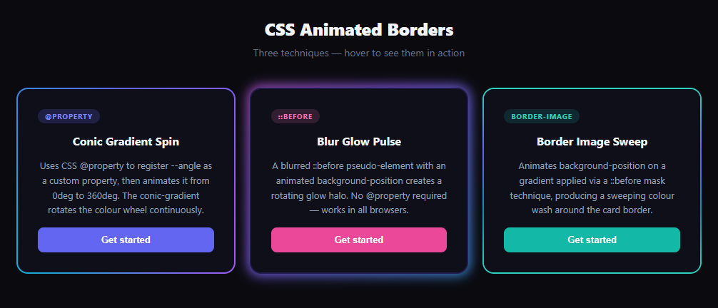
Glowing animated borders are one of the most-searched CSS effects — they appear on SaaS landing pages, developer portfolios, and premium component libraries. This snippet demonstrates three production-ready techniques side by side: a CSS @property conic-gradient rotation, a blurred pseudo-element glow pulse, and a padding-box / border-box background clip sweep — all animating continuously with zero JavaScript.
Animated gradient borders appear on countless SaaS product pages, developer portfolio cards, and UI component showcases. They signal premium quality and draw the eye to calls-to-action. Until recently, achieving them required JavaScript-driven canvas or SVG hacks, but modern CSS provides three clean, GPU-accelerated approaches — all demonstrated side by side in this snippet.
Technique 1: CSS @property conic-gradient spin
@property lets you register a custom CSS property with a type annotation. By registering --angle as syntax: '<angle>', the browser knows how to interpolate between angle values. A @keyframes spin { to { --angle: 360deg } } then animates the property from 0° to 360°. The card's background is a conic-gradient(from var(--angle), ...) — as --angle increments each frame, the gradient rotates continuously. Without @property, animating a custom property used inside a gradient is impossible because the browser treats unregistered custom properties as opaque strings and cannot interpolate them.
Technique 2: blurred ::before pseudo-element glow
The glow technique uses a ::before pseudo-element positioned with inset: -3px (3px outside the card on all sides), a background: linear-gradient with background-size: 300% 300%, and a filter: blur(8px). The @keyframes glowPulse animates background-position from 0% 50% to 100% 50% — moving the oversized gradient horizontally creates a colour wash effect. A ::after pseudo-element with the same background as the card interior covers the blurred gradient except at the edges, producing the halo border. This approach has broader browser support than @property since it uses only background-position animation.
Technique 3: padding-box / border-box background clip
CSS allows two background layers with different background-clip values using a shorthand: linear-gradient(#bg, #bg) padding-box, gradient border-box. The first layer fills only the content area (padding-box), while the second fills the entire element including the border area (border-box). Setting border: 2px solid transparent makes the border transparent so the gradient shows through it. Combined with the @property --angle animation on the border-image gradient, the border colour rotates. This technique is the most layout-friendly because it doesn't require a positioned pseudo-element and doesn't affect stacking context.
Browser support and fallbacks
@property is supported in Chrome 85+, Edge 85+, Safari 16.4+, and Firefox 128+. For older Firefox, techniques 2 and 3 degrade gracefully: the glow pulse still works (it only uses background-position animation), and the border-image sweep falls back to a static gradient border. A prefers-reduced-motion media query check in the JS pauses all animations for users who have opted out of motion.
Using animated borders in your project
Apply technique 1 to a .card or .button wrapper by copying the @property registration and the conic-gradient background. For a button with just a border glow (no filled gradient background), use technique 3 with background: #yourColor padding-box, gradient border-box and border: 2px solid transparent. Combine with a neon glow effect on the text for a full cyberpunk aesthetic.
Build with AI
Build, Understand, Optimize, and Extend It With AI
You don't have to research browser support tables yourself to know which of these three techniques is safe to ship today. Paste this snippet's HTML, CSS, and JS into an AI coding assistant like Claude and ask it to explain exactly why registering --angle with the property rule is what makes it possible to animate inside a conic-gradient at all, and why the padding-box/border-box technique needs a transparent border color rather than no border. The same assistant can help optimize it — for instance asking whether the blurred glow technique's filter is expensive enough on lower-end devices that the animation duration or blur radius should be tuned down. It's also useful for extending the effect: ask it to combine two of the three techniques into a single card, add a hover-triggered speed change instead of a constant rotation, or build a graceful fallback chain so older Firefox versions still get a reasonable static gradient border instead of nothing at all. Treat the code less like a finished artifact and more like a starting point for a conversation.
Prompt to recreate it
Copy this into your AI assistant of choice to build the effect from scratch, or as a jumping-off point for your own variant:
Build a card component with an animated gradient border using CSS custom properties, demonstrating three separate techniques side by side, in plain HTML, CSS, and minimal JavaScript.

Requirements:
- Register a custom CSS property for an angle value with a proper syntax descriptor so the browser knows how to interpolate it, then use a keyframe animation that only changes that custom property from its start to a full rotation, and reference the property inside a conic-gradient used as the element's background so the gradient itself visibly rotates.
- A second card technique that creates a glow halo using only a pseudo-element: position it slightly outside the card's edges, apply a blur filter, size its background larger than 100% so it can be animated via background-position rather than a transform, and place it behind the card's content using stacking order, with a second pseudo-element covering the interior so the blur only shows as a rim around the edges.
- A third card technique using two background layers with different background-clip values (one clipped to padding-box for the interior fill, one clipped to border-box for the border itself) combined with a fully transparent border color, so a rotating gradient becomes visible strictly within the border area without needing any pseudo-element at all.
- Detect the user's reduced-motion preference via a media query check in JavaScript and pause every animation on all three cards when that preference is set.
- Add a click handler on each card that toggles that specific card's animation play state between running and paused, useful as a simple interactive demo control, without affecting the other cards.
Want to tighten it up first? Run this prompt through the AI Prompt Studio to score it across 8 quality dimensions, catch anti-patterns, and tune the wording for Claude, ChatGPT, or Gemini before you paste it in.
Step by step
How to Use
- 1Load the snippetPaste the HTML, CSS, and JS into your page. Three dark cards appear — the left one has a spinning conic gradient border, the middle has a blurred glow halo, and the right has a sweeping teal border.
- 2Observe the @property techniqueThe left card's entire background rotates as a conic gradient — a
--anglecustom property animates from 0° to 360° via CSS@keyframes spin. - 3Compare the glow pulse techniqueThe middle card has no
border— a blurred::beforepseudo-element positioned outside the card creates the halo. The colour shifts from pink to purple to cyan on a 3-second loop. - 4See the border-image sweepThe right card uses the padding-box/border-box trick: a transparent
borderreveals the rotating gradient behind it. The border width is 2px — increase it in CSS for a thicker glow. - 5Click any card to pause/resumeThe JS click handler toggles
animationPlayStatebetweenrunningandpausedon the clicked card for interactive demos. - 6Apply to your own elementsCopy the technique that fits your browser support requirements. Paste the
@propertyregistration andbackgroundrule onto any element withborder-radiusand you're done.
Real-world uses
Common Use Cases
animation-duration: 6s for a subtle effect.Got questions?
Frequently Asked Questions
@property is supported in Firefox 128+ (released June 2024). For earlier Firefox, use technique 2 (blurred pseudo-element glow) which only relies on background-position animation and has universal support. Check caniuse.com/css-at-property for the current support table.
Wrap your <button> in a <div class="card-conic"> (or use the padding-box/border-box technique directly on the button). For technique 3, add @property, set border: 2px solid transparent, and set background: #yourButtonColor padding-box, conic-gradient(from var(--angle), ...) border-box.
The ::before pseudo-element needs to extend beyond the card boundary to create the glow halo. inset: -3px places it 3px outside on all sides. It's then pushed behind the card with z-index: -1. The ::after element covers the centre to prevent the glow from showing through the card body.
Yes. All three techniques are pure CSS — copy the styles into your component's stylesheet or CSS module. In React with Tailwind, technique 2 needs arbitrary values ([filter:blur(8px)]); techniques 1 and 3 need the @property registration in a global CSS file. In Vue, place the @property block in a <style> tag without scoped. In Angular, add it to styles.css.
Add .card:hover { animation-play-state: paused; }. For the glow technique, also add .card-glow:hover::before { animation-play-state: paused; }. This freezes the gradient at whatever angle it's at when the cursor enters.