More Animations Snippets
CSS Loader Gallery — 8 Pure CSS Spinners & Loaders Snippet
CSS Loader Gallery · Animations · Plain HTML, CSS & JS · Live preview
What's included
Features
About this UI Snippet
CSS Loader Gallery — Spinner, Skeleton, Dots, Pulse, Orbit & More
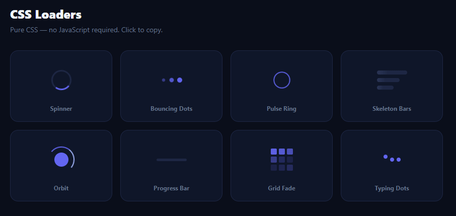
CSS loaders and spinners are among the most-searched UI components for front-end developers — every app needs at least one loading indicator, and searching for the right style accounts for significant traffic to developer resource sites. This snippet provides a gallery of eight distinct, pure-CSS loaders: a classic spinner, bouncing dots, a pulse ring, skeleton bars, an orbit, a progress bar, a 3×3 grid fade, and typing dots. Each is a live preview; clicking copies the minified CSS ready to paste.
Pure CSS — no JavaScript for the animations
Every loader uses only CSS @keyframes and animation properties — no JavaScript runs the animations. JavaScript is used only for the gallery rendering and copy functionality. This is the entire point of a "pure CSS loader": it works even in JavaScript-disabled contexts, it does not block the main thread, and it has no runtime overhead beyond the initial paint.
The eight loader types
The spinner (border-top-color with border-radius: 50% and rotate) is the most common loader pattern, appropriate for almost any context. Bouncing dots (three circles with staggered animation-delay on a scale and opacity keyframe — see the standalone dots loader) signal activity without directionality. The pulse ring (expanding, fading border-radius: 50%) is common for social and chat apps. Skeleton bars (shimmer gradient on placeholder lines) prevent layout shift and set content expectations during fetch. The orbit (two pseudo-elements: a rotating outer ring and a static inner dot) has a physics feel. The progress bar (translateX indeterminate sweep) communicates a linear task without a known percentage. The 3×3 grid fade (staggered opacity on nine cells) has a data-grid or terminal aesthetic. Typing dots (bouncing dots on a vertical path) are the standard chat "is typing" indicator.
The copy-per-loader model
Each loader's CSS is stored as a minified string in the loaders array alongside its HTML. Clicking a card copies only that loader's CSS, not the entire gallery stylesheet. The CSS in each string uses light-mode neutrals (rather than the dark gallery background) so it works on any page. The copy uses the Clipboard API with an execCommand fallback and shows a toast confirmation.
The shimmer skeleton technique
The skeleton loader uses a background: linear-gradient(90deg, light, lighter, light) at 200% width, animated with background-position from 200% to -200% — this makes the shimmer sweep from right to left across the bars. The key is background-size: 200% 100% so the gradient is wider than the element; the animation sweeps it through. This technique is the standard approach used by Facebook, LinkedIn, and most modern content feeds.
Animation-delay staggering
The bouncing dots, grid fade, and typing dots all use animation-delay on nth-child elements to offset a shared animation, creating a wave or cascade effect from a single @keyframes definition. This is a core CSS animation technique: one animation, multiple delays, complex visual result.
Step by step
How to Use
- 1Browse the loadersAll eight loaders animate live on page load. No JavaScript runs the animations — they are pure CSS @keyframes.
- 2Click to copy a loaderClick any loader card to copy its minified CSS to the clipboard. A "CSS copied!" toast confirms the action.
- 3Paste into your projectPaste the copied CSS into your stylesheet or a <style> tag. Add the corresponding HTML structure (one or two elements) to your page.
- 4Change the accent colourFind #6366f1 (indigo) in the copied CSS and replace it with your brand colour. Most loaders use only one or two colour values.
- 5Adjust the sizeScale a loader by changing its width and height values proportionally. Animations based on border-width or gap may also need tuning at very different sizes.
- 6Export for your frameworkClick "React" for a gallery component rendering each loader from the array. Click "Vue" for a Vue 3 SFC with the same pattern.
Real-world uses
Common Use Cases
Got questions?
Frequently Asked Questions
The skeleton bar has background: linear-gradient(90deg, light-colour 25%, lighter-colour 50%, light-colour 75%) with background-size: 200% 100% so the gradient is twice as wide as the element. The keyframe animates background-position from 200% 0 to -200% 0, sweeping the lighter midpoint of the gradient across the bar from right to left. The 200% size and the -200% end position together ensure the shimmer fully enters from the right and fully exits to the left with a smooth transition.
Find all occurrences of #6366f1 (indigo) in the copied CSS string and replace with your primary brand colour. For loaders with a lighter secondary colour (#a5b4fc), replace with a lighter tint of your brand colour (increasing the L value in HSL by 15–25%). For loaders with a border colour (#e2e8f0 or #1e2744), replace with the appropriate neutral for your light or dark theme.
A spinner is a generic "activity in progress" indicator that blocks the full content area with no structural information. A skeleton loader mimics the shape of the incoming content (lines for text, rectangles for images) so users can predict the layout before it loads. Skeletons dramatically reduce perceived load time and layout shift, making them the preferred choice for content-heavy lists, cards, and dashboards where the structure is known. Use a spinner for undetermined-length operations like form submissions where no content shape is expected.
Push a new object to the loaders array: { name: "My Loader", html: "<div class=\"my-loader\"></div>", css: ".my-loader{...}@keyframes my-anim{...}" }. Add the corresponding CSS to the gallery stylesheet for the live preview to render. call render() (or trigger a re-render in React/Vue state). The card is automatically added to the grid at the next render.
Accept a loaders array as a prop (or hardcode it as a constant). Map over it to render one card per loader, using dangerouslySetInnerHTML for the loader markup or rebuilding it as JSX. The copy handler reads the loader's css string and calls navigator.clipboard.writeText, then sets a copiedIndex in useState to show the toast. Because the animations are pure CSS, there is no animation state to manage in React — the keyframes run entirely in the browser. For the Tailwind version, click "Tailwind" to get the same markup with utility classes instead of a scoped stylesheet.
CSS Loader Gallery — Export as HTML, React, Vue, Angular & Tailwind
<!DOCTYPE html>
<html lang="en">
<head>
<meta charset="UTF-8" />
<meta name="viewport" content="width=device-width, initial-scale=1.0" />
<title>CSS Loader Gallery</title>
<style>
* { box-sizing: border-box; margin: 0; padding: 0; }
body { font-family: system-ui, sans-serif; background: #0a0e1a; min-height: 100vh; padding: 40px 20px; }
.wrap { max-width: 860px; margin: 0 auto; }
.title { font-size: 24px; font-weight: 900; color: #f1f5f9; margin-bottom: 6px; }
.sub { font-size: 14px; color: #64748b; margin-bottom: 32px; }
.gallery { display: grid; grid-template-columns: repeat(auto-fill, minmax(180px, 1fr)); gap: 16px; }
.loader-card { background: #0f1629; border: 1px solid #1e2744; border-radius: 16px; padding: 28px 20px 18px; display: flex; flex-direction: column; align-items: center; gap: 18px; cursor: pointer; transition: all 0.15s; }
.loader-card:hover { border-color: #6366f1; box-shadow: 0 4px 20px rgba(99,102,241,0.15); transform: translateY(-2px); }
.loader-stage { width: 60px; height: 60px; display: flex; align-items: center; justify-content: center; }
.loader-name { font-size: 12px; font-weight: 700; color: #64748b; text-align: center; }
/* ── 1. Spinner ── */
.spin { width: 40px; height: 40px; border: 3px solid #1e2744; border-top-color: #6366f1; border-radius: 50%; animation: spin 0.8s linear infinite; }
@keyframes spin { to { transform: rotate(360deg); } }
/* ── 2. Dots ── */
.dots { display: flex; gap: 6px; }
.dots span { width: 10px; height: 10px; border-radius: 50%; background: #6366f1; animation: bounce 1.2s ease infinite; }
.dots span:nth-child(2) { animation-delay: 0.2s; }
.dots span:nth-child(3) { animation-delay: 0.4s; }
@keyframes bounce { 0%,80%,100% { transform: scale(0.6); opacity: 0.4; } 40% { transform: scale(1); opacity: 1; } }
/* ── 3. Pulse Ring ── */
.pulse-ring { width: 44px; height: 44px; border-radius: 50%; border: 3px solid #6366f1; animation: pulse-ring 1.4s ease-out infinite; }
@keyframes pulse-ring { 0% { transform: scale(0.6); opacity: 1; } 100% { transform: scale(1.4); opacity: 0; } }
/* ── 4. Bar Skeleton ── */
.skeleton { width: 100%; display: flex; flex-direction: column; gap: 7px; }
.skel-line { height: 8px; border-radius: 4px; background: linear-gradient(90deg, #1e2744 25%, #2e3a5c 50%, #1e2744 75%); background-size: 200% 100%; animation: shimmer 1.6s linear infinite; }
.skel-line:nth-child(2) { width: 75%; }
.skel-line:nth-child(3) { width: 55%; }
@keyframes shimmer { 0% { background-position: 200% 0; } 100% { background-position: -200% 0; } }
/* ── 5. Orbit ── */
.orbit { width: 44px; height: 44px; border-radius: 50%; position: relative; }
.orbit::before { content: ''; position: absolute; inset: -4px; border-radius: 50%; border: 2px solid transparent; border-top-color: #6366f1; border-right-color: #a5b4fc; animation: spin 1s linear infinite; }
.orbit::after { content: ''; position: absolute; inset: 8px; border-radius: 50%; background: #6366f1; }
/* ── 6. Progress Bar ── */
.prog-bar { width: 100%; height: 5px; background: #1e2744; border-radius: 3px; overflow: hidden; }
.prog-fill { height: 100%; width: 40%; border-radius: 3px; background: linear-gradient(90deg, #6366f1, #a5b4fc); animation: progress 2s ease-in-out infinite; }
@keyframes progress { 0% { transform: translateX(-100%); } 100% { transform: translateX(350%); } }
/* ── 7. Square Grid ── */
.grid-spin { display: grid; grid-template-columns: 1fr 1fr 1fr; gap: 4px; width: 44px; }
.grid-spin span { width: 12px; height: 12px; border-radius: 2px; background: #6366f1; animation: grid-fade 1.5s ease infinite; }
.grid-spin span:nth-child(1) { animation-delay: 0s; }
.grid-spin span:nth-child(2) { animation-delay: 0.1s; }
.grid-spin span:nth-child(3) { animation-delay: 0.2s; }
.grid-spin span:nth-child(4) { animation-delay: 0.3s; }
.grid-spin span:nth-child(5) { animation-delay: 0.4s; }
.grid-spin span:nth-child(6) { animation-delay: 0.5s; }
.grid-spin span:nth-child(7) { animation-delay: 0.6s; }
.grid-spin span:nth-child(8) { animation-delay: 0.7s; }
.grid-spin span:nth-child(9) { animation-delay: 0.8s; }
@keyframes grid-fade { 0%,100% { opacity: 0.15; } 50% { opacity: 1; } }
/* ── 8. Typing Cursor ── */
.typing { display: flex; align-items: center; gap: 6px; }
.typing-bar { width: 3px; height: 28px; background: #6366f1; border-radius: 2px; animation: blink 1s step-end infinite; }
@keyframes blink { 0%,100% { opacity: 1; } 50% { opacity: 0; } }
.typing-dots { display: flex; gap: 5px; }
.typing-dots span { width: 8px; height: 8px; border-radius: 50%; background: #6366f1; animation: typing-d 1.4s ease infinite; }
.typing-dots span:nth-child(2) { animation-delay: 0.2s; }
.typing-dots span:nth-child(3) { animation-delay: 0.4s; }
@keyframes typing-d { 0%,60%,100% { transform: translateY(0); } 30% { transform: translateY(-8px); } }
.toast { position: fixed; bottom: 24px; right: 24px; background: #0f172a; color: #a5b4fc; font-size: 13px; font-weight: 700; padding: 10px 20px; border-radius: 10px; border: 1px solid #1e2744; opacity: 0; pointer-events: none; transform: translateY(8px); transition: all 0.2s; }
.toast.show { opacity: 1; transform: translateY(0); }
</style>
</head>
<body>
<div class="wrap">
<h2 class="title">CSS Loaders</h2>
<p class="sub">Pure CSS — no JavaScript required. Click to copy.</p>
<div class="gallery" id="gallery"></div>
<div class="toast" id="toast">CSS copied!</div>
</div>
<script>
var loaders = [
{
name: 'Spinner',
html: '<div class="spin"></div>',
css: '.spin{width:40px;height:40px;border:3px solid #e2e8f0;border-top-color:#6366f1;border-radius:50%;animation:spin .8s linear infinite}@keyframes spin{to{transform:rotate(360deg)}}'
},
{
name: 'Bouncing Dots',
html: '<div class="dots"><span></span><span></span><span></span></div>',
css: '.dots{display:flex;gap:6px}.dots span{width:10px;height:10px;border-radius:50%;background:#6366f1;animation:bounce 1.2s ease infinite}.dots span:nth-child(2){animation-delay:.2s}.dots span:nth-child(3){animation-delay:.4s}@keyframes bounce{0%,80%,100%{transform:scale(.6);opacity:.4}40%{transform:scale(1);opacity:1}}'
},
{
name: 'Pulse Ring',
html: '<div class="pulse-ring"></div>',
css: '.pulse-ring{width:44px;height:44px;border-radius:50%;border:3px solid #6366f1;animation:pulse-ring 1.4s ease-out infinite}@keyframes pulse-ring{0%{transform:scale(.6);opacity:1}100%{transform:scale(1.4);opacity:0}}'
},
{
name: 'Skeleton Bars',
html: '<div class="skeleton"><div class="skel-line"></div><div class="skel-line"></div><div class="skel-line"></div></div>',
css: '.skeleton{display:flex;flex-direction:column;gap:7px;width:120px}.skel-line{height:8px;border-radius:4px;background:linear-gradient(90deg,#e2e8f0 25%,#f1f5f9 50%,#e2e8f0 75%);background-size:200% 100%;animation:shimmer 1.6s linear infinite}.skel-line:nth-child(2){width:75%}.skel-line:nth-child(3){width:55%}@keyframes shimmer{0%{background-position:200% 0}100%{background-position:-200% 0}}'
},
{
name: 'Orbit',
html: '<div class="orbit"></div>',
css: '.orbit{width:44px;height:44px;border-radius:50%;position:relative}.orbit::before{content:"";position:absolute;inset:-4px;border-radius:50%;border:2px solid transparent;border-top-color:#6366f1;border-right-color:#a5b4fc;animation:spin 1s linear infinite}.orbit::after{content:"";position:absolute;inset:8px;border-radius:50%;background:#6366f1}@keyframes spin{to{transform:rotate(360deg)}}'
},
{
name: 'Progress Bar',
html: '<div class="prog-bar"><div class="prog-fill"></div></div>',
css: '.prog-bar{width:120px;height:5px;background:#e2e8f0;border-radius:3px;overflow:hidden}.prog-fill{height:100%;width:40%;border-radius:3px;background:linear-gradient(90deg,#6366f1,#a5b4fc);animation:progress 2s ease-in-out infinite}@keyframes progress{0%{transform:translateX(-100%)}100%{transform:translateX(350%)}}'
},
{
name: 'Grid Fade',
html: '<div class="grid-spin"><span></span><span></span><span></span><span></span><span></span><span></span><span></span><span></span><span></span></div>',
css: '.grid-spin{display:grid;grid-template-columns:1fr 1fr 1fr;gap:4px;width:44px}.grid-spin span{width:12px;height:12px;border-radius:2px;background:#6366f1;animation:grid-fade 1.5s ease infinite}.grid-spin span:nth-child(1){animation-delay:0s}.grid-spin span:nth-child(2){animation-delay:.1s}.grid-spin span:nth-child(3){animation-delay:.2s}.grid-spin span:nth-child(4){animation-delay:.3s}.grid-spin span:nth-child(5){animation-delay:.4s}.grid-spin span:nth-child(6){animation-delay:.5s}.grid-spin span:nth-child(7){animation-delay:.6s}.grid-spin span:nth-child(8){animation-delay:.7s}.grid-spin span:nth-child(9){animation-delay:.8s}@keyframes grid-fade{0%,100%{opacity:.15}50%{opacity:1}}'
},
{
name: 'Typing Dots',
html: '<div class="typing-dots"><span></span><span></span><span></span></div>',
css: '.typing-dots{display:flex;gap:5px}.typing-dots span{width:8px;height:8px;border-radius:50%;background:#6366f1;animation:typing-d 1.4s ease infinite}.typing-dots span:nth-child(2){animation-delay:.2s}.typing-dots span:nth-child(3){animation-delay:.4s}@keyframes typing-d{0%,60%,100%{transform:translateY(0)}30%{transform:translateY(-8px)}}'
}
];
function render() {
var gallery = document.getElementById('gallery');
gallery.innerHTML = loaders.map(function(l, i) {
return '<div class="loader-card" onclick="copyLoader(' + i + ')" title="Click to copy CSS">' +
'<div class="loader-stage">' + l.html + '</div>' +
'<span class="loader-name">' + l.name + '</span>' +
'</div>';
}).join('');
}
function copyLoader(idx) {
var css = loaders[idx].css;
function done() {
var t = document.getElementById('toast');
t.classList.add('show');
setTimeout(function() { t.classList.remove('show'); }, 2000);
}
if (navigator.clipboard && navigator.clipboard.writeText) {
navigator.clipboard.writeText(css).then(done).catch(function() { fallbackCopy(css, done); });
} else { fallbackCopy(css, done); }
}
function fallbackCopy(text, cb) {
var ta = document.createElement('textarea');
ta.value = text; ta.style.cssText = 'position:fixed;opacity:0;top:0';
document.body.appendChild(ta); ta.focus(); ta.select();
try { document.execCommand('copy'); cb(); } catch (e) {}
document.body.removeChild(ta);
}
render();
</script>
</body>
</html><!DOCTYPE html>
<html lang="en">
<head>
<meta charset="UTF-8" />
<meta name="viewport" content="width=device-width, initial-scale=1.0" />
<title>CSS Loader Gallery</title>
<!-- Tailwind CSS v3+ — arbitrary value classes (e.g. bg-[#0f172a]) are valid -->
<script src="https://cdn.tailwindcss.com"></script>
<style>
@keyframes spin { to { transform: rotate(360deg); } }
@keyframes bounce { 0%,80%,100% { transform: scale(0.6); opacity: 0.4; } 40% { transform: scale(1); opacity: 1; } }
@keyframes pulse-ring { 0% { transform: scale(0.6); opacity: 1; } 100% { transform: scale(1.4); opacity: 0; } }
@keyframes shimmer { 0% { background-position: 200% 0; } 100% { background-position: -200% 0; } }
@keyframes progress { 0% { transform: translateX(-100%); } 100% { transform: translateX(350%); } }
@keyframes grid-fade { 0%,100% { opacity: 0.15; } 50% { opacity: 1; } }
@keyframes blink { 0%,100% { opacity: 1; } 50% { opacity: 0; } }
@keyframes typing-d { 0%,60%,100% { transform: translateY(0); } 30% { transform: translateY(-8px); } }
* {
box-sizing: border-box; margin: 0; padding: 0;
}
body {
font-family: system-ui, sans-serif; background: #0a0e1a; min-height: 100vh; padding: 40px 20px;
}
.gallery {
display: grid; grid-template-columns: repeat(auto-fill, minmax(180px, 1fr)); gap: 16px;
}
.loader-card {
background: #0f1629; border: 1px solid #1e2744; border-radius: 16px; padding: 28px 20px 18px; display: flex; flex-direction: column; align-items: center; gap: 18px; cursor: pointer; transition: all 0.15s;
}
.loader-card:hover {
border-color: #6366f1; box-shadow: 0 4px 20px rgba(99,102,241,0.15); transform: translateY(-2px);
}
.loader-stage {
width: 60px; height: 60px; display: flex; align-items: center; justify-content: center;
}
.loader-name {
font-size: 12px; font-weight: 700; color: #64748b; text-align: center;
}
.spin {
width: 40px; height: 40px; border: 3px solid #1e2744; border-top-color: #6366f1; border-radius: 50%; animation: spin 0.8s linear infinite;
}
.dots {
display: flex; gap: 6px;
}
.dots span {
width: 10px; height: 10px; border-radius: 50%; background: #6366f1; animation: bounce 1.2s ease infinite;
}
.dots span:nth-child(2) {
animation-delay: 0.2s;
}
.dots span:nth-child(3) {
animation-delay: 0.4s;
}
.pulse-ring {
width: 44px; height: 44px; border-radius: 50%; border: 3px solid #6366f1; animation: pulse-ring 1.4s ease-out infinite;
}
.skeleton {
width: 100%; display: flex; flex-direction: column; gap: 7px;
}
.skel-line {
height: 8px; border-radius: 4px; background: linear-gradient(90deg, #1e2744 25%, #2e3a5c 50%, #1e2744 75%); background-size: 200% 100%; animation: shimmer 1.6s linear infinite;
}
.skel-line:nth-child(2) {
width: 75%;
}
.skel-line:nth-child(3) {
width: 55%;
}
.orbit {
width: 44px; height: 44px; border-radius: 50%; position: relative;
}
.orbit::before {
content: ''; position: absolute; inset: -4px; border-radius: 50%; border: 2px solid transparent; border-top-color: #6366f1; border-right-color: #a5b4fc; animation: spin 1s linear infinite;
}
.orbit::after {
content: ''; position: absolute; inset: 8px; border-radius: 50%; background: #6366f1;
}
.prog-bar {
width: 100%; height: 5px; background: #1e2744; border-radius: 3px; overflow: hidden;
}
.prog-fill {
height: 100%; width: 40%; border-radius: 3px; background: linear-gradient(90deg, #6366f1, #a5b4fc); animation: progress 2s ease-in-out infinite;
}
.grid-spin {
display: grid; grid-template-columns: 1fr 1fr 1fr; gap: 4px; width: 44px;
}
.grid-spin span {
width: 12px; height: 12px; border-radius: 2px; background: #6366f1; animation: grid-fade 1.5s ease infinite;
}
.grid-spin span:nth-child(1) {
animation-delay: 0s;
}
.grid-spin span:nth-child(2) {
animation-delay: 0.1s;
}
.grid-spin span:nth-child(3) {
animation-delay: 0.2s;
}
.grid-spin span:nth-child(4) {
animation-delay: 0.3s;
}
.grid-spin span:nth-child(5) {
animation-delay: 0.4s;
}
.grid-spin span:nth-child(6) {
animation-delay: 0.5s;
}
.grid-spin span:nth-child(7) {
animation-delay: 0.6s;
}
.grid-spin span:nth-child(8) {
animation-delay: 0.7s;
}
.grid-spin span:nth-child(9) {
animation-delay: 0.8s;
}
.typing-dots {
display: flex; gap: 5px;
}
.typing-dots span {
width: 8px; height: 8px; border-radius: 50%; background: #6366f1; animation: typing-d 1.4s ease infinite;
}
.typing-dots span:nth-child(2) {
animation-delay: 0.2s;
}
.typing-dots span:nth-child(3) {
animation-delay: 0.4s;
}
.toast {
position: fixed; bottom: 24px; right: 24px; background: #0f172a; color: #a5b4fc; font-size: 13px; font-weight: 700; padding: 10px 20px; border-radius: 10px; border: 1px solid #1e2744; opacity: 0; pointer-events: none; transform: translateY(8px); transition: all 0.2s;
}
.toast.show {
opacity: 1; transform: translateY(0);
}
</style>
</head>
<body>
<div class="max-w-[860px] my-0 mx-auto">
<h2 class="text-2xl font-black text-[#f1f5f9] mb-1.5">CSS Loaders</h2>
<p class="text-sm text-[#64748b] mb-8">Pure CSS — no JavaScript required. Click to copy.</p>
<div class="gallery" id="gallery"></div>
<div class="toast" id="toast">CSS copied!</div>
</div>
<script>
var loaders = [
{
name: 'Spinner',
html: '<div class="spin"></div>',
css: '.spin{width:40px;height:40px;border:3px solid #e2e8f0;border-top-color:#6366f1;border-radius:50%;animation:spin .8s linear infinite}@keyframes spin{to{transform:rotate(360deg)}}'
},
{
name: 'Bouncing Dots',
html: '<div class="dots"><span></span><span></span><span></span></div>',
css: '.dots{display:flex;gap:6px}.dots span{width:10px;height:10px;border-radius:50%;background:#6366f1;animation:bounce 1.2s ease infinite}.dots span:nth-child(2){animation-delay:.2s}.dots span:nth-child(3){animation-delay:.4s}@keyframes bounce{0%,80%,100%{transform:scale(.6);opacity:.4}40%{transform:scale(1);opacity:1}}'
},
{
name: 'Pulse Ring',
html: '<div class="pulse-ring"></div>',
css: '.pulse-ring{width:44px;height:44px;border-radius:50%;border:3px solid #6366f1;animation:pulse-ring 1.4s ease-out infinite}@keyframes pulse-ring{0%{transform:scale(.6);opacity:1}100%{transform:scale(1.4);opacity:0}}'
},
{
name: 'Skeleton Bars',
html: '<div class="skeleton"><div class="skel-line"></div><div class="skel-line"></div><div class="skel-line"></div></div>',
css: '.skeleton{display:flex;flex-direction:column;gap:7px;width:120px}.skel-line{height:8px;border-radius:4px;background:linear-gradient(90deg,#e2e8f0 25%,#f1f5f9 50%,#e2e8f0 75%);background-size:200% 100%;animation:shimmer 1.6s linear infinite}.skel-line:nth-child(2){width:75%}.skel-line:nth-child(3){width:55%}@keyframes shimmer{0%{background-position:200% 0}100%{background-position:-200% 0}}'
},
{
name: 'Orbit',
html: '<div class="orbit"></div>',
css: '.orbit{width:44px;height:44px;border-radius:50%;position:relative}.orbit::before{content:"";position:absolute;inset:-4px;border-radius:50%;border:2px solid transparent;border-top-color:#6366f1;border-right-color:#a5b4fc;animation:spin 1s linear infinite}.orbit::after{content:"";position:absolute;inset:8px;border-radius:50%;background:#6366f1}@keyframes spin{to{transform:rotate(360deg)}}'
},
{
name: 'Progress Bar',
html: '<div class="prog-bar"><div class="prog-fill"></div></div>',
css: '.prog-bar{width:120px;height:5px;background:#e2e8f0;border-radius:3px;overflow:hidden}.prog-fill{height:100%;width:40%;border-radius:3px;background:linear-gradient(90deg,#6366f1,#a5b4fc);animation:progress 2s ease-in-out infinite}@keyframes progress{0%{transform:translateX(-100%)}100%{transform:translateX(350%)}}'
},
{
name: 'Grid Fade',
html: '<div class="grid-spin"><span></span><span></span><span></span><span></span><span></span><span></span><span></span><span></span><span></span></div>',
css: '.grid-spin{display:grid;grid-template-columns:1fr 1fr 1fr;gap:4px;width:44px}.grid-spin span{width:12px;height:12px;border-radius:2px;background:#6366f1;animation:grid-fade 1.5s ease infinite}.grid-spin span:nth-child(1){animation-delay:0s}.grid-spin span:nth-child(2){animation-delay:.1s}.grid-spin span:nth-child(3){animation-delay:.2s}.grid-spin span:nth-child(4){animation-delay:.3s}.grid-spin span:nth-child(5){animation-delay:.4s}.grid-spin span:nth-child(6){animation-delay:.5s}.grid-spin span:nth-child(7){animation-delay:.6s}.grid-spin span:nth-child(8){animation-delay:.7s}.grid-spin span:nth-child(9){animation-delay:.8s}@keyframes grid-fade{0%,100%{opacity:.15}50%{opacity:1}}'
},
{
name: 'Typing Dots',
html: '<div class="typing-dots"><span></span><span></span><span></span></div>',
css: '.typing-dots{display:flex;gap:5px}.typing-dots span{width:8px;height:8px;border-radius:50%;background:#6366f1;animation:typing-d 1.4s ease infinite}.typing-dots span:nth-child(2){animation-delay:.2s}.typing-dots span:nth-child(3){animation-delay:.4s}@keyframes typing-d{0%,60%,100%{transform:translateY(0)}30%{transform:translateY(-8px)}}'
}
];
function render() {
var gallery = document.getElementById('gallery');
gallery.innerHTML = loaders.map(function(l, i) {
return '<div class="loader-card" onclick="copyLoader(' + i + ')" title="Click to copy CSS">' +
'<div class="loader-stage">' + l.html + '</div>' +
'<span class="loader-name">' + l.name + '</span>' +
'</div>';
}).join('');
}
function copyLoader(idx) {
var css = loaders[idx].css;
function done() {
var t = document.getElementById('toast');
t.classList.add('show');
setTimeout(function() { t.classList.remove('show'); }, 2000);
}
if (navigator.clipboard && navigator.clipboard.writeText) {
navigator.clipboard.writeText(css).then(done).catch(function() { fallbackCopy(css, done); });
} else { fallbackCopy(css, done); }
}
function fallbackCopy(text, cb) {
var ta = document.createElement('textarea');
ta.value = text; ta.style.cssText = 'position:fixed;opacity:0;top:0';
document.body.appendChild(ta); ta.focus(); ta.select();
try { document.execCommand('copy'); cb(); } catch (e) {}
document.body.removeChild(ta);
}
render();
</script>
</body>
</html>import React, { useEffect } from 'react';
// CSS — optionally move to CSSLoaderGallery.module.css
const css = `
* { box-sizing: border-box; margin: 0; padding: 0; }
body { font-family: system-ui, sans-serif; background: #0a0e1a; min-height: 100vh; padding: 40px 20px; }
.wrap { max-width: 860px; margin: 0 auto; }
.title { font-size: 24px; font-weight: 900; color: #f1f5f9; margin-bottom: 6px; }
.sub { font-size: 14px; color: #64748b; margin-bottom: 32px; }
.gallery { display: grid; grid-template-columns: repeat(auto-fill, minmax(180px, 1fr)); gap: 16px; }
.loader-card { background: #0f1629; border: 1px solid #1e2744; border-radius: 16px; padding: 28px 20px 18px; display: flex; flex-direction: column; align-items: center; gap: 18px; cursor: pointer; transition: all 0.15s; }
.loader-card:hover { border-color: #6366f1; box-shadow: 0 4px 20px rgba(99,102,241,0.15); transform: translateY(-2px); }
.loader-stage { width: 60px; height: 60px; display: flex; align-items: center; justify-content: center; }
.loader-name { font-size: 12px; font-weight: 700; color: #64748b; text-align: center; }
/* ── 1. Spinner ── */
.spin { width: 40px; height: 40px; border: 3px solid #1e2744; border-top-color: #6366f1; border-radius: 50%; animation: spin 0.8s linear infinite; }
@keyframes spin { to { transform: rotate(360deg); } }
/* ── 2. Dots ── */
.dots { display: flex; gap: 6px; }
.dots span { width: 10px; height: 10px; border-radius: 50%; background: #6366f1; animation: bounce 1.2s ease infinite; }
.dots span:nth-child(2) { animation-delay: 0.2s; }
.dots span:nth-child(3) { animation-delay: 0.4s; }
@keyframes bounce { 0%,80%,100% { transform: scale(0.6); opacity: 0.4; } 40% { transform: scale(1); opacity: 1; } }
/* ── 3. Pulse Ring ── */
.pulse-ring { width: 44px; height: 44px; border-radius: 50%; border: 3px solid #6366f1; animation: pulse-ring 1.4s ease-out infinite; }
@keyframes pulse-ring { 0% { transform: scale(0.6); opacity: 1; } 100% { transform: scale(1.4); opacity: 0; } }
/* ── 4. Bar Skeleton ── */
.skeleton { width: 100%; display: flex; flex-direction: column; gap: 7px; }
.skel-line { height: 8px; border-radius: 4px; background: linear-gradient(90deg, #1e2744 25%, #2e3a5c 50%, #1e2744 75%); background-size: 200% 100%; animation: shimmer 1.6s linear infinite; }
.skel-line:nth-child(2) { width: 75%; }
.skel-line:nth-child(3) { width: 55%; }
@keyframes shimmer { 0% { background-position: 200% 0; } 100% { background-position: -200% 0; } }
/* ── 5. Orbit ── */
.orbit { width: 44px; height: 44px; border-radius: 50%; position: relative; }
.orbit::before { content: ''; position: absolute; inset: -4px; border-radius: 50%; border: 2px solid transparent; border-top-color: #6366f1; border-right-color: #a5b4fc; animation: spin 1s linear infinite; }
.orbit::after { content: ''; position: absolute; inset: 8px; border-radius: 50%; background: #6366f1; }
/* ── 6. Progress Bar ── */
.prog-bar { width: 100%; height: 5px; background: #1e2744; border-radius: 3px; overflow: hidden; }
.prog-fill { height: 100%; width: 40%; border-radius: 3px; background: linear-gradient(90deg, #6366f1, #a5b4fc); animation: progress 2s ease-in-out infinite; }
@keyframes progress { 0% { transform: translateX(-100%); } 100% { transform: translateX(350%); } }
/* ── 7. Square Grid ── */
.grid-spin { display: grid; grid-template-columns: 1fr 1fr 1fr; gap: 4px; width: 44px; }
.grid-spin span { width: 12px; height: 12px; border-radius: 2px; background: #6366f1; animation: grid-fade 1.5s ease infinite; }
.grid-spin span:nth-child(1) { animation-delay: 0s; }
.grid-spin span:nth-child(2) { animation-delay: 0.1s; }
.grid-spin span:nth-child(3) { animation-delay: 0.2s; }
.grid-spin span:nth-child(4) { animation-delay: 0.3s; }
.grid-spin span:nth-child(5) { animation-delay: 0.4s; }
.grid-spin span:nth-child(6) { animation-delay: 0.5s; }
.grid-spin span:nth-child(7) { animation-delay: 0.6s; }
.grid-spin span:nth-child(8) { animation-delay: 0.7s; }
.grid-spin span:nth-child(9) { animation-delay: 0.8s; }
@keyframes grid-fade { 0%,100% { opacity: 0.15; } 50% { opacity: 1; } }
/* ── 8. Typing Cursor ── */
.typing { display: flex; align-items: center; gap: 6px; }
.typing-bar { width: 3px; height: 28px; background: #6366f1; border-radius: 2px; animation: blink 1s step-end infinite; }
@keyframes blink { 0%,100% { opacity: 1; } 50% { opacity: 0; } }
.typing-dots { display: flex; gap: 5px; }
.typing-dots span { width: 8px; height: 8px; border-radius: 50%; background: #6366f1; animation: typing-d 1.4s ease infinite; }
.typing-dots span:nth-child(2) { animation-delay: 0.2s; }
.typing-dots span:nth-child(3) { animation-delay: 0.4s; }
@keyframes typing-d { 0%,60%,100% { transform: translateY(0); } 30% { transform: translateY(-8px); } }
.toast { position: fixed; bottom: 24px; right: 24px; background: #0f172a; color: #a5b4fc; font-size: 13px; font-weight: 700; padding: 10px 20px; border-radius: 10px; border: 1px solid #1e2744; opacity: 0; pointer-events: none; transform: translateY(8px); transition: all 0.2s; }
.toast.show { opacity: 1; transform: translateY(0); }
`;
export default function CSSLoaderGallery() {
// Auto-generated escape hatch: the original snippet's vanilla JS runs once
// after mount and queries the rendered DOM. For idiomatic React, lift this
// into state + handlers.
useEffect(() => {
const _listeners = [];
const _originalAddEventListener = EventTarget.prototype.addEventListener;
EventTarget.prototype.addEventListener = function(type, listener, options) {
_listeners.push({ target: this, type, listener, options });
return _originalAddEventListener.call(this, type, listener, options);
};
var loaders = [
{
name: 'Spinner',
html: '<div class="spin"></div>',
css: '.spin{width:40px;height:40px;border:3px solid #e2e8f0;border-top-color:#6366f1;border-radius:50%;animation:spin .8s linear infinite}@keyframes spin{to{transform:rotate(360deg)}}'
},
{
name: 'Bouncing Dots',
html: '<div class="dots"><span></span><span></span><span></span></div>',
css: '.dots{display:flex;gap:6px}.dots span{width:10px;height:10px;border-radius:50%;background:#6366f1;animation:bounce 1.2s ease infinite}.dots span:nth-child(2){animation-delay:.2s}.dots span:nth-child(3){animation-delay:.4s}@keyframes bounce{0%,80%,100%{transform:scale(.6);opacity:.4}40%{transform:scale(1);opacity:1}}'
},
{
name: 'Pulse Ring',
html: '<div class="pulse-ring"></div>',
css: '.pulse-ring{width:44px;height:44px;border-radius:50%;border:3px solid #6366f1;animation:pulse-ring 1.4s ease-out infinite}@keyframes pulse-ring{0%{transform:scale(.6);opacity:1}100%{transform:scale(1.4);opacity:0}}'
},
{
name: 'Skeleton Bars',
html: '<div class="skeleton"><div class="skel-line"></div><div class="skel-line"></div><div class="skel-line"></div></div>',
css: '.skeleton{display:flex;flex-direction:column;gap:7px;width:120px}.skel-line{height:8px;border-radius:4px;background:linear-gradient(90deg,#e2e8f0 25%,#f1f5f9 50%,#e2e8f0 75%);background-size:200% 100%;animation:shimmer 1.6s linear infinite}.skel-line:nth-child(2){width:75%}.skel-line:nth-child(3){width:55%}@keyframes shimmer{0%{background-position:200% 0}100%{background-position:-200% 0}}'
},
{
name: 'Orbit',
html: '<div class="orbit"></div>',
css: '.orbit{width:44px;height:44px;border-radius:50%;position:relative}.orbit::before{content:"";position:absolute;inset:-4px;border-radius:50%;border:2px solid transparent;border-top-color:#6366f1;border-right-color:#a5b4fc;animation:spin 1s linear infinite}.orbit::after{content:"";position:absolute;inset:8px;border-radius:50%;background:#6366f1}@keyframes spin{to{transform:rotate(360deg)}}'
},
{
name: 'Progress Bar',
html: '<div class="prog-bar"><div class="prog-fill"></div></div>',
css: '.prog-bar{width:120px;height:5px;background:#e2e8f0;border-radius:3px;overflow:hidden}.prog-fill{height:100%;width:40%;border-radius:3px;background:linear-gradient(90deg,#6366f1,#a5b4fc);animation:progress 2s ease-in-out infinite}@keyframes progress{0%{transform:translateX(-100%)}100%{transform:translateX(350%)}}'
},
{
name: 'Grid Fade',
html: '<div class="grid-spin"><span></span><span></span><span></span><span></span><span></span><span></span><span></span><span></span><span></span></div>',
css: '.grid-spin{display:grid;grid-template-columns:1fr 1fr 1fr;gap:4px;width:44px}.grid-spin span{width:12px;height:12px;border-radius:2px;background:#6366f1;animation:grid-fade 1.5s ease infinite}.grid-spin span:nth-child(1){animation-delay:0s}.grid-spin span:nth-child(2){animation-delay:.1s}.grid-spin span:nth-child(3){animation-delay:.2s}.grid-spin span:nth-child(4){animation-delay:.3s}.grid-spin span:nth-child(5){animation-delay:.4s}.grid-spin span:nth-child(6){animation-delay:.5s}.grid-spin span:nth-child(7){animation-delay:.6s}.grid-spin span:nth-child(8){animation-delay:.7s}.grid-spin span:nth-child(9){animation-delay:.8s}@keyframes grid-fade{0%,100%{opacity:.15}50%{opacity:1}}'
},
{
name: 'Typing Dots',
html: '<div class="typing-dots"><span></span><span></span><span></span></div>',
css: '.typing-dots{display:flex;gap:5px}.typing-dots span{width:8px;height:8px;border-radius:50%;background:#6366f1;animation:typing-d 1.4s ease infinite}.typing-dots span:nth-child(2){animation-delay:.2s}.typing-dots span:nth-child(3){animation-delay:.4s}@keyframes typing-d{0%,60%,100%{transform:translateY(0)}30%{transform:translateY(-8px)}}'
}
];
function render() {
var gallery = document.getElementById('gallery');
gallery.innerHTML = loaders.map(function(l, i) {
return '<div class="loader-card" onclick="copyLoader(' + i + ')" title="Click to copy CSS">' +
'<div class="loader-stage">' + l.html + '</div>' +
'<span class="loader-name">' + l.name + '</span>' +
'</div>';
}).join('');
}
function copyLoader(idx) {
var css = loaders[idx].css;
function done() {
var t = document.getElementById('toast');
t.classList.add('show');
setTimeout(function() { t.classList.remove('show'); }, 2000);
}
if (navigator.clipboard && navigator.clipboard.writeText) {
navigator.clipboard.writeText(css).then(done).catch(function() { fallbackCopy(css, done); });
} else { fallbackCopy(css, done); }
}
function fallbackCopy(text, cb) {
var ta = document.createElement('textarea');
ta.value = text; ta.style.cssText = 'position:fixed;opacity:0;top:0';
document.body.appendChild(ta); ta.focus(); ta.select();
try { document.execCommand('copy'); cb(); } catch (e) {}
document.body.removeChild(ta);
}
render();
// Cleanup: restore addEventListener and remove all listeners
return () => {
EventTarget.prototype.addEventListener = _originalAddEventListener;
for (const { target, type, listener, options } of _listeners) {
target.removeEventListener(type, listener, options);
}
};
// Expose handlers used by inline JSX events to the global scope
if (typeof copyLoader === 'function') window.copyLoader = copyLoader;
}, []);
return (
<>
<style>{css}</style>
<div className="wrap">
<h2 className="title">CSS Loaders</h2>
<p className="sub">Pure CSS — no JavaScript required. Click to copy.</p>
<div className="gallery" id="gallery"></div>
<div className="toast" id="toast">CSS copied!</div>
</div>
</>
);
}import React, { useEffect } from 'react';
// Requires Tailwind CSS v3+ — https://tailwindcss.com/docs/installation
// Arbitrary value classes (e.g. bg-[#0f172a]) are valid Tailwind v3+
export default function CSSLoaderGallery() {
// Auto-generated escape hatch: the original snippet's vanilla JS runs once
// after mount and queries the rendered DOM. For idiomatic React, lift this
// into state + handlers.
useEffect(() => {
const _listeners = [];
const _originalAddEventListener = EventTarget.prototype.addEventListener;
EventTarget.prototype.addEventListener = function(type, listener, options) {
_listeners.push({ target: this, type, listener, options });
return _originalAddEventListener.call(this, type, listener, options);
};
var loaders = [
{
name: 'Spinner',
html: '<div class="spin"></div>',
css: '.spin{width:40px;height:40px;border:3px solid #e2e8f0;border-top-color:#6366f1;border-radius:50%;animation:spin .8s linear infinite}@keyframes spin{to{transform:rotate(360deg)}}'
},
{
name: 'Bouncing Dots',
html: '<div class="dots"><span></span><span></span><span></span></div>',
css: '.dots{display:flex;gap:6px}.dots span{width:10px;height:10px;border-radius:50%;background:#6366f1;animation:bounce 1.2s ease infinite}.dots span:nth-child(2){animation-delay:.2s}.dots span:nth-child(3){animation-delay:.4s}@keyframes bounce{0%,80%,100%{transform:scale(.6);opacity:.4}40%{transform:scale(1);opacity:1}}'
},
{
name: 'Pulse Ring',
html: '<div class="pulse-ring"></div>',
css: '.pulse-ring{width:44px;height:44px;border-radius:50%;border:3px solid #6366f1;animation:pulse-ring 1.4s ease-out infinite}@keyframes pulse-ring{0%{transform:scale(.6);opacity:1}100%{transform:scale(1.4);opacity:0}}'
},
{
name: 'Skeleton Bars',
html: '<div class="skeleton"><div class="skel-line"></div><div class="skel-line"></div><div class="skel-line"></div></div>',
css: '.skeleton{display:flex;flex-direction:column;gap:7px;width:120px}.skel-line{height:8px;border-radius:4px;background:linear-gradient(90deg,#e2e8f0 25%,#f1f5f9 50%,#e2e8f0 75%);background-size:200% 100%;animation:shimmer 1.6s linear infinite}.skel-line:nth-child(2){width:75%}.skel-line:nth-child(3){width:55%}@keyframes shimmer{0%{background-position:200% 0}100%{background-position:-200% 0}}'
},
{
name: 'Orbit',
html: '<div class="orbit"></div>',
css: '.orbit{width:44px;height:44px;border-radius:50%;position:relative}.orbit::before{content:"";position:absolute;inset:-4px;border-radius:50%;border:2px solid transparent;border-top-color:#6366f1;border-right-color:#a5b4fc;animation:spin 1s linear infinite}.orbit::after{content:"";position:absolute;inset:8px;border-radius:50%;background:#6366f1}@keyframes spin{to{transform:rotate(360deg)}}'
},
{
name: 'Progress Bar',
html: '<div class="prog-bar"><div class="prog-fill"></div></div>',
css: '.prog-bar{width:120px;height:5px;background:#e2e8f0;border-radius:3px;overflow:hidden}.prog-fill{height:100%;width:40%;border-radius:3px;background:linear-gradient(90deg,#6366f1,#a5b4fc);animation:progress 2s ease-in-out infinite}@keyframes progress{0%{transform:translateX(-100%)}100%{transform:translateX(350%)}}'
},
{
name: 'Grid Fade',
html: '<div class="grid-spin"><span></span><span></span><span></span><span></span><span></span><span></span><span></span><span></span><span></span></div>',
css: '.grid-spin{display:grid;grid-template-columns:1fr 1fr 1fr;gap:4px;width:44px}.grid-spin span{width:12px;height:12px;border-radius:2px;background:#6366f1;animation:grid-fade 1.5s ease infinite}.grid-spin span:nth-child(1){animation-delay:0s}.grid-spin span:nth-child(2){animation-delay:.1s}.grid-spin span:nth-child(3){animation-delay:.2s}.grid-spin span:nth-child(4){animation-delay:.3s}.grid-spin span:nth-child(5){animation-delay:.4s}.grid-spin span:nth-child(6){animation-delay:.5s}.grid-spin span:nth-child(7){animation-delay:.6s}.grid-spin span:nth-child(8){animation-delay:.7s}.grid-spin span:nth-child(9){animation-delay:.8s}@keyframes grid-fade{0%,100%{opacity:.15}50%{opacity:1}}'
},
{
name: 'Typing Dots',
html: '<div class="typing-dots"><span></span><span></span><span></span></div>',
css: '.typing-dots{display:flex;gap:5px}.typing-dots span{width:8px;height:8px;border-radius:50%;background:#6366f1;animation:typing-d 1.4s ease infinite}.typing-dots span:nth-child(2){animation-delay:.2s}.typing-dots span:nth-child(3){animation-delay:.4s}@keyframes typing-d{0%,60%,100%{transform:translateY(0)}30%{transform:translateY(-8px)}}'
}
];
function render() {
var gallery = document.getElementById('gallery');
gallery.innerHTML = loaders.map(function(l, i) {
return '<div class="loader-card" onclick="copyLoader(' + i + ')" title="Click to copy CSS">' +
'<div class="loader-stage">' + l.html + '</div>' +
'<span class="loader-name">' + l.name + '</span>' +
'</div>';
}).join('');
}
function copyLoader(idx) {
var css = loaders[idx].css;
function done() {
var t = document.getElementById('toast');
t.classList.add('show');
setTimeout(function() { t.classList.remove('show'); }, 2000);
}
if (navigator.clipboard && navigator.clipboard.writeText) {
navigator.clipboard.writeText(css).then(done).catch(function() { fallbackCopy(css, done); });
} else { fallbackCopy(css, done); }
}
function fallbackCopy(text, cb) {
var ta = document.createElement('textarea');
ta.value = text; ta.style.cssText = 'position:fixed;opacity:0;top:0';
document.body.appendChild(ta); ta.focus(); ta.select();
try { document.execCommand('copy'); cb(); } catch (e) {}
document.body.removeChild(ta);
}
render();
// Cleanup: restore addEventListener and remove all listeners
return () => {
EventTarget.prototype.addEventListener = _originalAddEventListener;
for (const { target, type, listener, options } of _listeners) {
target.removeEventListener(type, listener, options);
}
};
// Expose handlers used by inline JSX events to the global scope
if (typeof copyLoader === 'function') window.copyLoader = copyLoader;
}, []);
return (
<>
<style>{`
@keyframes spin { to { transform: rotate(360deg); } }
@keyframes bounce { 0%,80%,100% { transform: scale(0.6); opacity: 0.4; } 40% { transform: scale(1); opacity: 1; } }
@keyframes pulse-ring { 0% { transform: scale(0.6); opacity: 1; } 100% { transform: scale(1.4); opacity: 0; } }
@keyframes shimmer { 0% { background-position: 200% 0; } 100% { background-position: -200% 0; } }
@keyframes progress { 0% { transform: translateX(-100%); } 100% { transform: translateX(350%); } }
@keyframes grid-fade { 0%,100% { opacity: 0.15; } 50% { opacity: 1; } }
@keyframes blink { 0%,100% { opacity: 1; } 50% { opacity: 0; } }
@keyframes typing-d { 0%,60%,100% { transform: translateY(0); } 30% { transform: translateY(-8px); } }
* {
box-sizing: border-box; margin: 0; padding: 0;
}
body {
font-family: system-ui, sans-serif; background: #0a0e1a; min-height: 100vh; padding: 40px 20px;
}
.gallery {
display: grid; grid-template-columns: repeat(auto-fill, minmax(180px, 1fr)); gap: 16px;
}
.loader-card {
background: #0f1629; border: 1px solid #1e2744; border-radius: 16px; padding: 28px 20px 18px; display: flex; flex-direction: column; align-items: center; gap: 18px; cursor: pointer; transition: all 0.15s;
}
.loader-card:hover {
border-color: #6366f1; box-shadow: 0 4px 20px rgba(99,102,241,0.15); transform: translateY(-2px);
}
.loader-stage {
width: 60px; height: 60px; display: flex; align-items: center; justify-content: center;
}
.loader-name {
font-size: 12px; font-weight: 700; color: #64748b; text-align: center;
}
.spin {
width: 40px; height: 40px; border: 3px solid #1e2744; border-top-color: #6366f1; border-radius: 50%; animation: spin 0.8s linear infinite;
}
.dots {
display: flex; gap: 6px;
}
.dots span {
width: 10px; height: 10px; border-radius: 50%; background: #6366f1; animation: bounce 1.2s ease infinite;
}
.dots span:nth-child(2) {
animation-delay: 0.2s;
}
.dots span:nth-child(3) {
animation-delay: 0.4s;
}
.pulse-ring {
width: 44px; height: 44px; border-radius: 50%; border: 3px solid #6366f1; animation: pulse-ring 1.4s ease-out infinite;
}
.skeleton {
width: 100%; display: flex; flex-direction: column; gap: 7px;
}
.skel-line {
height: 8px; border-radius: 4px; background: linear-gradient(90deg, #1e2744 25%, #2e3a5c 50%, #1e2744 75%); background-size: 200% 100%; animation: shimmer 1.6s linear infinite;
}
.skel-line:nth-child(2) {
width: 75%;
}
.skel-line:nth-child(3) {
width: 55%;
}
.orbit {
width: 44px; height: 44px; border-radius: 50%; position: relative;
}
.orbit::before {
content: ''; position: absolute; inset: -4px; border-radius: 50%; border: 2px solid transparent; border-top-color: #6366f1; border-right-color: #a5b4fc; animation: spin 1s linear infinite;
}
.orbit::after {
content: ''; position: absolute; inset: 8px; border-radius: 50%; background: #6366f1;
}
.prog-bar {
width: 100%; height: 5px; background: #1e2744; border-radius: 3px; overflow: hidden;
}
.prog-fill {
height: 100%; width: 40%; border-radius: 3px; background: linear-gradient(90deg, #6366f1, #a5b4fc); animation: progress 2s ease-in-out infinite;
}
.grid-spin {
display: grid; grid-template-columns: 1fr 1fr 1fr; gap: 4px; width: 44px;
}
.grid-spin span {
width: 12px; height: 12px; border-radius: 2px; background: #6366f1; animation: grid-fade 1.5s ease infinite;
}
.grid-spin span:nth-child(1) {
animation-delay: 0s;
}
.grid-spin span:nth-child(2) {
animation-delay: 0.1s;
}
.grid-spin span:nth-child(3) {
animation-delay: 0.2s;
}
.grid-spin span:nth-child(4) {
animation-delay: 0.3s;
}
.grid-spin span:nth-child(5) {
animation-delay: 0.4s;
}
.grid-spin span:nth-child(6) {
animation-delay: 0.5s;
}
.grid-spin span:nth-child(7) {
animation-delay: 0.6s;
}
.grid-spin span:nth-child(8) {
animation-delay: 0.7s;
}
.grid-spin span:nth-child(9) {
animation-delay: 0.8s;
}
.typing-dots {
display: flex; gap: 5px;
}
.typing-dots span {
width: 8px; height: 8px; border-radius: 50%; background: #6366f1; animation: typing-d 1.4s ease infinite;
}
.typing-dots span:nth-child(2) {
animation-delay: 0.2s;
}
.typing-dots span:nth-child(3) {
animation-delay: 0.4s;
}
.toast {
position: fixed; bottom: 24px; right: 24px; background: #0f172a; color: #a5b4fc; font-size: 13px; font-weight: 700; padding: 10px 20px; border-radius: 10px; border: 1px solid #1e2744; opacity: 0; pointer-events: none; transform: translateY(8px); transition: all 0.2s;
}
.toast.show {
opacity: 1; transform: translateY(0);
}
`}</style>
<div className="max-w-[860px] my-0 mx-auto">
<h2 className="text-2xl font-black text-[#f1f5f9] mb-1.5">CSS Loaders</h2>
<p className="text-sm text-[#64748b] mb-8">Pure CSS — no JavaScript required. Click to copy.</p>
<div className="gallery" id="gallery"></div>
<div className="toast" id="toast">CSS copied!</div>
</div>
</>
);
}<template>
<div class="wrap">
<h2 class="title">CSS Loaders</h2>
<p class="sub">Pure CSS — no JavaScript required. Click to copy.</p>
<div class="gallery" id="gallery"></div>
<div class="toast" id="toast">CSS copied!</div>
</div>
</template>
<script setup>
import { onMounted } from 'vue';
var loaders = [
{
name: 'Spinner',
html: '<div class="spin"></div>',
css: '.spin{width:40px;height:40px;border:3px solid #e2e8f0;border-top-color:#6366f1;border-radius:50%;animation:spin .8s linear infinite}@keyframes spin{to{transform:rotate(360deg)}}'
},
{
name: 'Bouncing Dots',
html: '<div class="dots"><span></span><span></span><span></span></div>',
css: '.dots{display:flex;gap:6px}.dots span{width:10px;height:10px;border-radius:50%;background:#6366f1;animation:bounce 1.2s ease infinite}.dots span:nth-child(2){animation-delay:.2s}.dots span:nth-child(3){animation-delay:.4s}@keyframes bounce{0%,80%,100%{transform:scale(.6);opacity:.4}40%{transform:scale(1);opacity:1}}'
},
{
name: 'Pulse Ring',
html: '<div class="pulse-ring"></div>',
css: '.pulse-ring{width:44px;height:44px;border-radius:50%;border:3px solid #6366f1;animation:pulse-ring 1.4s ease-out infinite}@keyframes pulse-ring{0%{transform:scale(.6);opacity:1}100%{transform:scale(1.4);opacity:0}}'
},
{
name: 'Skeleton Bars',
html: '<div class="skeleton"><div class="skel-line"></div><div class="skel-line"></div><div class="skel-line"></div></div>',
css: '.skeleton{display:flex;flex-direction:column;gap:7px;width:120px}.skel-line{height:8px;border-radius:4px;background:linear-gradient(90deg,#e2e8f0 25%,#f1f5f9 50%,#e2e8f0 75%);background-size:200% 100%;animation:shimmer 1.6s linear infinite}.skel-line:nth-child(2){width:75%}.skel-line:nth-child(3){width:55%}@keyframes shimmer{0%{background-position:200% 0}100%{background-position:-200% 0}}'
},
{
name: 'Orbit',
html: '<div class="orbit"></div>',
css: '.orbit{width:44px;height:44px;border-radius:50%;position:relative}.orbit::before{content:"";position:absolute;inset:-4px;border-radius:50%;border:2px solid transparent;border-top-color:#6366f1;border-right-color:#a5b4fc;animation:spin 1s linear infinite}.orbit::after{content:"";position:absolute;inset:8px;border-radius:50%;background:#6366f1}@keyframes spin{to{transform:rotate(360deg)}}'
},
{
name: 'Progress Bar',
html: '<div class="prog-bar"><div class="prog-fill"></div></div>',
css: '.prog-bar{width:120px;height:5px;background:#e2e8f0;border-radius:3px;overflow:hidden}.prog-fill{height:100%;width:40%;border-radius:3px;background:linear-gradient(90deg,#6366f1,#a5b4fc);animation:progress 2s ease-in-out infinite}@keyframes progress{0%{transform:translateX(-100%)}100%{transform:translateX(350%)}}'
},
{
name: 'Grid Fade',
html: '<div class="grid-spin"><span></span><span></span><span></span><span></span><span></span><span></span><span></span><span></span><span></span></div>',
css: '.grid-spin{display:grid;grid-template-columns:1fr 1fr 1fr;gap:4px;width:44px}.grid-spin span{width:12px;height:12px;border-radius:2px;background:#6366f1;animation:grid-fade 1.5s ease infinite}.grid-spin span:nth-child(1){animation-delay:0s}.grid-spin span:nth-child(2){animation-delay:.1s}.grid-spin span:nth-child(3){animation-delay:.2s}.grid-spin span:nth-child(4){animation-delay:.3s}.grid-spin span:nth-child(5){animation-delay:.4s}.grid-spin span:nth-child(6){animation-delay:.5s}.grid-spin span:nth-child(7){animation-delay:.6s}.grid-spin span:nth-child(8){animation-delay:.7s}.grid-spin span:nth-child(9){animation-delay:.8s}@keyframes grid-fade{0%,100%{opacity:.15}50%{opacity:1}}'
},
{
name: 'Typing Dots',
html: '<div class="typing-dots"><span></span><span></span><span></span></div>',
css: '.typing-dots{display:flex;gap:5px}.typing-dots span{width:8px;height:8px;border-radius:50%;background:#6366f1;animation:typing-d 1.4s ease infinite}.typing-dots span:nth-child(2){animation-delay:.2s}.typing-dots span:nth-child(3){animation-delay:.4s}@keyframes typing-d{0%,60%,100%{transform:translateY(0)}30%{transform:translateY(-8px)}}'
}
];
function render() {
var gallery = document.getElementById('gallery');
gallery.innerHTML = loaders.map(function(l, i) {
return '<div class="loader-card" onclick="copyLoader(' + i + ')" title="Click to copy CSS">' +
'<div class="loader-stage">' + l.html + '</div>' +
'<span class="loader-name">' + l.name + '</span>' +
'</div>';
}).join('');
}
function copyLoader(idx) {
var css = loaders[idx].css;
function done() {
var t = document.getElementById('toast');
t.classList.add('show');
setTimeout(function() { t.classList.remove('show'); }, 2000);
}
if (navigator.clipboard && navigator.clipboard.writeText) {
navigator.clipboard.writeText(css).then(done).catch(function() { fallbackCopy(css, done); });
} else { fallbackCopy(css, done); }
}
function fallbackCopy(text, cb) {
var ta = document.createElement('textarea');
ta.value = text; ta.style.cssText = 'position:fixed;opacity:0;top:0';
document.body.appendChild(ta); ta.focus(); ta.select();
try { document.execCommand('copy'); cb(); } catch (e) {}
document.body.removeChild(ta);
}
onMounted(() => {
if (typeof copyLoader === 'function') window.copyLoader = copyLoader;
render();
});
</script>
<style scoped>
* { box-sizing: border-box; margin: 0; padding: 0; }
body { font-family: system-ui, sans-serif; background: #0a0e1a; min-height: 100vh; padding: 40px 20px; }
.wrap { max-width: 860px; margin: 0 auto; }
.title { font-size: 24px; font-weight: 900; color: #f1f5f9; margin-bottom: 6px; }
.sub { font-size: 14px; color: #64748b; margin-bottom: 32px; }
.gallery { display: grid; grid-template-columns: repeat(auto-fill, minmax(180px, 1fr)); gap: 16px; }
.loader-card { background: #0f1629; border: 1px solid #1e2744; border-radius: 16px; padding: 28px 20px 18px; display: flex; flex-direction: column; align-items: center; gap: 18px; cursor: pointer; transition: all 0.15s; }
.loader-card:hover { border-color: #6366f1; box-shadow: 0 4px 20px rgba(99,102,241,0.15); transform: translateY(-2px); }
.loader-stage { width: 60px; height: 60px; display: flex; align-items: center; justify-content: center; }
.loader-name { font-size: 12px; font-weight: 700; color: #64748b; text-align: center; }
/* ── 1. Spinner ── */
.spin { width: 40px; height: 40px; border: 3px solid #1e2744; border-top-color: #6366f1; border-radius: 50%; animation: spin 0.8s linear infinite; }
@keyframes spin { to { transform: rotate(360deg); } }
/* ── 2. Dots ── */
.dots { display: flex; gap: 6px; }
.dots span { width: 10px; height: 10px; border-radius: 50%; background: #6366f1; animation: bounce 1.2s ease infinite; }
.dots span:nth-child(2) { animation-delay: 0.2s; }
.dots span:nth-child(3) { animation-delay: 0.4s; }
@keyframes bounce { 0%,80%,100% { transform: scale(0.6); opacity: 0.4; } 40% { transform: scale(1); opacity: 1; } }
/* ── 3. Pulse Ring ── */
.pulse-ring { width: 44px; height: 44px; border-radius: 50%; border: 3px solid #6366f1; animation: pulse-ring 1.4s ease-out infinite; }
@keyframes pulse-ring { 0% { transform: scale(0.6); opacity: 1; } 100% { transform: scale(1.4); opacity: 0; } }
/* ── 4. Bar Skeleton ── */
.skeleton { width: 100%; display: flex; flex-direction: column; gap: 7px; }
.skel-line { height: 8px; border-radius: 4px; background: linear-gradient(90deg, #1e2744 25%, #2e3a5c 50%, #1e2744 75%); background-size: 200% 100%; animation: shimmer 1.6s linear infinite; }
.skel-line:nth-child(2) { width: 75%; }
.skel-line:nth-child(3) { width: 55%; }
@keyframes shimmer { 0% { background-position: 200% 0; } 100% { background-position: -200% 0; } }
/* ── 5. Orbit ── */
.orbit { width: 44px; height: 44px; border-radius: 50%; position: relative; }
.orbit::before { content: ''; position: absolute; inset: -4px; border-radius: 50%; border: 2px solid transparent; border-top-color: #6366f1; border-right-color: #a5b4fc; animation: spin 1s linear infinite; }
.orbit::after { content: ''; position: absolute; inset: 8px; border-radius: 50%; background: #6366f1; }
/* ── 6. Progress Bar ── */
.prog-bar { width: 100%; height: 5px; background: #1e2744; border-radius: 3px; overflow: hidden; }
.prog-fill { height: 100%; width: 40%; border-radius: 3px; background: linear-gradient(90deg, #6366f1, #a5b4fc); animation: progress 2s ease-in-out infinite; }
@keyframes progress { 0% { transform: translateX(-100%); } 100% { transform: translateX(350%); } }
/* ── 7. Square Grid ── */
.grid-spin { display: grid; grid-template-columns: 1fr 1fr 1fr; gap: 4px; width: 44px; }
.grid-spin span { width: 12px; height: 12px; border-radius: 2px; background: #6366f1; animation: grid-fade 1.5s ease infinite; }
.grid-spin span:nth-child(1) { animation-delay: 0s; }
.grid-spin span:nth-child(2) { animation-delay: 0.1s; }
.grid-spin span:nth-child(3) { animation-delay: 0.2s; }
.grid-spin span:nth-child(4) { animation-delay: 0.3s; }
.grid-spin span:nth-child(5) { animation-delay: 0.4s; }
.grid-spin span:nth-child(6) { animation-delay: 0.5s; }
.grid-spin span:nth-child(7) { animation-delay: 0.6s; }
.grid-spin span:nth-child(8) { animation-delay: 0.7s; }
.grid-spin span:nth-child(9) { animation-delay: 0.8s; }
@keyframes grid-fade { 0%,100% { opacity: 0.15; } 50% { opacity: 1; } }
/* ── 8. Typing Cursor ── */
.typing { display: flex; align-items: center; gap: 6px; }
.typing-bar { width: 3px; height: 28px; background: #6366f1; border-radius: 2px; animation: blink 1s step-end infinite; }
@keyframes blink { 0%,100% { opacity: 1; } 50% { opacity: 0; } }
.typing-dots { display: flex; gap: 5px; }
.typing-dots span { width: 8px; height: 8px; border-radius: 50%; background: #6366f1; animation: typing-d 1.4s ease infinite; }
.typing-dots span:nth-child(2) { animation-delay: 0.2s; }
.typing-dots span:nth-child(3) { animation-delay: 0.4s; }
@keyframes typing-d { 0%,60%,100% { transform: translateY(0); } 30% { transform: translateY(-8px); } }
.toast { position: fixed; bottom: 24px; right: 24px; background: #0f172a; color: #a5b4fc; font-size: 13px; font-weight: 700; padding: 10px 20px; border-radius: 10px; border: 1px solid #1e2744; opacity: 0; pointer-events: none; transform: translateY(8px); transition: all 0.2s; }
.toast.show { opacity: 1; transform: translateY(0); }
</style>// @ts-nocheck
// Note: vanilla JS DOM manipulation is preserved as-is inside ngAfterViewInit().
// For idiomatic Angular, replace document.getElementById() with @ViewChild() refs
// and move state into component properties with two-way binding.
import { Component, AfterViewInit, ViewEncapsulation } from '@angular/core';
import { CommonModule } from '@angular/common';
@Component({
selector: 'app-c-s-s-loader-gallery',
standalone: true,
imports: [CommonModule],
encapsulation: ViewEncapsulation.None,
template: `
<div class="wrap">
<h2 class="title">CSS Loaders</h2>
<p class="sub">Pure CSS — no JavaScript required. Click to copy.</p>
<div class="gallery" id="gallery"></div>
<div class="toast" id="toast">CSS copied!</div>
</div>
`,
styles: [`
* { box-sizing: border-box; margin: 0; padding: 0; }
body { font-family: system-ui, sans-serif; background: #0a0e1a; min-height: 100vh; padding: 40px 20px; }
.wrap { max-width: 860px; margin: 0 auto; }
.title { font-size: 24px; font-weight: 900; color: #f1f5f9; margin-bottom: 6px; }
.sub { font-size: 14px; color: #64748b; margin-bottom: 32px; }
.gallery { display: grid; grid-template-columns: repeat(auto-fill, minmax(180px, 1fr)); gap: 16px; }
.loader-card { background: #0f1629; border: 1px solid #1e2744; border-radius: 16px; padding: 28px 20px 18px; display: flex; flex-direction: column; align-items: center; gap: 18px; cursor: pointer; transition: all 0.15s; }
.loader-card:hover { border-color: #6366f1; box-shadow: 0 4px 20px rgba(99,102,241,0.15); transform: translateY(-2px); }
.loader-stage { width: 60px; height: 60px; display: flex; align-items: center; justify-content: center; }
.loader-name { font-size: 12px; font-weight: 700; color: #64748b; text-align: center; }
/* ── 1. Spinner ── */
.spin { width: 40px; height: 40px; border: 3px solid #1e2744; border-top-color: #6366f1; border-radius: 50%; animation: spin 0.8s linear infinite; }
@keyframes spin { to { transform: rotate(360deg); } }
/* ── 2. Dots ── */
.dots { display: flex; gap: 6px; }
.dots span { width: 10px; height: 10px; border-radius: 50%; background: #6366f1; animation: bounce 1.2s ease infinite; }
.dots span:nth-child(2) { animation-delay: 0.2s; }
.dots span:nth-child(3) { animation-delay: 0.4s; }
@keyframes bounce { 0%,80%,100% { transform: scale(0.6); opacity: 0.4; } 40% { transform: scale(1); opacity: 1; } }
/* ── 3. Pulse Ring ── */
.pulse-ring { width: 44px; height: 44px; border-radius: 50%; border: 3px solid #6366f1; animation: pulse-ring 1.4s ease-out infinite; }
@keyframes pulse-ring { 0% { transform: scale(0.6); opacity: 1; } 100% { transform: scale(1.4); opacity: 0; } }
/* ── 4. Bar Skeleton ── */
.skeleton { width: 100%; display: flex; flex-direction: column; gap: 7px; }
.skel-line { height: 8px; border-radius: 4px; background: linear-gradient(90deg, #1e2744 25%, #2e3a5c 50%, #1e2744 75%); background-size: 200% 100%; animation: shimmer 1.6s linear infinite; }
.skel-line:nth-child(2) { width: 75%; }
.skel-line:nth-child(3) { width: 55%; }
@keyframes shimmer { 0% { background-position: 200% 0; } 100% { background-position: -200% 0; } }
/* ── 5. Orbit ── */
.orbit { width: 44px; height: 44px; border-radius: 50%; position: relative; }
.orbit::before { content: ''; position: absolute; inset: -4px; border-radius: 50%; border: 2px solid transparent; border-top-color: #6366f1; border-right-color: #a5b4fc; animation: spin 1s linear infinite; }
.orbit::after { content: ''; position: absolute; inset: 8px; border-radius: 50%; background: #6366f1; }
/* ── 6. Progress Bar ── */
.prog-bar { width: 100%; height: 5px; background: #1e2744; border-radius: 3px; overflow: hidden; }
.prog-fill { height: 100%; width: 40%; border-radius: 3px; background: linear-gradient(90deg, #6366f1, #a5b4fc); animation: progress 2s ease-in-out infinite; }
@keyframes progress { 0% { transform: translateX(-100%); } 100% { transform: translateX(350%); } }
/* ── 7. Square Grid ── */
.grid-spin { display: grid; grid-template-columns: 1fr 1fr 1fr; gap: 4px; width: 44px; }
.grid-spin span { width: 12px; height: 12px; border-radius: 2px; background: #6366f1; animation: grid-fade 1.5s ease infinite; }
.grid-spin span:nth-child(1) { animation-delay: 0s; }
.grid-spin span:nth-child(2) { animation-delay: 0.1s; }
.grid-spin span:nth-child(3) { animation-delay: 0.2s; }
.grid-spin span:nth-child(4) { animation-delay: 0.3s; }
.grid-spin span:nth-child(5) { animation-delay: 0.4s; }
.grid-spin span:nth-child(6) { animation-delay: 0.5s; }
.grid-spin span:nth-child(7) { animation-delay: 0.6s; }
.grid-spin span:nth-child(8) { animation-delay: 0.7s; }
.grid-spin span:nth-child(9) { animation-delay: 0.8s; }
@keyframes grid-fade { 0%,100% { opacity: 0.15; } 50% { opacity: 1; } }
/* ── 8. Typing Cursor ── */
.typing { display: flex; align-items: center; gap: 6px; }
.typing-bar { width: 3px; height: 28px; background: #6366f1; border-radius: 2px; animation: blink 1s step-end infinite; }
@keyframes blink { 0%,100% { opacity: 1; } 50% { opacity: 0; } }
.typing-dots { display: flex; gap: 5px; }
.typing-dots span { width: 8px; height: 8px; border-radius: 50%; background: #6366f1; animation: typing-d 1.4s ease infinite; }
.typing-dots span:nth-child(2) { animation-delay: 0.2s; }
.typing-dots span:nth-child(3) { animation-delay: 0.4s; }
@keyframes typing-d { 0%,60%,100% { transform: translateY(0); } 30% { transform: translateY(-8px); } }
.toast { position: fixed; bottom: 24px; right: 24px; background: #0f172a; color: #a5b4fc; font-size: 13px; font-weight: 700; padding: 10px 20px; border-radius: 10px; border: 1px solid #1e2744; opacity: 0; pointer-events: none; transform: translateY(8px); transition: all 0.2s; }
.toast.show { opacity: 1; transform: translateY(0); }
`]
})
export class CSSLoaderGalleryComponent implements AfterViewInit {
ngAfterViewInit(): void {
var loaders = [
{
name: 'Spinner',
html: '<div class="spin"></div>',
css: '.spin{width:40px;height:40px;border:3px solid #e2e8f0;border-top-color:#6366f1;border-radius:50%;animation:spin .8s linear infinite}@keyframes spin{to{transform:rotate(360deg)}}'
},
{
name: 'Bouncing Dots',
html: '<div class="dots"><span></span><span></span><span></span></div>',
css: '.dots{display:flex;gap:6px}.dots span{width:10px;height:10px;border-radius:50%;background:#6366f1;animation:bounce 1.2s ease infinite}.dots span:nth-child(2){animation-delay:.2s}.dots span:nth-child(3){animation-delay:.4s}@keyframes bounce{0%,80%,100%{transform:scale(.6);opacity:.4}40%{transform:scale(1);opacity:1}}'
},
{
name: 'Pulse Ring',
html: '<div class="pulse-ring"></div>',
css: '.pulse-ring{width:44px;height:44px;border-radius:50%;border:3px solid #6366f1;animation:pulse-ring 1.4s ease-out infinite}@keyframes pulse-ring{0%{transform:scale(.6);opacity:1}100%{transform:scale(1.4);opacity:0}}'
},
{
name: 'Skeleton Bars',
html: '<div class="skeleton"><div class="skel-line"></div><div class="skel-line"></div><div class="skel-line"></div></div>',
css: '.skeleton{display:flex;flex-direction:column;gap:7px;width:120px}.skel-line{height:8px;border-radius:4px;background:linear-gradient(90deg,#e2e8f0 25%,#f1f5f9 50%,#e2e8f0 75%);background-size:200% 100%;animation:shimmer 1.6s linear infinite}.skel-line:nth-child(2){width:75%}.skel-line:nth-child(3){width:55%}@keyframes shimmer{0%{background-position:200% 0}100%{background-position:-200% 0}}'
},
{
name: 'Orbit',
html: '<div class="orbit"></div>',
css: '.orbit{width:44px;height:44px;border-radius:50%;position:relative}.orbit::before{content:"";position:absolute;inset:-4px;border-radius:50%;border:2px solid transparent;border-top-color:#6366f1;border-right-color:#a5b4fc;animation:spin 1s linear infinite}.orbit::after{content:"";position:absolute;inset:8px;border-radius:50%;background:#6366f1}@keyframes spin{to{transform:rotate(360deg)}}'
},
{
name: 'Progress Bar',
html: '<div class="prog-bar"><div class="prog-fill"></div></div>',
css: '.prog-bar{width:120px;height:5px;background:#e2e8f0;border-radius:3px;overflow:hidden}.prog-fill{height:100%;width:40%;border-radius:3px;background:linear-gradient(90deg,#6366f1,#a5b4fc);animation:progress 2s ease-in-out infinite}@keyframes progress{0%{transform:translateX(-100%)}100%{transform:translateX(350%)}}'
},
{
name: 'Grid Fade',
html: '<div class="grid-spin"><span></span><span></span><span></span><span></span><span></span><span></span><span></span><span></span><span></span></div>',
css: '.grid-spin{display:grid;grid-template-columns:1fr 1fr 1fr;gap:4px;width:44px}.grid-spin span{width:12px;height:12px;border-radius:2px;background:#6366f1;animation:grid-fade 1.5s ease infinite}.grid-spin span:nth-child(1){animation-delay:0s}.grid-spin span:nth-child(2){animation-delay:.1s}.grid-spin span:nth-child(3){animation-delay:.2s}.grid-spin span:nth-child(4){animation-delay:.3s}.grid-spin span:nth-child(5){animation-delay:.4s}.grid-spin span:nth-child(6){animation-delay:.5s}.grid-spin span:nth-child(7){animation-delay:.6s}.grid-spin span:nth-child(8){animation-delay:.7s}.grid-spin span:nth-child(9){animation-delay:.8s}@keyframes grid-fade{0%,100%{opacity:.15}50%{opacity:1}}'
},
{
name: 'Typing Dots',
html: '<div class="typing-dots"><span></span><span></span><span></span></div>',
css: '.typing-dots{display:flex;gap:5px}.typing-dots span{width:8px;height:8px;border-radius:50%;background:#6366f1;animation:typing-d 1.4s ease infinite}.typing-dots span:nth-child(2){animation-delay:.2s}.typing-dots span:nth-child(3){animation-delay:.4s}@keyframes typing-d{0%,60%,100%{transform:translateY(0)}30%{transform:translateY(-8px)}}'
}
];
function render() {
var gallery = document.getElementById('gallery');
gallery.innerHTML = loaders.map(function(l, i) {
return '<div class="loader-card" onclick="copyLoader(' + i + ')" title="Click to copy CSS">' +
'<div class="loader-stage">' + l.html + '</div>' +
'<span class="loader-name">' + l.name + '</span>' +
'</div>';
}).join('');
}
function copyLoader(idx) {
var css = loaders[idx].css;
function done() {
var t = document.getElementById('toast');
t.classList.add('show');
setTimeout(function() { t.classList.remove('show'); }, 2000);
}
if (navigator.clipboard && navigator.clipboard.writeText) {
navigator.clipboard.writeText(css).then(done).catch(function() { fallbackCopy(css, done); });
} else { fallbackCopy(css, done); }
}
function fallbackCopy(text, cb) {
var ta = document.createElement('textarea');
ta.value = text; ta.style.cssText = 'position:fixed;opacity:0;top:0';
document.body.appendChild(ta); ta.focus(); ta.select();
try { document.execCommand('copy'); cb(); } catch (e) {}
document.body.removeChild(ta);
}
render();
// Bind inline-handler functions to the component so the template can call them
Object.assign(this, { render, copyLoader, fallbackCopy });
// Expose handlers used by runtime-injected inline markup to window
if (typeof copyLoader === 'function') window.copyLoader = copyLoader;
}
}