
Learn Coding Visually
Learn to code with interactive, live-preview playgrounds — HTML, CSS, JavaScript, React & more.
 HTML Playground42 lessons · Click-based · Live preview
 CSS PlaygroundLearn CSS with a live editor
 JavaScript Playground60 lessons · DOM · Async · Canvas
 React PlaygroundLearn React with a live code editor
 GSAP PlaygroundLearn GSAP animation interactively
 SVG Playground44 lessons · shapes · paths · animation
 SCSS Playground45 lessons · Sass modules · tokens
 Tailwind PlaygroundLearn Tailwind CSS with a live editor
 Bootstrap 5 Playground50 lessons · live preview
Split Flap Display HTML CSS JS — Solari Board
Split Flap Display · Animations · Plain HTML, CSS & JS · Live preview
What's included
Features
About this UI Snippet
How to Build a Split-Flap Display with CSS 3D Transforms and JavaScript
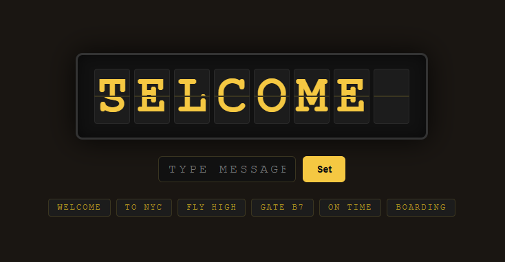
A split-flap display — also called a Solari board — is the mechanical-looking sign you see in old train stations and airports, where each character cell physically flips through letters until it lands on the target. This recreation uses CSS 3D transforms, the perspective and rotateX properties, and a JavaScript animation engine that cycles each cell through the character set one flap at a time. No images, sprites or libraries are involved — just the DOM and CSS.
The anatomy of one flap cell
Each character is a .flap-cell with fixed dimensions and, crucially, a CSS perspective value that creates the 3D viewing frustum so rotations look like they recede into the screen. Inside the cell are five layered elements: a static .top half showing the upper portion of the current character, a static .bot half showing the lower portion, a thin .divider line across the middle to mimic the seam of a physical flap, and two animated flaps — .flap-top-anim and .flap-bot-anim — that perform the actual flip and are hidden when idle.
Both halves clip their character. The top half uses overflow: hidden with the glyph aligned to the bottom, and the bottom half aligns the glyph to the top using transform: translateY(-50%) on its inner <span>. The result is that a single full-height character appears split exactly across the horizontal seam — the top half shows the upper part, the bottom half shows the lower part, exactly like a real flap.
How the flip animation works
A physical split-flap works in two beats: the top leaf bearing the old character rotates downward and out of view, then the bottom leaf bearing the new character rotates up into place. The code reproduces this precisely with rotateX and two transform-origin settings.
The top animated flap has transform-origin: bottom center, so it hinges along the seam. It starts at rotateX(0deg) showing the previous character, then transitions to rotateX(90deg), folding away from the viewer until it is edge-on and invisible. backface-visibility: hidden keeps its reverse side from showing. The bottom animated flap has transform-origin: top center and starts folded at rotateX(-90deg) showing the next character edge-on, then transitions to rotateX(0deg) to snap flat into the final position. Sequencing the two with short setTimeout delays (about 55ms each) produces the convincing click-down motion.
A subtle but essential trick: before animating, the code sets transition: none, applies the start transform, and then in a double requestAnimationFrame re-enables the transition and applies the end transform. The double rAF guarantees the browser has committed the start state to the layout before the transition begins, otherwise the browser would collapse both writes into one and no animation would play. This is the standard pattern for triggering CSS transitions from JavaScript reliably.
The character set and cycling logic
A constant CHARSET string defines the available glyphs in order: a leading space, then A–Z, then 0–9. Each cell stores a current index and a target index into this string. The animation does not jump straight to the target — like a real board, it steps one character forward at a time. animateStep advances current by one using modular arithmetic (current + 1) % CHARSET.length, performs one flip animation, and when finished schedules itself again with a short delay. It stops only when current === target. So changing a cell from A to G visibly flaps through B, C, D, E, F, G — the signature behavior of these boards.
Staggering columns and message handling
displayMessage pads or trims the input to exactly eight characters with padEnd and slice, then for each cell looks up the target character's index in CHARSET (falling back to space for unknown characters). To avoid a flat, simultaneous flip, each cell's animation start is delayed by i * 40 milliseconds via setTimeout, so the columns ripple from left to right — exactly how mechanical boards updated row by row. A per-cell animating flag prevents overlapping animation chains if a new message arrives mid-flip.
Building cells and wiring the UI
On load, the script creates eight cells with createElement, injects the inner markup with innerHTML, and stores each cell's state object in a cells array. Preset buttons are generated from a PRESETS array, each calling displayMessage on click. A text input lets users type custom messages (uppercased via CSS text-transform and JS), committing on the Set button or Enter key. Finally a setInterval auto-cycles through the presets every few seconds so the board is always alive, mirroring a departures board rolling through its schedule.
The whole effect — flipping leaves, the mechanical seam, the left-to-right ripple, the step-through-the-alphabet motion — comes entirely from layered absolutely-positioned divs, two rotateX hinges with opposite transform-origin, and a small recursive timing engine. It is a compact masterclass in CSS 3D and JavaScript-driven transitions.
Build with AI
Build, Understand, Optimize, and Extend It With AI
You don't have to trace every hinge rotation and timing offset by hand. Paste this snippet's HTML, CSS, and JS into an AI coding assistant like Claude and ask it to walk through exactly why the two animated flaps need opposite transform-origin values, or why a single requestAnimationFrame isn't enough to reliably trigger the transition. The same assistant can help optimize it — checking whether the recursive animateStep calls could be replaced with a single driving loop for boards with many more cells, or whether the per-step setTimeout chain introduces visible jitter under load. It's just as useful for extending the effect: ask it to add a sound on each flap, wire the board up to a live data feed like a real countdown or ticket queue, or support a taller multi-row board for longer messages. Treat the code less like a finished artifact and more like a starting point for a conversation.
Prompt to recreate it
Copy this into your AI assistant of choice to build the effect from scratch, or as a jumping-off point for your own variant:
Build an airport-style "split-flap display" (Solari board) in plain HTML, CSS, and JavaScript using only CSS 3D transforms — no canvas, no video, no sprite images, no libraries.

Requirements:
- A row of fixed-size cells, one per character, each with CSS perspective set on the cell so child rotations look like real 3D hinges rather than a flat squash.
- Each cell is built from five layered pieces: a static top half and static bottom half showing the resting character (clipped with overflow hidden, top half aligned to its top edge, bottom half aligned to its bottom edge, so together they show one full-height glyph split across a seam), a thin divider line across the middle, and two animated flap elements that are hidden except during a flip.
- The top animated flap must have transform-origin: bottom center and rotate from rotateX(0deg) to rotateX(90deg) to fold away and reveal the character underneath. The bottom animated flap must have the opposite hinge, transform-origin: top center, and rotate from rotateX(-90deg) up to rotateX(0deg) to snap the new character into place. Both need backface-visibility: hidden so their reverse side never flashes into view mid-rotation.
- Every cell tracks a current index and a target index into a shared character set (a leading space, then A-Z, then 0-9). A recursive step function must advance the current index by exactly one position per call (wrapping with modular arithmetic), play one two-beat flip animation for that single step, and call itself again until current equals target.
- Before triggering each rotation, apply the start transform with transition: none, then re-enable the transition and apply the end transform inside two nested requestAnimationFrame calls (not just one).
- When a new message is set, stagger each column's animation start by an increasing delay (e.g. columnIndex * 40ms) so the whole board updates as a left-to-right ripple.
- Add a text input and a Set button to commit a custom message, plus a row of preset buttons and a setInterval that auto-cycles through presets every few seconds.
Want to tighten it up first? Run this prompt through the AI Prompt Studio to score it across 8 quality dimensions, catch anti-patterns, and tune the wording for Claude, ChatGPT, or Gemini before you paste it in.
Source Code
<div class="app">
  <div class="board-frame">
    <div class="board" id="board"></div>
  </div>
  <div class="controls">
    <input type="text" id="msgInput" maxlength="8" placeholder="Type message..." spellcheck="false">
    <button id="setBtn">Set</button>
  </div>
  <div class="presets" id="presets"></div>
</div>
* { margin: 0; padding: 0; box-sizing: border-box; }
body {
background: #1a1612; color: #f5c842; font-family: 'Courier New', monospace;
min-height: 100vh; display: flex; align-items: center; justify-content: center;
}
.app { display: flex; flex-direction: column; align-items: center; gap: 24px; padding: 20px; }
.board-frame {
background: #111; border: 3px solid #333; border-radius: 10px;
padding: 20px 24px; box-shadow: 0 0 40px rgba(0,0,0,0.8), inset 0 0 20px rgba(0,0,0,0.5);
}
.board { display: flex; gap: 6px; }
.flap-cell {
position: relative; width: 52px; height: 80px;
perspective: 300px; cursor: default;
}
.flap-cell .top, .flap-cell .bot {
position: absolute; left: 0; right: 0; height: 50%;
background: #1c1c1c; border: 1px solid #2a2a2a;
overflow: hidden; display: flex; justify-content: center;
font-size: 72px; font-weight: 700; color: #f5c842;
line-height: 1;
backface-visibility: hidden;
}
.flap-cell .top {
top: 0; border-bottom: 1.5px solid #3a3520; border-radius: 4px 4px 0 0;
align-items: flex-start;
}
.flap-cell .bot {
bottom: 0; border-top: 1.5px solid #3a3520; border-radius: 0 0 4px 4px;
align-items: flex-end;
}
.flap-cell .bot span, .flap-cell .top span {
display: block;
}
.flap-cell .divider {
position: absolute; left: 0; right: 0; top: 50%; height: 2px;
background: #3a3520; z-index: 10; transform: translateY(-50%);
}
.flap-cell .flap-top-anim {
position: absolute; top: 0; left: 0; right: 0; height: 50%;
background: #1c1c1c; border: 1px solid #2a2a2a; border-radius: 4px 4px 0 0;
overflow: hidden; transform-origin: bottom center;
display: flex; align-items: flex-start; justify-content: center;
font-size: 72px; font-weight: 700; color: #f5c842; line-height: 1;
z-index: 5;
}
.flap-cell .flap-bot-anim {
position: absolute; bottom: 0; left: 0; right: 0; height: 50%;
background: #1c1c1c; border: 1px solid #2a2a2a; border-radius: 0 0 4px 4px;
overflow: hidden; transform-origin: top center;
display: flex; align-items: flex-end; justify-content: center;
font-size: 72px; font-weight: 700; color: #f5c842; line-height: 1;
z-index: 5;
}
.controls { display: flex; gap: 10px; }
#msgInput {
padding: 8px 14px; background: #111; border: 1px solid #3a3520;
border-radius: 6px; color: #f5c842; font-family: 'Courier New', monospace;
font-size: 18px; letter-spacing: 4px; width: 200px; text-transform: uppercase;
outline: none;
}
#msgInput:focus { border-color: #f5c842; }
#setBtn {
padding: 8px 20px; background: #f5c842; color: #111; border: none;
border-radius: 6px; font-weight: 700; font-size: 14px; cursor: pointer; transition: opacity 0.2s;
}
#setBtn:hover { opacity: 0.85; }
.presets { display: flex; gap: 8px; flex-wrap: wrap; justify-content: center; }
.preset-btn {
padding: 5px 12px; background: #1c1c1c; border: 1px solid #3a3520;
border-radius: 4px; color: #a89020; font-family: 'Courier New', monospace;
font-size: 12px; cursor: pointer; transition: all 0.15s; letter-spacing: 2px;
}
.preset-btn:hover { background: #2a2a1a; border-color: #f5c842; color: #f5c842; }const CHARSET = ' ABCDEFGHIJKLMNOPQRSTUVWXYZ0123456789';
const PRESETS = ['WELCOME','TO NYC ','FLY HIGH','GATE B7','ON TIME','BOARDING'];
const NUM_CELLS = 8;
const board = document.getElementById('board');
const cells = [];
function padMsg(msg) {
return msg.toUpperCase().padEnd(NUM_CELLS, ' ').slice(0, NUM_CELLS);
}
function createCell() {
const cell = document.createElement('div');
cell.className = 'flap-cell';
cell.innerHTML = `
<div class="top"><span> </span></div>
<div class="bot"><span> </span></div>
<div class="divider"></div>
<div class="flap-top-anim" style="display:none"><span> </span></div>
<div class="flap-bot-anim" style="display:none"><span> </span></div>
`;
return cell;
}
for (let i = 0; i < NUM_CELLS; i++) {
const el = createCell();
board.appendChild(el);
cells.push({ el, current: 0, target: 0, animating: false });
}
function getCharEl(cell) {
return {
top: cell.el.querySelector('.top span'),
bot: cell.el.querySelector('.bot span'),
animTop: cell.el.querySelector('.flap-top-anim'),
animBot: cell.el.querySelector('.flap-bot-anim'),
};
}
function setChar(cell, ch) {
const { top, bot } = getCharEl(cell);
const c = ch === ' ' ? ' ' : ch;
top.innerHTML = c;
bot.innerHTML = c;
}
function animateStep(cellObj) {
if (cellObj.current === cellObj.target) {
cellObj.animating = false;
return;
}
cellObj.animating = true;
const prev = CHARSET[cellObj.current];
cellObj.current = (cellObj.current + 1) % CHARSET.length;
const next = CHARSET[cellObj.current];
const { top, bot, animTop, animBot } = getCharEl(cellObj);
const prevC = prev === ' ' ? ' ' : prev;
const nextC = next === ' ' ? ' ' : next;
// Static top already shows nextC (revealed when animTop falls away)
top.innerHTML = nextC;
// Static bot stays at prevC — animBot (nextC) falls over it
bot.innerHTML = prevC;
// animTop covers static top with prevC, falls away to reveal nextC below
animTop.style.display = 'flex';
animTop.querySelector('span').innerHTML = prevC;
animTop.style.transition = 'none';
animTop.style.transform = 'rotateX(0deg)';
// animBot shows nextC bottom, starts folded invisible at -90deg
animBot.style.display = 'flex';
animBot.querySelector('span').innerHTML = nextC;
animBot.style.transition = 'none';
animBot.style.transform = 'rotateX(-90deg)';
requestAnimationFrame(() => {
requestAnimationFrame(() => {
animTop.style.transition = 'transform 0.05s ease-in';
animTop.style.transform = 'rotateX(90deg)';
setTimeout(() => {
animTop.style.display = 'none';
animBot.style.transition = 'transform 0.05s ease-out';
animBot.style.transform = 'rotateX(0deg)';
setTimeout(() => {
// Commit nextC to static bot, hide overlay
bot.innerHTML = nextC;
animBot.style.display = 'none';
setTimeout(() => animateStep(cellObj), 10);
}, 55);
}, 55);
});
});
}
function displayMessage(msg) {
const padded = padMsg(msg);
padded.split('').forEach((ch, i) => {
const idx = CHARSET.indexOf(ch) === -1 ? 0 : CHARSET.indexOf(ch);
const cellObj = cells[i];
cellObj.target = idx;
if (!cellObj.animating) {
setTimeout(() => animateStep(cellObj), i * 40);
}
});
}
// Init display
cells.forEach(c => setChar(c, ' '));
// Presets UI
const presetsEl = document.getElementById('presets');
PRESETS.forEach(p => {
const btn = document.createElement('button');
btn.className = 'preset-btn';
btn.textContent = p.trim();
btn.addEventListener('click', () => displayMessage(p));
presetsEl.appendChild(btn);
});
document.getElementById('setBtn').addEventListener('click', () => {
displayMessage(document.getElementById('msgInput').value || ' ');
});
document.getElementById('msgInput').addEventListener('keydown', e => {
if (e.key === 'Enter') displayMessage(e.target.value || ' ');
});
// Auto-cycle presets
let presetIdx = 0;
function cyclePres() {
displayMessage(PRESETS[presetIdx]);
presetIdx = (presetIdx + 1) % PRESETS.length;
}
cyclePres();
setInterval(cyclePres, 3500);Step by step
How to Use
- 1Watch it cycleOn load the board auto-cycles through preset messages, flapping each cell through the alphabet to its target.
- 2Click a presetPick one of the preset buttons to flip the board to that message instantly.
- 3Type custom textEnter up to eight characters in the input field — letters, numbers or spaces.
- 4Set the messagePress the Set button or hit Enter to animate the board toward your custom text.
- 5Observe the rippleNotice how columns start their flip staggered left to right for a mechanical board feel.
- 6Adapt the charsetEdit the CHARSET constant in the JS to add symbols or change the available glyphs.
Real-world uses
Common Use Cases
Got questions?
Frequently Asked Questions
It mimics a real split-flap board, which can only step one leaf forward at a time. The code advances the current index by one per animation and repeats until it reaches the target, so it visibly rolls through intermediate characters.
To trigger a CSS transition you must apply the start state, let the browser commit it, then apply the end state. Two nested rAF calls guarantee the start transform is painted before the transition begins, otherwise the browser batches both writes and skips the animation.
Both halves use overflow hidden. The top aligns the glyph to its bottom edge and the bottom shifts its glyph up with translateY(-50%), so together they show the upper and lower portions of the same full-height character across the seam.
Yes. Add the characters to the CHARSET constant. The cycling logic uses CHARSET.indexOf and modular arithmetic, so it automatically handles any length, though longer sets mean more flips to reach distant characters.
The static top and bottom halves display the resting character. The animated flaps are only shown during a flip to perform the rotation, then hidden again so the cell renders crisply without extra layered elements.
Yes. Click JSX for a React component, Vue for a Vue 3 SFC, Angular for a standalone component, or Tailwind for a utility-class version. In React, drive each character cell from props and trigger the flip animation in useEffect when the target text changes.