
Learn Coding Visually
Learn to code with interactive, live-preview playgrounds — HTML, CSS, JavaScript, React & more.
 HTML Playground42 lessons · Click-based · Live preview
 CSS PlaygroundLearn CSS with a live editor
 JavaScript Playground60 lessons · DOM · Async · Canvas
 React PlaygroundLearn React with a live code editor
 GSAP PlaygroundLearn GSAP animation interactively
 SVG Playground44 lessons · shapes · paths · animation
 SCSS Playground45 lessons · Sass modules · tokens
 Tailwind PlaygroundLearn Tailwind CSS with a live editor
 Bootstrap 5 Playground50 lessons · live preview
3D Rotating Cube Carousel — HTML CSS JS Snippet
3D Rotating Cube Carousel · Cards · Plain HTML, CSS & JS · Live preview
What's included
Features
About this UI Snippet
3D Rotating Cube Carousel — Perspective, preserve-3d & Four Real Faces

Most "3D carousels" fake depth with a flat stack of angled cards. This one is an actual cube: four faces glued to the sides of a single 3D box via rotateY + translateZ, and the whole box turns 90° at a time so a new face swings into view exactly like a real rotating cube would. It's built with nothing but CSS 3D transforms and vanilla JS — no library, no canvas, no WebGL.
One transform on the parent, four fixed transforms on the children
Each .cube-face gets a permanent transform that welds it to one side of the box — rotateY(0/90/180/-90deg) translateZ(130px) — set once in CSS and never touched again. The *only* thing JavaScript animates is the cube itself: cube.style.transform = 'rotateY(' + (-current * 90) + 'deg)'. Because the faces are already positioned relative to the cube's own coordinate space, rotating the parent carries all four of them around together, in perfect sync, with a single line of code.
Getting real depth instead of a flat skew requires two settings in the right place: perspective on the *scene* (the cube's parent, so the viewer has a vanishing point to look through) and transform-style: preserve-3d on the *cube* itself (so its children's 3D transforms compose in 3D space instead of being flattened onto the page). Miss either one and the "cube" collapses into an ordinary 2D card swap.
Build with AI
Build, Understand, Optimize, and Extend It With AI
Paste this snippet's HTML, CSS, and JS into an AI coding assistant like Claude and ask it to explain exactly why the four faces need their own fixed rotateY/translateZ transforms while only the parent cube's transform ever changes in JavaScript — and why translateZ has to equal exactly half the cube's width for the faces to meet without gaps. It's also a good exercise to ask the assistant to extend the swipe handler to support a live drag (rotating the cube proportionally to finger movement before snapping to the nearest face) instead of the current swipe-then-snap behavior, or to add a subtle ambient auto-rotation that pauses the instant a user interacts.
Prompt to recreate it
Copy this into your AI assistant of choice to build the effect from scratch, or as a jumping-off point for your own variant:
Build a genuine 3D rotating cube carousel in plain HTML, CSS, and vanilla JavaScript using only CSS 3D transforms — no library, no canvas.

Requirements:
- A perspective-enabled scene container wrapping a cube element with transform-style: preserve-3d, so child 3D transforms compose in real 3D space.
- Exactly four face elements absolutely positioned inside the cube, each given a permanent, never-changed CSS transform that welds it to one side of the cube using rotateY at 0/90/180/-90 degrees combined with translateZ equal to exactly half the cube's width, so the four faces form a closed box with no gaps.
- The ONLY transform JavaScript ever writes is a single rotateY on the cube element itself, computed from a "current face index" state variable — rotating the parent must carry all four faces around together automatically because of their fixed relative positions, not because JavaScript repositions each face individually.
- Previous/next buttons that increment or decrement the current face index (wrapping around at the ends) and re-render, plus a row of position-indicator dots generated dynamically from the face count where clicking a dot jumps to that face.
- Left/Right arrow key support that triggers the same next/previous logic.
- Basic touch swipe support: track touchstart and touchend X coordinates, and if the horizontal delta exceeds a small threshold, advance or go back one face.
- All rotation must be a CSS transition on the transform property so it animates smoothly on the compositor.
Want to tighten it up first? Run this prompt through the AI Prompt Studio to score it across 8 quality dimensions, catch anti-patterns, and tune the wording for Claude, ChatGPT, or Gemini before you paste it in.
Source Code
<div class="cube-stage">
  <div class="cube-scene">
    <div class="cube" id="cube">
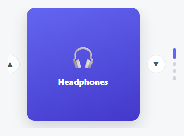
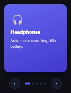
      <div class="cube-face cube-front"><span class="cube-emoji">🚀</span><h3>Launch Faster</h3><p>Ship features in days, not sprints.</p></div>
      <div class="cube-face cube-right"><span class="cube-emoji">🔒</span><h3>Stay Secure</h3><p>SOC2-ready by default, every deploy.</p></div>
      <div class="cube-face cube-back"><span class="cube-emoji">📈</span><h3>Scale With Ease</h3><p>Auto-scaling infra that just works.</p></div>
      <div class="cube-face cube-left"><span class="cube-emoji">🤝</span><h3>Collaborate Live</h3><p>Real-time editing, zero merge conflicts.</p></div>
    </div>
  </div>
  <div class="cube-controls">
    <button class="cube-btn" id="cubePrev" aria-label="Previous face">‹</button>
    <div class="cube-dots" id="cubeDots"></div>
    <button class="cube-btn" id="cubeNext" aria-label="Next face">›</button>
  </div>
</div>*{box-sizing:border-box;margin:0;padding:0}
body{font-family:system-ui,-apple-system,sans-serif;background:#0b0f1a;min-height:100vh;display:flex;align-items:center;justify-content:center;padding:32px}
.cube-stage{width:100%;max-width:340px}
.cube-scene{width:100%;height:280px;perspective:900px;display:flex;align-items:center;justify-content:center}
.cube{position:relative;width:260px;height:260px;transform-style:preserve-3d;transition:transform .7s cubic-bezier(.65,0,.35,1)}
.cube-face{position:absolute;inset:0;display:flex;flex-direction:column;align-items:center;justify-content:center;gap:10px;padding:24px;border-radius:16px;text-align:center;backface-visibility:hidden;box-shadow:inset 0 0 0 1px rgba(255,255,255,.08)}
.cube-emoji{font-size:44px}
.cube-face h3{color:#fff;font-size:17px;font-weight:800}
.cube-face p{color:rgba(255,255,255,.75);font-size:13px;line-height:1.5;max-width:200px}
.cube-front{background:linear-gradient(160deg,#6366f1,#4338ca);transform:rotateY(0deg) translateZ(130px)}
.cube-right{background:linear-gradient(160deg,#0ea5e9,#0369a1);transform:rotateY(90deg) translateZ(130px)}
.cube-back{background:linear-gradient(160deg,#ec4899,#9d174d);transform:rotateY(180deg) translateZ(130px)}
.cube-left{background:linear-gradient(160deg,#10b981,#047857);transform:rotateY(-90deg) translateZ(130px)}
.cube-controls{display:flex;align-items:center;justify-content:center;gap:18px;margin-top:22px}
.cube-btn{width:40px;height:40px;border-radius:50%;background:#161c2c;border:1px solid #2a3348;color:#cbd5e1;font-size:20px;line-height:1;cursor:pointer;display:flex;align-items:center;justify-content:center;transition:background .15s,color .15s,transform .1s}
.cube-btn:hover{background:#232c42;color:#fff}
.cube-btn:active{transform:scale(.92)}
.cube-dots{display:flex;gap:8px}
.cube-dot{width:8px;height:8px;border-radius:50%;background:#2a3348;cursor:pointer;border:none;transition:background .2s,width .2s}
.cube-dot.active{background:#6366f1;width:22px;border-radius:4px}var cube = document.getElementById('cube');
var faces = ['front', 'right', 'back', 'left'];
var current = 0;
function render() {
cube.style.transform = 'rotateY(' + (-current * 90) + 'deg)';
document.querySelectorAll('.cube-dot').forEach(function (d, i) {
d.classList.toggle('active', i === current);
});
}
function next() { current = (current + 1) % faces.length; render(); }
function prev() { current = (current - 1 + faces.length) % faces.length; render(); }
document.getElementById('cubeNext').addEventListener('click', next);
document.getElementById('cubePrev').addEventListener('click', prev);
var dotsWrap = document.getElementById('cubeDots');
faces.forEach(function (f, i) {
var d = document.createElement('button');
d.className = 'cube-dot';
d.setAttribute('aria-label', 'Go to face ' + (i + 1));
d.addEventListener('click', function () { current = i; render(); });
dotsWrap.appendChild(d);
});
document.addEventListener('keydown', function (e) {
if (e.key === 'ArrowRight') next();
else if (e.key === 'ArrowLeft') prev();
});
// Swipe support
var startX = null;
cube.addEventListener('touchstart', function (e) { startX = e.touches[0].clientX; });
cube.addEventListener('touchend', function (e) {
if (startX === null) return;
var dx = e.changedTouches[0].clientX - startX;
if (Math.abs(dx) > 40) { dx < 0 ? next() : prev(); }
startX = null;
});
render();Step by step
How to Use
- 1Paste HTML, CSS, and JSA dark 3D cube appears front-on, showing its first face.
- 2Click the arrowsThe cube physically turns 90° — a new face swings into view while the old one rotates away.
- 3Use the dotsClick any dot to jump straight to that face, turning the shortest direction automatically.
- 4Swipe on mobileDrag left or right on the cube to turn it — works with touch out of the box.
- 5Add a fifth faceA cube only has four sides for 90° turns — for more panels, pair this with the Coverflow Carousel or Carousel snippets instead.
Real-world uses
Common Use Cases
Got questions?
Frequently Asked Questions
Almost always a missing perspective or preserve-3d. perspective must be set on the cube's parent (.cube-scene), and transform-style: preserve-3d must be set on the cube itself — miss either one and the browser flattens the rotation onto the page.
Not as a literal cube — a cube only has 4 sides you can rotate through at 90° each. For more panels, use the Coverflow Carousel (fans cards in perspective) or the plain Carousel snippet, both of which scale to any number of slides.
Update the cube's width/height and each face's translateZ to exactly half that value (translateZ must equal half the cube's side length so the faces meet at the edges without gaps or overlap).
Yes — replace a face's content with an <img> sized to fill it (object-fit: cover works well) and drop the background gradient. The rotation logic is unaffected either way.
Yes — Left/Right arrow keys turn the cube, the prev/next buttons are real <button> elements, and a touchstart/touchend delta handles swipe on mobile.